
Photographer
D Alberto Photography
Posts: 117
Nashville, Tennessee, US
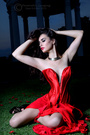
I frequently have trouble with the color red looking muddy on a variety of monitors and websites. It might look good on one website but muddy on another. Good on one monitor, but crappy on another. And it varies from photo to photo. This one, for example, looks okay on my monitor, in Preview, but looks like crap on Flickr and of course REALLY looks bad on FB. (Note: Please excuse the hair ties. <embarrassed cough>) ![https://farm8.staticflickr.com/7232/13919083953_bb4736ddfb.jpg]() But I've had several others. I've been told to try doing EVERYTHING in sRGB. Shoot RAW, edit sRGB, output sRGB. But since I use Lr, PS, on CC, and let those programs output for web, print, whatever, using sRGB, I figured it should all be good, right? Ah, well, any help would be appreciated. Even just the appropriate words to google will help. I tried searching there and in here. Thanks! Darwin

Photographer
udor
Posts: 25255
New York, New York, US

When was the last time you calibrated your monitor?
If you work on a calibrated monitor, at least you know that your colors are correct, and they will appear true on other calibrated monitors, but with the majority of computers, it will be a craps shot to see the right colors.
I might be wrong, but this is my guess.

Photographer
Revenge Photography
Posts: 1905
Horsham, Victoria, Australia
Monitor calibration compounded by excessive jpg compression (facebook) killing the high frequency data in your image.

Photographer
A-M-P
Posts: 18465
Orlando, Florida, US
That dress is not true red looks pinkish tone on my end. I think you need to calibrate your monitor.

Photographer
imcFOTO
Posts: 581
Bothell, Washington, US
I had lots of problems myself even though I was using sRGB throughout my process. Images seemed to appear differently depending on the browser I was using. I solved my problem once I found out that the sRGB icc profile being used on my PC was the version 4 and not the more widely supported version 2. I was able to change this as the default and images now seem much more consistent. Problem is, I can't remember how I changed it! Here's an interesting link that will help you see the difference. http://www.color.org/version4html.xalter On my PC it renders everything consistently in Internet Explorer but neither Chrome or Firefox will render the v4 properly. Seems most browsers are slow to adopt compatibility with v4 sRGB ICC profile. On Chrome, the blue sky in the top left quadrant is much more muted. I don't know if this is your problem - but something worth investigating perhaps.
Photographer
imcFOTO
Posts: 581
Bothell, Washington, US
A-M-P wrote:
That dress is not red looks pinkish tone on my end. I think you need to calibrate your monitor. It looks vivid red on mine (viewed on Chrome). I think it's the ICC profile at fault
Photographer
udor
Posts: 25255
New York, New York, US
A-M-P wrote:
That dress is not red looks pinkish tone on my end. I think you need to calibrate your monitor. imcFOTO wrote:
It looks vivid red on mine (viewed on Chrome). I think it's the ICC profile at fault Yeah, it looks red to me too... has a color bias (from artist color theory) towards a purple hue, but red in principle... I actually like how it looks on my screen.

Photographer
Photos by Lorrin
Posts: 7026
Eugene, Oregon, US
Sometimes Macs and PC's show color differently.
Photographer
AJ_In_Atlanta
Posts: 13053
Atlanta, Georgia, US
Red is the color with the lowest energy and the hardest for digital cameras to capture, but it looks red on mine (agree wit Udor, tending to purple)
Photographer
udor
Posts: 25255
New York, New York, US
AJScalzitti wrote:
Red is the color with the lowest energy and the hardest for digital cameras to capture, but it looks red on mine (agree wit Udor, tending to purple) I just looked at the picture again... and I noticed that there is a lot of blue on the steel ladder and also on the walls... so I am guessing the OP pushed the blue value, which cools down the red and pushes it towards a purple tone.

Photographer
Ruben Vasquez
Posts: 3117
Las Vegas, Nevada, US
I agree with others, the dress is red but there is a bit of bias towards blue. This is because there's too much blue in the dress causing it to shift towards pink/purple. To fix this, I would recommend a channel mixer adjustment layer, select the blue channel and lower it to 0% and then raise the green channel to 100%. Most of the effect will be in the dress but the rest of the image will shift a bit as well. To isolate the effect almost exclusively to the dress, change the layer blend mode to darken. I also lowered the layer opacity to 60% and got this: ![https://i663.photobucket.com/albums/uu356/Ruben9V/13919083953_bb4736ddfb_zpsf0233541.jpg]() ![https://farm8.staticflickr.com/7232/13919083953_bb4736ddfb.jpg]()
Photographer
D Alberto Photography
Posts: 117
Nashville, Tennessee, US
Hey, thanks everyone.
All of your responses give me a lot to work with now. Much appreciated!
Yes, I last calibrated maybe 2 or 3 months ago. I can't recall if it was packed and moved with the rest of our household goods or if it's here with me in the hotel. If it's not here, I guess I'm stuck for another 3 months unless I can borrow someone else's I suppose.
Thanks again,
Darwin
Photographer
A-M-P
Posts: 18465
Orlando, Florida, US
Ruben Vasquez wrote:
I agree with others, the dress is red but there is a bit of bias towards blue. This is because there's too much blue in the dress causing it to shift towards pink/purple. To fix this, I would recommend a channel mixer adjustment layer, select the blue channel and lower it to 0% and then raise the green channel to 100%. Most of the effect will be in the dress but the rest of the image will shift a bit as well. To isolate the effect almost exclusively to the dress, change the layer blend mode to darken. I also lowered the layer opacity to 60% and got this:
![https://i663.photobucket.com/albums/uu356/Ruben9V/13919083953_bb4736ddfb_zpsf0233541.jpg]() ![https://farm8.staticflickr.com/7232/13919083953_bb4736ddfb.jpg]() Top image is what I consider a true red but then again I'm a girl and to me the bottom would be considered more of a dark pink tone.
They say women have more names for colors and can see a bigger spectrum of shades. My BF used to fight with me saying something was yellow and I would say it was neon green. Too him it was either green or yellow no in between lol so we both took a color test and I score much better than him I could see more shades of colors than he could.
To me the reason it looks muddy is because you added blue to the shadows shifting it's color tone slightly towards a pink/purple undertone thus not making it a true red. From an artist point of view when you mix red and blue you get magenta which is what I think happened to your image. If you get rid of the blue the dress will look like a true red.
![https://www.bigblackpig.com/painting/rgb.jpg]()
Photographer
stacey clarke photo
Posts: 614
Swansea, Wales, United Kingdom
A-M-P wrote:
Top image is red to me but then again I'm a girl and to me the bottom would be considered more of a dark pink than red. i agree top image is actual red, bottom image would still be considered "red" but has a much pinkier tone.
do you save srgb for online

Photographer
joe man
Posts: 39
San Marcos, Texas, US
Photographer
Ruben Vasquez
Posts: 3117
Las Vegas, Nevada, US
Here's a screen grab to help. ![https://i663.photobucket.com/albums/uu356/Ruben9V/RedDressScreenGrap_zpsf9474bdc.jpg]() Essentially what this is doing is replacing the blue channel with the green channel, but by setting the layer blend mode to darken, it's only changing the blue channel in those areas that the green channel is darker than the blue (hence darken blend). If you take a look at the channels (before any adjustments are made), you'll see that the green channel is practically non-existent where the dress is but the blue channel is lighter (looking at just the dress). But the background is pretty much the same in all three channels so it's easy to isolate the area that's affected to only the dress without the need of making any selections.

Photographer
Zack Zoll
Posts: 6895
Glens Falls, New York, US
imcFOTO wrote:
I had lots of problems myself even though I was using sRGB throughout my process. Images seemed to appear differently depending on the browser I was using.
I solved my problem once I found out that the sRGB icc profile being used on my PC was the version 4 and not the more widely supported version 2. I was able to change this as the default and images now seem much more consistent. Problem is, I can't remember how I changed it!
Here's an interesting link that will help you see the difference.
http://www.color.org/version4html.xalter
On my PC it renders everything consistently in Internet Explorer but neither Chrome or Firefox will render the v4 properly. Seems most browsers are slow to adopt compatibility with v4 sRGB ICC profile. On Chrome, the blue sky in the top left quadrant is much more muted.
I don't know if this is your problem - but something worth investigating perhaps. That's a really good point about the colour profiles.
I'm also using the most recent version of chrome, and the dress looks magenta to me in-browser. I downloaded the file, and in Windows Picture Viewer and Photoshop it looked more 'red' - more so in PS.
If you're using Preview, I'm assuming that means that you have a Mac. Although Photoshop and other colour-managed programs theoretically work the same on Windows and Mac, preview and picture viewer do not, as they use the OS' native colour space.
Photographer
joe man
Posts: 39
San Marcos, Texas, US
Photographer
joe man
Posts: 39
San Marcos, Texas, US
Ok Then .. you all have given this monkey somthing to play with. I take the color venn stick it to photoshop and fire up the channel mixer and play. Needin to get the intuitive feel for the effects depending on sliders and output channels ...
Thanks

Photographer
DougBPhoto
Posts: 39248
Portland, Oregon, US
D Alberto Photography wrote:
Thanks!
Darwin Darwin, since everyone else are handling the difficult answers...
Are you positive that the color space profile is always being saved in your file output? For example, sometimes using 'save for web' option may omit the srgb profile if you don't make sure it is checked to be included.
It is my understanding that if that is not in there, you can get random results, and obviously, if you're going from computer to computer comparing, EACH and every computer needs to be calibrated, you can't consider the appearance on an uncalibrated computer as indicative of anything for evaluating color quality.

Photographer
J O H N A L L A N
Posts: 12221
Los Angeles, California, US
The top one appears purish red and the bottom one a dark pink on my Firefox browser.
Testing the color of each in the red diffused area I get:
top: 205,0,34
bottom: 211,0,77
Photographer
Ruben Vasquez
Posts: 3117
Las Vegas, Nevada, US
clickman818 wrote:
Ok Then .. you all have given this monkey somthing to play with. I take the color venn stick it to photoshop and fire up the channel mixer and play. Needin to get the intuitive feel for the effects depending on sliders and output channels ...
Thanks It's a good idea to have the channels palette open when you're manipulating the channel mixer so you can actually see what's going on. Get to know your color theory well. I find that it helps to think of it like mixing paint. Don't forget that you can use various layer blend modes as well. The ones I use the most are Normal, Lighten, Screen, Darken, Multiply, Color, and Luminosity. Much of the time, the affect is too much so it helps to adjust the opacity to really dial in the amount of change you want.
Photographer
D Alberto Photography
Posts: 117
Nashville, Tennessee, US
DougBPhoto: Yep. For output, sRGB is always checked. But if it weren't, I'm not sure I wouldn't be too embarrassed to admit it. Haha
Ruben, imcFoto, clickman, and others regarding channels, profiles: Thanks, again. I vaguely recall messing around with channels a couple years ago but got away from it. I guess I better get back to it fast. Same with the color profiles.
Good stuff. Thanks!
- Darwin
Photographer
Personality Imaging
Posts: 2100
Hoover, Alabama, US
It's not going to do much good to calibrate your monitor because nobody else calibrates theirs.
The best you can do is refuse to post serious work on crap sites like Facebook.

Photographer
Shadow Dancer
Posts: 9777
Bellingham, Washington, US
A-M-P wrote:
Top image is what I consider a true red but then again I'm a girl and to me the bottom would be considered more of a dark pink tone.
They say women have more names for colors and can see a bigger spectrum of shades. My BF used to fight with me saying something was yellow and I would say it was neon green. Too him it was either green or yellow no in between lol so we both took a color test and I score much better than him I could see more shades of colors than he could.
To me the reason it looks muddy is because you added blue to the shadows shifting it's color tone slightly towards a pink/purple undertone thus not making it a true red. From an artist point of view when you mix red and blue you get magenta which is what I think happened to your image. If you get rid of the blue the dress will look like a true red.
![https://www.bigblackpig.com/painting/rgb.jpg]() There are far more men with varying degrees of color blindness than women. I used to print images for a job, when color was critical I always consulted with female coworkers to make sure it was correct. I have measurable color blindness but not total. I have actually improved through practice.
There are apparently quite a few women who have exceptional perception of color:
http://www.gmanetwork.com/news/story/26 … ne-of-them
Photographer
DougBPhoto
Posts: 39248
Portland, Oregon, US
D Alberto Photography wrote:
DougBPhoto: Yep. For output, sRGB is always checked. But if it weren't, I'm not sure I wouldn't be too embarrassed to admit it. Haha
Ruben, imcFoto, clickman, and others regarding channels, profiles: Thanks, again. I vaguely recall messing around with channels a couple years ago but got away from it. I guess I better get back to it fast. Same with the color profiles.
Good stuff. Thanks!
- Darwin Good, sometimes the easiest explanations are often overlooked.
Photographer
Ruben Vasquez
Posts: 3117
Las Vegas, Nevada, US
Personality Imaging wrote:
It's not going to do much good to calibrate your monitor because nobody else calibrates theirs.
The best you can do is refuse to post serious work on crap sites like Facebook. I seriously hope no one takes this incredibly bad advice.
Photographer
Zack Zoll
Posts: 6895
Glens Falls, New York, US
Personality Imaging wrote:
It's not going to do much good to calibrate your monitor because nobody else calibrates theirs.
The best you can do is refuse to post serious work on crap sites like Facebook. Ruben Vasquez wrote:
I seriously hope no one takes this incredibly bad advice. It's excellent advice - just maybe not the way you're reading it.
Think of it this way: we all know that Facebook and other social media sites reduce the quality of your images in some way, and they look worse. So why on Earth would you want to post serious work somewhere when you know it will look worse than if you had posted it elsewhere?
The only good reason is if you don't have the time or money to make a proper website. Otherwise, you're accepting lower quality for no reason.
B L ZeeBubb wrote:
There are far more men with varying degrees of color blindness than women. I used to print images for a job, when color was critical I always consulted with female coworkers to make sure it was correct. I have measurable color blindness but not total. I have actually improved through practice. If you improved, then you might not actually be colour blind 
Colour blindness is an odd duck, and there are really more types than what we normally talk about. Normally we only talk about recognizing and naming individual swatches - saying that's green, that's red, etc. Those swatches might be lighter or darker, but the swatches they use in those tests are almost always one colour, in various shades. But it also comes in to play when trying to 'rank' colours(many tests make you sort colours in a tonal range from say red to purple), and when trying to colour correct.
I used to think I was colour blind as well; I even had a painting professor say that she thought the same thing of me. I didn't take it personally, because I also had her for drawing, and I aced that class. But I'm starting to think that it's just a lack of experience.
I used to be very poor at all three forms of colour recognition that I mentioned. Now, I can colour correct fairly well. I keep a Lee filter kit handy, and that helps an awful lot, and my eyes have been much better trained. I still struggle with recognizing colours outright though, even though I can very clearly recognize when there is more or less of a colour. If I went back to painting, and I was doing something like a Lucian Freud-type painting where my colours were mixed on the canvas, I'd be continually grabbing the wrong tubes of paint. It sounds odd that I can pick up on subtle changes but miss the bigger ones of 'are those shadows blue or cyan?', but one is a matter of comparison, and one is recognizing those colours in a vacuum.
If I were actually colour blind, I wouldn't be able to do either of them correctly, nor would I be able to learn - if your eyes don't pick up certain colours, you can't train them. I might be slightly colour blind, but it's much more likely that I lacked experience in seeing and paying attention to colour.
It's more likely that is your explanation as well.
Photographer
Ruben Vasquez
Posts: 3117
Las Vegas, Nevada, US
Personality Imaging wrote:
It's not going to do much good to calibrate your monitor because nobody else calibrates theirs.
The best you can do is refuse to post serious work on crap sites like Facebook. Ruben Vasquez wrote:
I seriously hope no one takes this incredibly bad advice. Zack Zoll wrote:
It's excellent advice - just maybe not the way you're reading it. I guess I should have been a little more explicit in what I was protesting. It wasn't that bit about Facebook but the little bit regarding monitor calibration, I contend as pretty bad advice that people shouldn't pay any attention to.
I went ahead and highlighted the pertinent portion in bold.
Photographer
Zack Zoll
Posts: 6895
Glens Falls, New York, US
That's why I said it was the way you were reading it. You put the emPHAsis on the wrong sylLAble
Photographer
AJ_In_Atlanta
Posts: 13053
Atlanta, Georgia, US
udor wrote:
I just looked at the picture again... and I noticed that there is a lot of blue on the steel ladder and also on the walls... so I am guessing the OP pushed the blue value, which cools down the red and pushes it towards a purple tone. That will do it. It's fine to do just mask more
Photographer
Ruben Vasquez
Posts: 3117
Las Vegas, Nevada, US
Zack Zoll wrote:
That's why I said it was the way you were reading it. You put the emPHAsis on the wrong sylLAble Actually no, I didn't put the emphasis on anything; I left it open to interpretation as I thought it was obvious which part was the bad advice. I [wrongly] figured people (especially those with experience), would know this and wouldn't need any more explanation than that but there is always that one...

Photographer
Odin Photo
Posts: 1462
Salt Lake City, Utah, US
In my personal experience, there is something about Facebook's compression engine that is particularly awful with reds. Other colors don't suffer nearly as much loss of contrast, color depth or added pixelation. It doesn't matter what size I upload. It just seems to have trouble with reds.
Photographer
Zack Zoll
Posts: 6895
Glens Falls, New York, US
Ruben Vasquez wrote:
Actually no, I didn't put the emphasis on anything; I left it open to interpretation as I thought it was obvious which part was the bad advice. I [wrongly] figured people (especially those with experience), would know this and wouldn't need any more explanation than that but there is always that one... I'm just yanking your chain. Happy Easter 
And to everyone else, while we're at it.
Photographer
Ruben Vasquez
Posts: 3117
Las Vegas, Nevada, US
Zack Zoll wrote:
I'm just yanking your chain. Happy Easter
And to everyone else, while we're at it. Sorry. I didn't mean to get so defensive. I tend to get into debates a lot and have gotten tired of people misquoting me or twisting my words into something I never meant or even implied.
Happy Easter to you too dude.
|


