
Model
NothingnesssEver
Posts: 194
New York, New York, US
Hi,
I have a bunch of new photos to update my port but I am having a hard time choosing photo to throw out, especially those with list. Please give me a push and tell me which one sucks so I can revamp my port. Any help would be greatly appreciated! In return, I would tell you in details what I think about your work and port in general.
Thank you!

Photographer
ikonas Boston
Posts: 736
Boston, Massachusetts, US

Phan Nguyen Nguyen wrote:
Hi,
I have a bunch of new photos to update my port but I am having a hard time choosing photo to throw out, especially those with list. Please give me a push and tell me which one sucks so I can revamp my port. Any help would be greatly appreciated! In return, I would tell you in details what I think about your work and port in general.
Thank you! You have a gorgeous look, you pose well, and all your images are unique. No single image stands out as being week. But if I had to chose I would say the third image in your first row. You are cute and pretty there but there is no strong concept to compare with your other images. Please feel fee to comment my work.
Keep up the great work and all the best
Photographer
Timothy Bell
Posts: 472
North Richland Hills, Texas, US
![https://photos.modelmayhem.com/photos/140226/14/530e70bcb8b3c_m.jpg]() This one doesn't appeal to me. Note: You can hide images which will allow you to upload new ones without losing your comments and lists should you decided to show it again later.

Photographer
erics_Toronto_GTA
Posts: 5176
Toronto, Ontario, Canada
#1 and #8, your look is by far better than them.
I trust comments more than lists.
Model
NothingnesssEver
Posts: 194
New York, New York, US
ikonas Boston wrote:
You have a gorgeous look, you pose well, and all your images are unique. No single image stands out as being week. But if I had to chose I would say the third image in your first row. You are cute and pretty there but there is no strong concept to compare with your other images. Please feel fee to comment my work.
Keep up the great work and all the best -Julius Thank you,
I like some of your works, some I don't care for, could be because I don't shoot nude. soft shadow and edges seem to be your style, I am more into very crisp and clean images but that's just me. You rely heavily on concept, and create some pretty interesting images, like those:
https://www.modelmayhem.com/portfolio/pic/29762046
https://www.modelmayhem.com/portfolio/pic/23488936
https://www.modelmayhem.com/portfolio/pic/30426037
https://www.modelmayhem.com/portfolio/pic/27314092 (the skin still need a little more editing for me)
but some work are meh IMHO:
https://www.modelmayhem.com/portfolio/pic/20093456 (the color, the lighting, it looks unedited. )
https://www.modelmayhem.com/portfolio/pic/34480502 (the model's face is just...)
https://www.modelmayhem.com/portfolio/pic/20328073 (her skin too orangish, sea too green, take back the hue, lose the frame)
https://www.modelmayhem.com/portfolio/pic/26000096 (B&W make the legging looking light she have different face skin and leg skin tone, or people could mistake it for bad lighting)
https://www.modelmayhem.com/portfolio/pic/26788552 (lose the frame, edit it a little bit more)
You are pretty good with composition, like this is great:
https://www.modelmayhem.com/portfolio/pic/22579249
https://www.modelmayhem.com/portfolio/pic/34139354
https://www.modelmayhem.com/portfolio/pic/35147597
do more of those, throw away the one with problems, your port will be much stronger.
Best,
Phan
Model
NothingnesssEver
Posts: 194
New York, New York, US
Timothy Bell wrote:
![https://photos.modelmayhem.com/photos/140226/14/530e70bcb8b3c_m.jpg]()
This one doesn't appeal to me.
Note: You can hide images which will allow you to upload new ones without losing your comments and lists should you decided to show it again later. This is helpful, thank you.
About your port, hmm I like your work a lot, especially the top row, very clean and striking! only maybe next time try not to crop her right at her hands ? https://www.modelmayhem.com/portfolio/pic/33778810
I personally like your simple backdrop photo more than the elaborate ones with props that you have in your port, with the exception of this: https://www.modelmayhem.com/portfolio/pic/35384766 (great pic!)
because some time the props/background get too busy and distract the viewers from the model:http://www.modelmayhem.com/portfolio/pic/35384875
or when the model blend into the background (maybe you purposely don't try to pop her in this one?: https://www.modelmayhem.com/portfolio/pic/34702711)
I don't like this as well, https://www.modelmayhem.com/portfolio/pic/34702715 maybe a little retouch will help.
I would take this away too cuz It looks like high school senior portrait to me https://www.modelmayhem.com/portfolio/pic/35384752
This is beautifully composed but the skin need to be edited: https://www.modelmayhem.com/portfolio/pic/33778841
other than that your composition (like this https://www.modelmayhem.com/portfolio/pic/35385399, perfection!), angle, and poses (or selection of poses) are great, very versatile. You seem to have pin up, fashion and commercial-style works in your port so you are definitely capable of many genres. I especially like your pin-up and recent white background work, the girl on the chair is a beautiful one too.
Best,
Phan
PS: I noticed you in forum, you sounds like a great person to work with.
Photographer
Timothy Bell
Posts: 472
North Richland Hills, Texas, US
Phan Nguyen Nguyen wrote:
This is helpful, thank you.
About your port, hmm I like your work a lot, especially the top row, very clean and striking! only maybe next time try not to crop her right at her hands ? https://www.modelmayhem.com/portfolio/pic/33778810
I personally like your simple backdrop photo more than the elaborate ones with props that you have in your port, with the exception of this: https://www.modelmayhem.com/portfolio/pic/35384766 (great pic!)
because some time the props/background get too busy and distract the viewers from the model:http://www.modelmayhem.com/portfolio/pic/35384875
or when the model blend into the background (maybe you purposely don't try to pop her in this one?: https://www.modelmayhem.com/portfolio/pic/34702711)
I don't like this as well, https://www.modelmayhem.com/portfolio/pic/34702715 maybe a little retouch will help.
I would take this away too cuz It looks like high school senior portrait to me https://www.modelmayhem.com/portfolio/pic/35384752
This is beautifully composed but the skin need to be edited: https://www.modelmayhem.com/portfolio/pic/33778841
other than that your composition (like this https://www.modelmayhem.com/portfolio/pic/35385399, perfection!), angle, and poses (or selection of poses) are great, very versatile. You seem to have pin up, fashion and commercial-style works in your port so you are definitely capable of many genres. I especially like your pin-up and recent white background work, the girl on the chair is a beautiful one too.
Best,
Phan
PS: I noticed you in forum, you sounds like a great person to work with. The first image was originally intended to be cropped in more in post but I decided I liked the hip in it, I wish I had the hands in it too.
I probably re-edited almost every shot in this port since I uploaded them. I tend to get excited after a shoot and put images up before I've thoroughly done post on them.
Thanks for your critique and the compliments. If you ever find yourself near me let's go shoot something fun.

Model
Sakura Love
Posts: 49
Hong Kong, Hong Kong, China

Model
Henk Holveck
Posts: 18
Los Angeles, California, US
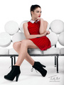
Phan Nguyen Nguyen wrote:
thank you, you should throw this one out, it is the least flattering photo in your port: https://www.modelmayhem.com/portfolio/pic/36097443
you have a nice body, work with better photographer You are very gorgeous but, there is a photo right next to it in the same style that shows more of your face. Other than that very great versatile port!
![https://photos.modelmayhem.com/photos/140530/18/53892f1daed8a.jpg]()
Model
NothingnesssEver
Posts: 194
New York, New York, US
Henk Holveck wrote:
You are very gorgeous but, there is a photo right next to it in the same style that shows more of your face. Other than that very great versatile port!
![https://photos.modelmayhem.com/photos/140530/18/53892f1daed8a.jpg]() you have a unique look, but i would prefer your old look with the facial hair like in this one: https://www.modelmayhem.com/portfolio/pic/35484234
would chose one of these two and throw the other one out because of the same hair styling and almost same expression: https://www.modelmayhem.com/portfolio/pic/33447105
https://www.modelmayhem.com/portfolio/pic/33445789
if you are going for the androgynous look then you are on the right track, just get a few more interesting images, but if you are going for the hulk look then maybe not so...
your eyes and eye brow are very engaging, i would recommend choosing images that highlight that 
all the best
Photographer
Santiago Alvarez
Posts: 91
Fort Lauderdale, Florida, US
![https://photos.modelmayhem.com/photos/140324/13/533096f8d5f1b_m.jpg]() While it IS a great photo, it doesn't really showcase your modeling abilities at all. It's just a cool picture. I feel like a model's port should have content that shows their features clearly. ![https://photos.modelmayhem.com/photos/140326/08/5332f6b2d1038_m.jpg]() This photo just doesn't live up to the rest of your port. Looks a little amateurish as well.
Model
NothingnesssEver
Posts: 194
New York, New York, US
Don Marciano wrote:
![https://photos.modelmayhem.com/photos/140324/13/533096f8d5f1b_m.jpg]()
While it IS a great photo, it doesn't really showcase your modeling abilities at all. It's just a cool picture. I feel like a model's port should have content that shows their features clearly.
![https://photos.modelmayhem.com/photos/140326/08/5332f6b2d1038_m.jpg]()
This photo just doesn't live up to the rest of your port. Looks a little amateurish as well. The thing that pops out the most from looking at your port is you have very strong angle, like the second pic in this one: https://www.modelmayhem.com/portfolio/pic/35355933
some very interesting composition, would lighten the editing a little bit because as of now I am not sure if the images are sharp enough because most of them are pretty dark.
I would delete this:http://www.modelmayhem.com/portfolio/pic/35329386
nothing to see, model not appealing, hair everywhere, even the harsh shadow on her face is so uninteresting. why is it even in your port? it is hurting you,
some awkward cropping
https://www.modelmayhem.com/portfolio/pic/36131431
https://www.modelmayhem.com/portfolio/pic/35330127
and this just doesn't do it for me: https://www.modelmayhem.com/portfolio/pic/35336151, look like some phone camera pic of a girl before hitting a club...
Keep improving on your strong points and maybe send some RAW file to retoucher to see what they come up with.
Best,
Photographer
ikonas Boston
Posts: 736
Boston, Massachusetts, US
Phan Nguyen Nguyen wrote:
Thank you,
I like some of your works, some I don't care for, could be because I don't shoot nude. soft shadow and edges seem to be your style, I am more into very crisp and clean images but that's just me. You rely heavily on concept, and create some pretty interesting images, like those:
https://www.modelmayhem.com/portfolio/pic/29762046
https://www.modelmayhem.com/portfolio/pic/23488936
https://www.modelmayhem.com/portfolio/pic/30426037
https://www.modelmayhem.com/portfolio/pic/27314092 (the skin still need a little more editing for me)
but some work are meh IMHO:
https://www.modelmayhem.com/portfolio/pic/20093456 (the color, the lighting, it looks unedited. )
https://www.modelmayhem.com/portfolio/pic/34480502 (the model's face is just...)
https://www.modelmayhem.com/portfolio/pic/20328073 (her skin too orangish, sea too green, take back the hue, lose the frame)
https://www.modelmayhem.com/portfolio/pic/26000096 (B&W make the legging looking light she have different face skin and leg skin tone, or people could mistake it for bad lighting)
https://www.modelmayhem.com/portfolio/pic/26788552 (lose the frame, edit it a little bit more)
You are pretty good with composition, like this is great:
https://www.modelmayhem.com/portfolio/pic/22579249
https://www.modelmayhem.com/portfolio/pic/34139354
https://www.modelmayhem.com/portfolio/pic/35147597
do more of those, throw away the one with problems, your port will be much stronger.
Best,
Phan Thanks for your critique. I appreciate the effort you put into it.
Few comments on your comments
https://www.modelmayhem.com/portfolio/pic/20093456 (the color, the lighting, it looks unedited. )
https://www.modelmayhem.com/portfolio/pic/20328073 (her skin too orangish, sea too green, take back the hue, lose the frame)
Both images were shot at sunrise so the hues are orangish. I do agree that the frame should go. Unfortunately I got already too many comments to change the image.
Keep up the great work - you are young and beautiful and you seem to have great judgement selecting talented photographers.
Model
NothingnesssEver
Posts: 194
New York, New York, US
ikonas Boston wrote:
Thanks for your critique. I appreciate the effort you put into it.
Few comments on your comments
https://www.modelmayhem.com/portfolio/pic/20093456 (the color, the lighting, it looks unedited. )
https://www.modelmayhem.com/portfolio/pic/20328073 (her skin too orangish, sea too green, take back the hue, lose the frame)
Both images were shot at sunrise so the hues are orangish. I do agree that the frame should go. Unfortunately I got already too many comments to change the image.
Keep up the great work - you are young and beautiful and you seem to have great judgement selecting talented photographers.
Julius Thank you and all the best
|


