|
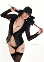
Need a little constructive criticism on My new shots, the first Two. 18+ Let it rip..please. Aug 08 14 11:36 pm Link I think the green underwear lines and wristband distract a lot from the first image. The wristband distracts from the second and for some reason I am not comfortable with the shadow lines (but that may be just me). Buyu Aug 09 14 08:24 am Link zzzzzzzzzzz I really see nothing interesting in either of them Aug 09 14 08:38 am Link The light is interesting in the second image, but that's really all the positive things I have to say about the images. I will not comment on the model. Aug 09 14 08:52 am Link I think the lighting is very interesting in both, and they have a moody quality that I like a lot. In the second one, I think the shadowing might be even more effective if the model were fully nude, but that's really the only constructive criticism I have on either, as I like both very much. Aug 09 14 08:59 am Link The model is pretty awful in these photos. Based on these two photo's I would say that she doesn't understand the basics of her job - find the light, and pose in an interesting way to try and tell a story. As for the photography itself. The key thing I would put forward is attention to detail. Heres what I see: 1. Lighting - In both photos its pretty uneven. The models legs disappear into inky pools of shadow. The effect is only heightened by black stockings. Lace or Nude colored stockings would have been much better. She has a bright light focused on her midsection from the left, which is a huge mistake for this model. She's an average sized woman. That lighting highlights her stomach. It makes an average woman look like she has a two six-pack a day gut or maybe she's pregnant and beginning to show. Its not flattering. Flat lighting from the front softened with a soft box or umbrella would have been much better. 2. Poses - Her poses make no sense to me. In the sitting shot she has her head back and her legs together. Why is her head back? Why is she clenching her knees together but sitting there topless? Particularly in the sitting shot the pose and the lighting make her legs look oddly misshapen. In the standing shot, her head is turned away from the camera. While that could be alluring, in this case its just awkward. Her left arm is completely lost above the elbow so that it looks as if one hand is coming from nowhere to grope her. The right hand on the hip - is she a little tea-pot? With the lighting it further accentuates the appearance of a belly. 3. Wardrobe - Those neon green undies have got to go - either in real life or in post. The color has nothing to do with anything else in the shot - its a distracting as if you had put a safety cone by the chair. If she had to have on underwear to be comfortable a nude colored pair would have been appropriate. She needs some accessory around the neck and fewer on her hands and wrist. These images might provide some working tools to practice dodging and painting with light. You can try opening up some of the inkier areas of the photo to reveal more detail. You can't push the entire photo or you'll blow out your hot spots, but you might be able to help some of the dark areas. Aug 15 14 01:08 pm Link |