|
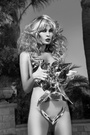
https://www.modelmayhem.com/portfolio/pic/36854537 18+ Too much, perhaps? Opinions, reactions, criticism, etc. Thank you.  Sep 05 14 05:28 pm Link The angles are very interesting. Too much? Depends on what you're going for. If you want suggestions, i think you should do a bit more editing to it...it seems a great image to go a bit more abstract or even macabre with. I'd say it's an excellent starting point for some exploration in that regard. It's your art, and it's an interesting image. Kudos. Sep 05 14 05:40 pm Link Opinions are like belly buttons. Everyone has one. Here's mine: 1. Model's left hand in defensive posture (palm out) but the rest of the image doesn't suggest defense. 2 Right hand fingers too spread, not graceful; wrist bent too far, looks "broken." 3. Too much emphasis (lighting and pose) on vulva; odd view of left buttock from front. 4. Background would be better either darker or white. Sep 05 14 07:53 pm Link I like it. It's dramatic and nicely lit. It is a bit vulvacentric, but I like that kind of thing even though I don't shoot much of it.:-)) Sep 05 14 08:11 pm Link very frankly ,,,,,,I like it and even better ,,,its an amazing looking model and the pose and the use of the body and hands is wonderful ,,, seeing a vagina does not distract me from the beauty of the whole image ,,,well done ,,, johnk Sep 05 14 08:32 pm Link I would suggest that you do not do anything more. It has good tonality and it is more visually interesting with the dramatic pose of the model than a lot of nudes. It really stands out. Sep 05 14 08:40 pm Link My first thought was "Ewwww". Its truly art, and makes me think, but it seems a far cry from your more surreal work; but not to my liking. Sep 05 14 08:43 pm Link I'm not really a fan of the lighting or the way the fingers are spread open. Looks a bit awkward. But back to the lighting, I'm guessing you used multiple lights to light the subject? I think just one light would of worked better. Would of created better looking shadows on her. Also I think if it was a black and white image, it would of been stronger. Sep 06 14 12:38 pm Link i like it Sep 06 14 03:32 pm Link For my tastes the pose is just a little too far into "awkward" territory. Sep 06 14 05:53 pm Link I am thinking it might be better if her right leg was positioned in another way. Although I am not too sure what I would do exactly without having the model tip over. The first thing that struck me while looking at the image is everything is bent in an odd and interesting way, and then the one leg is just straight and ordinary. Just a random thought. Sep 06 14 07:40 pm Link It differs from the normal static shots that are all over the place. It catches your attention and makes you form an opinion. To me that's what art is all about. It doesn't matter if the viewer likes or dislikes it as long as it makes them think. By the way, I happen to like it. Sep 06 14 07:54 pm Link Thank you! Sep 06 14 08:59 pm Link WCR3 wrote: I disagree completely.. Sep 07 14 09:37 am Link Its a bit too much for my tastes Sep 07 14 12:03 pm Link I like it, I'd like it more if her face was in less of that shadow. Sep 07 14 12:05 pm Link Works for me! It's definitely your style. It's a bit shocking, a bit controversial. Sep 07 14 12:12 pm Link Certainly works for me . . . I enjoy your pushing the limits of form, lighting and finishes . . . you've turned her into a beautifully abstract form, the nudity, and blatantness becomes secondary to the overall visual . . . Picasso would have been intrigued . . . SOS Sep 08 14 08:31 am Link In frame wrote: +1 Sep 08 14 09:04 am Link Though few things are not right on this image (1) right hand over the head distracting The angle of the pose not my fav. If I'm you I would retry Harry Sep 08 14 09:20 am Link David Stone Imaging wrote: If you look in my port, you will find a few more of her, if you're interested. Sep 10 14 01:27 pm Link |