|
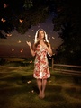
Sep 18 14 08:13 pm Link Love the photo until I get to the feet again lol. I know I commented on them in a previous critique of yours as well. Sep 18 14 08:19 pm Link TheRobertHanley wrote: Yeah...I struggle with those. I've already liquified them a good deal smaller. I'll try to get a bit more off them. Sep 18 14 08:23 pm Link darker outline on the top of her arms doesn't look right. Overall feeling is great. Sep 18 14 08:28 pm Link You are creative! Sep 18 14 08:46 pm Link I would have to agree with dd, the dark outline at the top of the arm and the glow at the bottom of the arm as well.......other than that Pretty impressive piece! Sep 18 14 10:08 pm Link Crop the top so it is 2 or 3 bricks lower, with the high contrast between light and dark the viewer’s eyes are drawn into this area The dark band along the top of the arms seems out of place, plus the white area under the arms is distracting, especially models left looks like a ghost outline Looks like a wide lens was used, would a less wide one have distorted her feet less? Other wise quite creative wish you well Sep 19 14 05:59 am Link Nice image, but the stool doesn't fit with the scene. You might have tried something a little more appropriate, even if you had to bring in stones, to create the needed height. The location, and concept were fine. Sep 19 14 06:37 am Link Thanks for all of your comments! I especially like the idea of having piled stones instead of the stool which is something we could easily have done. This is in a kiln in a brick factory. There were bricks everywhere. As to the dark above her arm and the light below is due to that this is a 30 second light painted exposure and with that come artifacts that I personally am a big fan of. For me the hallowing is appropriate to giving the image a slightly other world sort of look. Two lights were used for this picture. A flash with a beauty dish flashed once from the front and then a second time from behind. The slight movement of the model between these two flashes creates the halo effect on her arms. Also a flashlight was used to create the glow between her legs and the burn in above her head. I'm going to try to do something to make her feet look better...a trade off for the good stuff the superwide lens is creating on the other end of her body. Thanks again all! Sep 19 14 08:05 am Link Sad Movie Photography wrote: Difficult to do light painting with people. The artifacts are minimal. you did a good job of that. Sep 19 14 10:34 am Link I agree with the comments of the previous posters, but even with these artifacts this is a very high-impact image. Well done! Sep 19 14 01:19 pm Link I think it looks nice cropped right above her feet. Then you don't really know if she is floating or what. My eyes don't go to the lines around the arms that way as much either. It makes it look like a painting a bit with that crop more than a photo to me. #ladyjesus  Sep 19 14 03:22 pm Link Managing Light wrote: Thank you!! Sep 20 14 08:25 am Link TheRobertHanley wrote: I'll have a look at that crop and thanks again for your input! Sep 20 14 08:27 am Link |