|
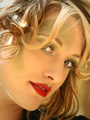
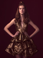
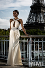
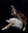
I'm new to MM and am looking for input on what I can do to improve my pictures and portfolio. Nov 20 14 10:31 pm Link The way I see it, you clearly have some concepts and ideas going on in your head, and probably a good sense of direction. Your models appear relaxed and comfortable. The painfully obvious issue to me is the composition. Your cropping and placement of people and parts just feels odd and often times constricted. I feel like your images don't breathe, or leave my eye wandering. The second big issue is the post work. I'm seeing a lot of lost detail, blown highlights, and muddy colors. I think you are on your way to something great. Keep it up!  Nov 20 14 11:11 pm Link  Horizontal image with model placed in center Watch your backgrounds, some guys head to right of model Wish her eyes were wide open Looks like photo is over exposed  Whites of eyes look over processed Missing lower part of chin looks odd in this image With models right shoulder being up, neck appears shortened Better in a vertical format  Cute model With that much cut off the top, it would balance out better with a tighter crop at bottom Looks like you may have used to wide a lens setting  Green thing in front of models face is a big distraction Instead of showing all of the back of her hand place on angle so it appears slimmer Need more light in eyes  What is the photo of, model or rocks? Vertical format would highlight the model better Hair looks over exposed  Keep an eye on your backgrounds; you have a branch running through her head Nov 21 14 05:28 am Link This is great feedback. Keep it coming! Nov 21 14 07:59 am Link You need to study lighting, by really fine photogs, as well as composition. Even outdoors, you are not making the most of lighting your images well. You "studio" looks, are poorly lit, indeed. Your compositions are not well designed, with good subject placement, or even good choice of landscape vs. portrait orientation. Until you get those aspects improved, the little stuff is not worth mentioning. Nov 21 14 10:40 am Link I agree with most others' comments, but also wanted to point out that I think this is your strongest image:  The focus on the face and eyes is just right, the contrast and color seem to suit it well and the composition is on. Nov 22 14 03:31 am Link You are doing pretty well so far. I would try for a wider range of compositions as you seem to focus solely on torsos and portraits. This one is particularly good, so try to build on the skills that you brought to it  Nov 23 14 12:52 am Link |