|
Forums >
General Industry >
Why pictures in magazines are not at their best ?
I wonder why many photographies in fashion and men magazines are not at their best ?
Many times : - the skin color is too blue, - there's a poor contrast (levels have not been adjusted), - the sharpness is not good, - ... We could think it's because of the CMYK gamut and the printing screen, but when you look the pictures on magazines websites they have the same problem. Globally pictures on advertising pages look always better than pictures in fashion and models pictorials. According to me, because advertising companies pay for their ads and want to catch the readers eye, they care about the pictures quality and pays retouchers to get the best ads possible ? But does it means, because the magazine pays for all their other pictures, they don't want extra cost for their fashion and models pictorials and so don't ask retouchers help ? Thanks for your comment. Nov 09 13 10:28 am Link Closer 2 Perfection wrote: Have you ever thought maybe your appreciation of beauty and your criteria for what's good and what's bad might not be at its best?
Nov 09 13 12:10 pm Link Closer 2 Perfection wrote: Best for who? Not every image needs to be high saturation and vivid colors. The economy of the four color web printing process is tweaked as good as it can get for the paper. Unless you want to go to sheet fed, more ink on expensive paper and slower runs, it isn't going to happen. National Geographic with a rotogravure press is much better.
Nov 09 13 12:16 pm Link Leonard Gee Photography wrote: I suspect that's not the real problem.
Nov 09 13 12:19 pm Link Natalia_Taffarel wrote: Oh Lordie, that's a can of worms, now isn't it! Nov 09 13 12:21 pm Link Closer 2 Perfection wrote: Best = It's the magazines decision what sucks and what doesn't. Nov 09 13 12:25 pm Link Closer 2 Perfection wrote: Your notions of "best" are rather generic, while editorials and campaigns are very specific creative visions.
Nov 09 13 12:38 pm Link High quality printing = expensive Nov 09 13 01:01 pm Link Closer 2 Perfection wrote: I just viewed your web site, and I must say, you have an incredible understanding of how the hue/saturation sliders work... you present a very interesting interpretation of imagery! Nov 09 13 01:04 pm Link Why pictures in magazines are not at their best ?
Could be a number of reasons: 1) When measuring "quality", some magazines may consider "cost" and "quick" as the major attributes of "quality". 2) The photographer is trying to make an artistic statement by being different. 3) The printer is cutting corners. 4) OJR (On the job retirement) -- the quality control editor just doesn't care. Who can say? Nov 09 13 01:10 pm Link fashion ads often rock. Editorials in print fashion magazines are often very good-they catch a lot of readers attentions. Looks go through cycles. Blue is still in but Versace went differently in a campaign using Mert & Marcus.
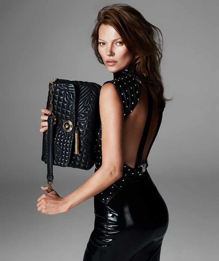
Here's one Mert & Marcus http://lookslikegooddesign.com/wp-conte … /mm-1.jpeg and I think this from an editorial. During this blue period Versace hired them and then they had to change direction for 2013. Donatella Versace stated that she was going with Kate Moss and this time it was about the model and the clothes. Here's Mert and Marcus following the client's direction: http://www.designscene.net/wp-content/u … ott-07.jpg You'll see their customary blue tonality went right out the window. It's evident from what Natalia posted of your retouching that you like more natural skin tones, but I actually like the original you retouched. It really grabbed my eye. What makes a magazine editor and Donatella Versace see the same way for a while may change due to economics, sales, and feedback and they may end up choosing different styles after a few years. And magazine editors will change the style and look of editorials, as they search for the new 'it" thing. Nov 09 13 01:11 pm Link Looknsee Photography wrote: What magazines are you buying? Nov 09 13 01:13 pm Link Robert Randall wrote: True. Nov 09 13 01:16 pm Link While I don't generally agree that magazines put out anything sub-par, there was an instance that it came up while I was attending RIT. I was looking through a vogue to find examples of different lighting (high key, low key, over exposed, underexposed) and I remember finding an advertising image that was clearly not only underexposed but also so nosy from and the lighting in general was just terrible. I remember showing it to my advertising teacher to ask it if counted for underexposed and she 'Ughhh yes' in a way where I could tell she clearly didn't think much of the picture.
That being said, all the other images in the magazine were pro quality and I haven't really come across anything that bad since. Maybe the editors where on a tight budget or just saw something they liked in the image that I didn't. Flukes happen I'm sure, but generally those blurs, color effects and everything else is intentional and on par with current styles and trends for a reason-it looks good and also new and unique. Nov 09 13 02:13 pm Link Awesome Headshots wrote: Oh yeah - I've had editors do stuff to my images that make me glad there's a check involved. Nov 09 13 03:43 pm Link Natalia_Taffarel wrote: I like the original better Nov 09 13 03:59 pm Link I think I must be in trouble then too as all my images seem lacking in colour completely!
Maybe the OP can save me? IBTL Just my $0.02 Ciao Stefano www.stefanobrunesci.com Nov 09 13 04:06 pm Link Joined yesterday?
Good first post. Would you like some toast with your spam? Oh, and who did the retouching on the "before" images? Is that your work? Nov 09 13 04:15 pm Link That Italian Guy wrote: You know.... You could do selective coloring... just saying Nov 09 13 05:01 pm Link I'd suggest you post in critique to see how well your idea of perfection aligns with others. Nov 09 13 05:18 pm Link Digitoxin wrote: Image purchased on Fotolia and "before" is not retouched. Nov 09 13 05:22 pm Link J O H N A L L A N wrote: I've already done it and it seems only a few shares it. Nov 09 13 05:25 pm Link Jerry Nemeth wrote: According to all other comments, I'm not sure whether or not it's a compliment. Nov 09 13 05:28 pm Link Closer 2 Perfection wrote: Think about it. Nov 09 13 05:32 pm Link Digitoxin wrote: Closer 2 Perfection wrote: Images that are sold through stock sites are usually ALREADY retouched... Nov 09 13 05:35 pm Link It's all pretty subjective. You like one style and everybody else likes another.
Retouchers are used in most fashion campaigns regardless of medium. Maybe you're comparing high fashion with commercial fashion? Nov 09 13 06:21 pm Link Closer 2 Perfection wrote: Yes, it is.
Nov 09 13 07:03 pm Link Natalia_Taffarel wrote: Sorry I accept critiques concerning my skills but not that I'm a liar faking its job
Natalia_Taffarel wrote: Yep it looks like you hit the main point.
Natalia_Taffarel wrote: Yep that's what it seems I should focus on.
Natalia_Taffarel wrote: Thanks for your help Natalia. Nov 09 13 09:55 pm Link Closer 2 Perfection wrote: Because it is fashion photography, not product photography. There is a difference. Nov 09 13 11:35 pm Link Closer 2 Perfection wrote: Not calling you a liar, you probably can't tell that it is, but it is definitively retouched. Nov 10 13 02:13 am Link Yeah, those three befores are heavily retouched. Yowza. Nov 10 13 05:28 am Link oh vey. Nov 10 13 09:04 am Link Closer 2 Perfection wrote: It seems to me that you think stock photos aren't retouched. That's clearly not the case. Nov 10 13 01:05 pm Link Closer 2 Perfection wrote: Do you honestly think that the " before" image is not retouched? Really? Nov 10 13 01:11 pm Link Because when there's a print run the average is calibrated not each individual page in addition the quality of paper pays a large part in the reproduction. Nov 10 13 01:12 pm Link This is the dude that is responsible.
Talk to him. . Nov 10 13 02:49 pm Link Sorry for the misunderstanding.
When Digitoxin wrote Digitoxin wrote: I thought she was meaning I retouch the "before" images so that it looks with no colors contrast.
Nov 10 13 03:03 pm Link Raoul Isidro Images wrote: More likely one of these women, or others like them. Very few men on fashion mag mastheads these days.
Nov 10 13 03:12 pm Link I think all this is just too funny.. A retoutcher isn't even an artist, he is only a repairmem. We never had any need for retoutchers before digital... The photographer did all the corrections as part of his skill set.
Imagin DaVinci using a retoutcher? Hey man ur paintings are too red dude! Hahahahaha Nov 10 13 04:33 pm Link -" the skin color is too blue,
- there's a poor contrast (levels have not been adjusted), - the sharpness is not good, - ... " All completely subjective ideas. There's no such thing as the "right way" to do art. It'd be pretty boring if that were the case. Nov 10 13 04:36 pm Link |


