|
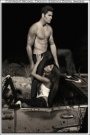
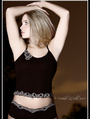
When I look at other people's photos and then my own photos, mine seem to be really colorful. What do you all think? Is it too much? Too colorful? Too saturated? Too much contrast? Let me know. Thanks. https://modelmayhem.com/pics.php?id=36856 Sep 09 05 03:23 am Link It's too much yellow. adjust the light compensation. You need to tell your camera what kind of lighting conditions you are shooting. If that doesn't fix it you might have to tweek it a little in the manual settings. What camera are you using? Sep 09 05 03:55 am Link I think they look great,i love lots of color in images,the skin tone might be off just a tad...I use auto white balance try that! Sep 09 05 04:29 am Link Better yet, set a custom WB each time the light changes. Paul Sep 09 05 10:11 am Link i happen to like vivid and satured ated shots. i think my photos already say that though Sep 09 05 10:20 am Link Actually I know how to white balance. Everything I did to the colors was intentional (believe it or not...heh) and I was just wondering what people thought about it.  Thanks for the replies. Thanks for the replies. To answer, I use Nikon D70. And I don't use auto WB because it's never consistant from photo to photo. In fact I normally set it at Flash WB -1 (5600K) and adjust WB in Photoshop when needed. Sep 09 05 02:55 pm Link I did not see TOO much color. I add saturation to most of my shots because i seek to make them a bit more dramatic, and "I" like them that way. Sep 09 05 04:32 pm Link I don't think you use too much colour.. But it does seem that you prefer a monochrome palette... In film, games and animation a trick we use to get a strong image is to use a touch of complimentary colour... This would work really good with your colour style... I'm assuming you already have a colour wheel - but if not you can google search and download one - it is an essential for ANY visual creative... Most of my photos are monochrome as well - theres a couple at the bottom that I intentionally contrasted the colour schemes... My avatar is an example of what I mean as well... It is predominately shades of warm reds - I threw in the cool blue to pull the eye through the image... Your compositon is good - I suspect that giving this a try might give you some cool results.. Or you just might hate it - but hey you never know.. Happy shooting!!! peace CIP 1 Sep 09 05 04:44 pm Link I don't think they're too satuated . However I , myself , like adding warmth especially for portraits.The only exception is in your photo .. Clover . great shot and mood.... Just my humble opinion and .02 cents worth Sep 09 05 04:50 pm Link I think you can do what makes you happy, speak your own language, there will be people who agree and people who disagree, as life, but at the end of the day you will feel you did your best and in your own personal way. TSep 09 05 05:09 pm Link Michael Crouch wrote: i don't think theirs too much yellow in all the pictures.. jsut the one "Angela" one, but still doesn't effect the beautiful photo. Sep 09 05 05:13 pm Link Love the images! I don't think you are usinng too much color. I saturate my color too. Ed Sep 11 05 05:29 am Link Looks fine to me.... Not that yellow as [It's too much yellow. adjust the light compensation. You need to tell your camera what kind of lighting conditions you are shooting. If that doesn't fix it you might have to tweek it a little in the manual settings.] says it it Asians have a more yellow under tone that others if its to yellow to you then go to selective color and in yellow channel add blue Is this your style thou if so dont do a thing Sep 11 05 02:59 pm Link Daniel Kwan wrote: YIKES...if you are afraid you have too much color... Sep 11 05 03:06 pm Link Don't second guess yourself. Sep 11 05 07:11 pm Link Actaully it's a lot less color than what I shoot with Good stuff, keep it up. Sep 11 05 10:21 pm Link If you're doing it on purpsoe then there's nothing wroing with it. It's part of your style and the "look" of your work. There will be those who love it and will want to work with you and those who hate it and won't work with you... just like it happens with everyone else's style :-) Daniel Kwan wrote: Sep 11 05 10:28 pm Link If you like it then by all means go for it. Personally I think that there are a couple you've gone too far with since the whites of their eyes are kind of greenish and I don't think that's exactly flattering to the models. But if it's a style you're happy with - do it! As to the white balance, I wonder why NOT just use auto if you're going to adjust it to your taste anyway. just a little smarty pants comment... Sep 11 05 10:48 pm Link Hey everyone thanks a lot for the responses! I especially liked the colorwheel idea. icedimage wrote: Because if there are multiple shots that I want to use, shot at the same location and under the same lighting, with a preset WB I can just adjust them all the same way (by copying the adjustment layer from one image to another). With Auto WB the WB might be inconsistant and I'd have to mess with the images more. Sep 12 05 04:31 pm Link I like your picks the way they are. Color is a way for the model and the photog to express their point of views. Look at it this way, atleast they are not dull. It helps you stand out as a photog. It is always good to be different! Sep 12 05 05:21 pm Link I think they look good the way they are but that because you changed them to look like that. I cant say anything negative about a photo created by the imagination of the photog. Every oil painting in the world was created the same way and some are worth millions, photos are the same. Good photos, very creative. Sep 12 05 05:32 pm Link |