|
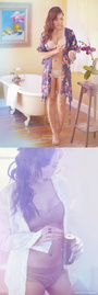
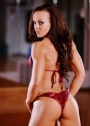
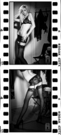
Hey guys...still working hard at my port, and i'd love some BRUTALLY HONEST feedback. Thanks! Sep 21 05 02:03 pm Link Hi Reds, thanks for posting! I think your port is off to a good start, but I'm certainly no expert on the matter, as my personal critique thread can show. I did want to say, however, that your first B&W image is absolutely gorgeous. It's dramatic, with dramatic lighting that reveals just enough yet keeps you mysterious. You've got a great pose and expression and you have the perfect body for the image. It may not necessarily get you a catalog gig, but I loved it and I wanted to say so. Congrats! Sep 21 05 02:45 pm Link Most of your images need the Levels adjusted in Photoshop. I don't know why the photographer didn't do this for you before he gave them to you. I did the headshot. Send me an email at [email protected] and I'll send it to you. Paul Sep 21 05 02:51 pm Link Almost all your images lack contract, appearing alittle flat. Your best shot is the 'pink panties and purple bra' shot with the smile. You have a great smile. Use it in a few more pics...  Sep 21 05 02:57 pm Link What is your portfolio for? What kind of work are your trying to attract? I'm not sure other than general thoughts how you can get an effective critique if folks aren't gearing their thoughts to what it needed. Sep 21 05 04:20 pm Link There is one shot which must go! The headshot where you have your hand in front of our face. Even if the hand did not look like it is picking a pimple there is no reason to distrct the viewer with your hands in front of the face. Some of the others should go because they are duplications of the same outfit theme and look. Keep the best two or three (after you have the post processing completed) and and chuck the others until you get more. There is no reason to fill the 20 spaces because the spaces are there. They are there in order to allow you to load 20 awesome pictures not all the images you have.. Sep 21 05 07:35 pm Link Post my edits Reds, I agree with the people above. The photographer does not seem to be post processing them correctly for display on the web. The prints may like fine, but they are flat. Sep 21 05 09:32 pm Link Brutal & Sweet.. You are great .. Your pictures are not .. Get a better photographer .. And get naked .. :-) Sep 21 05 10:58 pm Link I agree with most said above. Images are flat and needs level adjustments for contrast. But even then they wouldn't be great. I actually like the headshot with the hand. B&W on the mattress, bad lighting and your forehead is wrinkled. I check out your site, those shots are really good. It's not you, it's the photographer. Sep 22 05 02:05 am Link Louis Braga wrote: why do you want to get her naked? no need for that. Sep 22 05 02:56 pm Link you must have edited your portfolio because i only see 9 images up. thats great, you are my hero. i wish i could cut my portfolio down to 9. maybe tomorrow. anyways, as for your modeling skills, i think you are doing a good job. varied looks, laughing, smiling, serious, a variety of poses. you look comfortable. some of your photos work with the low contrast flat style, but i agree with the others, most need level adjustments. i like your headshot with hand up, its got some style. you'll get some great images as you continue! -isaac Sep 22 05 04:24 pm Link Agree that the photos lack post processing. The lighting is poor in all of them, none of the pictures have you glowing, or light up your eyes. Looks like the pictures are taken by GWC who are just trying get pictures of you in different states of undress. The pic of you in the suite looks ok, but you have your leg up in front of you and the colours look off. Keep at it, the pictures will get better as you gain more experience, and are able to pick out and work with better photographers Sep 22 05 09:59 pm Link ProShotPhoto wrote: I disagree here. I don't see a single duplicate outfit and the pictures are actually quite varied in their emotive feel (from coy, to pensive, to sultry, to giggly...). The complete images don't necessarily always exude those themes, but it's there in her eyes and in her facial expressions which is where it counts most. Sep 23 05 12:24 am Link Reds wrote: Get yer butt over to a commercial / stock photographer. Sep 23 05 12:27 am Link Man, I love red heads, so maybe I am biased, but I think you are quite pretty. Unfortuneately, you need to get some better photos. The second shot (white T and boy shorts) would have been fantastic with some better lighting and maybe a little more time on your hair. The "look" you are giving in that photo, combined with the pose, the way you are tugging on the shirt, etc, are just about perfect. I see promise in you. Not in the particular photos. I hope to see you post some better images. A couple show some nice composition and you have a look that communicates (not that deer in headlights look) just work with a few more photographers. The rest has been covered. Mark Sep 23 05 09:49 am Link Aside from testing with other photographers I would suggest a few swimsuit shots, some fitness shots of you in workout clothing (you have a fresh face look), some buisness looks and some stock photography shots (check out Corbis and other stock photo companies). I think these catagories could help your book and give you a commercially viable portfolio. Thats is my 2 cents. Spend it how you wish... Sep 23 05 10:06 am Link ProShotPhoto wrote: I have to disagree with getting rid of the photo with hand. In the 'soft' form that its in it creates a feeling of thought. I do think you need to work with a few other photographers though. Remember the "spice of life". Everyone likes something different. Show in your portfolio that you can be as diverse as possible. Not just a single use model. Sep 23 05 12:06 pm Link yeah, i liked the headshot the most. i think the balance on that was pretty good, though my screen is a funny angle-so maybe not. but i swear i have seen pictures like that in bazar.and lots of 'em. Sep 25 05 04:51 am Link |