Forums > Digital Art and Retouching > high level - color grading/toning/cross processing..

Photographer

IOWASCENE

Posts: 11

Tallinn, Harju, Estonia

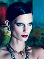
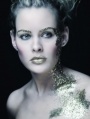
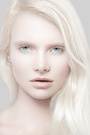
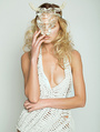
hey guys,

i can't see/read such topics anymore. there are tons of examples posted to achieve some kind of look especially the "fashion look" but it seems like it remains every time without any real results.
also videos tutorials/dvd's/webinars etc. but still everything at mainstream level.

ofc everything depends on the quality of the image, light, equipment etc ... thats why each image is individual and u can't achieve exact the same look on a different image... but u can achieve something similar/recognizable that creates your style.

there are so many excellent photographer who master the photography/retouching part very well but don't reach the clients or just usual people because of the color grading/processing/toning... whatever. especially the average consumer who don't understand the photography part are getting more comfortable with the mood/colors of the images. best example is instagram and stuff...

anyway that was an introduce to start a new topic about color.

http://www.linatesch.com

here you got all the different variations of light/location/situation, but the recognizable look is still there. (just look! not talking about the photography part)

any ideas to get the final touch?

Mar 04 15 02:39 pm Link

Digital Artist

Koray

Posts: 6720

Ankara, Ankara, Turkey

Hey thanks for the link smile
I dont think you'll get much help around here anymore except from the LUT guy who is just promoting his software...but I like the link...its cool and all evilgrin

Mar 04 15 03:27 pm Link

Photographer

Tulack

Posts: 836

Albuquerque, New Mexico, US

smile It's not my software. I have no relations to it.

Mar 04 15 04:23 pm Link

Digital Artist

Koray

Posts: 6720

Ankara, Ankara, Turkey

Tulack wrote:
smile It's not my software. I have no relations to it.

it doesnt matter if you are Oleg or not...my point is still valid even if its not really tongue

Mar 04 15 04:30 pm Link

Retoucher

Patrick Golez

Posts: 50

Manila, National Capital Region, Philippines

I think what makes them look consistent is their contrast, they all have the same contrast although some doesn't really have real blacks but it has the same punch as the others. Whoever did the treatment is a beast, i imagine a handful a curves, levels etc were used although some looked like they used a LUT or even doing it on a real grading program like speedgrade or da vinci, i've done it a few times not the best workflow though. Thanks for the share, never heard of this gal. I'm now a fan of her.

Mar 04 15 04:52 pm Link

Retoucher

Tincture

Posts: 126

New York, New York, US

Strong contrast coupled with decreased saturation will get you that look for the most part.  I like to start with a strong 's' global curve, this will increase contrast and saturation, so I'll do a hue/sat adjustment layer and reduce the saturation. I'll also add a curve set to luminosity to add a bit of extra contrast without adding any more saturation. It takes some practice, but any look you can think of can be achieved with curves.

Mar 04 15 08:35 pm Link

Photographer

IOWASCENE

Posts: 11

Tallinn, Harju, Estonia

Yes, she's quite strong, glad u like.
Anyway the contrast is obviously and that u can achieve everything with the curves also. But there's still a method to make the fine tune. I'm sure a very simple one, but with genius results. Hopefully without needing a third party software...

Mar 05 15 03:06 am Link

Retoucher

Tincture

Posts: 126

New York, New York, US

No third party software, just practice. Learn how to mask and use curves and the world is your oyster.

Mar 05 15 07:56 pm Link

Photographer

IOWASCENE

Posts: 11

Tallinn, Harju, Estonia

definitely!

Mar 06 15 02:09 am Link

Photographer

365 Digitals Exposed

Posts: 807

Perris, California, US

Koray wrote:
Hey thanks for the link smile
I dont think you'll get much help around here anymore except from the LUT guy who is just promoting his software...but I like the link...its cool and all evilgrin

Definitely  all I see  is  LUT LUT LUT   .  well said Koray
Unfortunately PEANO is gone and he was the only one  good in this forum,  the other people only use this forum to sale CDS and little workshops for  beginners .

Mar 11 15 01:18 pm Link

Retoucher

pixel dimension ilusion

Posts: 1550

Brussels, Brussels, Belgium

365 Digitals Exposed wrote:

Definitely  all I see  is  LUT LUT LUT   .  well said Koray
Unfortunately PEANO is gone and he was the only one  good in this forum,  the other people only use this forum to sale CDS and little workshops for  beginners .

+1

Mar 11 15 02:15 pm Link

Retoucher

CLICK retouch

Posts: 235

Denver, Colorado, US

It's basically cloning, painting, dodge and burn, sharpening and color correction.

No secrets, only a lot of patience.

Mar 11 15 05:34 pm Link

Digital Artist

Koray

Posts: 6720

Ankara, Ankara, Turkey

365 Digitals Exposed wrote:

Definitely  all I see  is  LUT LUT LUT   .  well said Koray
Unfortunately PEANO is gone and he was the only one  good in this forum,  the other people only use this forum to sale CDS and little workshops for  beginners .

Although I wasnt really a fan of him, he was indeed the only one around who did have the knowledge and patience to deal with the 'look' type of questions. Patience is the key word here...thats why he even made images and collected links to other threads and posts to avoid typing the same things all the time evilgrin

Mar 12 15 12:45 pm Link

Photographer

A_Nova_Photography

Posts: 8652

Winston-Salem, North Carolina, US

365 Digitals Exposed wrote:

Definitely  all I see  is  LUT LUT LUT   .  well said Koray
Unfortunately PEANO is gone and he was the only one  good in this forum,  the other people only use this forum to sale CDS and little workshops for  beginners .

For a while this was the only forum I visited every day... Would love to get back to where we once were minus the for sale stuff!

Mar 12 15 03:38 pm Link

Photographer

TMA Photo and Training

Posts: 1009

Lancaster, Pennsylvania, US

OP Question: How to get that final touch?

I looked through the linked images some...and saw that there were several  " fashion / editorial / trendy / color play " type of themes in use in various places throughout the portfolio.  I wont comment on all of the trends or styles...but just a few.

In these images there are some very nice models, art direction, makeup, lighting and good photography (which is very nice and creates a great base)... and then there is that  " ADDED Subtle Artistic Color Processing"  that adds another visual dimension to an otherwise purely colored image.  These images are good technically to begin with...and good artistically to finish with.

A Repeating Theme in the Images: The Blue in the Shadows Look.  There are a number places where the dark / near black areas of the image are contaminated with a low contrast blueish cast. This color cast is usually in the darker parts of the images...there are some other places where it is a general overcast color.  This Blue Cast in the Blacks is a common artistic technique. 

Ill share one good way to generically create that Look in Photoshop next...but it doesnt have to be a BLUE cast!  It can be any color your artist eye wants or needs it to be!!

How Can I Do That?  This low contrast blue coloring can be done using Curves for the most creative flexibility. You can start out with a regular curve...and by pulling up the bottom left part of an RGB Adjustment Layer Curve...that first gives you that low contrast look in the darkest areas only.  Then, you can then take that same curve and go into the "Blue Channel" of it ( look for the "pulldown" to the right of RGB to get to just the blue channel)...and then... adjust the bottom left part of the blue curve to begin to add blueness to just the dark parts of the image.  Drag the lower left curve point around in real time and you will see different intensities of blue.  If you want the whites to be more blueish...drag the top right part of the curve.  If you want the whole image to develop a coolish blue color cast...then move the center part of the curve.  So now... you have that low contrast blue LOOK in the darkest parts the image!   

If you choose to use Curve Adjustment Layers ( look at the bottom of the Layers Pallet ) ...they automatically come with a white mask added...that means you can add this Blue LOOK everywhere in the image however strong you want it.  If you want to selectively add this blue to only certain parts of the image...then do a command or control  " I "  to invert the white mask into a black mask... which will hide the blue.  NOW, select the mask...and then paint on the image with a low opacity 15% soft white brush to Add in the blueness...where ever you artistically want it...and however strong or subtle you want it.  Change the brush to a black brush... and paint to erase the blueness!   You can now selectively add this beautiful blue look to almost any particular part of an image that you creatively want... till the artist side of you is happy. 

The Tonality Controls In Adobe Camera Raw. There is also a  " Cross Processing and Image Toning " capability built right within your own Adobe Camera Raw screen in Photoshop.  So if youre an ordinary photographer you can easily go there and begin to experiment visually!  Its located right under the histogram on the top right...its the 2nd and 5th push buttons called Tone Curve and Split Toning.  Go in there and play around.  The Tone Curves section can give you that desaturated blue in the dark areas look globally with no problems.  The Split Toning allows you make the highlights or shadows any contaminated color you want ( yellowish whites) and (blueish darks) for example. 

Remember: For the most creative and precise artistic control...and the ability to change your mind without penalty...you should do this coloring toning process with " Curve Adjustment Layers" within Photoshop itself.   Curves... when used inside of Photoshop... can visually change almost any visual element... almost as fast as you can think... and you can control every aspect of the look... without any speed or creative penalties.

Also: YOU CAN DO THIS COLORING WITH ANY COLOR YOU WANT IN THE SHADOW OR HIGHLIGHT AREAS...to get that editorial look!  NOT JUST BLUE!   (Red/Cyan..Green/Magenta...Blue/Yellow are some of the other color combinations)  Experiment Visually like you are an artist!

The Photographer / Artist Mix:   The issues sometimes with photographers is: They wish they were much more of a developed artist than they are now!  Which colors go together best?  What colors would I use to get that editorial look?  This artistic skill set is part of a developmental process for some.  Some Technically oriented or newer photographers may be challenged by these newer artsy looks...and they will have to layer this new Artistic Skill Set on top of their other acquired technical skills... like lighting, getting perfect color balance, and which F stop to use for example.

This skill is usually a developmental thing! The newer photographers usually work HARD to get good models, good makeup, good poses, good lighting, good layout, and realistic colors to start with.  AFTER THAT...then... they have to Learn the " artsy stuff " to make their images look like they have a film look, or they got processed in the wrong kind of chemicals (for the white/yellow + dark/blue look), and they have to start looking into how to recolor skin tones till they look golden brown instead of perfect.  It may be that you are too technical as a photographer...which is good...but now you may have to develop the artistic side of your brain too!

Ill bet there are probably 26 different kinds of " Skills " a photographer has to master... before he feels like his photography is technically and artistically under his command...and he can get the kind of LOOK he sees in his Mind...rather than what ever kind of Raw Thing happened to pop out of the back end of his camera.  UUGH +  LOL

Mar 12 15 04:32 pm Link

Retoucher

a k mac

Posts: 476

London, England, United Kingdom

Re. the Lina Tesch images - the high contrast film look means sacrificing detail in the blacks and three-quarter tones to achieve the contrast. There are two perennial problems in this respect from a retoucher's point of view, and both of them are to do with being cautious.
1/ Starting with a fairly flat conversion to preserve detail/data across the tonal range tends to accustom the eye to that sort of look, and often what seems to the retoucher like quite heavy contrast applied towards the end of the retouch still leaves the photographer wanting more.
2/ With images destined for print, there is always going to be some concern about how the blacks will come out, and this often leads to playing safe in terms of preserving detail.

The old saying about omelette and eggs is really true. If you want high impact film-type contrast then you're going to be sacrificing detail in the shadows.

For a photographer with a clear vision, doing her own processing for on-screen display, this may be a non-issue. But for a retoucher trying to second guess what the photographer may be looking for, and with work destined for print, this is a huge issue.

Mar 13 15 12:23 am Link

Photographer

IOWASCENE

Posts: 11

Tallinn, Harju, Estonia

it's obvious that there worked top artists like makeup/photographer/director etc... so the fundament is already godlike.

i just wanted to create a bit advanced thread where the general hundred times posted stuff like bringing the blue curve up in the shadows and down in the highlights not needed to explain anymore.

I'm quite satisfied with my photography/retouching/grading etc... already... but still "quite"...
and to move forward i wanted to discuss the higher level. tweaking together and try out some things.

yee, i read some posts from peano. interesting guy! unfortunately i came too late smile

so never be completely satisfied with ur work and keep moving.

PS: thanks for the replies!

Mar 13 15 09:03 am Link

Photographer

Martin Troy

Posts: 29

Honolulu, Hawaii, US

Doesn't it suck that nobody ever gives a clear direct answer to this question?  I've searched the entire internet looking for the answer to the Vogue "editorial" look.  And NOBODY will reveal the secret.  I'm thoroughly convinced that nobody knows except for those elite photographers who work for the top magazines.  I've spent billions of hours shooting and learning every nook and cranny of photoshop and still can't get that exact "high fashion" quality.

Apr 09 15 01:13 pm Link

Retoucher

D A N

Posts: 124

Jacksonville, Florida, US

Martin Troy wrote:
Doesn't it suck that nobody ever gives a clear direct answer to this question?  I've searched the entire internet looking for the answer to the Vogue "editorial" look.  And NOBODY will reveal the secret.  I'm thoroughly convinced that nobody knows except for those elite photographers who work for the top magazines.  I've spent billions of hours shooting and learning every nook and cranny of photoshop and still can't get that exact "high fashion" quality.

There is NO secret! you can analyze all you can and try to copy exactly the look and copy everything but the reason why those images look "high-end" "editorial" "vogue" whatever is because they used models/locations/lighting/teams/cameras/digital techs, etc that are at the top of the industry and know what they are doing.

I'll give you an examples... look at this website http://www.boxstudios.com do you see anything different? anything that jumps at you? it has written "expensive" all over it.

There's no look, what you get from those images is a feeling, they do something to you. I dare to say that if you remove the "look" applied to it those images would still be really strong without any color look applied to it.

Apr 09 15 03:08 pm Link

Retoucher

a k mac

Posts: 476

London, England, United Kingdom

Martin Troy wrote:
Doesn't it suck that nobody ever gives a clear direct answer to this question?  I've searched the entire internet looking for the answer to the Vogue "editorial" look.  And NOBODY will reveal the secret.  I'm thoroughly convinced that nobody knows except for those elite photographers who work for the top magazines.  I've spent billions of hours shooting and learning every nook and cranny of photoshop and still can't get that exact "high fashion" quality.

I've heard this a thousand times - the "secret sauce" conspiracy theory. It's just nonsense. There are an infinite number of looks in the pages of the top publications. There is no common look. There is no conspiracy. It's just to do with the bringing together of all the elements that make great images. Like great cooking. The only thing that all the mages printed in Vogue have in common is that they are printed in Vogue.

Apr 09 15 11:46 pm Link

Photographer

Martin Troy

Posts: 29

Honolulu, Hawaii, US

There definitely is too a secret.  I have great respect for the both of you ^^ and you are both really amazing retouchers, but apparently, as i look through your impressive portfolios, you still haven't discovered it either.  If you have, then let's see it.  Where are your Vogue and Harper's tear sheets?  Not to put you down at all.  I seriously love both of your work.  Let's see those Gucci ads.  Where are they?  And are they of the exact high caliber represented in the magazines?  And.. let's have the secret!  Because if I'm ever going to shoot for those high end clients, I'm going to have to know how to deliver the high end content that they expect.

*AKMac, i do see that you have tear sheets from Harper's, but honestly those are not difficult edits to achieve.  I'm talking Gucci, Givenchy..  or the Campari ad with Jessica Alba.  If you can show me something like that, (and explain how its done) then i'll kneel and kiss your ass.

http://www.starhorn.com/wp-content/uplo … NDAR-4.jpg

Apr 10 15 03:41 am Link

Retoucher

a k mac

Posts: 476

London, England, United Kingdom

Martin Troy wrote:
*AKMac, i do see that you have tear sheets from Harper's, but honestly those are not difficult edits to achieve.  I'm talking Gucci, Givenchy..  or the Campari ad with Jessica Alba.

You were initially asking about editorials. Now it's High End ads.

I actually do have significant experience in retouching editorials for Vogue, Cosmopolitan, Harpers, Elle etc. However, I haven't worked on any of those famous ads, so I can only go by what my eyes tell me, which is....there's technically nothing done in post that couldn't have been achieved with a standard version of Photoshop. Regarding the aesthetic side of things - yes there's a lot of talent, vision and knowhow, but...well, what would you expect?

Apr 10 15 06:35 am Link

Retoucher

a k mac

Posts: 476

London, England, United Kingdom

Martin Troy wrote:
I'm thoroughly convinced that nobody knows except for those elite photographers who work for the top magazines. .

Remember this is a retouching forum. If you want to find out about the photographic side of things you need to ask the photographers.

Apr 10 15 07:40 am Link

Photographer

cwwmbm

Posts: 558

Vancouver, British Columbia, Canada

There was a thread somewhere here where there was a good explanation on that Campari campaign. You of course understand that the final look it's not just retouching, it's lighting as well.

Apr 10 15 09:17 am Link

Retoucher

Tincture

Posts: 126

New York, New York, US

Martin Troy wrote:
There definitely is too a secret.  I have great respect for the both of you ^^ and you are both really amazing retouchers, but apparently, as i look through your impressive portfolios, you still haven't discovered it either.  If you have, then let's see it.  Where are your Vogue and Harper's tear sheets?  Not to put you down at all.  I seriously love both of your work.  Let's see those Gucci ads.  Where are they?  And are they of the exact high caliber represented in the magazines?  And.. let's have the secret!  Because if I'm ever going to shoot for those high end clients, I'm going to have to know how to deliver the high end content that they expect.

*AKMac, i do see that you have tear sheets from Harper's, but honestly those are not difficult edits to achieve.  I'm talking Gucci, Givenchy..  or the Campari ad with Jessica Alba.  If you can show me something like that, (and explain how its done) then i'll kneel and kiss your ass.

http://www.starhorn.com/wp-content/uplo … NDAR-4.jpg

It's hard to distill tens of thousands of hours of accrued experience into a 'secret technique', that's why these threads don't go anywhere.  It's like playing guitar, there's no secret to play complicated solos, it comes down to lots of practice.  Also, what's in it for retouchers to share any secrets?  Some unsolicited advice, having a look is only one component to shooting for these high end clients, you'll need to live in a center of fashion; New York, London, Paris, Tokyo, etc, you'll need to assist an established photographer to accrue your own knowledge and meet the movers and shakers, that's how it's done.

Apr 11 15 09:22 am Link

Photographer

J O H N A L L A N

Posts: 12221

Los Angeles, California, US

Tincture wrote:
It's hard to distill tens of thousands of hours of accrued experience into a 'secret technique', that's why these threads don't go anywhere.

I've seen these threads in the past provide a lot of very useful information on color grading - just not so much anymore as MM winds down from when there were many accomplished technicians here. The OP might want to do a forum search and review the somewhat voluminous threads on the subject.

Apr 11 15 10:10 am Link

Photographer

Vicarious Photography

Posts: 64

Houston, Texas, US

AKMac wrote:
The only thing that all the mages printed in Vogue have in common is that they are printed in Vogue.

This.
I have came to that conclusion as of recent. There have been some not so great stuff coming out of Vogue as of recent.
I'm no expert, but I think that it is the combination of all things- model, photographer, mua, stylist, and retoucher,  that make this final glorious product.
I think that perhaps having a certain style and being a master of it may get you in Vogue. But there are several other publications that could use your style, and that is good enough for me as long as they are payin $$$ smile

Apr 17 15 02:19 pm Link

Photographer

cwwmbm

Posts: 558

Vancouver, British Columbia, Canada

Martin Troy wrote:
There definitely is too a secret.  I have great respect for the both of you ^^ and you are both really amazing retouchers, but apparently, as i look through your impressive portfolios, you still haven't discovered it either.  If you have, then let's see it.  Where are your Vogue and Harper's tear sheets?  Not to put you down at all.  I seriously love both of your work.  Let's see those Gucci ads.  Where are they?  And are they of the exact high caliber represented in the magazines?  And.. let's have the secret!  Because if I'm ever going to shoot for those high end clients, I'm going to have to know how to deliver the high end content that they expect.

*AKMac, i do see that you have tear sheets from Harper's, but honestly those are not difficult edits to achieve.  I'm talking Gucci, Givenchy..  or the Campari ad with Jessica Alba.  If you can show me something like that, (and explain how its done) then i'll kneel and kiss your ass.

http://www.starhorn.com/wp-content/uplo … NDAR-4.jpg

Frankly, I'm surprised a person of your skillset subscribes to such moronic conspiracy theories.

Here's a secret, behold. There is no "Make Campary look" filter of preset. There's no yanking curves that will accomplish it. There is, however many hours spent isolating elements into different layers and then doing color grading for them separately. This isolation can be done by marque tool, pen tool, brushing on a mask, by doing manipulating selective color layer - it's up to you, and it depends on what the image is. Sometimes it takes 20 minutes, more often than not it takes couple hours. The knowledge of how to do that, what path is the easiest comes with experience; you need to mess up few times before you get it right. That is the real secret. Or, in a shorter version, the secret is in trying and failing until you succeed.

All of the above applies strictly to color work only. There's plenty D&B (not just skin - everything) that goes into this.

If you want to learn, you need to learn to understand what "having Campary" look means. It's not a look. It's a green sky with orange skin, and with all other colours subdued.

Apr 17 15 03:15 pm Link

Retoucher

D A N

Posts: 124

Jacksonville, Florida, US

I have to quote here something that AKMac said in 2012 and it's so well put, it really hits the nail.

I think, when you are coming from the standpoint of trying to reproduce looks in post, and you want to control the outcome, you tend to think about controllable factors. But in reality its virtually impossible to separate the visual elements (texture, tone, colour, shape etc) from the representational contents of the image, and, above all, your human response to very beautiful model.
When you have a 'Wow' response it's usually a reaction a highly complex interweaving of physical, representational and psychological elements which defy analysis. Nobody can fully control or understand how these elements interact to produce the effect. When you look at an editorial, why are some images so much better than others? Is it because the photographer and the production team decided to slip in a few mediocre ones? No. It's because even they can't fully control or understand why one particular shot has a particular magic. But they have the eyes to see it, and the experience to capture it. This is the magic. No matter how much time you spend sampling colours, replicating tonal gradations and tweaking curves, you cannot reproduce the original 'wow'. I think that's why this idea of closely guarded secrets prevails.


The quote comes from here and that thread is interesting to read.

Apr 17 15 07:53 pm Link

Retoucher

ST Retouch

Posts: 393

Amsterdam, Noord-Holland, Netherlands

Cwwmbm and Akmac gave great answers on this thread  and they have right 100%.

There are no secrets or any hidden techniques .

There is only fact that many people by default think that if some file is published in some main magazines that means immediately that file is something special and everyone wants to copy that even if files are with very mediocre work in many cases .

That's the reaction of mass media victims , many people are victims of mass media marketing.

I will try to explain something.

For example imagine and let's  say ( hypothetically speaking ) that files  of Cwwmbm or AKMac ( both of them have very nice work) were used for some famous Ad campaigns.
Immediately after that we will have zillion threads here around how to get Cwwmbm or AKMac look .

Or imagine ( hypothetically speaking ) other case , that some famous magazine decide tomorrow to publish files with plastic skin , immediately the day after tomorrow we will have zillion threads how to get fake plastic skin in post from this and that magazine and 95% of people will start immediately to make plastic skin , they will forget everything what they have learned about skin retouching , they will make plastic files.

That's the reactions  of mass media victims.

I can list you right now at least 20-30 photographers from MM which produce far better work then any published files from "these famous magazines " how you call them , but no one discuss how to get look from these photographers.

And that's my answer on how to get this and that look threads, don't be mass media marketing victims.

Back to the topic , here is link before and after
http://www.celebitchy.com/25447/jessica … r_campari/

Files are nice , and as you can see there are a lot of composite and partly composite work .
For any professional color grading , the most important thing is to make great perfect mask and to have two separated layers , one layer with isolated model and second layer with isolated background ( Cwwmbm already wrote that)
Then you can change sky background  or change sky color from blue to green with very basic steps  within 5 minutes of work.
Then apply different color grading on model skin and you are done.

These are all "secrets" how people call on thread , for any professional color grading you must use composite work or partly composite work , because only with these steps you have full control of every single pixel on file .

Then  add green /cyan colors on sky on separated layer where is background only and add orange/warm photo filter to model skin on separated layer where is model only and that's is.

These are all famous "hidden techniques "  for people which want to know "special hidden techniques"   and which believe in some very special and hidden techniques.

Best regards
ST

Apr 18 15 05:09 am Link