|
Forums >
Digital Art and Retouching >
How to get rich black and white like this
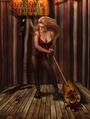
How do i get rich black and white colours like this wise creatives https://www.facebook.com/marinalaswick/ … mp;theater Jun 18 15 05:22 am Link Silver effects pro is a great tool to have Jun 18 15 05:56 am Link Nothing special about this black and white i think. Black and white + curves in photoshop. Also as mentioned there are plug-ins.. silver effects pro is a good place to start. And also, remember. To achieve a great black and white, the lighting should be good in the first place. Jun 18 15 06:53 am Link Gradient maps are the best tool I've found for B/W. It allows you to select the tonal replacement values and how quickly they transition. Here's how. 1) In PS, select Gradient Map from the corrections layer menu 2) Select the black to white gradient 3) on the gradient bar along the bottom of the window click on the bar to place a new anchor point, place it about 1/3 of the way up from black. Double click on the point to pull up the color picker. Pick a grey about 1/3 of the way up from black. Place another anchor point about 1/3 down from white and make it a grey 1/3 down from white. 4) you can now slide the anchors along the bar to set where you want the tones in the original to be replaced with the tones you picked. You'll see a little arrow between the anchors, you can slide this to determine how quickly the transition between the anchors happens. if you want to you can add more anchors in. I really wouldn't call the tones in the sample rich, it looks rather muddy to me. Jun 18 15 10:50 am Link You could also look into creating luminosity masks. They allow you to mask the different tonal ranges in an image... and they isolate one range of tones from another... so you can work on darkening just the shadow areas for example. You can also manipulate the mid tones, or just the highlight tones... to what ever you want them to be as well. This is nice if you want to make the blacks a bit blacker, and the face become more contrasty, and the highlights to really pop off the page for example. The original posters image also has the blacks ever so slightly contaminated with a green cast ( you can use a curve layer ...with the green channels lower left part of the curve pulled up ever so slightly... to create this kind of color cast to a B+W image). Jun 18 15 12:46 pm Link Another tool you could try is VSCO which emulates film stock. Jun 20 15 12:51 am Link Retouch Tom wrote: +1 QFT Jun 20 15 04:57 am Link Thomas Van Dyke wrote: Luckily, Silver Effects Pro is still available. It's part of the NIK Collection that Google bought. They also did some minor upgrades to it the past week and current version of the NIK Collection is 1.2.9. I use their Viveza 2 a lot too since Nikon lost the Control Points to Google in Capture NX-D (Still in older NX-2 version.). Jun 20 15 07:07 am Link There are several ways to do B&W in Photoshop with and without using plugins. One process that I use is to use the black and white adjustment layer, create two or three layers with different black and white settings, then play around with layer blend modes (multiply, screen, soft light) depending upon the image. I usually do three b&w settings when working with a person: maximum white, maximum black, and then either neutral density or green filter. With each setting I do the "claw" (shift+control+alt+e / shift+command+option+e) to stamp the b&w on it's own layer then, when I have the two or three layers, go to town. A recipe from one of Scott Kelby's books uses the gradient map and then duo/tri/quad-tones. Convert your image to b&w using gradient map. Shift mode to grayscale and discard color information (duo/tri/quad-tones only work on grayscale images) Shift mode to duotone where you can also do tri- and quad-tones depending on which of the many defaults that you pick. Note that the toning is very dependent upon the image; some images that will look great with a duotone don't look good with a quad-tone (and vice versa). Once you have the toned image, shift mode back to RGB. Finally, if you use a Mac, Macphun has an app that does b&w conversion similar to silver effects pro; and it should, since the designers and programmers for Macphun were the same ones who worked for Nik and jumped ship when Google bought out Nik Software. Topaz Labs also does b&w conversion, as does OnOne. And, as a previous poster noted, if you don't have the light right, you're not going to get a good b&w image. I've read and heard that the best b&w images are ones that have a strong contrast, so if you have that already in your color image, then the potential of getting a good b&w from it is higher than an image that doesn't have as strong of a contrast. Jun 24 15 11:19 am Link I'm not the orig. poster, but I enjoyed all these techniques you all posted; after reading them I tried them all. They seem like different paths to the same house, but then again, Photoshop is all about that. Thanks for the tips, these are some new tools in my drawer. Jun 27 15 04:28 pm Link GRMACK wrote: +++++ Jun 28 15 03:06 pm Link Maybe I'm wrong, but on my monitor the linked image isn't BnW, it's a duotone. Another infinite universe. Image - Mode - Greyscale, Image - Mode - Duotone. Jul 01 15 12:03 am Link Pictures of Life wrote: For me it is black and white but there is a overall greenish tint to it, or at least on my calibrated monitor at work. Looking at the numbers there is about 10 points less red in most areas and 5 points more green then blue on average. I would check your monitor settings just in case so it doesn't hurt your workflow . Jul 01 15 12:07 pm Link I think this look can be done using only Photoshop. Black and white adjustment layers to start with, maybe masking other adjustment layers. I'm almost sure her face was done using dodge and burn. Jul 10 15 04:49 pm Link Here are some other ways to create some noteworthy B+W images using Photoshop... (Watch out - somewhat detailed) Quick and Boring: When youre doing B+W...try NOT to use the HSL (Hue/Saturation/Luminance tool)... by pulling down the Saturation Slider in the panel! Pulling out all the saturation in all the colors is quick to do using this method... BUT... it produces a very FLAT looking B+W image... only mono-chrome (no colors). Pulling down the saturation slider just gets you a white to black toned image... with no other visual artistry allowed...period! Its quick and easy...but its also Flat and boring. Next... Try the "Black and White" Adjustment Layer... for more Tonal Adjustability: This tool lets you adjust the B+W tonality of many different colors independently. To get there: Go to the Layers Pallet... and then go down to the "Adjustment Layers" icon on the bottom of the panel (the half moon icon). You can then select "Black and White" from the list. This will allow you to adjust individual colors in your image and to change how they get represented by B+W tones. Adjustment layers like this one...make their own New Layer... with a Mask on that layer too. This Layer Mask allows you to "Selectively Apply" the visual effect to whatever part of the image you want with complete artistic control. So, you can control the tonality of how some individual colors are represented in your B+W image. With this B+W Adjustment Layer... you will have at least some sliders for the individual colors in the image... and you would be able to brighten up the face area for example by sliding the red and yellow sliders to the right by whatever amount looks the best to your artistic eye. You can also make other colors transfer lighter or darker too with this method. So, sometimes that helps an image to look moody, or contrasty, or highly artistic... instead of just pure flat monochrome. The ability to take individual colors in your image... and to be able to change the degree of blackness and whiteness of each interactively... is a step Up from the "No Saturation Slider" method above. Having a mask associated with this layer...also allows you to selectively paint where this effect takes place. Sometimes you only want an adjustment to appear in just one small place...rather than across the whole image. Highlights and Shadows does a nice job: Using the Highlights and Shadows tool under Image > Adjustments> can also help you to get those darker black tones and some more contrasty whites... and even some mids...so the image would POP and look more like a magazine type image. With this tool you can make tonal adjustments to the shadow areas and the highlight areas interactively...and sometimes it can help to you to extend the visual range of the lights and darks in your image. Some people use this adjustment tool quite alot. Its got a nice look, good controls, and it can make a real difference in the lights and dark areas of your image. Selective, Hand Painted, Curve Adjustment Layers: Whats this??? You can take an ordinary Curve Adjustment Layer...with its associated Layer Mask... and you can hand paint in any degree of tonality you desire... exactly where you want it! WOW! To do this: Go to the Layers Pallet...choose Adjustment Layers...then choose Curves. This makes one new Adjustment Layer with a curve and a mask on it automatically. Now pull up the Curve line from the center by 1/2 a unit. This will brighten your overall image. Now do Command / Control "I" to invert the mask from a white mask to a black mask. The image will now go back to regular again. NOW...with a soft, 8% low opacity, white brush... select the mask so its outlined and then paint on the image. Where ever you paint will now get brighter. the more you paint...the brighter that area will become...its like adding light to the image!!! You are now painting with electronic light. Artistically paint on your image and brighten the tones in any place on your image you want. If you make a mistake or want to tone down some work you already did...just change your brush to a black color...and it will erase the lightening you painted in. This is the same kind of effect as dodging and burning! If you make another Curve Adjustment layer... and pull its curve DOWN... then when you paint with your white brush...it will create darkness and shadow where ever you paint. Paint on your image to emphasize areas of the picture that should be darker. WOW! Go to the first layer again...and when you paint on that layer mask again...it will lighten any area you paint on! So now you see a clean, clear, totally transparent effect that can now add any degree of lightness or darkness to your image under total artistic control. You're the artist...Go and make your image amazing... by selectively and interactively changing its tonality anywhere you want. Add clean brightness and darkness to your image until it has just the look you were hoping for! The Big Boys Power Play: Luminosity Masks and Curve Layers Together If you are a real Photoshop geek...and you are also an artist.... or maybe a magazine photographer... then this method gives you additional visual control over the light, mid and dark ranges of your image. Its somewhat sophisticated...but it is so very powerful. It allows you to make specific and targeted adjustments to just the darkest or brightest or other tonal range in your images. The first thing to do is to be able to separate the different tonality ranges in your image... the darkest areas of your image...the middle tones in your image...and the highlight ranges in your image. You can isolate working on just the dark, or mid, or high brightness parts of your images...without terribly affecting the other tone ranges. This allows you to work on the dark tones in your image... without affecting the highlights in your image for example. Typically you would make 3 separate luminosity masks...one for the darkest tones of your picture, one for the middle tones (the skin range) and then one for the highlight tones. These luminosity masks control where your next adjustments will take place. The next step is to use Curve Adjustment Layers to actually control the grayness or blackness in that range. So, with a Curve, you could make only the darkest parts of your image any degree of darkness you wanted to interactively! The Luminosity Mask would take the darkness created by the Curve...and apply it to JUST the Darkest Parts of your image! NICE! You can then make a curve to control the tones in the mid and high tone areas. Curves are totally clean, transparent, and non-destructive...so they will always give you the highest quality and adjustability possible. Its even possible to introduce some colored toning to your image with these curves too...like in the Original Post Image... that had some green tint added to the darker tones... to give it that modern magazine feel. "Luminosity Masks" and "Using Adjustment Layers" can be Googled and YouTubed. Here is a great resource place among others to get started understanding what Luminosity Masks can do... and how to make them. http://goodlight.us/writing/luminositym … sks-1.html Be advised: It may take you a whole hour or more of study just to get the methodology down. Learning how to use Curves and Layer Masks might take you an additional couple of hours if youre a newbie at this. So, this "complete artistic control stuff" doesn't come without some effort!. But, once you get it down...it will be useable on all your images... from portraits, to landscapes, to commercial images. From then on...the images you see in your head... will begin showing up on your computer screen a lot more often! This is heavy duty stuff...but it is what many of the pros use to get those images that make your jaw drop. - There was great post above by "Down Town Pro Photo" about using gradients to control image tones. I think that gradients are also a valuable tool to get to know...and the poster did a great job of outlining and getting started with the concept of image tone grading. So, Youre right...there are probably 11+ different ways to skin a cat and make powerful B+W images in Photoshop... Some quick and easy...and some for the artist who wants absolute, complete visual control in his images. Jul 10 15 08:07 pm Link Shoot film, and know what you're doing with lights. Sorry didn't mean to be snarky. SilverEfx Pro is a great tool for emulating B&W film Jul 10 15 08:09 pm Link I bounce between Exposure 7 and SilverEfx Pro. Jul 10 15 08:21 pm Link |