|
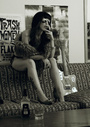
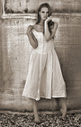
This image was taken at an abandoned cowboy jail in the Badlands Of South Dakota  May 08 16 02:32 pm Link I like the shot and the mood it creates. However, that modern looking car that is visible in the window doesn't fit the rest of the image. If it were me, I would edit out the car. May 08 16 02:49 pm Link Sure I see your point. But I probably would not edit such things out. May 08 16 02:59 pm Link Great looking image but the car is a distraction. May 08 16 03:15 pm Link Top Gun Digital wrote: agreed, and put in an alien space ship! May 08 16 04:09 pm Link Top Gun Digital wrote: +1 remove the car or the window May 08 16 04:30 pm Link Top Gun Digital wrote: +1 May 08 16 04:40 pm Link Risen Phoenix Photo wrote: Hi, I recommend that you reconsider cropping out the vehicle. It's a huge distraction and takes away from how amazing this shot is. Please reconsider. May 08 16 04:58 pm Link I agree, I like the image, maybe a little more contrast for me but the car has to go. May 08 16 05:02 pm Link Such an awesome cool shot. Jen May 10 16 02:27 pm Link Removing the car and shoe prints [Back in the day they only had smooth leather bottoms] would go along way in this photograph I wish you well May 10 16 03:38 pm Link +however many that is now... Take out the car.  May 10 16 04:21 pm Link Y'know -- as an alternative to editing out the car, I'd take a look at an alternative cropping: cut the top of the image off, so that the top of the model is the top of the image. That'll put the model in the top left of the image, and coincidentally would crop the car out entirely. The off-center composition might add a little more tension to the image & emphasize the floor cracks a bit more. But that's just me -- I crop everything. May 10 16 04:43 pm Link I totally agree with everyone that it's an awesome photo, and the car needs to go. If it weren't for that, I would expect to find this hanging in an art gallery. May 10 16 04:49 pm Link I think I've been in that jail . . . during Rally Week in Sturgis . . . course, my cellmate didn't look near THAT good . . .  Keep the danged car, it's kind of a kitschy nod to the modern world, contained in a period styled image . . . plus, it obviously catches everyone's eye . . . for some reason, it brought this image to my mind . . . Keep the danged car, it's kind of a kitschy nod to the modern world, contained in a period styled image . . . plus, it obviously catches everyone's eye . . . for some reason, it brought this image to my mind . . .  . . . or maybe that was just how I got home after they let me outta the drunk tank . . . SOS May 10 16 05:01 pm Link Great setting, pose, model and colors -- but getting rid of the car (and the shoe prints) would take it over the top May 10 16 05:03 pm Link Well yeah of course the car. But it's a really good photo of a lot of interesting texture and tone. The model's lost in it all. Either a change in crop, more contrasty/hotter lighting on her specifically, or posing that causes the eye to go to her. Right now my eye totally ignores her as it traverses the image. May 10 16 06:48 pm Link Risen Phoenix Photo wrote: I would say the SUV is not fitting as well,, very curious on your reasoning on not editing it out?? could you expand on your thinking?? May 10 16 10:16 pm Link I like the tone of the image but it doesn't knock me out of my chair ( so to speak ) May 10 16 10:25 pm Link I like the image except for the car. May 10 16 10:44 pm Link I love the image, I would keep the window, and lose the car. May 11 16 03:35 am Link it makes me wonder if you are up to date on your tetanus shots May 11 16 01:05 pm Link J O H N A L L A N wrote: I agree, really good with interesting things going on. One of the reasons I like shooting with Risen Phoenix! May 11 16 03:15 pm Link If you absolutely don't want to crop it at all, then perhaps you'd consider at least darkening the window quite a bit, and maybe blurring the car into semi-oblivion. Right now, the saturation of the sepia toning is rather heavy, and the format so tall, that the bright tones of the window become the focal point. I think there are several ways to crop it that would make it a much stronger image, and I would still lighten up on the saturation. Not so sure I like the pose with the full crop, but it gets more intriguing with a tighter one, as it might with a darker window-light. EDIT: I looked at it again with the image more nearly filling the height of my screen and it worked better visually for me at least as far as the placement of the model within the current cropping . May 12 16 01:25 am Link Lee_Photography wrote: When I shoot on location I shoot what's there. The shoe prints were there so I leave it. Perhaps it would be better without the car, but that was also there. I am not creating a set, it's there, it's part of the given environment of the shot, I don't tend to change those things. May 13 16 11:32 pm Link I'm with everyone else, when it comes to the car. Personally, I'd say just crop in tighter, instead of cloning out the window. There's a little too much dead space, so getting rid of it will only add strength to the main subject. I'd also suggest softening the sepia tone some and bumping up the contrast to get at least something close to highlights. Great location, mood, and pose otherwise. May 14 16 03:00 am Link I like the image , but the car is a huge issue ... May 18 16 09:23 pm Link Risen Phoenix Photo wrote: I'm not trying to change your mind about what to do with this image, but... May 18 16 09:28 pm Link |