
Photographer
Silvino Leoni
Posts: 11
Amsterdam, Noord-Holland, Netherlands
Photographer
roger alan
Posts: 1192
Anderson, Indiana, US
Photographer
A-M-P
Posts: 18465
Orlando, Florida, US
Don't like any of them. All the poses were very unflattering and just not good at all.
Photographer
Silvino Leoni
Posts: 11
Amsterdam, Noord-Holland, Netherlands
A-M-P wrote:
Don't like any of them. All the poses were very unflattering and just not good at all. True, they don't flatter the model, However - now that I look back on the shoot - Flattering the model wasn't really a purpose. She was quite the eccentric type and wanted to stand out.
Thanks for your feedback.

Photographer
Jeffrey M Fletcher
Posts: 4861
Asheville, North Carolina, US
Silvino Leoni wrote:
True, they don't flatter the model, However - now that I look back on the shoot - Flattering the model wasn't really a purpose. She was quite the eccentric type and wanted to stand out.
Thanks for your feedback. There's an awkwardness to them that I like and that makes them notable. 3rd one is the best, portrait the worst of the bunch.
Photographer
ChadAlan
Posts: 4254
Los Angeles, California, US
A-M-P wrote:
Don't like any of them. All the poses were very unflattering and just not good at all. Silvino Leoni wrote:
True, they don't flatter the model, However - now that I look back on the shoot - Flattering the model wasn't really a purpose. She was quite the eccentric type and wanted to stand out.
Thanks for your feedback. Other than being unflattering, which wasn't the purpose, the images don't emote anything. The poses feel stiff and her expressions aren't convincing. They look staged. Maybe there are some frames before or after that show real emotion?

Photographer
Mark Salo
Posts: 11726
Olney, Maryland, US

As others have said: "weird and unflattering*, and the lighting is harsh, awkward, stiff, no emotion"
1) pointless
2) huge face
3) bizarre pose
4) out of focus
*I would say, unflattering to the photographer."

Photographer
Risen Phoenix Photo
Posts: 3779
Minneapolis, Minnesota, US
These four are the weakest in your port. And you do have some wonderful images. I think you were trying to achieve something new here with this work. They are definitely not conventional. So I would suggest you continue to work on this style and what you are trying to accomplish with this work.
Btw. There was a fellow MM photographer that was critiqued on his unconventional nudes, bizarre poses, wierd comps. Most had nothing positive to say about his work, that is until he had a few wonderful exhibititions featuring his unique style. Now everyone thinks he is a genius.
So, stay the course and perfect your style.
Photographer
thiswayup
Posts: 1136
Runcorn, England, United Kingdom
Silvino Leoni wrote:
True, they don't flatter the model, However - now that I look back on the shoot - Flattering the model wasn't really a purpose. Unfortunately a lot of people here don't understand that there isn't any type of photograph with a woman in it that isn't meant to be a type of porn or pin-up. You're really looking in the wrong place if you want feedback on serious art photography.
The shot that works best for me is this
https://www.modelmayhem.com/portfolio/pic/41318970
The set is weakened for me because focus isn't sharp over the whole model. If part of the subject is blurred I want there to be a reason for it; here there isn't. Excellent modelling and direction, good lighting, nice tonality... poses and angles don't quite work for me. But you're trying to do something hard, so you'll need more attempts. I can see you developing something very interesting with more work.
Photographer
George Holroyd
Posts: 106
Budapest, Budapest, Hungary
Your first image immediately conjured thoughts of Herb Ritts. I like the harsh treatment of the subject's skin but not with the blown out backgrounds or the compositions. Save for the headshot, I like the pose and the emphasis on her neck but the model's face is too out of focus for my taste.
Can you re-schedule time with the model, refine, and re-shoot the set? Make it an iterative process...
Photographer
Silvino Leoni
Posts: 11
Amsterdam, Noord-Holland, Netherlands
thiswayup wrote:
You're really looking in the wrong place if you want feedback on serious art photography.
The shot that works best for me is this
https://www.modelmayhem.com/portfolio/pic/41318970
The set is weakened for me because focus isn't sharp over the whole model. If part of the subject is blurred I want there to be a reason for it; here there isn't. Excellent modelling and direction, good lighting, nice tonality... poses and angles don't quite work for me. But you're trying to do something hard, so you'll need more attempts. I can see you developing something very interesting with more work. about your first remark... "uhuh" :-)
Thanks for your feedback on the portrait, however, I have shots with a clear focus on her eyes, and less of an angle towards the camera, but they're simply too standard to fit with the rest of the poses and they don't work as a series.
The model went total nutcase while posing and it was a joy to work with her. But as some reflect; it is maybe indeed rather emotionless, since - for the model - it was more of an act, a stage where she was performing in front of my camera.
She has quite the personality, that's for sure, and she's extravagant all the way, so something tells me... this is her... but she's not in her natural habitat.
I have more pictures from these series and I'll adapt my portfolio later this week since I've finished some new material.
I'll keep you posted.
Photographer
thiswayup
Posts: 1136
Runcorn, England, United Kingdom
Silvio - have you thought of doing blur shots with her? Camera on tripod, 1/4 sec exposure, flash on rear curtain?
Photographer
John H Read Photography
Posts: 63
Red Deer, Alberta, Canada
I try to be truly constructive when I give a critique, this place can be fairly brutal and childish. So if you have any questions about my critique please feel free to ask or respond as you see fit.
So lets go through them:
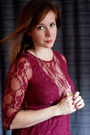
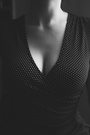
Image number one (41318973 hands on bottom) is too light, making it a bit darker would draw your eye more to your focal point and allow you to get the amazing skin textures which is what these images are so often about. A tighter crop will enhance the image even more.
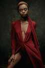
Image number two (41318972 semi squat portrait) the whole pose looks so uncomfortable, and that translates to the viewers. Eye contact is just not there, and with her eyes showing just the white it makes her appear mentally unbalanced. So much of this photo could have been saved if you had just allowed her to make eye contact. Better cropping with less white above the subject would make it so much stronger.
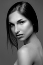
Image three (41318971 portrait standing) The girl looks like she has no arms, this is a definite no-no when it comes to composition. The other issue is again how light the image is, a little darker would allow her to be more separated from the background or just add more contrast.
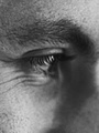
Image four (41318970 portrait) no eye contact and the composition is just not there, without eye contact you lose an important focal point and it's what this image is dying for.
You know I looked through you posted portfolio and you would seem to have a grasp on the basics of photography so I'm not sure what happened here. If it was my portfolio and I had to pick one to use in my portfolio it would only be the first one and I would definitely darkened it and added contrast to give it a more in your face exposure. Good luck to you and your shooting, hope these comments help you out.
Photographer
Silvino Leoni
Posts: 11
Amsterdam, Noord-Holland, Netherlands
John H Read Photography wrote:
I try to be truly constructive when I give a critique, this place can be fairly brutal and childish. So if you have any questions about my critique please feel free to ask or respond as you see fit.
So lets go through them:
Image number one (41318973 hands on bottom) is too light, making it a bit darker would draw your eye more to your focal point and allow you to get the amazing skin textures which is what these images are so often about. A tighter crop will enhance the image even more.
Image number two (41318972 semi squat portrait) the whole pose looks so uncomfortable, and that translates to the viewers. Eye contact is just not there, and with her eyes showing just the white it makes her appear mentally unbalanced. So much of this photo could have been saved if you had just allowed her to make eye contact. Better cropping with less white above the subject would make it so much stronger.
Image three (41318971 portrait standing) The girl looks like she has no arms, this is a definite no-no when it comes to composition. The other issue is again how light the image is, a little darker would allow her to be more separated from the background or just add more contrast.
Image four (41318970 portrait) no eye contact and the composition is just not there, without eye contact you lose an important focal point and it's what this image is dying for.
You know I looked through you posted portfolio and you would seem to have a grasp on the basics of photography so I'm not sure what happened here. If it was my portfolio and I had to pick one to use in my portfolio it would only be the first one and I would definitely darkened it and added contrast to give it a more in your face exposure. Good luck to you and your shooting, hope these comments help you out. Thanks, but I disagree with every single comment you made. You touched the feeling of the shoot only once: "it makes her appear mentally unbalanced"
Like I commented earlier in this post: making her look "fabulous" was not the purpose of this shoot. Giving this an all too regular light and setting would have made a huge loss in effectiveness. We aimed for a demolishing effect; making people feel uncomfortable when they see the pictures is part of the effect we were aiming for. it's a straight in your face mental breakdown you're seeing here (however well acted, she was a normal girl, no worries :-) )
Your comments about the cropping are understandable if I look at your portfolio, but the use of negative space is justified here imo. if you crop too close in the first picture, you'd lose the lines towards the in your face vagina and thus lose tension as a whole... you'd just show a vagina.
If you'd crop the other pictures closer, the model would come over as a threat and the viewer would suddenly become a part of the picture, where as I wanted the watcher here to feel as a voyeur (like I was as a photographer) - watching a girl - from a distance - lose herself. The viewer is not part of the action here, he just "sees" things that make him feel uncomfortable.
Thanks for you comments, we can always learn from each other, and I learn from the way you see my pictures, so it's not because I disagree with your opinion, that I think it's worthless.

Retoucher
Lacroix-Retouch
Posts: 45
Zurich, Zurich, Switzerland
I think your photos are pretty bold and interesting. I like it when a photo makes me go like 'whats going on here?''
|

