|
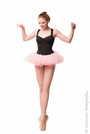
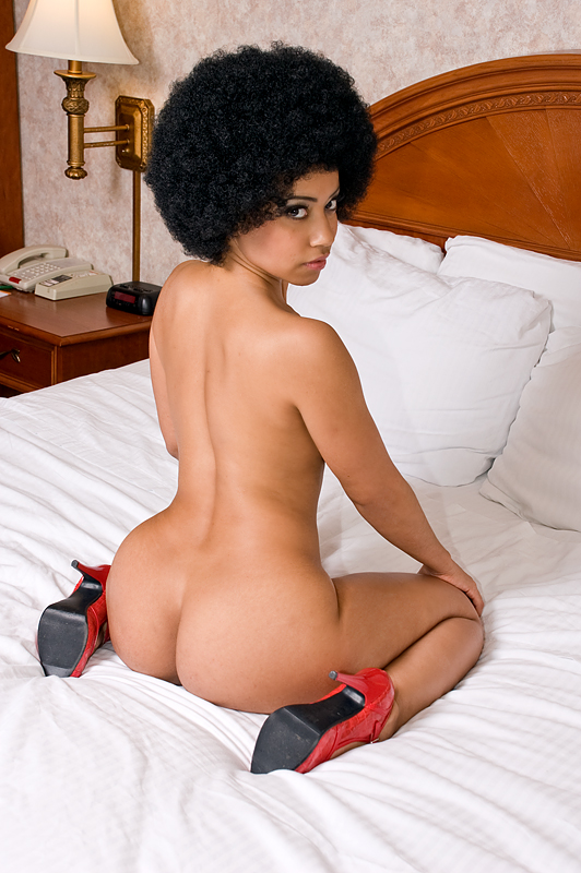
Closed Sep 11 13 06:58 am Link Poulsons Photography wrote: sure, why not? Sep 11 13 07:02 am Link Example. Great view. Cute expression.  Sep 11 13 07:03 am Link Maria J Campos wrote: This is a cute shot. You can see the fun she is having. But the effect on the image is not for me. Looking for more realistic color. Sep 11 13 07:05 am Link Sep 11 13 07:06 am Link Soft Lights wrote: Great shape. love the serious expression. listed. Sep 11 13 07:11 am Link Sep 11 13 07:14 am Link Sep 11 13 07:19 am Link Square Jaw Photography wrote: Absolutely love the first one. The muscle tone is awesome. Perfect lighting. Listed. Sep 11 13 07:19 am Link In Search Of Venus wrote: Not in love with the angle or the expression. Sep 11 13 07:20 am Link Poulsons Photography wrote: Thank you! Sep 11 13 07:20 am Link Sep 11 13 07:25 am Link In Search Of Venus wrote: I mostly like this one. Except that hair drives me nuts! Sep 11 13 07:30 am Link How about this one?  Sep 11 13 07:40 am Link Harmon Photography wrote: Perfect. Listed. Great profile of the face. Perfect shape. Nice color pop with the lips! Sep 11 13 07:45 am Link Here's another you may like...  Sep 11 13 07:47 am Link Poulsons Photography wrote: Thank you so much! Sep 11 13 07:48 am Link Two other (18+) possibilities... https://photos.modelmayhem.com/photos/1 … 1e6c42.jpg https://photos.modelmayhem.com/photos/1 … bd14a0.jpg Sep 11 13 07:50 am Link Harmon Photography wrote: I think I like this one the best. Sep 11 13 08:04 am Link Harmon Photography wrote: I listed this one! Love it Sep 11 13 08:11 am Link  Sep 11 13 08:11 am Link Sep 11 13 08:16 am Link Sep 11 13 08:21 am Link Pantelis Palios Fashion wrote: Too many distractions in the background. Sep 11 13 08:29 am Link Sep 11 13 08:30 am Link PIEntertainment wrote: Image not crisp and sharp. Sep 11 13 08:30 am Link Red Baron Photography wrote: Shot is grainy. Sep 11 13 08:31 am Link Grady Richardson wrote: Very nice shot. Sep 11 13 08:31 am Link Sep 11 13 09:04 am Link Sep 11 13 09:14 am Link Sep 11 13 10:08 am Link 18+ https://www.modelmayhem.com/portfolio/pic/24561824 https://www.modelmayhem.com/portfolio/pic/33050354 Tell me if I win anything? LOL Sep 11 13 10:15 am Link Here's one more for you, though it's not a neutral screen-direction shot. 18+ https://www.modelmayhem.com/portfolio/pic/30133975 Sep 11 13 10:22 am Link Sep 11 13 10:24 am Link Dwight Smalls wrote: Perfect. Listed Sep 11 13 03:06 pm Link Ashley Kirby wrote: Don't care for the shadows and graininess to the image. Sep 11 13 03:07 pm Link Ashley Kirby wrote: This would be good, if it wasn't such an unprofessional looking image. Sep 11 13 03:07 pm Link Connor Photography wrote: Top one is too blurry. The second is cropped at the bottom in a terrible place. Sep 11 13 03:08 pm Link Square Jaw Photography wrote: Not bad, but I find my eyes drawn to the blown out windows. Sep 11 13 03:09 pm Link Soft Lights wrote: This is not really a bad shot, it just doesn't appeal to me. Sep 11 13 03:09 pm Link |


