Model
Wallace Simpson
Posts: 89
Toronto, Ontario, Canada
Wallace Simpson wrote:
Thoughts  ? ?
![https://photos.modelmayhem.com/photos/130107/18/50eb85fd20d5b_m.jpg]()
![https://photos.modelmayhem.com/photos/120217/14/4f3ed65cdcae1_m.jpg]() *poke*

Model
Shelly Foster
Posts: 53
Abbotsford, British Columbia, Canada
![https://photos.modelmayhem.com/photos/121120/11/50abd38a3e01b_m.jpg]() ![https://photos.modelmayhem.com/photos/121120/10/50abd285aa046_m.jpg]() looking forward to hearing your feedback!

Photographer
RachelReilly
Posts: 1748
Washington, District of Columbia, US
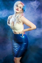
Wallace Simpson wrote:
Thoughts ?
![https://photos.modelmayhem.com/photos/130107/18/50eb85fd20d5b_m.jpg]()
![https://photos.modelmayhem.com/photos/120217/14/4f3ed65cdcae1_m.jpg]() Sorry I skipped you!
That one kid louie was so cute I had to address him first.
Photo 1: this is a very beautiful image! Make up/ hair/ styling/ model's expression/ lighting/ retouching is all really gorgeous. The angle doesn't even bother me.
I however do not get the black fabric, why is it there, why is it bunched up, it looks like she was climbing out of a black morbid hole ( perhaps that was intended haha)
I would like it better without the fabric
Photo 2: ok I am biased, I hate latex and pin up
So I do not like the styling at all. Besides that the lighting is interesting. The smoke makes this photo appear more amateur in my opinion. Models expression and pose are just alright for me, nothing special
Photographer
RachelReilly
Posts: 1748
Washington, District of Columbia, US
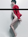
Shelly Foster wrote:
![https://photos.modelmayhem.com/photos/121120/11/50abd38a3e01b_m.jpg]()
![https://photos.modelmayhem.com/photos/121120/10/50abd285aa046_m.jpg]()
looking forward to hearing your feedback! Do me a favor, go back to bottom of page 5 and read what I wrote to Louie Kline.
Every single word of that applies to you as well except you're a girl.
You are stunning!
Photo one: is ... Not exciting me. It's just little a cutesy little photo of a pretty girl who's foot is cut off
Photo 2: is more interesting..the location is more exciting and the train tracks ! Your expression is ehh and the crop of this is TERRIBLEEEE.
I prefer this photo (ignoring that your feet are cut off :-/)
![https://photos.modelmayhem.com/photos/121120/11/50abd4057a341_m.jpg]()
I know you didn't ask for advice but I'm going to give it to you.
Practice your facial expressions and posing in the mirror , study supermodels and fashion magazines
And again work with better photographers.
Model
Shelly Foster
Posts: 53
Abbotsford, British Columbia, Canada
Rachel Reilly wrote:
Do me a favor, go back to bottom of page 5 and read what I wrote to Louie Kline.
Every single word of that applies to you as well except you're a girl.
You are stunning!
Photo one: is ... Not exciting me. It's just little a cutesy little photo of a pretty girl who's foot is cut off
Photo 2: is more interesting..the location is more exciting and the train tracks ! Your expression is ehh and the crop of this is TERRIBLEEEE.
I prefer this photo (ignoring that your feet are cut off :-/)
![https://photos.modelmayhem.com/photos/121120/11/50abd4057a341_m.jpg]()
I know you didn't ask for advice but I'm going to give it to you.
Practice your facial expressions and posing in the mirror , study supermodels and fashion magazines
And again work with better photographers. I love that you gave me advice, thankyou! That's exactly what I wanted. So just to clarify, what your saying is, that I need a good agency? I am aware that I need to work with better photographers, I am in the process of finding ones I can work with.
Photographer
RachelReilly
Posts: 1748
Washington, District of Columbia, US
^ Yes, you're a bit short but if you can I would get signed with an agency, that will give you the chance to work with really experienced photographers
Going back to you being shorter- doesn't mean you can't be a phenomenal beauty /glamour/ commercial model
Best of luck!
Model
Shelly Foster
Posts: 53
Abbotsford, British Columbia, Canada
Rachel Reilly wrote:
^ Yes, you're a bit short but if you can I would get signed with an agency, that will give you the chance to work with really experienced photographers
Going back to you being shorter- doesn't mean you can't be a phenomenal beauty /glamour/ commercial model
Best of luck! Okay, thank you so much for your input!
Photographer
RachelReilly
Posts: 1748
Washington, District of Columbia, US

Photographer
bw fotograf
Posts: 209
Salt Lake City, Utah, US

some brand spanking new work. how did i do? ![https://photos.modelmayhem.com/photos/130120/10/50fc3e0dc96be_m.jpg]() ![https://photos.modelmayhem.com/photos/130120/11/50fc3f05e91bb_m.jpg]() and one more that's not on MM... ![https://farm9.staticflickr.com/8475/8385096327_23bdf7ec76_m.jpg]()
Photographer
RachelReilly
Posts: 1748
Washington, District of Columbia, US

Photographer
Ezhini
Posts: 1626
Wichita, Kansas, US
Go for it: ![https://www.ezhiniartanddesign.com/MMMainPagePics/MM-MainPage-Pic06b.jpg]()

Photographer
Matt Forma
Posts: 373
Denver, Colorado, US
Photographer
RachelReilly
Posts: 1748
Washington, District of Columbia, US
Ezhini wrote:
Go for it:
![https://www.ezhiniartanddesign.com/MMMainPagePics/MM-MainPage-Pic06b.jpg]() This portrait is just okay!
I don't like how you messed w the wb it looks like.
Models expression /styling/ makeup could be better
And lose the hat!
Photographer
RachelReilly
Posts: 1748
Washington, District of Columbia, US
Matt Forma wrote:
Here is my entry. First time I shot on a beach with a model - http://www.facebook.com/photo.php?fbid= … =1&theater I love this shot! Models face / bod look beautiful
Everything looks great although I would say I wish you took this a slightly different angle where the viewer could see more of her bod from the side

Photographer
Ryan South
Posts: 1421
Baton Rouge, Louisiana, US
Any thoughts? I'm particularly interested in thoughts on processing. Below is the original scan from the negative. Thanks ![https://ericliffmann.smugmug.com/photos/i-Sq5QRCQ/2/XL/i-Sq5QRCQ-XL.jpg]() ![https://ericliffmann.smugmug.com/photos/i-WCzjkfM/0/XL/i-WCzjkfM-XL.jpg]()
Photographer
bw fotograf
Posts: 209
Salt Lake City, Utah, US
Photographer
RachelReilly
Posts: 1748
Washington, District of Columbia, US
The lingerie shot is the best bc it's the softest and her pose and facial expression don't look forced!

Model
Stitch Asylum
Posts: 1908
Virginia Beach, Virginia, US
I'd like a critique on my portfolio, if you have time.
Model
Stitch Asylum
Posts: 1908
Virginia Beach, Virginia, US
I'd like a critique on my portfolio, if you have time.
Photographer
RachelReilly
Posts: 1748
Washington, District of Columbia, US
ELiffmann wrote:
Any thoughts? I'm particularly interested in thoughts on processing. Below is the original scan from the negative. Thanks ![https://ericliffmann.smugmug.com/photos/i-Sq5QRCQ/2/XL/i-Sq5QRCQ-XL.jpg]() ![https://ericliffmann.smugmug.com/photos/i-WCzjkfM/0/XL/i-WCzjkfM-XL.jpg]() I prefer the latter- first one .. The color is horrendous .. ESP w the theme of the photo
But right off the bat, lose the huge watermark! It is such in intrusion on your art.
I really do enjoy this image! It's very beautiful and creative. Love the models pose/styling/hair/makeup/ facial expression, it all ties in together very well! I do like the billowy fabric in the background but I'm not sure how I feel about the bars ..I get it, it's all ballet related.
And lose the what look like power outlets below the bars.
Keep up the great work!
Photographer
RachelReilly
Posts: 1748
Washington, District of Columbia, US
DRaskin Photography wrote:
I have three that I'd like your opinion on. Really have enjoyed reading all the posts and critiques of the pictures. Very informative. I appreciate you taking the time to do this.
![https://photos.modelmayhem.com/photos/130123/20/5100bf2340916_m.jpg]()
![https://photos.modelmayhem.com/photos/130120/19/50fcbae61e1a9_m.jpg]()
![https://photos.modelmayhem.com/photos/130120/19/50fcba9520063_m.jpg]() Photo 1: it's not a terrible shot but it is terribly boring!
Ok makeup/ hair /and styling look good but llama's expression is so blah and her pose is ehh.. Her hands are cut off, and lastly the lighting is flat.
Photo 2: lighting sucks location sucks and llamas expression /pose suck! Also her hair looks lifeless. Not a good image!
Photo 3: the best of the lot.
Models expression finally is natural and beautiful her hair/ make up and stying look good.! The light still is ehh... But I like how she is in the car, I however don't get why she laying down w her head hanging out of the car lol also her pose is a bit stiff and I would Have told her to take her hand off her stomach.
Also watch out, you cut off her feet!

Photographer
DRaskin Photography
Posts: 167
Sacramento, California, US
Rachel Reilly wrote:
Photo 1: it's not a terrible shot but it is terribly boring!
Ok makeup/ hair /and styling look good but model's expression is so blah and her pose is ehh.. Her hands are cut off, and lastly the lighting is flat.
Photo 2: lighting sucks location sucks and models expression /pose suck! Also her hair looks lifeless. Not a good image!
Photo 3: the best of the lot.
Models expression finally is natural and beautiful her hair/ make up and stying look good.! The light still is ehh... But I like how she is in the car, I however don't get why she laying down w her head hanging out of the car lol also her pose is a bit stiff and I would Have told her to take her hand off her stomach.
Also watch out, you cut off her feet! Thank you. I appreciate it. I definitely see your point about lighting.

Photographer
juliarabkin
Posts: 782
Rochester, New York, US
Photographer
RachelReilly
Posts: 1748
Washington, District of Columbia, US
DRaskin Photography wrote:
Thank you. I appreciate it. I definitely see your point about lighting. To spice up lighting outdoors I usually bring at least 1 travel light with me!

Photographer
Mike The Hawk Hudson
Posts: 3
Ashton-in-Makerfield, England, United Kingdom
Just started to do boudoir photography as the images produced can tell a story and have plenty of emotion in them. My quandry is dark and moody.... or....light and airy......... and when to choose which one Could you please critique this shot.....thanks in advance https://www.modelmayhem.com/portfolio/pic/31375173

Photographer
Becca Lemire
Posts: 3
Toronto, Ontario, Canada
Nick Tsianos wrote:
Hey! Young photographer here as well. I really like your style. Mine is pretty different, but give me your honest thoughts on this photo I just took
![https://farm9.staticflickr.com/8217/8291982871_1773e7525e_c.jpg]()
What do you think about the pose and my color grading? The photo was taken purely to benefit my portfolio and the models. Thanks! the only thing I would say is that she has a slightly terrified look in her eyes which comes off as a bit strange....
Photographer
Becca Lemire
Posts: 3
Toronto, Ontario, Canada
Wallace Simpson wrote:
*poke* really cool! i like the smoke in the second one, it has a cool 80s rock n roll affect
Photographer
Becca Lemire
Posts: 3
Toronto, Ontario, Canada
Shelly Foster wrote:
![https://photos.modelmayhem.com/photos/121120/11/50abd38a3e01b_m.jpg]()
![https://photos.modelmayhem.com/photos/121120/10/50abd285aa046_m.jpg]()
looking forward to hearing your feedback! i like the train tracks as a location, and the angle, it looks great. the only thing i would say is that everything about you in that shot is very pretty, commercial, posed, pulled together. but train tracks can have so much emotion and darkness to them. its a bit of a weird contrast. you should go back to the train tracks and do something that has more of a struggle to you! you in the same spot, same angle, same everything, just in a high fashion outfit, high fashion pose/expression would result in a much more moving and completely different looking photo. feel free to let me know what you think!
cheers

Photographer
OliePhotography
Posts: 3
Stockholm, Stockholm, Sweden
Hi, Here are a few new pics I uploaded. Would appreciate your thoughts on these. Thanks. ![https://photos.modelmayhem.com/photos/130126/00/5103981d88126_m.jpg]() ![https://photos.modelmayhem.com/photos/130126/00/510397f193a71_m.jpg]()
Photographer
RachelReilly
Posts: 1748
Washington, District of Columbia, US
JuliaRabkindotcom wrote:
![https://photos.modelmayhem.com/photos/130119/17/50fb43e26c713.jpg]()
![https://photos.modelmayhem.com/photos/120920/15/505b958edada5.jpg]() Ok this is really easy. I LOVE your work!
Photo 1: this idea is fabulous and I love the movement. Your model looks fantastic as well!
2 things though, I know it's meant to be dark but I would have opened the shadows a teeny bit
And also I would have like to seen a more open crop at the top and cut off horses hooves and backside
Photo 2: I absolutely love this! The models expression is lovely and so is the hand.
Nothing to critique except there's a weird something black by the model's right shoulder.
Photographer
RachelReilly
Posts: 1748
Washington, District of Columbia, US
Mike The Hawk Hudson wrote:
Just started to do boudoir photography as the images produced can tell a story and have plenty of emotion in them. My quandry is dark and moody.... or....light and airy......... and when to choose which one
Could you please critique this shot.....thanks in advance
https://www.modelmayhem.com/portfolio/pic/31375173 Ok this photo is pretty odd!
I guess the post work is fine but I hate her expression and pose.. Looks like she's about to engage in relations.. It's just not a very flattering photo.

Photographer
Francisco Castro
Posts: 2629
Cincinnati, Ohio, US
Rachel Reilly wrote:
Maybe a new photo or a photo you're just not sure about.
Or specify exactly what you want to be critiqued, portfolio, profile..
I'm just another young aspiring fashion photographer,
I will give you my own personal opinion on the photo(s)
Open to models, makeup artists and photographers :-)
Feel free to give me feedback as well if you want! What do you think of this image, from a purely artistic vantage point?
![https://photos.modelmayhem.com/photos/130126/19/51049f96cb395.jpg]()
Photographer
DRaskin Photography
Posts: 167
Sacramento, California, US
If you have some time, here's a couple more. ![https://photos.modelmayhem.com/photos/130126/00/51038ff0b42a4_m.jpg]() ![https://photos.modelmayhem.com/photos/130123/21/5100c5f73feb5_m.jpg]() and I played a bit with the cropping on the one from earlier: ![https://photos.modelmayhem.com/photos/130126/00/510395d1ca093_m.jpg]() I think that's better as it doesn't look like I cut off her foot. Her hand was on her stomach as she was wedged against the seat but I do see your point about moving it somewhere else. Really appreciate your critique and as it's making me think and reassess some. cheers, Don
Photographer
RachelReilly
Posts: 1748
Washington, District of Columbia, US
Photographer
RachelReilly
Posts: 1748
Washington, District of Columbia, US
olideb08 wrote:
Hi,
Here are a few new pics I uploaded. Would appreciate your thoughts on these. Thanks.
![https://photos.modelmayhem.com/photos/130126/00/5103981d88126_m.jpg]()
![https://photos.modelmayhem.com/photos/130126/00/510397f193a71_m.jpg]() Both of these are just ok. seem a bit amateur. Perhaps you could have brought in a hair light ? And the black and white you put them in looks kind I'd green :-/
Photographer
RachelReilly
Posts: 1748
Washington, District of Columbia, US
Francisco Castro wrote:
What do you think of this image, from a purely artistic vantage point?
![https://photos.modelmayhem.com/photos/130126/19/51049f96cb395.jpg]() This photo is ok. It seems a but contrasty which made the color in here face way too red and over saturated.. So if look at definitely changing that.
Other than that seems like a pretty good idea.

Model
Lauren Terese
Posts: 6
Melbourne, Victoria, Australia
I would love critique but unsure of how to post photos from an iPhone?
Photographer
RachelReilly
Posts: 1748
Washington, District of Columbia, US
Just go to the photo on your profile and copy a nd paste the mm forum code
|


 ?
?