|
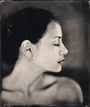
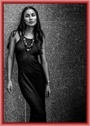
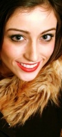
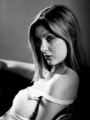
Apr 19 13 02:28 pm Link and finally 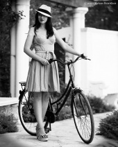 Apr 19 13 02:28 pm Link Vasara wrote: Listed! At first from the thumbnail I was honestly going to comment about composition, but this image is one that is better served in larger format. This is a great example of how a properly photographed image can come together to capture the emotion and intensity of a concept. I give you props for trying something different and off beat with your posing as well in an artistic sense in this image. kudos Apr 19 13 02:30 pm Link Vasara wrote: pass. props for creativity, but for me the composition and post did not mesh worlds to make me want to list. please feel free to play again. Apr 19 13 02:31 pm Link Justin Bonaparte wrote: pass. a portrait is a portrait is a portrait is a portrait...... yawn... what can you say differently with your captures that has not been doing prior? The strong point of this image is the tonality, but the model seems bored, and you seem to have caught her blinking or napping. please feel free to play again. Apr 19 13 02:32 pm Link L Raye wrote: Listed! alright, I'll give you this one even though I had to click through your port to find the link to list. Apr 19 13 02:35 pm Link Charlie-CNP wrote: Not sure if you mean different posts for each one, but for now, just one. (18+) Apr 19 13 02:35 pm Link Open Eyes wrote: pass. sorry, can't get past the usage of bad blur from post work in this. also the pose is a bit awkward/forced feeling. please feel free to play again. Apr 19 13 02:36 pm Link Apr 19 13 02:36 pm Link Apr 19 13 02:37 pm Link ebbfauna wrote: pass on both. (please see rules about one image per post in this thread too). sorry, but the first one seems like some form of fetish play gone mime, and the second one is not black and white, and seems like a deer in the headlights with an attempt at framing in photoshop. please feel free to play again. Apr 19 13 02:37 pm Link  Apr 19 13 02:38 pm Link L Raye wrote: turn it black and white and I might consider..... Apr 19 13 02:38 pm Link L Raye wrote: pass. close, but no cigar. I enjoy the usage of space in this image, and the model seems quite graceful, but for me the pose does not mesh with the environment fully to make me say wow. please feel free to play again. Apr 19 13 02:39 pm Link L Raye wrote: pass. I give you props for creativity on this one, but the fact that the water crops her at the knees, and that she is very much forcing the pose vs. letting it happen organically is something to consider for this one. The usage of shadow and light for the interaction of the piece is nice, but maybe play with different compositions. please feel free to play again. Apr 19 13 02:41 pm Link Grace Photographic wrote: pass. hmm... it is a bride in a dress with one main light in the scene.... yawn... what can you do differently with composition and expressiveness? To me your subject seems bored in this image more so than emoting feeling beautiful as she should in that amazing dress. please feel free to play again. Apr 19 13 02:42 pm Link Grace Photographic wrote: pass. your tones are the strongest point of this image. For me though, the foreshortening is both a blessing and a curse in this image. It makes for lines in space to play off of each other in an interesting means, but it also gives your model a big head (literally). maybe play with different compositions. please feel free to play again. Apr 19 13 02:44 pm Link Drew Smith Photography wrote: pass. model looks uncertain in her expression, the t-shirt over the boobs thing has been done a million times before.... bad post created vingetting... brick wall which has also been done a million times before... need I say more? but to improve maybe try a different setting, and use natural light to create some form of lighting fall off in the shot vs. post. Also, maybe get your model to think about things that would get her into the zone of what seems to be an attempt at a sexy fitness style shoot here. The expression especially is what will sell the image. please feel free to play again. Apr 19 13 02:47 pm Link Drew Smith Photography wrote: pass. better on this one than the prior one. For me though, the composition feels too much like just a head floating in space. What is that head attached to? maybe add upper shoulders in composition if you are going to crop to give the image more of a weighted feel. Also, the haze type effect that was added in post is not doing much for this image, and I can see a spot on her cheek where you used the spot healing brush to correct a blemish. The strong point in this image is the beautiful catch light in her right eye. please feel free to play again. Apr 19 13 02:49 pm Link photographix wrote: pass. either you or the model posted this one before. please see my prior comments on it on page one or two. please feel free to play again. Apr 19 13 02:52 pm Link Apr 19 13 02:58 pm Link Loria Harrison wrote: pass. I first and foremost have to give you props for what you are doing with your goals and aspirations. It takes a lot of courage to do what you are doing and to get out there, so congrats on that! However, I'm sorry, but with all respect, I cannot judge an image off of something that someone is going through in their life. I base my decisions off of composition, lighting, emotion, and artistic merit. This particular image has a great expression to it to indeed say mysterious as you have labeled it. However, to make an image with the wow factor, the whole package has to come together with the merging of worlds with model, photographer, lighting, mood, tonality..etc. there are a few technical things such as the motion blur, and lighting that I think particularly could be improved upon in this image to make it stronger. Keep shooting though, it is great to see people like you out there doing what they do to show others a very positive thing! People take way too much for granted in this world, and this goes to show that there are those of us who can march to the beat of our own drum and do it successfully. please feel free to play again. Apr 19 13 02:59 pm Link Cupcake Paparazzi wrote: pass. tones are the strong point of this image. I am honestly not wild about the crop or the models expression, and somewhat question the styling choice on those jeans/pants. Things to improve upon in this image would maybe be to have the model change up expressions, re-compose the image various ways to see how you can capture the emotion, and maybe throw in a rim light on the back of her hair a bit. please feel free to play again. Apr 19 13 03:01 pm Link Cupcake Paparazzi wrote: pass. sorry, but your first one was better. This one has soft focus issues, seems under exposed, and the neck feels really strained. please feel free to play again. Apr 19 13 03:02 pm Link Ed Woodson Photography wrote: pass. the tones are nice, but it seems like too much background and not enough model in this one. I think that the expressiveness of your model is good in this image, but I don't get the concept fully from just seeing the model in the graveyard. what can you show me further in this image visually that will emote the story? please feel free to play again. Apr 19 13 03:03 pm Link Cecilia Or wrote: pass. just seems like a simple portrait to me. even more importantly though the expression of your face is what makes for a great image. This one seems like you just woke up or something and a photographer was in the room with you. What can you express with a simple facial expression? please feel free to play again. Apr 19 13 03:05 pm Link Cecilia Or wrote: the styling is nice, but this is not a true black and white image. It is what is called monochromatic sepia toned. black and white only in this thread please. Apr 19 13 03:06 pm Link Cecilia Or wrote: pass. see my prior comment about expressions and portrait. Apr 19 13 03:07 pm Link Cecilia Or wrote: pass. props for creativity and trying to expand past your previous portrait style of imagery, but this image has issues from the bad post processing, to the composition, to the cropping of your hands at the joints, to the setting that you are posing in. One thing to improve upon with something like this would be maybe to collaborate with your photographer to use a more dynamic environment/space other than a bedroom/house for a look like this. I think that environment is crucial to create the vibe that you are going for. Right now this just says "hey, I'm in a Halloween costume in a room with someone that just got their first camera". Try shooting this in different settings though with a photographer that knows what they are doing, and I think you could make a really dynamic image with the concept though. please feel free to play again. Apr 19 13 03:10 pm Link Handle with Cake wrote: pass. interesting idea yes, execution no.... maybe try something that is not so center weighted with the framing in this concept. Also, either the way the image was shot has soft focus issues, or the way it was post processed. Either way, maybe shoot over 1/125th of a second to ensure that the edges of your subject are tack sharp, and I think this could be a more successful image. please feel free to play again. Apr 19 13 03:12 pm Link MyrnaByrna wrote: pass. sorry, but this looks like fashion show at a mall to me especially with the bystanders in the upper areas of the image. Also, whomever shot it has a few technical issues like blown out highlights. One suggestion to improve the image would be maybe to borrow the great dresses that you and the other model have and find a photographer that could play with mood especially in the imagery and that is technically sound. please feel free to play again. Apr 19 13 03:13 pm Link Drew Smith Photography wrote: maybe not at the wheel, but in the studio perhaps... Apr 19 13 03:14 pm Link Brian Scanlon wrote: pass. interesting usage of form and light on the figure. However, there are some technical issues like the soft focus (maybe try to re-shoot this with a prime lens to ensure that it is tack sharp), and the over processing in post. I definitely think that this concept could be re-explored though to shoot it again. Maybe add just a hint of fill on your models back with a reflector as well, or play with positioning of lights. please feel free to play again. Apr 19 13 03:16 pm Link Brian Scanlon wrote: Listed! I'm going to list this one just for sheer historical context. Helmut Newton would be proud. However, one thing that stands out like a sore thumb is your attire in this image. If you are going to shoot yourself shooting a nude figure, at least try to do something creative with it other than the khaki's and tucked in shirt. The ensemble comes off as very GWC'ish unfortunately, but I still give you props for exploring the history of photography with this image. Apr 19 13 03:19 pm Link Keep them coming folks! I will start in on the top of page 4 either later tonight, or sometime tomorrow. Apr 19 13 03:20 pm Link Charlie-CNP wrote: That's why it's there. Apr 19 13 03:42 pm Link Apr 19 13 03:52 pm Link Apr 19 13 03:53 pm Link Apr 19 13 04:02 pm Link Apr 19 13 04:06 pm Link |


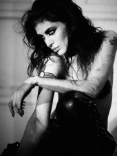


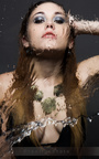
 Interesting usage of scale to shift the viewers focal plane into the linear planes of shift with your model. The pose is quite interesting and expressive because it somewhat feels like the subject is a giant, yet vulnerable because of the ideals of hiding the face in particular and holding the body. I would say great usage of tension in this image.


