Model
Luna Diosa
Posts: 13242
Elizabeth, New Jersey, US
Model
Mary Zdo
Posts: 176
San Ramon, California, US
This is awesome. Let me know where I belong!
Photographer
JAE
Posts: 2207
West Chester, Pennsylvania, US
This could be interesting.
Photographer
Primordial Creative
Posts: 2353
Los Angeles, California, US

taking notes about these asylums in hopes of shooting in them all.

Photographer
Anthony Gordon
Posts: 514
Toronto, Ontario, Canada
This may simply be the most innovative critique thread ever.
I'd love to hear your thoughts...
Model
ebbfauna
Posts: 44
Victoria, British Columbia, Canada
Awesome, just awesome.
I'm in if you care to take a boo!
Photographer
Cherrystone
Posts: 37171
Columbus, Ohio, US
I wanna know where I should check in....then I'll tell you which one I've already been to. 

Photographer
Tom Linkens
Posts: 6450
Lititz, Pennsylvania, US
Where do I belong in your professional opinion?
Photographer
I Ference Photography
Posts: 1202
Brooklyn, New York, US
JAE Photography PA wrote:
This could be interesting. Your port presents a pretty consistently good mix of erotica and art, and like a walk through Greystone Park State Hospital there is plenty to see. But like Greystone, there are flaws - like the cinderblocks used to repair the building after the fires of '29 and '30. Tons of compelling work here, like:
https://www.modelmayhem.com/portfolio/pic/29277257 (18+)
https://www.modelmayhem.com/portfolio/pic/32050504 (18+)
https://www.modelmayhem.com/portfolio/pic/25899293 (18+)
But then, there are the minor cracks in the locally quarried gneiss. Near the top of your port, you have this:
![https://photos.modelmayhem.com/photos/121224/19/50d91dce335a1_m.jpg]()
which is weak, compared to most of your port, and followed immediately by the equally weak
![https://photos.modelmayhem.com/photos/130221/16/5126be064a636_m.jpg]()
And then we get to the last two photos in your port, and I wonder what you're thinking including them in this body of work. How does the cheesy glamor of:
![https://photos.modelmayhem.com/photos/110814/01/4e4786a5d2805_m.jpg]()
fit in with mostly art and erotic photography? It's like putting a photograph of Danny Trejo in a gallery of flower photography; there's just no rhyme or reason. Ditto for the photo before it.
But on the whole, a reasonably expansive and very high quality portfolio that I enjoyed immensely, much like the hallowed halls of Greystone Park.
Photographer
I Ference Photography
Posts: 1202
Brooklyn, New York, US
David Miller Photoworks wrote:
taking notes about these asylums in hopes of shooting in them all. You won't be able to shoot in them all; Buffalo's being renovated, Weston's been sold as a tourist attraction, Philadelphia went down in early '06, and Norwich State Hospital - which your port reminds me of - lost its best buildings in '11/'12. Let's get back to Norwich. Your port is uneven, all over the place, inconsistent. On one hand, you have some stunners like:
![https://photos.modelmayhem.com/photos/120522/00/4fbb451e8e5d4_m.jpg]()
![https://photos.modelmayhem.com/photos/120428/22/4f9ccf743783f_m.jpg]()
But then, you have a bunch of dead-weight, some of it marred by a deeply distracting watermark. Ignore any fanboy love this one gets because Mosh is modeling in it; it's dreadful:
![https://photos.modelmayhem.com/photos/121001/20/506a603eca207_m.jpg]()
Selective desaturation, distracting background, chopped legs - nothing about it works, really. And what the hell is going on with this one:
![https://photos.modelmayhem.com/photos/120424/11/4f96eafe383b4_m.jpg]()
Huh? Is there a grand concept I'm missing here, or is this just a voyage to goofball town? Lose it.
You clearly have some interesting concepts. You also have some concepts that are just wonky. Figure out before a shoot which are the good and which are the bad, and you'll walk away with more stunning images and less goofy ones. Cut down that port a bit, and refill the weaker parts with stuff as strong as your strongest work, and you'll be transferred out to Greystone in a Black Mariah when the superintendent reviews your case.
Photographer
Stephoto Photography
Posts: 20158
Amherst, Massachusetts, US
I'll probably end up in Philadelphia or something, but I love and spend my spare time in abandoned insane asylums anyway, so... why not 
Photographer
I Ference Photography
Posts: 1202
Brooklyn, New York, US
Anthony Gordon wrote:
This may simply be the most innovative critique thread ever.
I'd love to hear your thoughts... Like the repetitive wards of Rockland State Hospital, it takes a bunch of searching through your port to find the truly inspirational work. Most of your port looks like it could be any photographer, just as most of Rockland looks like it could be any 1930s rapid-expansion-era asylum. Put in the footwork of walking the long corridors, and there are gems like these:
![https://photos.modelmayhem.com/photos/120302/12/4f51334d87efb_m.jpg]()
![https://photos.modelmayhem.com/photos/080929/07/48e0b72beefb5_m.jpg]()
https://www.modelmayhem.com/portfolio/pic/28448324 (18+)
The last of which I'm drawn to though I can't explain why - usually I hate white-background composites like this, but this one really nails it. But then, there's a lot of annoying paint chips to walk over to get to those shots, like:
![https://photos.modelmayhem.com/photos/110517/16/4dd300e2ac44c_m.jpg]()
Awkward pose, and facing away from the camera just doesn't work.
![https://photos.modelmayhem.com/photos/081209/06/493e57a982ba5_m.jpg]()
Your lens needs a wipe or that haze is intentional; I'm hoping for the former, but not optimistic, and that watermark is obnoxious.
![https://photos.modelmayhem.com/photos/100402/10/4bb623b9a0351_m.jpg]()
This looks like My First Nude Photograph. Terrible lighting, boring pose, totally uninteresting. Actually, reminds me of my first nude session, so the title I gave it works. But seriously, ditch it.
And make some pretty hefty cuts to the rest of your port. Really evaluate each image, and decide whether it's your strongest work. And if it's not, if it's even a bit bad - just let it go, and then tell the orderlies you're ready for a transfer to a more interesting asylum.
Photographer
Anthony Gordon
Posts: 514
Toronto, Ontario, Canada
I Ference Photography wrote:
Really evaluate each image, and decide whether it's your strongest work. And if it's not, if it's even a bit bad - just let it go, and then tell the orderlies you're ready for a transfer to a more interesting asylum. You're rough, but it's given me some things to think about. Thank you for the critique, hopefully next time I can trade straightjackets for a better facility...
Photographer
I Ference Photography
Posts: 1202
Brooklyn, New York, US
Cherrystone wrote:
I wanna know where I should check in....then I'll tell you which one I've already been to. You have a nice, expansive selection of great art nudes - big like Greystone Park State Hospital, but flawed like this asylum as well. Occasionally in your port, you reach that hallway that has all the stupid desks and filing cabinets piled up in it. That corridor always breaks the flow!
https://www.modelmayhem.com/portfolio/pic/32274423 (18+)
There's something captivating about this classic art nude, even if the seam between ceiling and wall is visible. The contemplative expression and sepia toning work so very well together!
https://www.modelmayhem.com/portfolio/pic/18603801 (18+)
Amazing, perfectly lit bodybuilding photo that has all the trappings of a classical statue.
![https://photos.modelmayhem.com/photos/090125/11/497cb8a175c95_m.jpg]()
Holy crap does the shadow make this compelling! And while it doesn't fit with most of your work,
![https://photos.modelmayhem.com/photos/100123/11/4b5b53bc3672d_m.jpg]()
has a voyeuristic realism to it that is just captivating. But then there are those desks to trip over - here's one:
https://www.modelmayhem.com/portfolio/pic/32349476 (18+)
The lighting doesn't work here, and neither does the pants line - in a portfolio of pure nudes, this really breaks the flow. And it feels too soft.
https://www.modelmayhem.com/portfolio/pic/18709139 (18+)
Huh? The artistic spell is broken. It's a boringly-lit naked chick drinking a beer on a couch.
You have far more hits than misses, and a little bit of trimming from 92 images won't hurt you. Go through, find the weakest ones, and the superintendent might just consider sending you to Buffalo State Hospital!
Now satisfy my curiosity, where have you actually been?
Photographer
I Ference Photography
Posts: 1202
Brooklyn, New York, US
Tom Linkens wrote:
Where do I belong in your professional opinion? Just like the scattered campus of Norwich State Hospital, your port contains some lovely sights and some terrible bores. Like the (sadly demolished) Salmon Building, this image is brooding and beautiful:
https://www.modelmayhem.com/portfolio/pic/29182696 (18+)
And like the staircase in the administration building, this photograph is subtly lovely with some great light:
![https://photos.modelmayhem.com/photos/100201/19/4b67968d48371_m.jpg]()
However, like Norwich, your portfolio is inconsistent in its appeal. For example:
![https://photos.modelmayhem.com/photos/080911/21/48c9c7ed00adf_m.jpg]()
At this point, "here's a pretty girl with my TLR" is just a bad gimmick. (One which I was guilty of myself, many years ago.) But add in some atrocious lighting, and it's a whole nother level of bad. And these:
https://www.modelmayhem.com/portfolio/pic/21780112 (18+)
https://www.modelmayhem.com/portfolio/pic/18475236 (18+)
Don't both need to be in here, since one is just a B&W version of the other. The B&W works better; scrap the color. It seems amateurish to put them both in there side by side. But then there's this:
https://www.modelmayhem.com/portfolio/pic/23166921 (18+)
I don't know what you were thinking; this looks like it came straight out of some "GWC with a love of point-n-shoot cameras in cheap motel rooms" photoset. Literally nothing about it works, and it brings down your entire port, kind of like how the maintenance shop annex brings down the character of Norwich.
Do some soul searching and port searching, cut out a bunch of the drek, and refine your technique, and you'll be driven to a better asylum when the nurses clear you to finish your insulin coma therapy.
Photographer
Drew Smith Photography
Posts: 5214
Nottingham, England, United Kingdom
Okay - I'm committed to this!

Photographer
Jorge Kreimer
Posts: 3716
San Cristóbal de las Casas, Chiapas, Mexico
Photographer
I Ference Photography
Posts: 1202
Brooklyn, New York, US
SPierce Photography wrote:
I'll probably end up in Philadelphia or something, but I love and spend my spare time in abandoned insane asylums anyway, so... why not No Byberry for you! You're getting shipped straight to Middletown State Hospital, a small hospital full of beauty, not unlike your port. You probably have a lot more (weaker) images you could add to your port, but for the moment you've kept it to 10, and for the most part those 10 are all relevant and lovely. A lot of MM photographers should take a cue from this - quality, not quantity. You have some real standouts:
![https://photos.modelmayhem.com/photos/120811/04/502647b0319b1_m.jpg]()
This is an absolutely wonderful portrait. Simple, elegant, perfectly composed. Shows that you don't need elaborate lighting or backdrops to make a compelling image; just the right lighting and subject.
![https://photos.modelmayhem.com/photos/110703/15/4e10f0efcd714_m.jpg]()
Again, fairly simple concept, but flawless execution. The compo couldn't be better; even the hand trailing out of frame works here. And then:
![https://photos.modelmayhem.com/photos/130302/06/51320e81a9b7b_m.jpg]()
Wow! I very rarely say "I wish I'd taken that photo", but I wish I'd taken that photo. Powerful, evocative, perfectly toned, and little details - like the streaks of angular light - just give it a powerful finish. There's only one photo which doesn't cut the mustard among your ten:
![https://photos.modelmayhem.com/photos/130501/20/5181dc5367bb7_m.jpg]()
It's boring, lacks the wonderful simplicity of most of your work, and is awkwardly posed. I'd lose that one. But in general, you've nailed the beauty of simplicity in your work, and don't post bullshit to fill the empty slots in your port - good for you! Like Middletown, there isn't a ton to see, but what's there is all diverse and enjoyable. Keep doing what you're doing; not to say "don't improve", but you clearly have an eye and that's half the battle. And once you build up that port some, apply for a transfer to Greystone or, dare I say, Buffalo!

Photographer
wendy haigh
Posts: 517
Melbourne, Victoria, Australia
Lol... This sounds like fun!!!
Photographer
I Ference Photography
Posts: 1202
Brooklyn, New York, US
Drew Smith Photography wrote:
Okay - I'm committed to this! Committed you are indeed... in fact, you're the first person in this thread getting committed to Buffalo State Hospital! Like the grand towered monument to mental health designed in true Richardsonian Romanesque, your portfolio is expansive, and full of unimpeachable beauty and technical excellence. Congrats on being insane enough to warrant this stately building!
You cover a wide range of styles, and you do every one of them well. And just like the 1871 behemoth where every room is interesting, every one of the images you present merits a view. What really blows me away, though, is the fact that you do styles I absolutely hate well enough that I can't say a bad word about them. I can't stand Photoshopped "digital art", and yet this is just amazing:
![https://photos.modelmayhem.com/photos/110626/03/4e070ce8c13a4_m.jpg]()
But in every style in which you shoot, you do it well, and most importantly inject it with creativity and vision. In a 35 shot portfolio on MM, this is almost never seen. You have fantastic art nudes:
https://www.modelmayhem.com/portfolio/pic/30737369 (18+)
in particular evokes a wide range of thoughts - almost as if it's high-concept without appearing to have an overthought concept underlying it. Then you do beauty in a superlative manner:
![https://photos.modelmayhem.com/photos/121202/09/50bb893ce46e6_m.jpg]()
Wonderful editorial work with fabulous lighting:
![https://photos.modelmayhem.com/photos/110717/13/4e23403a0070f_m.jpg]()
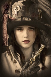
And even high concept (steampunk, no less) scenes that don't have even the slightest whiff of cheese:
![https://photos.modelmayhem.com/photos/110615/09/4df8dfac271dc_m.jpg]()
I'm impressed; you definitely have one of the coolest portfolios I've seen on this site. Basically, just keep doing what you're doing, and do lots more of it. I'm sure that just like Buffalo State Hospital - to which I've made more trips than just about anybody - I'll be returning to your portfolio again just to see what's changed. And congratulations - you've earned a spot in the most beautiful psychiatric hospital ever constructed! I just hope they have enough Thorazine on hand to keep you under control!
Model
_eMMe_
Posts: 866
Florence, Toscana, Italy
Model
Luna Diosa
Posts: 13242
Elizabeth, New Jersey, US
Model
Lela Jesse
Posts: 1148
Shasta Lake, California, US
I Ference Photography wrote:
Like wandering the halls of Rockland State Hospital and seeing the same room over and over again, looking at your port shows the same expression in almost every photograph. You need to learn to emote something other than "I'm pouty and I know it"! This shot is pretty cool (as is the lovely old truck):
![https://photos.modelmayhem.com/photos/130219/22/51246ce2c2dc7_m.jpg]()
But you don't need two more with the same truck in your port! Cut your port down a lot, work on your expressions, shoot with some better photogs, and you'll get transferred to a more upscale abandoned asylum soon enough! Thank you!

Model
Amelia Vane
Posts: 93
Somerville, Massachusetts, US
Love this idea! I'd love to know!!

Model
Raina Noel R
Posts: 549
Rio Vista, California, US
I'm curious.
Photographer
Cherrystone
Posts: 37171
Columbus, Ohio, US
I Ference Photography wrote:
Now satisfy my curiosity, where have you actually been? Caro, Eloise, & Eastern Michigan, heavy on the last two.

Photographer
Anthony Lanza
Posts: 30
Omaha, Nebraska, US
Which asylum am I ?
Photographer
Stephoto Photography
Posts: 20158
Amherst, Massachusetts, US
I Ference Photography wrote:
No Byberry for you! You're getting shipped straight to Middletown State Hospital, a small hospital full of beauty, not unlike your port. You probably have a lot more (weaker) images you could add to your port, but for the moment you've kept it to 10, and for the most part those 10 are all relevant and lovely. A lot of MM photographers should take a cue from this - quality, not quantity. You have some real standouts:
![https://photos.modelmayhem.com/photos/120811/04/502647b0319b1_m.jpg]()
This is an absolutely wonderful portrait. Simple, elegant, perfectly composed. Shows that you don't need elaborate lighting or backdrops to make a compelling image; just the right lighting and subject.
![https://photos.modelmayhem.com/photos/110703/15/4e10f0efcd714_m.jpg]()
Again, fairly simple concept, but flawless execution. The compo couldn't be better; even the hand trailing out of frame works here. And then:
![https://photos.modelmayhem.com/photos/130302/06/51320e81a9b7b_m.jpg]()
Wow! I very rarely say "I wish I'd taken that photo", but I wish I'd taken that photo. Powerful, evocative, perfectly toned, and little details - like the streaks of angular light - just give it a powerful finish. There's only one photo which doesn't cut the mustard among your ten:
![https://photos.modelmayhem.com/photos/130501/20/5181dc5367bb7_m.jpg]()
It's boring, lacks the wonderful simplicity of most of your work, and is awkwardly posed. I'd lose that one. But in general, you've nailed the beauty of simplicity in your work, and don't post bullshit to fill the empty slots in your port - good for you! Like Middletown, there isn't a ton to see, but what's there is all diverse and enjoyable. Keep doing what you're doing; not to say "don't improve", but you clearly have an eye and that's half the battle. And once you build up that port some, apply for a transfer to Greystone or, dare I say, Buffalo! I can survive Middletown. Thanks   I'll delete the one iffy shot from my port, was debating over whether I needed to have a full body shot in there or not, but I guess i'll just stick with my headshots I'll delete the one iffy shot from my port, was debating over whether I needed to have a full body shot in there or not, but I guess i'll just stick with my headshots
Funnily enough, I was originally only at 5, and once I signed up on this thread I was all "oh, shit, i should add in a few more!" so I did 
Photographer
Tom Linkens
Posts: 6450
Lititz, Pennsylvania, US
I Ference Photography wrote:
But then there's this:
https://www.modelmayhem.com/portfolio/pic/23166921 (18+)
I don't know what you were thinking; this looks like it came straight out of some "GWC with a love of point-n-shoot cameras in cheap motel rooms" photoset. Literally nothing about it works, and it brings down your entire port, kind of like how the maintenance shop annex brings down the character of Norwich.
Do some soul searching and port searching, cut out a bunch of the drek, and refine your technique, and you'll be driven to a better asylum when the nurses clear you to finish your insulin coma therapy. That 18+ photos are no longer allowed on profile pages, where I point out my sense of humor..would sound like an excuse. So perhaps Zinn Star and myself are both actually crazy?
Photographer
EMB Images
Posts: 1342
Delmar, Delaware, US
OK, tell me where I belong, others has told me Im crazy
Model
Devin Sparkes
Posts: 63
Los Alamitos, California, US
haha this looks fun! me please
Model
Mary Zdo
Posts: 176
San Ramon, California, US
Photographer
I Ference Photography
Posts: 1202
Brooklyn, New York, US
Jorge Kreimer wrote:
Ok! At your competency hearing, the superintendent had a hard time figuring out where to place you, finally settling on Greystone Park State Hospital with a diagnosis of acute schizophrenia. Like Greystone, most of your port is absolutely wonderful - you have an exceptional degree of technical mastery paired with a sense of being able to clearly communicate exactly what you need from a model. It really shows through in shots like:
https://www.modelmayhem.com/portfolio/pic/28847538 (18+)
which is simple on the surface, yet reveals excellent compo and lighting, posing, and a powerful sense of presence from the model that is often absent from shots like this.
![https://photos.modelmayhem.com/photos/130127/20/510601a006b73_m.jpg]()
Here, the subtle lighting and muted color contrast nicely with the claustrophobic framing and knife which almost entirely divides the scene (blade toward viewer) to create a subtle feeling of ominous dread.
And the entire "Laura New" batch at the end of your portfolio could serve as an object lesson to many photographers here on when it's acceptable to post a whole bunch of shots from the same photoshoot. Although on the surface, they seem similar - simple, well lit art nudes with the same model - the amount of variation when you look below the surface is staggering, making a cohesive body of work that doesn't grow boring.
But then, there's the stuff which - like Greystone's rebuilt roof, its hallway full of desks - really detracts from the portfolio on the whole. First and foremost, there's the "ghosts" album - LOSE IT. NOW. I mean c'mon:
![https://photos.modelmayhem.com/photos/130429/07/517e7d661655c_m.jpg]()
This looks like something I could have made in Photoshop 2.0 back in the 90s. It's almost painful to look at. This isn't a concept, it's a joke. Unless you mean it to be a joke, remove it post haste. And then there are the shots with the weird halos and post-processing:
https://www.modelmayhem.com/portfolio/pic/32200978 (18+)
I don't know what you're going for here, but that said, whatever it is you're missing your mark. This just looks bad, and you have a bunch like this. The majority of your port is so very strong - it's almost like there are two artists adding work to one portfolio, the master and the joker. Get rid of the gimmicky shit and focus on what you're good at - technically masterful shots that rely on excellent lighting and posing instead of chicanery - and your port will be elevated to a whole new level - and maybe the Black Mariah will even show up to take you to Buffalo State Hospital.
Photographer
I Ference Photography
Posts: 1202
Brooklyn, New York, US
wendy haigh wrote:
Lol... This sounds like fun!!! Your port posesses a sense of epic grandeur much like Greystone Park State Hospital, although just like that hospital there are some portions that are just aggravating to traverse. In most cases, a really great concept can be executed once, maybe twice - but every single one of your wrapped-face portraits is a knockout, and somehow they form a compelling body of work, none more than:
![https://photos.modelmayhem.com/photos/110314/22/4d7ef9ad00a6e_m.jpg]()
The fact that these all work, and work well together, without coming off as pretentious, overdone, or one-trick-ponyish, is a real credit to your talent and vision. The watermark needs to go, but that's a personal preference. Much of your other work is striking too:
![https://photos.modelmayhem.com/photos/110420/01/4dae95210cb40_m.jpg]()
While I wish the cigar were lit and smoking, this still has a wonderful noir feel to it, and the model's expression is perfect.
![https://photos.modelmayhem.com/photos/100501/07/4bdc396679151_m.jpg]()
Many photographers would kill to get this much personality out of their models. And it's technically very well executed.
But then there are the things - like the remodeled rooms of the inner wards - that drag your port down. First and foremost, let's talk about cheesy faux-vintage borders: don't use them. I might find myself liking this photograph:
![https://photos.modelmayhem.com/photos/100921/00/4c9859a0cf07d_m.jpg]()
But I can't tell, because the cheesy fake-polaroid border is so damn distracting. And you do this a lot. Just stop. It's not artistic, it's ridiculous. Then there are the odd ducks which stand out and detract from your portfolio:
![https://photos.modelmayhem.com/photos/100118/19/4b552050c0720_m.jpg]()
This is a post-processing disaster. A triptych of cautionary tales about too much Photoshop. The superintendent is giving you a shot of Thorazine now - sit back, relax, and stop overprocessing your photos. And this:
https://www.modelmayhem.com/portfolio/pic/32298545 (18+)
Seems like one of those near-misses where you almost got a compelling image, didn't, and decided to stick it in your port anyhow. The lighting is boring, her rings are distracting, and the pose would have worked much better in contrast with a different background.
Still, you've shown yourself to have a keen eye for art photography - particularly with the wrapped-face series - and I'm excited to see what sorts of finger paintings you create during arts-and-crafts time on the ward! Trim down some of the weak elements in your port and get rid of those damn borders, and you can petition the Powers That Be for a transfer to Buffalo.
Photographer
Merry
Posts: 1678
London, England, United Kingdom
If you're still going, please do tell me hehe!
Photographer
I Ference Photography
Posts: 1202
Brooklyn, New York, US
_eMMe_ wrote:
Please, I am curious. Your portfolio has some interesting parts and some painfully boring parts, much like Norwich State Hospital. There are a handful of really powerful shots, which reveal strength and personality, such as in your avi:
![https://photos.modelmayhem.com/photos/121127/11/50b5189adfc45_m.jpg]()
and in this classic Polaroid:
![https://photos.modelmayhem.com/photos/130311/06/513dd67debdf6_m.jpg]()
And the rawness and harsh technical execution of this art nude are very appealing:
https://www.modelmayhem.com/portfolio/pic/31951639 (18+)
However, there's a bunch of dross in there as well, and you need to vary up your emoting more - in most of the shots in which you address the camera (viewer) directly, you're making bedroom eyes. As in these:
![https://photos.modelmayhem.com/photos/130319/05/514854cdaf250_m.jpg]()
https://www.modelmayhem.com/portfolio/p … 0#27723619 (18+)
https://www.modelmayhem.com/portfolio/p … 0#31402871 (18+)
https://www.modelmayhem.com/portfolio/p … 0#31402871 (18+)
https://www.modelmayhem.com/portfolio/p … 0#27723644 (18+)
It seems that you only have two expressions - this one, and mysteriously staring out of frame. Work with your emoting more, and you'll come away with some stronger images. There are some photos in your portfolio that just come off as amateurish in terms of technical proficiency - eg:
https://www.modelmayhem.com/portfolio/pic/27990610 (18+)
![https://photos.modelmayhem.com/photos/121206/11/50c0f88d085af_m.jpg]()
Giving the overall impression of an overall uneveness in your work and the skill of those you work with. Trim the fat, work with some more skilled photographers, and you might be able to apply for a transfer to Middletown.
|


 I'll delete the one iffy shot from my port, was debating over whether I needed to have a full body shot in there or not, but I guess i'll just stick with my headshots