|
Forums >
Hair, Makeup & Styling >
Black and White versus Colour Photography Makeup
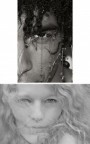
I was once told by an MUA that makeup for colour is not the same thing as for black and white. I thought "hmmm", ok, I believe you. Doing more black and whites now I would like to understand what the difference is in theory, and so I can give better direction to my MUA when I know I want a Black and White Image. Thanks in advance for your insights. Lee May 27 08 06:35 pm Link Dunno much about photography. . . But if you told me the shoot was black and white--maybe I would use contrasting colors. This would show contour, detail and definition. May 27 08 06:47 pm Link What that MUA told you is true. (old b&w movies from the early years used a film that was very sensitive to blue... so all makeup was tinted green)(MUA's in those days had to MU twice, once for screen, once for live... and make them match!) Very old trick... To check and see how something will look in b&w, contrast wise, look through a #25 red filter... or red sunglasses. If you are going to go for an 'old hollywood glam' look... get green sunglasses. Personally... I carry sunglasses in Red/Blue/Green [good 'ol... (RBG)] This lets me get some idea of what each channel will see, contrast wise, before I shoot May 27 08 06:59 pm Link Dependent on the circumstances, makeup for black and white photos may need to be treated differently then for color photography. It's generally safer just to assume that you need to always treat them differently. A lot of factors will determine how the makeup will behave. Depending on what kind of film and process the photographer is using. Or if they are shooting digitally in color, then converting the images to black and white in post production. Obviously color will not be visible in the final images, so you need to be more conscious of the tonal contrast instead of the color contrast the makeup creates. Heavily saturated, or strong colors will obviously have the biggest potential for problems. Where as foundations or powders that are more neutral in color will be the easiest to imagine the final results. What may look like a bright red lipstick in color might look completely black in the final image. Or a bright colored eyeshadow might completely disappear when rendered in black and white. Experience comes through trial and error, and is something worth testing and practicing with. Always ask the photographer for their input so they can steer you in a direction that will work for that particular shoot if you are unsure. As a photographer I would try to be conscious of what colors might pose problems in my workflow, so that I can warn the MUA. For makeup artists, the easiest tip I've ever heard just to get you thinking in the right direction.. Take good color digital photos of your pallets, or lipsticks, etc. Then make a copy, and simply convert it to black and white in photoshop, or with any other image editing tool on your computer. Look at the color and black and white photos next to each other to see how different colors behave once rendered in black and white. It's not a perfect example, but can be a good jumping off point. May 27 08 07:15 pm Link Yes, it is true, makeup for B & W is definetly different then that of color. Here is basic comparison shot (don't mind the bad pic). This makeup was done specifically for a color shoot. We wanted it to have that sunkissed look to it, but not over the top. You can see definate eyeshadow contouring, blush and lipstick. When looking at the B & W version, she has a very natural look to her. No blush, minimal eyeshadow and no lipstick.  Had I known that the intent was to do b & w from the beginning, but still wanted that fresh sunkissed look, I would have definetly added more contrast makeup to compensate for the blending in of color. The other photographers already gave GREAT advice, but this just helps for those that are image needy (like myself). LOL May 27 08 08:27 pm Link Colors have different values "in color" than when done in grayscale or black and white. For example, in color we can clearly tell the difference between pink and blue. But they may have a similar grayscale value and not register as different shades of gray. So what might look like a lot of detail and dimension in color may be very flat in black and white. May 27 08 09:13 pm Link take a picture of your makeup in black and white and that'll give you a better idea as to the colors  May 27 08 09:17 pm Link Lee Geyer wrote: ok May 27 08 09:45 pm Link Lee Geyer wrote: It's not just makeup, everything is different. My dad is a photographer and he helped me understand colours, and grey scaling as mentioned above, when I was studying makeup history at college. May 27 08 09:47 pm Link i love that great pic posted by yeikov make up artist. Showing a color and black white pic helps a whole lot. Cosmetic Couture posted a great example as well. I often see black and white images and wonder what colors were used. Anybody else have some color vs black & white images they can post? Basically my concept on color vs black n white photography is this. With black n white photography, everything becomes shades of gray so the color of the makeup doesn't matter as much... i.e. no one knows they have red lips, purple blush, and dark brown w/taupe shadow. Unless you were aiming for that look, you would not select those colors for color photography. You do have to make sure plenty of powder is used for black & whites cause shine heavily shows up. Heavy application is normally required for contouring/highlighting. Not enough color cosmetics for black n white photography can have the model looking dead or not made up at all. Sometimes, I tell my students, if you don't look like a clown (excluding the white face, round circles for cheeks and joker looking mouth), you didn't apply it right. Color just has to be applied heavy than usual. i.e. the photo posted by yeikov make up artist is very strong, model's features come across clear whereas the other photo posted by Cosmetic Couture looks as the model is not wearing makeup & the bags under the eyes are still very obvious. Cosmetic Couture even mentioned has it been known the photo would be b&w, more contrast would have been present. Both are Beautful Pics btw. May 28 08 02:28 am Link My general rule of thumb is that everything needs to be taken up a few notches for black and white, especially contouring otherwise you end up with a flat white face and no cheekbone! The other thing to note is that lipsticks which are very dark will read as black on b&w. Unless black lips is what you're going for, its good to be aware of that. May 28 08 07:59 am Link Black doesn't usually show up black on black and white. To the OP, how do you convert to black and white (if digital)? Do you just convert from RGB to Grayscale, or do you use a channel mixer? If you use a channel mixer, you'll understand that certain colours are usually lightened/darkened while converting. As a photographer too, I usually darken blues, and lighten reds. If I wanted dark make-up in a B+W image, I'd use dark blue:  It'd be worth taking a colour wheel off the net, and converting it to black and white, trying different conversions, to see the different tones produced. Oh, and I think that for make-up artists working in B&W, as there's no colour to play with, it's all about tone and textures I hope that little ramble helps, Amy May 28 08 02:26 pm Link If you would like to get a good idea of what the different colors do in a B&W photo.... Use your digital camera and take a picture of a MUA's eyeshadow palette. Confirt this one into B&W as well. When printed and placed together you get a very good idea what will happen. For example: Red will probable make a nice shade of black. Green and yellow is nice to use as a blush/ shaping. Have fun!!!! May 28 08 05:08 pm Link |