|
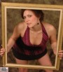
Ok,I need your help. I need to know which images have to be dropped from my portfolio. Keep in mind I have two books...one for commercial/product/ and the other for Maximstyle glam.. please pick out my weakest pics..and maybe a a lil explanation why would help me see where I failed and can improve upon next time..much obliged! thank you. Jul 06 05 07:46 pm Link Posted by sibyl: I'd say Cheeezeee. Only because the face is so blurry, so it's made probably the weakest IMO of the lot. Jul 06 05 07:53 pm Link Thank you...you're right..it's gone Jul 07 05 09:01 am Link I am assuming this is the Maxim glam port. If so, I would go for more T&A type shots even if there is no nudity (i.e. opps and cyberblue). I'd be interested to see your commercial port as well. Jul 07 05 09:07 am Link "pillsbury doughboy" only because your skin tone is significantly different in color than the rest of the images. "dr. suess" while certainly an interesting composition, is certainly not showcasing you - it is showing the photographer. Jul 07 05 09:12 am Link Posted by CharliesImages: I didn't see the dr. suess as a maxim glam image either... Jul 07 05 09:14 am Link hmmm intresting on the doughboy one..because I am half black and can tan that dark...but you're right if I'm not usually tan I shouldln't use it..can I cheat and lighten up my skintone? not Michael Jackson white of course  as for the Suess..that's a hella good point about who it showcases..I will leave that as a web only image and not put into my book.. oh to clear it up..this port is a bit of everything..I was wondering what I should PRINT for my two seperate books from what I have gotten thus far from photographers... you guys have made very valid points..thanks so much for the input... Jul 07 05 10:17 am Link You're showing a variety of looks. That's good. You look "really hot" in some of the glam shots. That's good too. At your hight, I think your commercial port could focus on lifestyle images with a natural look to them. This would help differentiate it from the glossy Photoshop in the glam port. Jul 07 05 10:37 am Link what to do with the real cool images that are caught in between the two extremes? web only? Jul 07 05 12:22 pm Link To add variety to the portfolios, you could put a few (2 or 3) into each book. Just decide if it leans towards glam or commercial print, for example. Don't forget about your compcard. You have about 5 images to work with. I would focus one comp just on fashion and one comp just on glamour. One compcard with a combination of glamour head shots and body shots along with lifestyle shots might work well... I think profile websites or a personal website are great places for cool images that don't fit into either book. You could look at the web as a thrid book to augment the commercial and glam books, and put a few of the images from the real books into your web portfolio along with the cool and artistic photos. Just my 2¢ Jul 07 05 12:29 pm Link thank you..that actually makes quite a bit of sense...my personal site acting like a third book,I'll discuss with the girl whos doing my site over... Jul 10 05 10:02 am Link everyone has their own opinion. for me, i would... cut: '80's wildchild' (i feel the lighting is harsh, possibly too much textue in the wrong places, too contrasty) 'angel of funk' (i dont feel any connection here, you have a great look on your face but it all doesnt add up for me, wierd angle like dr. on acid?) possibly 'oops' (you look much more at ease in other pictures, such as cyberblue) my favorites are: 'tribute to raquel welch' (hot look, its own individual image style, very unique look for you in your portfolio) 'rita hayworth' (shows off your full body, lower body from the belly down, plus you got a flower in your hair, haha) 'outlook skateboards' (like one of those fine ladies from the rap video, err. punk video.) 'banana' (my personal favorite) 'me sashaying my hindu inner goddess' (my favorite composition. dynamic lighting, interesting pose) those are just a few of my favorites. beautiful. but my opinion doesn't matter as much as yours. you should love the shots you put in, right? Jul 11 05 06:13 am Link ok the 80's pic will not go in my print book it will probably just stay on as a web only image... teh angel of funk isn't really suspose to make sense otehr than being totally over the top dragqueen fabolous haha..I wante dosmething almost cartoony but heavily styled...something "funky" looking..I think that was accomplished...but yeah it's one for shock value almost..I MAY stick in my book just to wake up the art director mid way through my portfolio..one may not like it but it does stick out in your head and you remember the shot because you're trying to figure it out..besides if everything in the world made sense it would be boring... You're the first person not to like the "oops" pic, well actually matthew cooke thought it be better if I was baring my lil breasts because then it would add that element of shame to it but he liked it regardless of that...that is actually an outtake pic and I was way more comfortable shooting that set with lawrence than I was the blue set..but that's interetsing how you saw it and I appreciate your input and opinions..  Jul 11 05 07:22 am Link |