Photographer
robert christopher
Posts: 2706
Snohomish, Washington, US

fairly new to this game but relish the advice of photographers and models to help me improve my game.

Model
A BRITT PRO-AM
Posts: 7840
CARDIFF BY THE SEA, California, US
well usually these kinda posts show crappy work .. so i was particularly impressed!!
great stuff
i think u r doing fine
i really like the 2nd image - and darker shadowy images with clever ligthing are my preference anyway. Maybe you would like to work with various lightings, shadows and subjects getting more emotion from the models
but its all good!!!
apart from the boob job model (yuk) i cant criticise. Look forward to seeing more!!
Photographer
Todd S.
Posts: 2951
Chapel Hill, North Carolina, US
Robert,
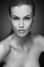
There's definitely improvement since the short time ago when you asked for feedback. Three images in particular I'll comment on:
"Yulia" (the 2nd, sepia toned one) is very striking. It just creeps me out a little bit that most of the left side of her face is completely missing. Maybe the "mask" effect is what you were going for, or the compression screwed it or something, but I wish there were a little more balance between the two sides. Alternately if you wanted to burn out some of right side that might bring a little more balance back. Everything else about the image: the overall composition, the lighting on her breasts and hair, is very nice.
"Yulia with some color" looks over-processed. Is her skin really tha porcelain? It's a little unnerving.
I much prefer the the feel of the image to its left which tells a very nice story, an intimate moment of a girl pinning her hair up caught by a photographer. There's wonderful tone transition between her underarm and breast and the soft focus is totally appropriate for this image. It's just my opinion of course, but I would call this the best image in your portfolio right now.
Did you get your hands on that lighting book yet? Keep up the good work!
...todd
Photographer
robert christopher
Posts: 2706
Snohomish, Washington, US
Posted by Todd Steinwart:
Robert,
There's definitely improvement since the short time ago when you asked for feedback. Three images in particular I'll comment on:
"Yulia" (the 2nd, sepia toned one) is very striking. It just creeps me out a little bit that most of the left side of her face is completely missing. Maybe the "mask" effect is what you were going for, or the compression screwed it or something, but I wish there were a little more balance between the two sides. Alternately if you wanted to burn out some of right side that might bring a little more balance back. Everything else about the image: the overall composition, the lighting on her breasts and hair, is very nice.
"Yulia with some color" looks over-processed. Is her skin really tha porcelain? It's a little unnerving.
I much prefer the the feel of the image to its left which tells a very nice story, an intimate moment of a girl pinning her hair up caught by a photographer. There's wonderful tone transition between her underarm and breast and the soft focus is totally appropriate for this image. It's just my opinion of course, but I would call this the best image in your portfolio right now.
Did you get your hands on that lighting book yet? Keep up the good work!
...todd not here yet, but i will read every page promise, (i usually just look at the pictures)
Photographer
robert christopher
Posts: 2706
Snohomish, Washington, US
Posted by Anjel Britt:
well usually these kinda posts show crappy work .. so i was particularly impressed!!
great stuff
i think u r doing fine
i really like the 2nd image - and darker shadowy images with clever ligthing are my preference anyway. Maybe you would like to work with various lightings, shadows and subjects getting more emotion from the models
but its all good!!!
apart from the boob job model (yuk) i cant criticise. Look forward to seeing more!!
thank you very much, thqat means a lot to me. no boob jobs here, really, oh to have the breasts of a twenty year old again.
Photographer
robert christopher
Posts: 2706
Snohomish, Washington, US
Posted by Todd Steinwart:
Robert,
There's definitely improvement since the short time ago when you asked for feedback. Three images in particular I'll comment on:
"Yulia" (the 2nd, sepia toned one) is very striking. It just creeps me out a little bit that most of the left side of her face is completely missing. Maybe the "mask" effect is what you were going for, or the compression screwed it or something, but I wish there were a little more balance between the two sides. Alternately if you wanted to burn out some of right side that might bring a little more balance back. Everything else about the image: the overall composition, the lighting on her breasts and hair, is very nice.
"Yulia with some color" looks over-processed. Is her skin really tha porcelain? It's a little unnerving.
I much prefer the the feel of the image to its left which tells a very nice story, an intimate moment of a girl pinning her hair up caught by a photographer. There's wonderful tone transition between her underarm and breast and the soft focus is totally appropriate for this image. It's just my opinion of course, but I would call this the best image in your portfolio right now.
Did you get your hands on that lighting book yet? Keep up the good work!
guilty as charged, i tend to overprocess many of these images, hopefully i'll outgrow that quickly as i get better with my exposure settings.
...todd
Photographer
robert christopher
Posts: 2706
Snohomish, Washington, US
Posted by Todd Steinwart:
Robert,
There's definitely improvement since the short time ago when you asked for feedback. Three images in particular I'll comment on:
"Yulia" (the 2nd, sepia toned one) is very striking. It just creeps me out a little bit that most of the left side of her face is completely missing. Maybe the "mask" effect is what you were going for, or the compression screwed it or something, but I wish there were a little more balance between the two sides. Alternately if you wanted to burn out some of right side that might bring a little more balance back. Everything else about the image: the overall composition, the lighting on her breasts and hair, is very nice.
"Yulia with some color" looks over-processed. Is her skin really tha porcelain? It's a little unnerving.
I much prefer the the feel of the image to its left which tells a very nice story, an intimate moment of a girl pinning her hair up caught by a photographer. There's wonderful tone transition between her underarm and breast and the soft focus is totally appropriate for this image. It's just my opinion of course, but I would call this the best image in your portfolio right now.
Did you get your hands on that lighting book yet? Keep up the good work!
...todd not here yet, but i will read every page promise, (i usually just look at the pictures)
|
