Model
Emma-Marie
Posts: 129
Brisbane, Queensland, Australia
I have lots of shoots coming up, and I need to know what to get rid of in my port..
So here's the deal: Tell me a picture I should delete, and I will give you a constructive critique either on an image of your choice, or your portfolio as a whole.
Lets get started!

Model
John Ujjjjjjj Xghp
Posts: 2298
Ķızıltepa, Navoi, Uzbekistan
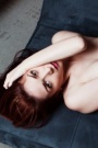
Definitely delete this: ![https://modelmayhm-2.vo.llnwd.net/d1/photos/100202/18/4b68e57763f4d_m.jpg]() It's blurry. And you're on railroad tracks. And there are two other models, so it's hard to tell in just one glance which one is you. And when you lie down, you have the tendency to repeat similar poses with your legs. Keep one image of each pose and get rid of the rest. A brief overview of my portfolio, please 
Model
Emma-Marie
Posts: 129
Brisbane, Queensland, Australia
Lisa Levin wrote:
Definitely delete this:
![https://modelmayhm-2.vo.llnwd.net/d1/photos/100202/18/4b68e57763f4d_m.jpg]()
It's blurry. And you're on railroad tracks. And there are two other models, so it's hard to tell in just one glance which one is you.
And when you lie down, you have the tendency to repeat similar poses with your legs. Keep one image of each pose and get rid of the rest.
A brief overview of my portfolio, please Thanks for the feedback Haha, yes my legs do tend to do the same thing over and over..
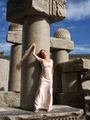
Overall, I like your port. There are a few shots where your arm is up near your head, and I think maybe pick just one to keep your port diverse. I like the fact that you can pull off so many styles, your versatility as a model is great.
If I were you I would delete this:
![https://modelmayhm-6.vo.llnwd.net/d1/photos/100120/10/4b5751539a99c_m.jpg]()
Your hair obscures your face a little too much, and we cant engage with your expression. It's supposed to be a little naughty, but I think you could play it up a little and be a bit cheekier.
On the other hand, i LOVE this:
![https://modelmayhm-6.vo.llnwd.net/d1/photos/100202/17/4b68d18397978_m.jpg]()
Stunning. You have the pin-up look and expression just perfect. Great concept, and you executed it with flair.
Model
Miss Bravo
Posts: 855
Mesa, Arizona, US
I think you should delete this ![https://modelmayhm-2.vo.llnwd.net/d1/photos/091208/00/4b1e07ec98848.jpg]() You already have the exact pose in color and the color version looks much better. as a whole you have a great port though.

Photographer
Tyler Schultz
Posts: 42
Anaheim, California, US
![https://modelmayhm-2.vo.llnwd.net/d1/photos/100129/22/4b63cce703cab_m.jpg]() i say you keep the black and white and delete this one. but i really like black and white
Model
Miss Bravo
Posts: 855
Mesa, Arizona, US
Tyler Schultz wrote:
![https://modelmayhm-2.vo.llnwd.net/d1/photos/100129/22/4b63cce703cab_m.jpg]()
i say you keep the black and white and delete this one. but i really like black and white I like b&w too, but the expression isn't as intense and the models finger is pointing straight up, thats why I like the color better
Photographer
Tyler Schultz
Posts: 42
Anaheim, California, US
Miss Bravo wrote:
I like b&w too, but the expression isn't as intense and the models finger is pointing straight up, thats why I like the color better yea i guess your right... i agree then!
Model
Emma-Marie
Posts: 129
Brisbane, Queensland, Australia
Miss Bravo wrote:
I like b&w too, but the expression isn't as intense and the models finger is pointing straight up, thats why I like the color better I must agree that I like the colour more.. The finger thing seriously annoys me too! However, a lot of people seemed to prefer the B&W. Thanks for your feedback!
Now, your port:
First up, your avatar is simply gorgeous.
![https://modelmayhm-4.vo.llnwd.net/d1/photos/100125/09/4b5dd6746b5ac_m.jpg]()
The clean, clear lighting accentuates your facial structure. Great expression and pose, and you really engage with the camera here.
This one, not so much:
url=http://modelmayhem.com/portfolio/pic/16152817]![https://modelmayhm-4.vo.llnwd.net/d1/photos/100127/19/4b60ff8c62644_m.jpg]() [/url] [/url]
I know you've had some positive feedback, but it just doesnt work for me. Your feet have been cropped off, and the shadows across your body are a little distracting.
I really like you port overall, now I think it is just a matter of finding some seriously good photographers and trying some new concepts. Go for extreme, dramatic make-up, or highly styled fashion looks. Try to step outside the box a little
Model
Emma-Marie
Posts: 129
Brisbane, Queensland, Australia
Tyler Schultz wrote:
yea i guess your right... i agree then! Yes, once you notice the finger, it is hard to ignore!
I love your portfolio.. Especially your music series! Every image is powerful, sensual, and beautiful. I am a little biased though, as I am a musician myself These are definitely my favourite photos in your port, and I think you should pursue more nude/studio shoots. You are very good at it.
I like the idea of your "fun" album, just be careful that your real-life shots don't come across as too 'snap-shot' style.. Play around with lighting and filters a little more, or think of a specific emotion and spend a day shooting people to truly capture it.
Model
Miss Bravo
Posts: 855
Mesa, Arizona, US
Emma-Marie wrote:
I must agree that I like the colour more.. The finger thing seriously annoys me too! However, a lot of people seemed to prefer the B&W. Thanks for your feedback!
Now, your port:
First up, your avatar is simply gorgeous.
I really like you port overall, now I think it is just a matter of finding some seriously good photographers and trying some new concepts. Go for extreme, dramatic make-up, or highly styled fashion looks. Try to step outside the box a little Thanks so much... I've definately been trying to get something more 'out there.' I'm over flowing with concepts and ideas but it costs money to make those things happen. I've had more negative feedback on that second photo than any others so I'm sure it will be replaced soon. Thanks again for your time.
Photographer
RICHARD CREAN
Posts: 376
Las Vegas, Nevada, US
Umm let me have a peek. Brb I would say this BW one because you sort of have two of the same images and the color one is much more compositionally pleasing and the color works well. ![https://modelmayhm-2.vo.llnwd.net/d1/photos/091208/00/4b1e07ec98848_m.jpg]()
Model
Emma-Marie
Posts: 129
Brisbane, Queensland, Australia
Model
Emma-Marie
Posts: 129
Brisbane, Queensland, Australia
Miss Bravo wrote:
Thanks so much... I've definately been trying to get something more 'out there.' I'm over flowing with concepts and ideas but it costs money to make those things happen. I've had more negative feedback on that second photo than any others so I'm sure it will be replaced soon. Thanks again for your time. No worries at all
Just a tip, scour the casting calls in your area and respond to as many as you can. Be confident, professional, and available. As for the expense of shoots, you'd be surprised how many photographers will work with you if you approach them with a striking, unique concept!
Model
Faith EnFire
Posts: 13514
Milwaukee, Wisconsin, US
![https://modelmayhm-2.vo.llnwd.net/d1/photos/091008/00/4acd9138eb342_m.jpg]() this one. It just looks awkward and doesn't show you very well

Model
-Veronica
Posts: 272
Orlando, Florida, US
I would delete this one: ![https://modelmayhm-2.vo.llnwd.net/d1/photos/091008/00/4acd9138eb342_m.jpg]() and this one: ![https://modelmayhm-2.vo.llnwd.net/d1/photos/091208/00/4b1e07ec98848_m.jpg]()
Model
Emma-Marie
Posts: 129
Brisbane, Queensland, Australia
Faith EnFire wrote:
![https://modelmayhm-2.vo.llnwd.net/d1/photos/091008/00/4acd9138eb342_m.jpg]()
this one. It just looks awkward and doesn't show you very well Thanks it has never been a favourite of mine, but people seem to like it.. no accounting for taste!
Ok your port.
First of all, you have something from almost every style here, and I love it. From glamour to fashion, you adapt and have created some amazing shots along the way. Some of your concepts are just stunning, especially the extreme MU/Styling in your New album. That is amazing.
This, however, is one of my favourite shots of you:
![https://modelmayhm-7.vo.llnwd.net/d1/photos/091222/03/4b30b3cebf926_m.jpg]()
Its quirky yet sexy, cute and unique. I love it. You have really captured a great expression hear, and it truly stands out.
Possibly my least favourite is this:
![https://modelmayhm-7.vo.llnwd.net/d1/photos/091114/14/4aff33d972d66_m.jpg]()
There is nothing distinctive that show off YOU. This could almost be anyone, and it looks a little too much like a snapshot.
Overall, love your port. I would just go through and delete everything except your absolute best work. You have so many photos, it can be a little hard to browse through.
Model
Victoria Dagger
Posts: 2051
San Francisco, California, US
A few options: ![https://modelmayhm-2.vo.llnwd.net/d1/photos/091008/00/4acd927e97be9_m.jpg]() is unflattering to your nose and doesn't show your figure very well ![https://modelmayhm-2.vo.llnwd.net/d1/photos/091008/00/4acd9164d5b5a_m.jpg]() looks a bit snapshot-ish. ![https://modelmayhm-2.vo.llnwd.net/d1/photos/091008/00/4acd9138eb342_m.jpg]() really not digging the straddling pose. ![https://modelmayhm-2.vo.llnwd.net/d1/photos/091208/00/4b1e08e708c8c_m.jpg]() is better than the above, but not as good as the preceding image from the same shoot - it's a bit busy Whole port for me, please
Model
Emma-Marie
Posts: 129
Brisbane, Queensland, Australia
-Veronica wrote:
I would delete this one:
![https://modelmayhm-2.vo.llnwd.net/d1/photos/091008/00/4acd9138eb342_m.jpg]()
and this one:
![https://modelmayhm-2.vo.llnwd.net/d1/photos/091208/00/4b1e07ec98848_m.jpg]() Thanks Veronica
Ok, I think that you do have an interesting look, however your current portfolio doesn't show that off. I strongly recommend you delete the 4 shots in the second row of your portfolio. They either aren't very flattering, or they look as though you took them yourself. It is better to have 4-6 great shots, than 10 average ones. I like the last images, with the old car and lots of contrast, keep these for now. The first few pics with you in the black dress: some of these are good, but you can tell it is all from the same shoot, and they aren't quite different enough.
Again, keep these for now, but I urge you to find a professional photographer in your area who will give you a great start to your modelling career. If you don't want to pay someone, start asking around for a TFP shoot, but make sure you present the photographer with a concept that will benefit his/her portfolio as well as yours.
You will, in time, find out what suits you. When you do, exploit it!
All the best of luck to you
Model
Samantha Williamson
Posts: 2045
Altoona, Florida, US
![https://modelmayhm-2.vo.llnwd.net/d1/photos/091008/00/4acd9138eb342.jpg]() least fav as your other pics show your amazing legs better! Hope to see some headshots from you soon!
Photographer
TopPhotos1
Posts: 50
Burnsville, Minnesota, US
OK .. lets hear what you have to say ...

Photographer
Mike Chaiken
Posts: 1089
Bristol, Connecticut, US
I would get rid of this one because it's not very flattering for you. Since your chin is lifted and the shot is looking up, it elongages your head awkwardly. Also, the outfit offers no contours at this angle. It looks like a paper sack. The retouching is nice, so kudos for you for handling that. But, it doesn't do you justice. ![https://modelmayhm-2.vo.llnwd.net/d1/photos/091119/05/4b0541875a966_m.jpg]()
Model
John Ujjjjjjj Xghp
Posts: 2298
Ķızıltepa, Navoi, Uzbekistan
Emma-Marie wrote:
Thanks for the feedback Haha, yes my legs do tend to do the same thing over and over..
Overall, I like your port. There are a few shots where your arm is up near your head, and I think maybe pick just one to keep your port diverse. I like the fact that you can pull off so many styles, your versatility as a model is great.
If I were you I would delete this:
![https://modelmayhm-6.vo.llnwd.net/d1/photos/100120/10/4b5751539a99c_m.jpg]()
Your hair obscures your face a little too much, and we cant engage with your expression. It's supposed to be a little naughty, but I think you could play it up a little and be a bit cheekier.
On the other hand, i LOVE this:
![https://modelmayhm-6.vo.llnwd.net/d1/photos/100202/17/4b68d18397978_m.jpg]()
Stunning. You have the pin-up look and expression just perfect. Great concept, and you executed it with flair. Thank you so much! I just got a new pin up picture, so I replaced one of my (way too many) arm-over-head images. The one of me in glasses is next on my list for deletion.
Best of luck on your upcoming shoot!

Photographer
Rebecca Newman Photography
Posts: 1631
Tampa, Florida, US
delete this...you look very proportionate and actually kinda short which is strange because you are 6'0!! ![https://modelmayhm-2.vo.llnwd.net/d1/photos/091008/00/4acd9164d5b5a_m.jpg]()
Model
Victoria Shaughnessy
Posts: 508
Arvada, Colorado, US
Emma-Marie wrote:
I have lots of shoots coming up, and I need to know what to get rid of in my port..
So here's the deal: Tell me a picture I should delete, and I will give you a constructive critique either on an image of your choice, or your portfolio as a whole.
Lets get started! Get rid of your 6th, cant see your pretty face.
7th, you look short.
8th, want to see your other leg! models cant be amputees lol
Model
Emma-Marie
Posts: 129
Brisbane, Queensland, Australia
Victoria Dagger wrote:
Whole port for me, please Oh this is tough! I've always admired your work
Ok, overall I think you are a gorgeous, versatile model. You know what you look good doing, and you do it well.
Wouldn't mind seeing you try some high-fashion style shots, you are striking enough to really pull this off. I also think you would look SPECTACULAR in emerald green, and this would add a gorgeous touch of colour to your port.
If I were you, I would keep the colour version of this one. It accentuates your expression so much more than the B&W.
![https://modelmayhm-9.vo.llnwd.net/d1/photos/100130/12/4b649d2891feb_m.jpg]()
Gorgeous concept + styling, but I would have loved to have seen more of your face!
![https://modelmayhm-9.vo.llnwd.net/d1/photos/100127/14/4b60c2919c4af_m.jpg]()
My personal favourite:
![https://modelmayhm-9.vo.llnwd.net/d1/photos/091122/13/4b09af89ad1b9_m.jpg]()
You have absolutely nailed this shot. Simply stunning
So yes, though you are already versatile, I would push it even further. Fantastic port
Model
Emma-Marie
Posts: 129
Brisbane, Queensland, Australia
Elaine Ford wrote:
least fav as your other pics show your amazing legs better! Hope to see some headshots from you soon! This shot is my least favourite also.. And yes, headshots coming on the 21st February I have a fantastic photographer + MUA lined up for a studio shoot, so hopefully get a few then.
Now your port:
Overall, a very strong portfolio. I love the way you can transition from elegant, striking and sophisticated, to cheeky/sexy and more casual. The only thing that I think is missing (and yes, it's missing from my port too!) is a smiling shot. I would love to see your smile!
Now THIS is amazing.. I can see why it is your avatar.
![https://photos.modelmayhem.com/photos/091208/17/4b1efdfe95d23_m.jpg]()
Your pose and expression are effortless, combined with great styling and photography, and this is a seriously winning shot. Maybe try a few more in this vein, but perhaps with more focus on a headshot, using dramatic make-up, and a splash of colour. I think it would be stunning.
Now this:
![https://photos.modelmayhem.com/photos/090305/09/49b01138d6ca6_m.jpg]()
While I love your expression and engagement with the camera, I think it is cropped a bit strangely to my (very untrained) eye. You also have quite a few shots in your port with your arms up around your hair/head, maybe cut down on a few of these?
So overall, great port. Maybe push the boundaries with your poses, try something completely different! I just feel you could take what you've got a step further to make you really stand out from the crowd.
Photographer
Paul Tirado Photography
Posts: 4363
New York, New York, US
This has to go. ![https://modelmayhm-2.vo.llnwd.net/d1/photos/091119/05/4b0541875a966_m.jpg]() Blurry and not very flattering to you.
Model
Emma-Marie
Posts: 129
Brisbane, Queensland, Australia
Mike Chaiken wrote:
I would get rid of this one because it's not very flattering for you. Since your chin is lifted and the shot is looking up, it elongages your head awkwardly. Also, the outfit offers no contours at this angle. It looks like a paper sack. The retouching is nice, so kudos for you for handling that. But, it doesn't do you justice.
![https://modelmayhm-2.vo.llnwd.net/d1/photos/091119/05/4b0541875a966_m.jpg]() Thanks Mike That one is mainly there for the colour.. Hopefully to be replaced soon by something better!
I do really like the way that you have a distinctive style in your portfolio. Your lighting is perfect to create a mood-filled atmosphere that I love. Your shots warrant a second glance, and your nudes are tasteful and sensual.
I also like the headshot you have as your first picture, it is a good shot of a very pretty model.
This stands out to me, but not for the best reasons:
![https://photos.modelmayhem.com/photos/091106/17/4af4cc5f38292_m.jpg]()
To me (and I am NO expert whatsoever!), the models pose seems almost forced and uncomfortable. She also appears to be leaning quite heavily on the rear leg, which gives a strange almost diagonal line to the shot.
I think you have much better work in your port without this one
I saw you are influenced by Film Noir. Play this up, maybe set up a concept with male + female model and make it look like you have captured a still out of one of the old movies. I think you would have a lot of fun, and it would benefit your portfolio to have some male presence.
Makeup Artist
Shon-Sanks
Posts: 343
Atlanta, Georgia, US
Model
Emma-Marie
Posts: 129
Brisbane, Queensland, Australia
Lisa Levin wrote:
Thank you so much! I just got a new pin up picture, so I replaced one of my (way too many) arm-over-head images. The one of me in glasses is next on my list for deletion.
Best of luck on your upcoming shoot! Thanks I'm doing a few, so should be good!
I love your new pin-up pics! I think you definitely have a talent for them
Model
Emma-Marie
Posts: 129
Brisbane, Queensland, Australia
Rebecca Smith wrote:
delete this...you look very proportionate and actually kinda short which is strange because you are 6'0!!
![https://modelmayhm-2.vo.llnwd.net/d1/photos/091008/00/4acd9164d5b5a_m.jpg]() Thanks for the advice
Now you port:
First up, I love your profile! I think it makes a really good impression, is informative, but isn't too stuffy.
You have some amazing pictures. In particular, I think you first two rows are really professional. You have mastered a great range of expressions and poses, and the photography is great. I love the variety you have, from high-fashion to girl-next-door, you've got it all. And what a gorgeous smile!
A few of your older pictures look a little like snap-shots compared to your newer work, so I guess you could trim a few out.
I'm no expert, but if I was an agency, I'd be buying you flowers and escorting you to my office in a limo to get the papers signed!
Keep up the great work
Model
Emma-Marie
Posts: 129
Brisbane, Queensland, Australia
Victoria Shaughnessy wrote:
Get rid of your 6th, cant see your pretty face.
7th, you look short.
8th, want to see your other leg! models cant be amputees lol Haha you have ruined my dreams! I was going to make being an amputee the next best thing..
Your port:
First of all, your eyes! Stunning! They really engage with the camera, and help to accentuate your unique look. I love most of your photos, and I like your diversity.
I must say, I'm finding it hard to find anything to critique!
I love this series, your poses and expression are great, however (and it may just be my computer) but it doesn't look quite sharp enough in focus for me..
![https://modelmayhm-9.vo.llnwd.net/d1/photos/100105/23/4b443d19d5cf3_m.jpg]()
The lighting could also have manipulated to banish some distracting shadows.
So, that's about it. Bottom line? I think you're great
|


 [/url]


