
Retoucher
Sebastian Reuter
Posts: 126
Frankfurt, Hassia, Germany
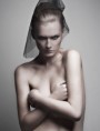
Hey Folks, I was wondering if you might give me some critique on what i should improve or take better care of on coming retouches. no need to hold back  i am fine with harsh critique. before: ![https://img57.imageshack.us/img57/4065/skin2.th.jpg]() and after ![https://img535.imageshack.us/img535/2106/skin1.th.jpg]()

Retoucher
J Strath
Posts: 928
Los Angeles, California, US
It looks great! How are you getting such an even texture and in places where there wasn't much texture? Tell meeee! XD
Retoucher
Michael Brittain
Posts: 2214
Wahiawa, Hawaii, US
One of the first things that stood out to me was that although it looks like you spent time on the entire image the area of her hand inbetween the bracelets looks like no work was put into it... which would be fine except that the rest of the image looks like a lot of work was put into it.
I hate the arm above the head for two reasons... One it looks to thick and two it doesn't have the same amount of work as the face. The same can be said about the neck it doesn't look like as much attention was given to it.
I think the eybrows ad lashes also could use more work. For my own personal taste, I'd work on softening up the bottow eye creases some. I also think the skin tone could use some work... at the smaller magnifications the patchiness stands out some.
Retoucher
J Strath
Posts: 928
Los Angeles, California, US
 I don't mind the eye creases at all. MAYBE just the top most crease on her left eye, but that's it. I think it makes the image keep some of it's natural appearance rather than being too edited. I don't mind the neck either, though I think some of those hairs should be cleaned up. Not erased completely, just cleaned up a little like the hairs on the side of her face. Those turned out really well; I think a similar treatment would work for the neck too. I guess it's all a matter of taste. I do agree about the arm though. It could use some more work. It's already pretty distracting the way it's just clunked on her head. XD So since it gets so much attention, it's pretty noticeable if it's not cohesive with the rest of the picture. Again....I LOVE THE TEXTURE! ^___^ Any tips on how to do skin?
Retoucher
Sebastian Reuter
Posts: 126
Frankfurt, Hassia, Germany
HuggleMistress wrote:
It looks great! How are you getting such an even texture and in places where there wasn't much texture? Tell meeee! XD i copied the texture from other areas of here face where it was more intact
btdsgn wrote:
One of the first things that stood out to me was that although it looks like you spent time on the entire image the area of her hand inbetween the bracelets looks like no work was put into it... which would be fine except that the rest of the image looks like a lot of work was put into it.
I hate the arm above the head for two reasons... One it looks to thick and two it doesn't have the same amount of work as the face. The same can be said about the neck it doesn't look like as much attention was given to it.
I think the eybrows ad lashes also could use more work. For my own personal taste, I'd work on softening up the bottow eye creases some. I also think the skin tone could use some work... at the smaller magnifications the patchiness stands out some. thanks a lot for the effort. highly appreciated. i did not notice myself that i actually neglegted pther areas too much giving it a closer look i can see what you pointed out.
on the arm i actually now find it amazing that i did not realize myself that its quite tick thats like ... wow  while on the neck i am not so sure as what to improve much ,since it did look quite fine to me. could you point out some parts where more editing would have been needed? while on the neck i am not so sure as what to improve much ,since it did look quite fine to me. could you point out some parts where more editing would have been needed?
the skin tone is for my website already corrected, just noticed after i merged the image for MM and was too lazy to redo the MM version. there were still some too saturated parts and it was overall too saturated for my taste. (i still need to get a better monitor, since i am not so sure if mine is really doing a good job despite calibration).
thanks again lots of usefull hints 
Retoucher
Sebastian Reuter
Posts: 126
Frankfurt, Hassia, Germany
HuggleMistress wrote:
I don't mind the eye creases at all. MAYBE just the top most crease on her left eye, but that's it. I think it makes the image keep some of it's natural appearance rather than being too edited. I don't mind the neck either, though I think some of those hairs should be cleaned up. Not erased completely, just cleaned up a little like the hairs on the side of her face. Those turned out really well; I think a similar treatment would work for the neck too. I guess it's all a matter of taste.
I do agree about the arm though. It could use some more work. It's already pretty distracting the way it's just clunked on her head. XD So since it gets so much attention, it's pretty noticeable if it's not cohesive with the rest of the picture.
Again....I LOVE THE TEXTURE! ^___^ Any tips on how to do skin? didnt see your new post before answering. if you have skype and dont mind to wait a bit i could just share my desktop with you while i am doing the recovering of the texture. (great feature, guess one of the only reasons i use skype).
the short and written version would be like in my previous post, i do copy the texture out of parts on the face with similar texture. (for examply i would fill texture on her forehead with other parts from the forehead).
the hair on the neck is another thing that could use some work i agree. thanks for the adivce
Retoucher
Solstice Retouch
Posts: 2779
New York, New York, US
What monitor are you using? Overall, and at first glance, you did fantastic. The only critique I have is on the skin tone itself on the cheek, there are many shades that need to be fixed. Some areas are over saturated and some are desaturated. It's blotchy but an easy fix The same problem is present in the arms. Another note, you neglected the whites of the eyes, even out the tone and flaws. Great work! About the eye crease debate, I don't mind them, I would potentially just remove the top crease, it will be aesthetically more balanced and still natural.
Retoucher
Sebastian Reuter
Posts: 126
Frankfurt, Hassia, Germany
Solstice Retouch wrote:
What monitor are you using? Overall, and at first glance, you did fantastic. The only critique I have is on the skin tone itself on the cheek, there are many shades that need to be fixed. Some areas are over saturated and some are desaturated. It's blotchy but an easy fix The same problem is present in the arms.
Another note, you neglected the whites of the eyes, even out the tone and flaws.
Great work! About the eye crease debate, I don't mind them, I would potentially just remove the top crease, it will be aesthetically more balanced and still natural. thanks a lot
i am using a hp w2207h. nothing fancy but as long as i am still a student i doubt that i will be able to afford something more decent. i am not doing retouching for a long so i usually was fine with the colorrange did get, it did suffice for the printwork i had do. can you give me hint on evening out the saturated and desaturated areas? do i try to mask this that back in with adjustment layers? i am a little clueless on this one.
Retoucher
Solstice Retouch
Posts: 2779
New York, New York, US
Mourn wrote:
thanks a lot
i am using a hp w2207h. nothing fancy but as long as i am still a student i doubt that i will be able to afford something more decent. i am not doing retouching for a long so i usually was fine with the colorrange did get, it did suffice for the printwork i had do. can you give me hint on evening out the saturated and desaturated areas? do i try to mask this that back in with adjustment layers? i am a little clueless on this one. Excellent!
Have you tried gradient map for skin tone? It's minor and should correct it right up
Retoucher
Sebastian Reuter
Posts: 126
Frankfurt, Hassia, Germany
Solstice Retouch wrote:
Excellent!
Have you tried gradient map for skin tone? It's minor and should correct it right up in what way would i use one ?  sorry i am a lost cause on this one, still lack a lot of the basics. sorry i am a lost cause on this one, still lack a lot of the basics.
|
 i am fine with harsh critique.

 I don't mind the eye creases at all. MAYBE just the top most crease on her left eye, but that's it. I think it makes the image keep some of it's natural appearance rather than being too edited. I don't mind the neck either, though I think some of those hairs should be cleaned up. Not erased completely, just cleaned up a little like the hairs on the side of her face. Those turned out really well; I think a similar treatment would work for the neck too. I guess it's all a matter of taste.
  The same problem is present in the arms.
  while on the neck i am not so sure as what to improve much ,since it did look quite fine to me. could you point out some parts where more editing would have been needed?
  sorry i am a lost cause on this one, still lack a lot of the basics.