|
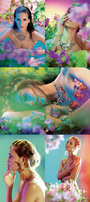
This is my latest work, I need critiques on it  what do you think? Before:  After:  By the way, model is Nicole Dawes (MM #873394), photographed by James Germain. Apr 11 10 08:47 am Link I hope you mean Latest work and not Last work! : ) Not a big fan of this one. I looked through your portfolio and this one just doesn't seem to have the flare that much of your other work does. Apr 11 10 08:52 am Link New Dawn Photography wrote: oh yeah, latest! Pardon Apr 11 10 09:03 am Link I think this is a very successful manipulation. The way you've got her in that chair is seamless! And I like the "painted" look. And wow.....that's a lot of magenta! XD I would like it more with a less monotone background, but that's just my opinion. Overall, it's pretty darn good! Apr 11 10 10:04 am Link I find there to be too much purple, not enough depth. But the actual manipulation work is flawless, good work! Apr 11 10 11:16 am Link If you add some lights, reduce the contrast, take out those distracting blacks and whites on her skin, and make it less purple on the skin, it will look fine. Also, if you add some light on the model, it will look fine. There's that lack of punch, the image looks dead to me. Apr 11 10 10:06 pm Link Are you using Gaussian blur to simulate shallow DOF? If so, try something that simulates lens blur better. Needs some bokeh glints.  http://marksweeney.blogspot.com/2009/01 … oshop.html as the luminosity in the purple background changes you should do something with the hue. Apr 12 10 09:24 am Link I quite like it, I think she goes into the chair well, but the chair itself needs more of a shadow and form as it still looks a bit pasted onto the background. Just my thoughts also if you changed the background hue a little, maybe more blue Apr 13 10 02:38 am Link Thank you to everyone, I'm going to update it with all your suggestions asap Apr 13 10 03:10 am Link I don't like that the actual model it's magenta. I think with more of a montone look it would look much better. Apr 13 10 08:16 am Link I think with some more work on the image this could turn into a nice manipulation. Right now it looks mostly painted and if i would not have seen the original image i would have guessed the whole thing is a digital painting. try to get some reality back into the girl and you are on the right way  Apr 13 10 11:30 pm Link Mourn wrote: actually the intention was to make something that could look like mostly a digital painting. there's a lot of painting in it Apr 14 10 06:22 am Link the image has naturally or you made it like this, triangular aliments. Head to two birds. Legs and head, model and birds.... but that skull completely wreaks it being straight on to the model. If I were you I'd push it out to the right so you make another triangle to the model and chair. It was the first thing I noticed and now thats all I see.... remember we view images from bottom/mid left to right and I cant get past it :-P But thats me and I love proper composition and alignments.... have a read: http://features.cgsociety.org/story_cus … 275&page=1 Apr 14 10 04:06 pm Link Ni Anluain wrote: thank you! it was a really good read! Apr 15 10 03:27 am Link |