|
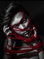
Hey you guys! I haven't asked for any critique in a while...but I feel like I've past some type of "milestone" with my last edit. I'm extremely proud with how good ((i think)) it looks. Haha, so I'd like to get the output of others to see what I could have done better and/or differently. By the way...I know the lines for the make up are really sharp....but I tried to get a really super clean look...so I thought it made for good style? So yeah....what do you guys think about that....should I still have softend the edges anyway?  May 15 10 10:30 pm Link I think I would have softened it a little, because otherwise it looks like she might not have been wearing any eyemakeup >_o  May 16 10 11:33 pm Link i think dramatic photos like this need dramatic contrast and lighting but that is just my personal preference. to be honest the makeup doesnt even look like makeup anymore as it did in the original. it looks like a polygon set to color mode and does not retain the look of makeup anymore. I would also soften the lips up some more. i realise you cleaned them up a bit already but it really needs more. I would also sharpen the hair a bit and get rid of all the specular highlights on the teeth so they dont look so wet. I would also improove the catchlights in the eyes. I would also get rid of those stray hairs either side of her head and also fix that little "bump" on her right ear. May 17 10 02:43 am Link I like the makeup but my biggest problem with it is the skin. See under the chin, the chicken neck, and on the models right hand side of her face (our left). Have ye tried a small displacement map over the makeup to get the skin texture to blend? It doesn't soften the hard edges, rather it maps it to the skin. I hope I explained that right, it sounds better in my head :-P May 17 10 02:53 am Link It might be just me, but I preferred the Before picture. The after picture looks to me like a sore thumb. It's like the first thing I saw when I looked at the After shot. Was this your intent? May 17 10 02:56 am Link Ni Anluain wrote: Haha, "Chicken neck." I agree, I should have paid more attention to the rest of the skin too. XD May 17 10 12:59 pm Link BorninSF wrote: Care to explain WHY it's a sore thumb? That would be much more helpful. May 17 10 01:01 pm Link Apart from what has been mentioned so far, I'd also suggest you get rid of some of the stray hairs on her neck as well as fixing the lightening of the crooked tooth (the viewer should also be able to view its top due to the new perspective, so you should clone some of the teeth-top over it to make it more realistic). Best regards, Jonas May 17 10 01:15 pm Link |