Forums >
Critique >
What's my weakest image? Then I'll tell you yours!

Model
Lili
Posts: 41
San Francisco, California, US
The one in the jean shorts definitely is not is solid as the rest..gorgeous portfolio otherwise:)
Model
Axioma
Posts: 6822
Antwerp, Antwerp, Belgium
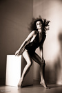
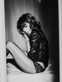
I'd say this one: ![https://modelmayhm-8.vo.llnwd.net/d1/photos/101125/23/4cef606932c6e_m.jpg]() I think because I just HATE the outfit  . Also, you're not making any effort, just sitting there and smiling. WORK woman! POSE! EMOTE! ![https://modelmayhm-8.vo.llnwd.net/d1/photos/091122/03/4b091c76355c9_m.jpg]() Because in the small version, you could pass for a 30year old. NOT good.

Model
Tara Babcock
Posts: 191
Seattle, Washington, US
Lisa Jupiter wrote:
The one in the jean shorts definitely is not is solid as the rest..gorgeous portfolio otherwise:) Thanks!
You:
![https://photos.modelmayhem.com/photos/101117/18/4ce4948fe77fa_m.jpg]()
This one just isn't as strong, interesting or sexy as your other from the same set. Both are great, though. I hope it is not real fur... :-/
Photographer
GNapp Studios
Posts: 6223
Somerville, New Jersey, US
![https://modelmayhm-8.vo.llnwd.net/d1/photos/091126/03/4b0e66de4cc66_m.jpg]() This is the only shot that doesn't show your gorgeous face and fabulous figure, but it is still interesting.

Photographer
Douglas Robert
Posts: 440
Laguna Beach, California, US
TARA BABCOCK wrote:
Why? Give details! THEN you get a critique!  your telling me something with your eyes and I like that. It seems genuine and you don't really have this expression in any other photo..
the one's laying down are just sultry and I like the outfit..its a little different than all of your other photos..
Model
Axioma
Posts: 6822
Antwerp, Antwerp, Belgium
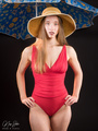
TARA BABCOCK wrote:
What could possibly be wrong with the outfit!?!? I'm sorry, a green/black striped bikini/lingerie with matching hat and scarf? What's NOT wrong with it ?
Model
Tara Babcock
Posts: 191
Seattle, Washington, US
Mini_ wrote:
I'm sorry, a green/black striped bikini/lingerie with matching hat and scarf? What's NOT wrong with it ? It's green and blue and it's underwear and then a scarf and a hat... I don't get it? Everyone else likes it! If you don't like stripes you suck! 
Photographer
Sentimental-SINtimental
Posts: 1314
Longview, Washington, US
Hey Tara, I just happened to come across this forum thread... and I would like to answer why that one picture makes you look older. The big hair is a dated look, as far as the one user saying Dolly... toally wrong. Suzanne Sommers (Three's Company) would be more fitting... and it's a 70's show. Big hair was hot back in late 70s- mid 80s. Yes I'm telling on my age. IMHO your hair looks much better when it's more straightened... like it is in rest of port. If you want to pick from my port... totally up to you... as I am just explaining. Don't have me drive up I-5... hehehe joking of course
Model
Tara Babcock
Posts: 191
Seattle, Washington, US
Douglas Robert wrote:
your telling me something with your eyes and I like that. It seems genuine and you don't really have this expression in any other photo..
the one's laying down are just sultry and I like the outfit..its a little different than all of your other photos.. Aww, thank you! I would adore working with you sometime, your stuff rocks! 
You:
It's so hard to find anything weak!
https://www.modelmayhem.com/portfolio/pic/17100548
This, I suppose. I find it weird looking from far away and when I click on it I feel it's a bit over sharpened. Still sexy!

Model
marissa charles
Posts: 2935
London, England, United Kingdom
TARA BABCOCK wrote:
I've got a little time to kill this past week. Would love to hear from you all and give it a shot with your books too! There are not any, but if I had to be ruthless, then image 4.
Nice port hun.xx
Photographer
Henri3
Posts: 7392
Minneapolis, Minnesota, US
TARA BABCOCK wrote:
What is wrong with the Barbie shot and the couple shot? I also don't see how the yellow image is detrimental because the second image isn't taking up a spot in my port. I feel that they are not identical and compliment each other well in a set... or are you saying you don't like either of them at all?
You:
Your beauty work rocks! I love it!
![https://modelmayhm-1.vo.llnwd.net/d1/photos/060908/10/45018709d6515_m.jpg]()
I don't like this because it looks a bit amateurish and the concept is lost on me. Who hasn't done the two cliches, the sexy nurse outfit and the showing the fan that's blowing the hair thing and then you put it on a plain wall. I also don't like the lighting. I gotta laugh as that blue image I'm VERY proud of...it was the 17yr old models first prof shoot, the concept was hers, and her performance, beauty& charisma simply knocked my socks off. For a new model she was unbelievably good and her range was f..kng astonishing, great in every genre we shot.
Frankly the barbie is unsettling as you're such a beauty,so it dosn't attract me and the two in yellow I assumed took up 2 slots rather a double image.... as a double shot if offers a bit of variety-yes
Photographer
Nor-Cal Fine Art Studio
Posts: 169
Walnut Creek, California, US
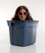
Your weakest: ![https://modelmayhm-8.vo.llnwd.net/d1/photos/081111/23/491a5e3f1f5b6_m.jpg]() because you are not the primary focus of the image. No face visible. Also the cropping of the hand with missing fingertips is awkward. OK, now it is your turn for revenge!

Photographer
Fist Full of Ish
Posts: 2301
Aiken, South Carolina, US
GNapp Studios wrote:
![https://modelmayhm-8.vo.llnwd.net/d1/photos/091126/03/4b0e66de4cc66_m.jpg]()
This is the only shot that doesn't show your gorgeous face and fabulous figure, but it is still interesting. +1

Photographer
K I S S
Posts: 178
Swansea, Wales, United Kingdom
![https://modelmayhm-8.vo.llnwd.net/d1/photos/091216/14/4b29604e882a7_m.jpg]() I like all your pics but i like the rest better than this one x

Model
lynne g
Posts: 674
Philadelphia, Pennsylvania, US
KissPhotography wrote:
![https://modelmayhm-8.vo.llnwd.net/d1/photos/091216/14/4b29604e882a7_m.jpg]()
I like all your pics but i like the rest better than this one x +1!
These are "head shots", but excess lighting blows out your face. I "get" them, in the idea that the photographer doesn't seem to think your face is as important as your body, which in truth, is awesome!!!
BUT, you've got a pretty face. You have plenty of shots which show off other assets. In a head shot, you ought to be showing your face off, so IMO, these are the least effective images bc they don't accomplish what they are supposed to.

Photographer
Shatter Leaf
Posts: 487
Houston, Texas, US
You have some fantastic work, so hard to choose. ![https://modelmayhm-8.vo.llnwd.net/d1/photos/081111/23/491a5e3f1f5b6_m.jpg]() I think this ^ is probably one of your weakest, in my opinion. As has been said above, your involvement in the image seems minimal, and a few of the details (clipped fingers, cropping) could be a little better. It's good, but it's certainly nowhere near your best. Congrats on your success as an entrepreneur, btw!
Model
Tara Babcock
Posts: 191
Seattle, Washington, US
marissa charles wrote:
There are not any, but if I had to be ruthless, then image 4.
Nice port hun.xx Thanks!
You:
![https://modelmayhm-4.vo.llnwd.net/d1/photos/101125/05/4cee631f1ab58_m.jpg]()
This one, to me, isn't as good as the other in this set you have posted!
Model
Tara Babcock
Posts: 191
Seattle, Washington, US
Nor-Cal Fine Art Studio wrote:
Your weakest:
![https://modelmayhm-8.vo.llnwd.net/d1/photos/081111/23/491a5e3f1f5b6_m.jpg]()
because you are not the primary focus of the image. No face visible. Also the cropping of the hand with missing fingertips is awkward.
OK, now it is your turn for revenge! Thanks!
You:
https://www.modelmayhem.com/portfolio/pic/17916077
I feel that this one should be more lit up on her face. If it's supposed to be a silhouette then it should be one. I feel like the body is lit up, but not the face at all. Also, the model has weird tan lines.
Model
Tara Babcock
Posts: 191
Seattle, Washington, US
KissPhotography wrote:
![https://modelmayhm-8.vo.llnwd.net/d1/photos/091216/14/4b29604e882a7_m.jpg]()
I like all your pics but i like the rest better than this one x Thanks!
You:
I like all of your work, but...
![https://modelmayhm-7.vo.llnwd.net/d1/photos/101123/15/4cec53da48fff_m.jpg]()
This, I guess. I can't tell where her hairline starts or if she has eyebrows because it's so bright.
Model
Tara Babcock
Posts: 191
Seattle, Washington, US
lynne g wrote:
+1!
These are "head shots", but excess lighting blows out your face. I "get" them, in the idea that the photographer doesn't seem to think your face is as important as your body, which in truth, is awesome!!!
BUT, you've got a pretty face. You have plenty of shots which show off other assets. In a head shot, you ought to be showing your face off, so IMO, these are the least effective images bc they don't accomplish what they are supposed to. Thanks, I like then, though. They give me a bit of a different look.
You:
Most of your work is similar in quality, but this one...
![https://photos.modelmayhem.com/photos/101125/19/4cef304f34b6a_m.jpg]()
Looks a bit cheap and at first glance I picture you with a mustache. The lighting and photography doesn't do you justice. It reminds me of when I was starting out and my photographers were mostly hobbyists.
Model
Tara Babcock
Posts: 191
Seattle, Washington, US
Shatter Leaf wrote:
You have some fantastic work, so hard to choose.
![https://modelmayhm-8.vo.llnwd.net/d1/photos/081111/23/491a5e3f1f5b6_m.jpg]()
I think this ^ is probably one of your weakest, in my opinion. As has been said above, your involvement in the image seems minimal, and a few of the details (clipped fingers, cropping) could be a little better. It's good, but it's certainly nowhere near your best.
Congrats on your success as an entrepreneur, btw! Thanks!
You:
![https://photos.modelmayhem.com/photos/100111/15/4b4bba37cb224_m.jpg]()
I just don't like something about this. Instead of capturing her beauty I feel you accentuated her freckles and over sharpened her, especially her eyes. Crop is a bit off too.
I love your other work, though! Awesome!

Model
Tatiana Paris
Posts: 1212
Los Angeles, California, US
My least fav ![https://modelmayhm-8.vo.llnwd.net/d1/photos/101125/23/4cef606932c6e_m.jpg]() Great port though!
Model
Tara Babcock
Posts: 191
Seattle, Washington, US
Tatiana Paris wrote:
My least fav ![https://modelmayhm-8.vo.llnwd.net/d1/photos/101125/23/4cef606932c6e_m.jpg]()
Great port though! Why!? You must give why!

Photographer
Cherrystone
Posts: 37171
Columbus, Ohio, US
This one. Weak/overdone photoshop, didn't take it to the degree it ought have been done IMHO. ![https://modelmayhm-8.vo.llnwd.net/d1/photos/091120/12/4b06fa296bb4a_m.jpg]()
Model
Dazey
Posts: 1039
Clearwater, Florida, US
Model
Tara Babcock
Posts: 191
Seattle, Washington, US
Cherrystone wrote:
This one. Weak/overdone photoshop, didn't take it to the degree it ought have been done IMHO.
![https://modelmayhm-8.vo.llnwd.net/d1/photos/091120/12/4b06fa296bb4a_m.jpg]() That's funny, everyone loves that one! But I agree, I did the 'shop and I know nothing about skin filters. It's definitely not overdone though. I'd never do that. I did another version that looks crisper, though! I'm working on it!
You:
https://www.modelmayhem.com/portfolio/pic/18513745
I feel this one doesn't do the model justice. I don't know much about art nudes, though. Definitely not my area of expertise. I like color! This looks like an amateur glamour pose in fine art black and white, IMO. The rest are cool!
Photographer
Cquence Photography
Posts: 155
Toronto, Ontario, Canada
The 8th Shot in your port is meh but the rest is cool
Model
Dazey
Posts: 1039
Clearwater, Florida, US
TARA BABCOCK wrote:
Thanks!
You:
![https://modelmayhm-5.vo.llnwd.net/d1/photos/100926/17/4c9fdfa9c4b3e_m.jpg]()
This is cute, but is it functional to your port as a model? Thank you for your feedback, it is appreciated... and to answer your question I do a lot of live bodypaint modeling so I think it would be fair to say it does add to my portfolio. Maybe I could add it to my profile and remove it from my portfolio... what are your thoughts on that if I may ask?? I am doing a shoot Tuesday night and plan to have 2 fresh images to add* Is there a 2nd weakest you see? If you don't care to answer further questions I do understand!!
Model
Tara Babcock
Posts: 191
Seattle, Washington, US
Cquence Photography wrote:
The 8th Shot in your port is meh but the rest is cool Thanks!
You:
![https://modelmayhm-2.vo.llnwd.net/d1/photos/100823/07/4c72848b10bb6_m.jpg]()
I don't get it... high school cutie caught off guard on her bed and the picture didn't come out well because you took it with a Polaroid? I probably just don't get it!
Model
Tara Babcock
Posts: 191
Seattle, Washington, US
Dazey wrote:
Thank you for your feedback, it is appreciated... and to answer your question I do a lot of live bodypaint modeling so I think it would be fair to say it does add to my portfolio. Maybe I could add it to my profile and remove it from my portfolio... what are your thoughts on that if I may ask?? I am doing a shoot Tuesday night and plan to have 2 fresh images to add* Is there a 2nd weakest you see? If you don't care to answer further questions I do understand!! I definitely think it would be better served on your profile, rather than your actual book. I would put it there with a caption underneath. Many people read profiles and will see it, but NO ONE seems to read the captions on the pictures in the actual book! See, I didn't know you do that!
As far as other weak images... I am super flattered you even care about my opinion, haha!
![https://modelmayhm-5.vo.llnwd.net/d1/photos/080719/12/4882159f43fc5_m.jpg]()
I really like this because it's a close up of your pretty face, but I feel the shadows are a little too strong. I wouldn't get rid of it though unless you have a stronger beauty shot or a cool headshot. Your work is cool. It's very diverse and artistic.
Model
Tara Babcock
Posts: 191
Seattle, Washington, US
What do you guys think of this image? ![https://img822.imageshack.us/img822/2766/90728319.th.jpg]() Do you think it will benefit my book?
Photographer
Phil Edelstein
Posts: 663
Las Vegas, Nevada, US
ok, although i don't usually participate in these i'm in a somewhat playful mood tonight lol: my choices are: https://www.modelmayhem.com/portfolio/pic/19653748 Just don't think this angle is very flattering compared to some of your other images. With the obviously skimpy suit top fitting you as it does, the angle it's shot at doesn't do that look justice. You are much hotter than that image allows for. and https://www.modelmayhem.com/portfolio/pic/20450890 "The best angle ever" ...cute. Just don't think the crop is very good. I know based on the point of the shot it would need to be a cropped image, for the most part. Just think it's less flattering than it could be, and that angle could be shot much better and hotter. Nothing against you on either image (more the photographer lol, just compared to your other work these don't standout as much as others you have posted (in my opinion.) Have at it, my portfolio is at your fingertips. All my best, Phil
Model
Tara Babcock
Posts: 191
Seattle, Washington, US
Phil Edelstein wrote:
ok, although i don't usually participate in these i'm in a somewhat playful mood tonight lol:
my choices are:
https://www.modelmayhem.com/portfolio/pic/19653748
Just don't think this angle is very flattering compared to some of your other images. With the obviously skimpy suit top fitting you as it does, the angle it's shot at doesn't do that look justice. You are much hotter than that image allows for.
and
https://www.modelmayhem.com/portfolio/pic/20450890
"The best angle ever" ...cute. Just don't think the crop is very good. I know based on the point of the shot it would need to be a cropped image, for the most part. Just think it's less flattering than it could be, and that angle could be shot much better and hotter.
Nothing against you on either image (more the photographer lol, just compared to your other work these don't standout as much as others you have posted (in my opinion.)
Have at it, my portfolio is at your fingertips.
All my best,
Phil Thanks! It's probably my fault on the second one, I recropped it a bit for my port... there was much too much room above my head and to my left in my opinion. I was centering my boobs while trying to get it a bit closer.
Where the hell have you been during my trips to Vegas!?!
You:
![https://modelmayhm-6.vo.llnwd.net/d1/photos/101002/10/4ca767ff2c38c_m.jpg]()
This doesn't do the model justice, IMO. Angles from the bottom aren't good for pear shaped girls like her, her legs look just too large and there are no heels or anything to compensate.
https://www.modelmayhem.com/portfolio/pic/648831
The hair is blown out so much it hurts my eyes... and there's a hair caught in that juicy butt of hers... which is where most peoples' eyes will be looking.
![https://modelmayhm-6.vo.llnwd.net/d1/photos/070412/15/461e85f058b67_m.jpg]()
This is not a good angle for this model. She looks like she's bordering on a double chin from looking down and I don't like the expression. Her bikini bottom looks like it's sagging off in the crotch and at this angle her body looks a but curve-less and boyish.
I love your work, though! Would love to collaborate. Look at these!
![https://modelmayhm-6.vo.llnwd.net/d1/photos/100909/22/4c89bcb33a215_m.jpg]()
![https://modelmayhm-6.vo.llnwd.net/d1/photos/101002/10/4ca77028235f6_m.jpg]()
![https://modelmayhm-6.vo.llnwd.net/d1/photos/060428/08/44521cb7c7657_m.jpg]()
![https://modelmayhm-6.vo.llnwd.net/d1/photos/060428/05/4451ee7db7f50_m.jpg]()
Just to point out a few I love!

Model
Vanessa Hanson
Posts: 67
Orange, California, US
worst=the one with the beanie and scarf BECAUSE the location/wardrobe looks awkward, besides that very nice portfolio!
my turn please (:
Model
Tara Babcock
Posts: 191
Seattle, Washington, US
Vanessa Hanson wrote:
worst=the one with the beanie and scarf BECAUSE the location/wardrobe looks awkward, besides that very nice portfolio!
my turn please (: Nice work! It's hard to find something to complain about!
![https://modelmayhm-7.vo.llnwd.net/d1/photos/100705/21/4c32b7d42b0e3_m.jpg]()
This image is a bit bothersome to me because I feel that the angle doesn't suit your face. Otherwise it is a very cool and sexy concept, but I feel your other B&W's are better. I wish I could see this wet concept with a different angle and expression.
Photographer
Pieter Vandeur
Posts: 1345
Brussels, Brussels, Belgium
In response to your new question: To me, the pic is an addition to your port. I even kinda like the extremely smooth finish on it. I don't like the PS-fooling around in your neck, though. For me, that's truly too artificial. Your port: I'm doubting between two images. - https://www.modelmayhem.com/portfolio/pic/12270295 : There's a colour issue with your skin here. Too yellow-ish and the combination with the colour of your lips doesn't work for me. I would like the pic very much if the colour would be a bit adapted/more natural - https://www.modelmayhem.com/portfolio/pic/20449763 : styling-wise, I think, this is slightly strange. For me, there's too much going on: you have the stripes in the bikini, the lace in the panties, the scarf, the mug.... It's a bit too much and busy for a simple guy like me... :-)
|

 . Also, you're not making any effort, just sitting there and smiling. WORK woman! POSE! EMOTE!


