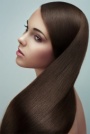
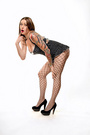
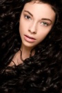
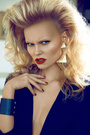
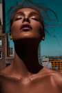
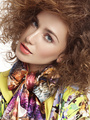
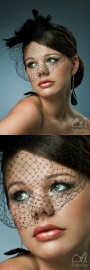
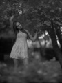
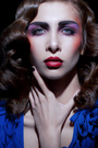
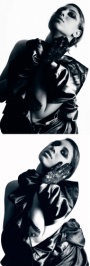
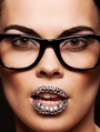
 I've been obsessing over adding a glossy effect in post lately and wanted to some feedback and am also hoping that other people have experience with this kind of processing and can give some tips. Basically it's lots of d&b to simplify the form/transitions while enhancing depth and shine followed by some gentle painting with white over the shine. Obviously this works better with the proper lighting and if the model has done something so their skin is moist. If the lighting is totally wrong and the model has dry skin, then the only way to do this would be blatantly painting in the gloss using your digital painting skills (I'm not at a level where I can do that yet). I'm aware it's not the most masculine or realistic look. It's more of a quasi-illustrative/movie poster kind of style I'd like to refine. The first time I ever saw this look was in Amy Dresser's and Jill Greenberg's portfolios. Here's one of the pages in Greenberg's work that has lots of the shiny look: http://www.manipulator.com/Commissions/ … hiny-faces. I'm not trying to copy this style exactly, but it was my inspiration for this and I'm trying to develop my own take on the kind of highlight work she does. Jill's lighting is so perfect for the glossy/shiny look. I wish I knew someone who had raw files like that I could work on or I had the proper lighting equipment to take my own. Here's a before after gif, but it's not the best to see what I've done as the raw file with default settings is fairly underexposed:  Here's the raw conversion and the retouch so you can open them both in tabs to toggle back and forth (so you can see most clearly what I did highlight-wise) Raw conversion Retouch Oh, and I stupidly can't find where I wrote down the photographer's name so I can't credit them as of yet for this. If anyone happens to recognize this image (from the challenge forum) please point me in the right direction so I don't have to go digging through like 8 pages of threads. Here's another experimental glossy (from photographer Kristina Vassilieva, model Marie-Louise. and MUA Eimear) retouch I did but it's too overdone imo:  slightly larger (bonus question: Does that look like her boob or arm in the retouch? I can't tell) Finally I even ended up trying it on one of the shots from the shoot that my avatar was taken from. Didn't quite work out. Besides the skin looking a bit like a boiled lobster, something is off about the shine in this one: http://1.bp.blogspot.com/-ptuad0v2WTQ/T … yshiny.jpg Jul 18 11 07:26 am Link wow you did a wonderful job especially on the female retouch. I love it! I myself am trying to experiment with this effect. So hopefully I can learn a lot from the responses on this thread Jul 18 11 09:49 am Link I think you've done a very good job on both, the second one is like the difference between a softbox and a silver beauty dish Jul 18 11 10:06 am Link I like that style of retouching. It seems to be quiet popular these days. I admire your work and get inspiration from you to try my self. Do you make your own decisions how to get that look or get some tips from fellows retouchers , google? To me it doesn't look like boob any more. rather a crossroad between two. It is flattened. I can only guess that nipple is down there. Excuses me being so straight forward. Jul 18 11 11:31 am Link AMAZING! In the female picture, I think it looks like her arm. https://www.modelmayhem.com/po.php?thread_id=767309 Jul 18 11 11:21 pm Link Great job! You are a master, I don't think they are overdone at all. Just a thing that distracts a bit to me is the eye brows of the female, they got too bright maybe. Jul 19 11 12:01 am Link Wow, that was way better feedback than I was expecting. Looks like I'm on the right track! nebulaoperator wrote: It was through analytical observation of the glossy look in other retouchers work (as well as just shiny skin in general) and by testing myself against some of Amy Dresser's before/afters (see this post and this post for details as to what I mean by this). I'll flatten the arm/boob so it looks more like an arm. Pari Retouch wrote: Thanks, I totally forgot to take care of those. I was either going to lighten them (or remove them) so that they look like a stylistic choice or darken them enough to look natural. Right now they're kind of in the middle which makes them distracting. Nice catch. Jul 19 11 06:05 am Link This is amazing I have been trying to create tricks to making a glossy look on skin, so far I only know how to add shine to skin. Gloss seems to be much harder to achieve for some reason and it's probably because gloss looks really smooth on skin but to keep it looking real you have to keep texture from the skin under the glossy highlights which is the real challenge  All though your image doesn't look glossy it looks more like the models are intensely moisturised glossy is more shiny with a lot less colour Still well done very inspiring I like Kristina Vassilieva image you retouched more because of the sliver hues and tones in the skin P.S THAT'S NOT THE RIGHT LINK TO THE FEMALE MODELS PROFILE LOLJul 19 11 06:08 am Link MP Retouch wrote: Thank you for links. I am considering to get this one :RetouchPRO LIVE "Pointy Man" with Amy Dresser. And for others would recommend this one if you after this kind of retouching. Jul 19 11 02:55 pm Link Your highlights look fake- there is too much color in them, watch that Mike! And I would suggest you use Color Range to fill on Normal Mode than Overlay painting- looks fake- spot on! I mean use them both, right now you seem using only or more so the latter. Study Amy Dresser's B/A- she is the best at light painting. Jul 19 11 07:01 pm Link Appreciate all the great advice. Just dumping another attempt in here. This is the image I'm using in my (incomplete atm) youtube series. I think I'm going to end up doing a walkthrough of the layers of the psds used in creating this one and then make additional tutorials based off questions in the comments. If I tried to do a walkthrough of the whole process, it would be like 7 videos (it's not really something that would work sped up - it's a bazillion tiny changes that slowly shape the final image that each need a couple sentences of explanation). It was a little trickier as the subject didn't really have any shine that I could build off of so I had to pretty much fake it completely. I find it visually appealing to look at even though the actual photo is so strange. Is it too harsh looking?  PJKRetouching wrote: Yeah, I really shouldn't have named the thread "glossy" as it's actually "shiny." Glossy is a reflection of the environment on a smooth surface. Shine is a reflection of the light source that isn't limited to smooth texture. The method I used (painting white on the highlights) actually removes some of the texture from the highlights making the subject look smoother in a way. If you'd rather have your shine razor sharp, just use the blend if sliders to bring back some of the texture. Ashish Arora wrote: Thanks, that's a really useful tip. Much appreciated. Ashish Arora wrote: I didn't do any overlay painting except for the iris. I did all the dodge and burn with curves and then I topped it off with the selective color filled with white (on normal) trick. Are you saying I should do more of the fill with white as opposed to the d&b? Jul 24 11 08:14 pm Link I look forward to the videos, I remember a thread from months ago on getting the "Jill Greenberg look" the one of the older man seems very much that style, I think you did good work on them all Jul 25 11 12:14 am Link Thank you MP for sharing such a great work with us. Tell us what was the hardest part of this retouch? Did you use a reference image while working on it? I suppose you were testing your RAM'S limits too:) Jul 25 11 01:36 am Link MP Retouch wrote: Ooh did you change the image? Jul 25 11 02:20 am Link Ledo retouch wrote: nebulaoperator wrote: Thanks. At first this retouch was an oversize to emulate her color toning so I used one of her images as my reference while I tried to match the color. Once I got the color close, then I went in and let loose, experimenting for hours trying to bring out as much depth as I could while preserving the transitions. When I was in that stage of the processing, I stopped looking at the reference and took the coloring in more of my own direction (a little more saturated and blue). nebulaoperator wrote: I actually have a pretty powerful PC, but I have a habit of duplicating the psd once I get enough layers or I decide I want to experiment with a new direction. If my adjustments then don't work out, I just close the psd and resume where I was before. Ashish Arora wrote: I think Imight have misunderstood what you were saying. By "overlay painting" did you mean d&b using an overlay 50% grey layer? I'm not sure what you mean by "change the image." Ashish Arora wrote: Your tip about the highlight needing to be less saturated really blew me away, thanks. It really improves the realism of the shine by a great deal. I also tried painting some of the background color into the shine (to see if it would look like it was reflecting the environment) but couldn't get it to look very good, so that experiment didn't succeed. Again really appreciate the feedback. Jul 25 11 06:31 pm Link MP Retouch wrote: Change as in replace the first image of the glossy male model. MP Retouch wrote: Exactly. Highlights have less saturation because they are highlights, try burning a highlight- it will appear to be more saturated (visual) MP Retouch wrote: Ooh background color? Depends what sort of environment is it. Try this, it should work for your image: Jul 26 11 03:41 am Link MP Retouch wrote: Amazing work! Jul 26 11 10:46 am Link Love the toning and depth but I'm not a big fan of the eyes, I think they don't look enough natural and to me it turns the nice guy into evil guy . Very good work still. Jul 26 11 02:08 pm Link great job with the man congrats. The girl looks little fake for my taste Jul 27 11 05:07 am Link MP Retouch wrote: Still looks like a long flattened boob. Jul 30 11 01:54 pm Link Awesome work MP. I need one and one thing only ! Can you share the technique like you did for D&B, lol Congrats, R O N... Aug 01 11 06:05 am Link Great Work!!! Im really interested in your approach to this image! Aug 03 11 12:30 pm Link very nice Aug 03 11 12:36 pm Link This processing is really nice especially the first and the third picture. Looking forward to the tutorial Aug 03 11 03:10 pm Link Ajain wrote: +1 Aug 03 11 04:20 pm Link I've started the "tutorial" which is more of a psd walkthrough. I'll later put out proper tutorials will cover specific techniques and how/when to use them. This isn't really glossy, but might as well throw this one in here as well instead of creating a new thread. This was another super-experimental retouch. I'm not really happy with the texture and the overall image in general. I just don't find it appealing. I think I just need to spend more time on the d&b phase. I was also trying to develop a hazy-yet-not-glamour-shot type of look but I think I failed. Feedback greatly appreciated!  slightly larger I put this gif together for the hell of it. When I'm "playing" in photoshop (experimental retouching), I work destructively and make lots of new psds as I go in case I want to go back. I put together this gif of some of the key points in my process for those who are curious. Most of the styling comes from the local contrast, carving, and color toning, but the longest part of the retouch is the actual "retouching" phase. Looking at this gif now it seems like I should have pulled back on the carving/color-toning/local contrast phase. That's where it starts looking over-processed.  Here's another experiment:  The only parts I really don't like about it are the way the hands are really warped/fake looking, the smoke looking a little confusing, that one distracting clump of hair, and the text on the cup that I was too lazy to paint out. If I was going to try to fake a super-wide-angle/fisheye in Photoshop again, I'd take another picture looking down at the cup/hands and then use that as the starting point for the warping. Aug 03 11 06:49 pm Link I think the blue bkgrnd is killing it a bit, but the overall image is good. I think the key for this effect is in the natural look of the image with the glossy punch and playing with the contrast . WAITING FOR THE TUT. Aug 03 11 07:49 pm Link MP Retouch wrote: Would be great if you could tell us something bout the Light, that was used to capture the raw shot.. Aug 04 11 06:26 am Link MP Retouch wrote: Try to curve a bit the smoke and the transitions are too hard in it....aaaand when you make highlights on the face, make them on the hands too, they now seem flat to me. Aug 05 11 12:58 am Link Sanonjr Photography wrote: +1 Aug 05 11 11:05 am Link I've got a couple more experiments to toss your way. The feedback I've been getting from this thread has really been helping me.  This one was an experiment with creating a really sterile, bright processing. What I don't like about what I did was the subtle difference in skin color on the legs compared to the rest of her body. Also maybe I should make her look even more colorless in general with darker black hair? Finally I just noticed the small horizontal line at the top of the image.  Thoughts on the skin here? I should have done more hair retouching - that was pure laziness, no excuses. When I'm bored I love to retouch skin so this was one of those times. I just noticed I messed up her chin. Before it was centered and after the retouch it's smaller and over to the left. This was one of Vitaly's free raws btw. Sanonjr Photography wrote: Thanks. I agree about the blue being too strong. I want to keep somewhat of a blue because I find the white/blue/tan color scheme appealing so I have to figure out a way to make it less gaudy next time. Tutorial is in progress. Turns out it's harder than I thought to explain my way through all the psds without becoming a stuttering mess. Grazian wrote: You're pretty close. It was a large shoot through umbrella (with a sheet over it for added diffusion) at a 45 degree angle from above and then a small softbox from below. Sofia Zasheva wrote: Great advice thanks. Especially about the highlights on the hands - didn't even notice. Aug 06 11 03:25 am Link Be sure to link the tutorials!!!!! so keen!! Aug 06 11 03:34 am Link great natural retouch an the lady in the second picture, like it 1st one,hair and dress looking to contrasty , their looking like "put on top" but the high key processing is really nice effect, maybe a softer edit on hair and dress Aug 06 11 04:20 am Link MP Retouch wrote: Aside from what you mentioned, I would make the shoulders closer to symmetrical. Perhaps smoothing out the curve for the shoulder on camera left. Aug 07 11 06:59 pm Link Really fantastic work, especially on the girl. Please please please give us the tutorial soon! I'm sure I'm not the only one super keen on seeing it Aug 18 11 10:43 am Link Grazian wrote: Thanks, I see what you mean. Lulie Lens wrote: Thanks for the feedback. I mentioned the fact that I'd take another shot looking down at the cup and body and composite them together. The reason I'm trying to figure out how to do this in Photoshop instead of just using a fisheye or super-wide angle lens is simple - I don't own one! If I was going to make a habit out of doing shots like this I'd invest in one, but just for the occasional gimmicy shot I'd rather do a composite in photoshop than invest the money. Aug 18 11 11:30 pm Link MP : great experimentations. I feel like everyone can learn a lot in this thread. Regarding the last three images : 1) The lightening of her eyes gives a surreal look. As if she was in trance state. But I think you did it on purpose 2) I really like it. The cheekbone looks a bit strong. 3) I like the face but not the rest of the body. The posture is strange and I feel like something is wrong with her proportions. Also you decided to remove the background, ok no problem, except that now there is something we don't know what is it under her arm. I would remove it. I find the original image difficult and I don't know if you can really get a WOW result with it. Aug 19 11 06:18 am Link MP Retouch wrote: I wanted to say something about those two that bothered me: Aug 21 11 12:15 am Link MP Retouch wrote: So where are these videos I love to check them out great work by the way.... Aug 22 11 01:32 pm Link Julian Marsalis wrote: @Julian: MPretouch's Youtube channel Aug 28 11 01:26 pm Link |


