|
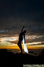
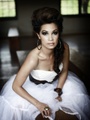
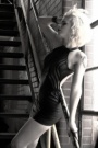
To TSchwab: these banners are the product of image retouching and layering software like photoshop. there may be site that offers drag and drop banner solutions but loading the Augie font and really getting what you want might be hard  To MM: is my entry non compliant because of the missing R? for registered trademark? Can I/should I resubmit? or will it still be judged on design as is? Mar 18 12 09:07 pm Link Mar 18 12 09:51 pm Link Mar 18 12 10:08 pm Link Mar 19 12 04:30 am Link Mar 19 12 05:51 am Link Mar 19 12 06:49 am Link Andreea Cernestean wrote: Thats badass! Mar 19 12 07:06 am Link  Mar 19 12 07:31 am Link Here's my submission  Mar 19 12 11:17 am Link Mar 19 12 11:39 am Link Mar 19 12 11:41 am Link finally!! iv always thought the model mayhem model wasn't very modelicious!! great choice! x Mar 19 12 11:42 am Link The present type face is childish to say the least. If you're not a child or a pedophile... it's hard to relate to it. Just sayin'. -JULIAN Mar 19 12 11:48 am Link Mar 19 12 11:52 am Link Mar 19 12 12:02 pm Link  Mar 19 12 01:56 pm Link  Mar 19 12 01:58 pm Link Here are mine    Mar 19 12 02:13 pm Link My favorites! In order. N I G H T V I S I O N wrote: K I S S P H O T O wrote: Matthew Lane wrote: Scrollah wrote: Also thank you to all you rebel users who did not use augie. Mar 19 12 03:11 pm Link Mar 19 12 03:55 pm Link MMbanner3.pdf Mar 19 12 05:06 pm Link Agree! Agga Design wrote: Mar 19 12 05:14 pm Link As long as you keep that horrible font, don't expect anything cutting edge or even neat!! When I saw the ad for the competition I was glad to Finally see that banner go, but seems it will only be replaced by another not-so-beautiful one. And why the strict rules regarding the placement of image and 'logo'?? There's not much left to play around or be creative with. Mar 19 12 05:22 pm Link PatelVPhotography wrote: I don't agree with you. I am Ranting here because I'm a client who Pays every month for their service- it's not for free, and I may decide to upgrade someday. So I would like to be greeted by a less-ugly banner every day. I'm not ranting as a designer who doesn't like the assignment, but a member of the community who would like to improve it. Mar 19 12 05:29 pm Link Mar 19 12 05:35 pm Link  Mar 19 12 05:37 pm Link [img]BannerSummer3.jpg[/img] Mar 19 12 05:49 pm Link entry submitted  Mar 19 12 05:49 pm Link dont like the Augie font. Its not professional enough...but...here is a version of it anyway.   Mar 19 12 06:13 pm Link Mar 19 12 07:18 pm Link  Mar 19 12 07:44 pm Link The one with the yellow crime scene tape is FAAAAABULOUS! Mar 19 12 07:47 pm Link Just strolled around and saw lots of really cool entries! It would be great if the judging committee did a change-up and allowed fonts other than Augie (stated in the rules) but that would be going against their own word, hurting the integrity of the rules (especially for folks that followed them). I've seen some great patterns, though, and lots of creativity. But...some of you entered multiple images (despite the rules saying only one per member), different sizes other than 800x100, and so on. Keep your fingers crossed that the judges will be lenient... :-) I hope they do this again next year! Mar 19 12 07:55 pm Link  Mar 19 12 07:57 pm Link Mayhem #2391462 Mar 19 12 08:17 pm Link Hedging my bets:   Mar 19 12 08:21 pm Link Mar 19 12 08:23 pm Link Mar 19 12 08:36 pm Link Mar 19 12 08:39 pm Link  Mar 19 12 08:45 pm Link |