|
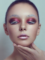
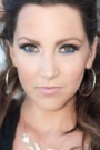
Please let me know what I did wrong with the retouching. I kinda feel the final result lacks the 'ooomph'. Top is original, bottom is retouched. Feel free to critique the photography side as well, as I am the one who took pics. #1   #2   #3   #4   May 21 12 06:02 pm Link Honestly? I think oomph necessary for a great picture goes way beyond retouching and what you have here in all aspects. Think styling, model, pose, expression, lighting, environment. I'm not sure what it is your trying to achieve with these. May 21 12 06:10 pm Link MichaelClements wrote: I rephrased my question a bit. I'm mainly asking for critique and guidance for the retouching effort. May 21 12 06:19 pm Link I'm not sure what to suggest for the first two other than that the flyaway hair could do with correction. I think the whites of the eyes are too bright as well, you could tone them down and make them a little more natural. For the third one, the face seems a little flat and some carving could help define the cheeks. Definitely work on all that wispy hair. You could also, either by RAW compositing or painting white on a soft light layer, get a little more out of those eyes since they've got light coming into them to start with. I also see some unevenness in the color on her face, mostly a little bit of pink on the nose, a shadow above the top lip (mostly noticeable on the lefthand side), and kind of orangey sploches on the left cheek and down near the jaw on the right. There's a little of that on the visible cheek temple, and that's from oversaturation. Try toning down the color with a saturation/vibrance layer by toning down the vibrance and masking it to fit the areas you need. The facial colors should also match the bust, and they don't; the face is more orange-toned, and the bust is more pinkish. Imo the pinker tone works better against the green background and the red hair, so whatever method you like for that, I think a hue/saturation adjustment layer to just move it over. (This applies to all three of them.) Hope that helps! May 22 12 11:45 pm Link Gloria Budiman wrote: I'm only offering my opinion, I'm not an expert retoucher nor claim to be. However, to a degree I see what the problem you feel is there may be. When you lit the image and/or added a little Saturation, it turned tour models skin pinkish and lit her hair on fire a lil bit May 23 12 02:34 am Link  I just backed-off on Saturation, added a lil selective Vibrance, smoothed her skin a lil, and dealt with her strays a bit. Notice the difference removing the strays made was the most dramatic, after the saturation-level in her skin being reduced? That's something to bear in mind, too. Strays  I only did a three-minute job of this in Sagelight alone, just to give you an idea of what I was saying. I only did a three-minute job of this in Sagelight alone, just to give you an idea of what I was saying. IMHO alone, as always; ~Danny http://www.dbiphotography.com/ Disclaimer: I am not an expert, nor do I claim to be. Anyone who questions the weight of my opinion(s) is free to validate my words based upon their review of my work – which may/may not be supportive. May 23 12 02:51 am Link The desaturated image makes the skin look cyan and makes her look like she has a moustache. I think the saturated version is not too bad compared to this. It is definitely a little orange in the skin though. The face is darker than the body and it's not the same color either, that's something you should come as close as you can in camera though. You can always correct the skin color with some color local adjustment with Curves (select an area and play with the different channels curves and you will see what it does) It looks like you blurred the skin to get a smooth aspect. Usually in retouching it's a no no cos you lose all the texture and it is exactly what you do not want to happen. You should look into the Dodge and Burn technique. Practice makes perfect and you will need some patience and time with this technique, but it's well worth it cos it's the way to go. There is also the split frequency technique that you can use for dealing with other problems such as zits and flying hair (youtube it, you'll see a lot of good tutorials). Inverted high pass is another commonly used technique and, if well done, helps a lot in some situation (overdo it and you get some obvious lazy shiny retouching work), again you can find info on youtube or good articles about it on Natalia Taffarel's tumblr. According to me, you also whitened the white of the eyes too much, it makes them pop weirdly. Look at pictures in great fashion magazine (or even better, people in real life) the white always a color cast in it, it's never fully white. Usually you just need to get rid of the veins if you can see them and smooth things out in the white, but you don't always need (I would say never but I am not experienced enough to be sure about that) to brighten it, it looks fake otherwise. hope that helps. May 23 12 09:08 am Link I'm not a retoucher but I liked the retouching:) Just wish she had a necklace on. Could you photoshop a necklace on her? Or something so she looks a little more styled. Maybe add something to the background to make it a bit more creative looking:) Just ideas, other than that I think the retouching is ok:) May 23 12 09:25 am Link ottoretouch wrote: That's because I only used Sagelight, which is only good for a few things and never as a final-program (IMO). I agree the skin loks lifeless and she's sporting a lil mustache there, but wtvr. That was all of 3/4 minutes (literally), and to show differences in skin-tone for comparison (as well as strays). Like I said, I'm not an expert and that was not an actual retouch May 23 12 09:56 am Link DBIphotography Toronto wrote: Maybe she wanted to have a moustache.. who knows May 24 12 06:00 am Link |


 Fyi: Picasa was my 2nd 'program' I used for retouching. Have a laugh...I used Picnik when I first began, the first 2 shoots! Lol! (Now closed-down) You need to work on your workflow overall, not your retouching techniques. Sorry, you need to turn your workflow inside-out and upside-down. Take a picture of it, run 20+ trial-runs with the same 4 photos