|
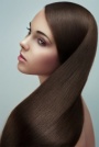
Hey All  Here's an image I recently retouched!  can I hear you guy's opinions please! also let me know if the image is better without the coloured shadows?  Thanks in advance xo Jun 09 12 04:30 pm Link some parts I like, And most I don't, skin is very smooth, but looks overcooked with lots of saturation in places that don't need it. I'm puzzled about the really hot highlight over the brow and some other spots burn. the lips and nails could use more shine, good color but they look flat. good work on eyes. but overall, there is more things to worry about before colored shadow. Jun 09 12 07:46 pm Link It seems interesting, very waxy looking especially in the hands looks like heavy use of an Inverted High Pass maybe if so dodge and burn instead. I would bring some of the original skin back I think colors are fine and maybe a tiny bit more shape with the burn. Jun 13 12 05:27 am Link The nails seem flat to me. & i prefer the one without the colored shadows. Jun 13 12 09:19 pm Link the colored shadows are totally oversaturated to the point where you can see color banding. I'd tone them down a little, and instead of having them purple like the rest of the image, make them a complimentary color. Jun 22 12 11:54 am Link I generally like it but there are a few things that are a bit extreme, people seemed to have touched on them already. The lines above the eyebrows are way to strong, she looks like she is furrowing. The highlights on the face, while they look really nice and smooth, are way brighter than the nightlights on her hands and lips, so that should be more consistent. You can even fix that with a dodge brush to the lips and hands set really low. The nails and lips look really flat. I would take your dodge and burn brush on a separate Luminosity layer and try to add some 3d to them. I like the skin, it looks very nice. Overall, pretty solid job sir. Jul 25 12 01:25 pm Link Too much highlight above the right eyebrow. Left eye lashes seem like they have a loss of detail compared to the right side lashes. Nails look flat. I think these are small edits...the image is great otherwise! Sep 04 12 11:02 am Link very good job, i only see that in the dark areas need more strength, in your carving remark the dark parts to gain more volume and visual appeal, however, i repeat you, is a good job i like it... only the darks in the carving because looks a little flat Oct 18 12 04:17 am Link ChelleyCredible wrote: I would agree. The nails look a bit flat here (and some of the highlights are a little blown out in my opinion). Oct 21 12 10:36 pm Link |