|
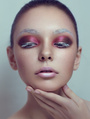
ok gimme your .2cents or your 100 dollar critique, I am all ears.. eyes.  Jul 02 12 06:23 pm Link its good Jul 03 12 12:06 am Link Koray wrote: Thanks, I'll consider you the voice of God from now on. Jul 03 12 03:22 pm Link truly looks solid...better than I could do to be honest, I love how deliberate it looks and obviously intentional to leave wild hairs and such even how specific you were to leave the shadow from the bow on her shoulder... but speaking of shadows and black point, where is it... it looks fine but tons of light was thrown at her there is very minimal light ratio here... Im not sure what it is but her right side eye (furthest away) looks odd or something maybe its how its catching the light Jul 04 12 07:28 am Link bobbydolan wrote: yup, I looked at what you said, I reckon it's too cyan compared to the other side that is more red. Let's see if it get better nudging it a tad. Jul 04 12 08:09 pm Link A bit comic-book styled for my taste, but overall it's very good. I like the way you kept all the detail, including freckles on her shoulders.  Thumbs up! Jul 26 12 04:01 pm Link I love it. Great work with the lights and shadows on the face. I think the rest of the body seems a little bit flat compare to the face. Jul 26 12 08:35 pm Link Really nice work. I think the redness in the forhead is a bit too extreme though. did it end up looking that way after a curve adjustment or was it always like that? Looks a bit unnatural. I'd just do a quick selective color mask on the cheek and forhead and remove some magenta, but not too much so as to keep the nice contrast it presents next to the highlights. Jul 27 12 12:22 am Link I love this photo and your work on it. The photo looks familiar but I can not place it, where did you get the original if I may ask? Thanks. Jul 27 12 03:47 am Link I like everything about it except the skin which has a little too much detail repetition, especially around the left eye. Jul 27 12 09:24 am Link I like it all apart from the wrinkles just along the arm in the shadow area. Otherwise looks great to me. Jul 30 12 02:37 pm Link The neck area...towards the ear....seems discolored. Not evenly colored and the texture isn't consistent in that area. The highlight spot on the shoulder looks awkward and also the uneven shadow on the left side of the arm going down. Other than that, it's a pretty decent image! Sep 04 12 10:46 am Link |