|
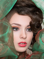
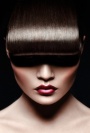
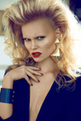
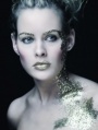
I have an image(1) that I recently retouched and I need your sincere critiques on my work. I was wondering how I can transition of what I have into image(2). Can anyone what techniques it was used to create this beautiful glossy retouch? I have tried many ways but I just don't know how it is done. Anyone? Thanks! image 1:  image 2:  Jul 19 12 09:44 pm Link I just did a quick test and if you use the blue channel to create a lights luminosity mask 6 times it gives you a nice base which you can fill with white or use curves or whatever. you still will have to mask some parts of it but atleast it grabs the natural lights. if you dont know what a luminosity mask lights x 6 is read here: http://goodlight.us/writing/luminositym … sks-1.html Jul 20 12 01:26 am Link I would argue that both images look they have been band-stopped to within an inch of their lives. The second image has many dissimilarities to your image, the magenta/rose tone is different to your more yellow base and there are a couple more marked differences. But the skin is not so different, both heavy handed. I would advise a more discreet use of bandstop and more reliance of d&b. If anything I prefer the skin work on the first image, perhaps that just personal taste. Jul 20 12 02:48 pm Link You should be able to achieve this using frequency Separation. There are some fantastic tutorials if you google it. It's a pretty fantastic foolproof method for retouching. Update: Once your finished editing your image, to acheive that really soft look on the contour of her face without dulling the contrast, Create a new layer, fill it with white and set the opacity to about 17-21 percent. Then take your eraser with a very soft brush at about 40 percent and gently restore her eyes, lips, and lightly brush over shadows. That should pretty much give you that effect. Jul 23 12 10:02 pm Link PhotoVision wrote: Please keep posting things... find you really amusing!!! Are you really serious?? Jul 31 12 02:26 am Link I have to agree that the skin work on your image doesn't necessarily differ far from the image that you want to achieve. It's mostly just color differences. However, and I want to be honest and and give only constructive criticism, but I don't really like the treatment of the skin on either image and don't think it's something you should be pursuing to achieve. It's not really "high-end" quality and I would suggest further exploration into tutorials etc. that might get you a better and more sought after end result. Practice makes perfect. Aug 01 12 12:27 am Link Thank you for all your inputs. I am here to learn from you guys. I have done many after this post and I would like to show you if I am getting any closer to IMAGE2 that I had posted at the top of this post. It seems like the look that everyone is going for and it is the look that I truly admire.     I know that I am not there yet but some critiques on them will further my improvements. I do not get inputs from photographers after I posted them and therefore it is hard for me to figure out if my images are done according to MODELMAYHEM's professional standards. Thanks guys! Aug 02 12 08:46 am Link First of all the last image looks really bad right now so either keep working on it or just dump it, trust me. And in terms of shine and skin work you are not really there yet. I see you are improving but to be successful you need to tone down your smoothing and spend more time with dodge and burn and carving. Aug 02 12 09:53 am Link tvandang retouching wrote: Out of curiosity who is everyone? Model Mayhem? Aug 02 12 10:09 am Link Koray, D&B, how much is enough, i guess:-) perhaps I don't have a trained eye to notice that my retouched photo wasn't done enough D&B. ZOOMING, looking at pixels, making them lighter or darker, developing smooth transitions between skin tones, and I guess I still don't get it yet:-( oh, carving. I think that is the hardest for me. Just the understanding of the human body curves and lightening. I guess I will keep working on it... Thanks! Aug 02 12 11:21 am Link the main problem that I see is that you are smoothing the tones too much which makes you loose contours and shape. you may want to watch this: http://www.youtube.com/watch?v=RM0byiIc … plpp_video Aug 02 12 12:26 pm Link AYC Photo wrote: Exactly what I was thinking. Aug 02 12 01:17 pm Link 23rdmarch Retouch wrote: not everybody likes your type of retouching either. Aug 02 12 03:42 pm Link Koray wrote: I'm well aware of that (well, otherwise this thread wouldn't ever started, right?). Aug 02 12 11:22 pm Link Have you tried the oil trick or moisturizer trick? Have the model rub a little bit of veg. oil or moisturizer on her skin and make sure it is rub in real well and it will give the skin a nice shine but not that wet look you get if it isn't rub in as well. Of course this is an "in-camera" effect, not post, but you won't have to worry about it then, just smooth the skin. My 2cents Aug 02 12 11:40 pm Link Thomas Sellberg wrote: I bet the MUA loves that. Aug 03 12 03:59 am Link I try to update my work as I go to see if I improve giving you guys advices. Here is another one:  Looking through the forum, having many retouchers posting their works, one photographer would praise the work and the other would hate it. This is what I am so confused about it. There is no consistency of techniques among photographers. It is very hard for me to determine which is the best, generally accepted techniques out there. Many would say that it all depends on the client's preferences. I am doing this just for fun and criticism on my works are just positive to me. --------------------------------------------------------------------------------- Koray, I thought contour(highlights) is done by brushing it using dodge or burn tool or whatever techniques you would use to create a 3D dimension of the model? Some retouchers are very creative with adding contour to a model that does not have any dimensions. Aug 03 12 08:46 am Link here is a good thread about carving: https://www.modelmayhem.com/po.php?thread_id=808677 Aug 03 12 09:08 am Link Thanks! I will continue to post my images just to get more criticism from you guys. I really appreciate you guys inputs.  Aug 07 12 05:16 pm Link My try on PWL(paint with lights):-)    Aug 08 12 07:39 pm Link It is quiet evident that you have blurred the low pass layer, I would suggest to d&b rather than blurring in LP. It is time consuming but definitely worth it. Aug 09 12 02:09 am Link Try one image just D&B. Spend days on it...don't look at your old retouched one's.... then have a fresh look at it ...you will be surprised... Aug 09 12 03:11 pm Link dp Aug 09 12 03:11 pm Link dp... sorry browser playing tricks on me Aug 09 12 03:11 pm Link Thanks guys:-) One day it will click in my brain with D&B but not yet...   Aug 09 12 09:56 pm Link what youre doing is tooo much. try taking one of ur edited photos and layer over top of the original, turn the opacity down to about 48%. I think it'll look "better". Aug 11 12 03:49 pm Link Kristofer J Lloyd, I will keep that in mind. Thanks!  Aug 12 12 11:11 pm Link it look to plastic , looks like u just pasting poors all over the image and then overdoing the highpass+ bluring,ivert tech Aug 15 12 09:44 am Link reswelz123: pasting poors? i am confused. you have to tell me how your 2 profile images below are so different than mine and my previous is just bad looking and you might be right. i will absorb your advice. Mr Koray told me just just to do a lot of D&B. still trying to perfect that technique. it is not easy to me and i don't have a lot of patience at all. reswelz123 profile images:   my new retouch:  Aug 15 12 07:13 pm Link your new one is way better than the others...you are getting there  Aug 16 12 04:13 am Link Thanks, Koray.   Aug 16 12 09:54 pm Link Another one...   Aug 17 12 08:17 pm Link Most of the retouched images show way too much use of the IHP technique. It's fine in moderation to unify some tones, but in a heavy handed way it makes skin look like sandblasted stone. I would use it more subtlety and rely more on d&b. The image 2 above is probably the most pleasing so far. Aug 18 12 05:12 am Link thank you Mike.   Aug 19 12 12:21 am Link My progression...   Aug 21 12 10:50 pm Link tvandang retouching wrote: getting better...dont forget the eyes and nails and overall color. Aug 22 12 03:47 am Link HAHAHA thanks for posting ,why u get mad it was u asking for advice what u want ppl to lie and tell u that techniek is good ,that image u post of me i did it with the same techniek u doing and the other with strikeforce and i never say they was wright , i just saying try to d&b more and just try to even out skin tones cause u not doing that at all read this my help u from natalia taffarel http://nataliataffarel.tumblr.com/post/ … -high-pass for now im just doing photos effects http://alltypeseffect.wordpress.com/ Aug 22 12 05:25 pm Link My progression...  Aug 24 12 10:47 pm Link The 4th image above me...of the armpit is really distracting me. What's up with it? I'm not an expert but I think you got some pretty decent work. Sep 04 12 10:28 am Link Thanks. I will take decent works as a worthy compliment. Here are my recent ones:         Sep 05 12 04:34 pm Link |