Photographer
T I A R A
Posts: 63
Cairns, Queensland, Australia
Would love some feedback on my top row of images.
Please let me know what you think.
Thanks

Photographer
The Gross Bite
Posts: 3966
Lansing, Michigan, US
Collages... I'm not a fan of collages. Your collages are weird!
Just my opinion.
Photographer
T I A R A
Posts: 63
Cairns, Queensland, Australia
The Effective Image wrote:
Collages... I'm not a fan of collages. Your collages are weird!
Just my opinion. Could you tell me why? So that I can improve?
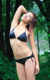
This is my favorite of your images:
![https://photos.modelmayhem.com/photos/110721/16/4e28b245d1d62_m.jpg]()
Photographer
The Gross Bite
Posts: 3966
Lansing, Michigan, US
IMHO, collages 'dilute' strong images and don't help weak ones at all.
Your collages are 'weird' in that you make up collages of collages, and the images are not even remotely 'similar'.
Oops... my mistake some of what I thought were 'collages' are really separate images that just had no text between them. Now that they have a few view counts, I see that they are really separate images. Anyway, you still have collages...
Ya gotta be B R U T A L in posting only the best of your images. Putting together collages get's you more 'image space' but no one is going to hire you because you saved a few bucks by not upgrading to more image slots: they hire you because your images are good! And 15 'good' images will beat 100 'so-so' images any day.
As is oft remarked in these forums... pick the best (shot from a shoot) and dump the rest.
Don't know which is the best? Better start learning what is a 'good' image and what is a 'so-so' image. It's part of the job.
Just my opinion.
Photographer
dd photography
Posts: 944
San Diego, California, US
Not nearly as good as your row 3.
DD

Photographer
Paul Tirado Photography
Posts: 4363
New York, New York, US
dd photography wrote:
Not nearly as good as your row 3.
DD +1
Photographer
Encaptured Perfection
Posts: 223
Saint Catharines-Niagara, Ontario, Canada
The Effective Image wrote:
IMHO, collages 'dilute' strong images and don't help weak ones at all. While i generally agree with this, I dont think this applies to most people's opinion of collages...while a good eye can tell when a bad image is masked within a collage, i find from viewcount and number of comments on some collages online that a great collage can deceive most people's eyes all the time! I have seen multiple collages of images that wont make it as a single picture - but as a visual assault it did have an impact. A photog that can't seem to frame a great picture by itself puts together foot, waist, boobs, lips, covered hair into a collage and suddenly it looks pretty artistic.
Photographer
Encaptured Perfection
Posts: 223
Saint Catharines-Niagara, Ontario, Canada
OP i agree with the other 2 posters..your 3rd row images are really strong compared to the top row.
Model
Cole Morrison
Posts: 3958
Portland, Oregon, US
The images are flat and could use some editing, and the framing is a bit tight on a couple. The styling is just atrocious but that is not your fault.
You have better images than these.
Photographer
T I A R A
Posts: 63
Cairns, Queensland, Australia
The Effective Image wrote:
IMHO, collages 'dilute' strong images and don't help weak ones at all.
Your collages are 'weird' in that you make up collages of collages, and the images are not even remotely 'similar'.
Oops... my mistake some of what I thought were 'collages' are really separate images that just had no text between them. Now that they have a few view counts, I see that they are really separate images. Anyway, you still have collages...
Ya gotta be B R U T A L in posting only the best of your images. Putting together collages get's you more 'image space' but no one is going to hire you because you saved a few bucks by not upgrading to more image slots: they hire you because your images are good! And 15 'good' images will beat 100 'so-so' images any day.
As is oft remarked in these forums... pick the best (shot from a shoot) and dump the rest.
Don't know which is the best? Better start learning what is a 'good' image and what is a 'so-so' image. It's part of the job.
Just my opinion. Thanks! That helps a lot. I guess I've got some culling to do!
Photographer
T I A R A
Posts: 63
Cairns, Queensland, Australia
Encaptured Perfection wrote:
While i generally agree with this, I dont think this applies to most people's opinion of collages...while a good eye can tell when a bad image is masked within a collage, i find from viewcount and number of comments on some collages online that a great collage can deceive most people's eyes all the time! I have seen multiple collages of images that wont make it as a single picture - but as a visual assault it did have an impact. A photog that can't seem to frame a great picture by itself puts together foot, waist, boobs, lips, covered hair into a collage and suddenly it looks pretty artistic. You have a point but I think you're right in saying that it looks like I'm trying to disguise a shitty image. Kinda like some photogs do with black and white.
I think maybe I should start being more ruthless with what images I post.
Thanks so much for all the helpful advice. 
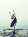
![https://photos.modelmayhem.com/photos/120925/17/50624febefc8b_m.jpg]()
This is your best IMO
Photographer
T I A R A
Posts: 63
Cairns, Queensland, Australia
Cole Morrison wrote:
The images are flat and could use some editing, and the framing is a bit tight on a couple. The styling is just atrocious but that is not your fault.
You have better images than these. I really like your avatar. Or this one:
Encaptured Perfection wrote:
OP i agree with the other 2 posters..your 3rd row images are really strong compared to the top row. Thanks for the constructive criticism. Very helpful.

Photographer
Michael Broughton
Posts: 2288
Winnipeg, Manitoba, Canada
i prefer your bottom. 
Photographer
T I A R A
Posts: 63
Cairns, Queensland, Australia
dd photography wrote:
Not nearly as good as your row 3.
DD Found it super hard to pick your best as there were so many great shots but this one stood out to me!
Photographer
T I A R A
Posts: 63
Cairns, Queensland, Australia
Paul Tirado Photography wrote:
+1 Pick of the litter!
Photographer
T I A R A
Posts: 63
Cairns, Queensland, Australia
Michael Broughton wrote:
i prefer your bottom. Thanks.
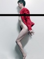
Your best:
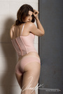
![https://photos.modelmayhem.com/photos/120122/23/4f1d08417103a_m.jpg]()
Photographer
Encaptured Perfection
Posts: 223
Saint Catharines-Niagara, Ontario, Canada
Tiara Seccombe wrote:
You have a point but I think you're right in saying that it looks like I'm trying to disguise a shitty image. Kinda like some photogs do with black and white.
I think maybe I should start being more ruthless with what images I post.
Thanks so much for all the helpful advice.
![https://photos.modelmayhem.com/photos/120925/17/50624febefc8b_m.jpg]()
This is your best IMO Thanks. And just to clarify, I was responding to the other photog. Personally, while i think some people do collages to hide bad apples, i think yours are not.
- The black and white expression ones is very well done, and if it was hung in a gallery - would have been done in collages of canvases too! Each individual ones stands by its own.
- Looks to me that your 3 horizontal collages is done because of MM's limitation for horizontal images. They all can stand by themselves.
I am not bothered by your particular use of collages. By the way, good culling :p.
Photographer
T I A R A
Posts: 63
Cairns, Queensland, Australia
Encaptured Perfection wrote:
Thanks. And just to clarify, I was responding to the other photog. Personally, while i think some people do collages to hide bad apples, i think yours are not.
- The black and white expression ones is very well done, and if it was hung in a gallery - would have been done in collages of canvases too! Each individual ones stands by its own.
- Looks to me that your 3 horizontal collages is done because of MM's limitation for horizontal images. They all can stand by themselves.
I am not bothered by your particular use of collages. By the way, good culling :p. Thanks. I just got rid of anything that wasn't commented on or listed.
Happy Shooting! Keep up your fantastic work.

Photographer
Lee_Photography
Posts: 9863
Minneapolis, Minnesota, US
A look at row 1
Photo 4
Details
Bet in the last group of photos you could have moved the camera to get rid of power pole
Middle photo rocks
Photo 3
Camera angle quite low
Glare is washing out contrast
Missing hands
Move model to photo left a bit, so there is more space in front of her
Photo 2
Give me all of the hands in photo 7 best of the group
Photo 1
Eyes appear to not be in sharp focus
Hair seems washed out from glare
Raise camera to eye level
Posing think dynamic, try not to face head and shoulders in same direction
Long fingers
Arch back
Glare is a fad, why waste your money on a quality camera and lenses
Photographer
T I A R A
Posts: 63
Cairns, Queensland, Australia
Lee_Photography wrote:
A look at row 1
Photo 4
Details
Bet in the last group of photos you could have moved the camera to get rid of power pole
Middle photo rocks
Photo 3
Camera angle quite low
Glare is washing out contrast
Missing hands
Move model to photo left a bit, so there is more space in front of her
Photo 2
Give me all of the hands in photo 7 best of the group
Photo 1
Eyes appear to not be in sharp focus
Hair seems washed out from glare
Raise camera to eye level
Posing think dynamic, try not to face head and shoulders in same direction
Long fingers
Arch back
Glare is a fad, why waste your money on a quality camera and lenses Thanks for the advice.
These weren't the ones I was talking about (I deleted them) but appreciate the feedback regardless! I'll definitely take your advice!
Happy Shooting!
Your best:
![https://photos.modelmayhem.com/photos/100611/07/4c1241da48f6e_m.jpg]()
Photographer
William Kious
Posts: 8842
Delphos, Ohio, US
The collage in the first row really doesn't make a lot of sense. There's no cohesive "theme". It's like you couldn't decide which image you liked best, so you threw them together.
The outdoor shots, well, I'm distracted by the completely blown-out sky. It works to an extent with the shot in the field, but the rest... it seems you don't know how to achieve a balanced exposure in harsh lighting conditions.

Photographer
Karl Ray
Posts: 494
Chicago, Illinois, US

Photographer
Mark
Posts: 2977
New York, New York, US
Man that is one bad row of pics. Almost all the pics in the collage are bad by themselves but by lumping them together the collage may be better than its parts.
Really think the styling on the bkini vest girl is bad, and I see zero story going on just a girl stuck in the desert, the 2nd pic is very bland to.
What are you thinking - you like them? why?
Photographer
T I A R A
Posts: 63
Cairns, Queensland, Australia
Mark wrote:
Man that is one bad row of pics. Almost all the pics in the collage are bad by themselves but by lumping them together the collage may be better than its parts.
Really think the styling on the bkini vest girl is bad, and I see zero story going on just a girl stuck in the desert, the 2nd pic is very bland to.
What are you thinking - you like them? why? Would you mind providing some constructive criticism that I can actually use? Instead of just being an asshole?

Photographer
Jhono Bashian
Posts: 2464
Cleveland, Ohio, US
The Effective Image wrote:
Collages... I'm not a fan of collages. I also agree. why collages? can't you pick just one shot or do you need to see 9??

Photographer
J E W E T T
Posts: 2545
al-Marsā, Tunis, Tunisia
Some really good work there, just stick with single images.
Ignore the jerks.
Avoid cliche'd expressions.

Photographer
GMM Photography
Posts: 269
NORTH HOLLYWOOD, California, US
Image 1
Dispite the popular consensus of people not liking collages, I think this is a good concept and well executed. Being able to show the models range of expresions and emotions is well done. It could be the laptop that I am on atm, but the photo quality seems to be off just a little. Personally I feel an image like this is better suited for the models portfolio, picking the best image and using that one in yours.
Image 2
I am not a fan of blown out highlights or over exposed images. The model looks as though she is completely not comortable having her photo taken. This location and model had so much potential but poorly executed. Once again the image quality is poor. This is probably the one image in your port that probably should not be there.
Image 3
This one I am on the fence about. As stated before I am ok with collages, but perhaps this would have been better if it showed some sort of storyline. I love the image in the middle but it just doesn't fit with the other two. I would suggest that you do some research on triptych to understand the flow that can be created when doing this type of post work. Once again the highlights are blown out. You might want to concider changing the time of day that you shoot and avoid the midday sun.
Image 4
This image is so simlar to 3 that the above critique applies to this one as well. The left side, watch your cropping. Its better to capture the model without missing appendages and crop later. The right side is just somewhat bland. The pose is not interesting and once again this has so much potential but it falls flat.
In my opinion your on the right track but first and foremost you need to understand how light works and what you can and cannot get away with. Do lots of experimenting, do some research, there is so much information out there that will help you.
Photographer
Mark
Posts: 2977
New York, New York, US
Tiara Seccombe wrote:
Would you mind providing some constructive criticism that I can actually use? Instead of just being an asshole? Your work just brings it out in me I guess- but open your eyes- I mentioned bad styling and no story- thats' constructive criticism. And you never said why you like them as I asked
Photographer
William Kious
Posts: 8842
Delphos, Ohio, US
Haven't you already asked about these?
Photographer
T I A R A
Posts: 63
Cairns, Queensland, Australia
J E W E T T wrote:
Some really good work there, just stick with single images.
Ignore the jerks.
Avoid cliche'd expressions. Thanks.
Yeah I guess collages are not that great.
Photographer
T I A R A
Posts: 63
Cairns, Queensland, Australia
GMM Photography wrote:
Image 1
Dispite the popular consensus of people not liking collages, I think this is a good concept and well executed. Being able to show the models range of expresions and emotions is well done. It could be the laptop that I am on atm, but the photo quality seems to be off just a little. Personally I feel an image like this is better suited for the models portfolio, picking the best image and using that one in yours.
Image 2
I am not a fan of blown out highlights or over exposed images. The model looks as though she is completely not comortable having her photo taken. This location and model had so much potential but poorly executed. Once again the image quality is poor. This is probably the one image in your port that probably should not be there.
Image 3
This one I am on the fence about. As stated before I am ok with collages, but perhaps this would have been better if it showed some sort of storyline. I love the image in the middle but it just doesn't fit with the other two. I would suggest that you do some research on triptych to understand the flow that can be created when doing this type of post work. Once again the highlights are blown out. You might want to concider changing the time of day that you shoot and avoid the midday sun.
Image 4
This image is so simlar to 3 that the above critique applies to this one as well. The left side, watch your cropping. Its better to capture the model without missing appendages and crop later. The right side is just somewhat bland. The pose is not interesting and once again this has so much potential but it falls flat.
In my opinion your on the right track but first and foremost you need to understand how light works and what you can and cannot get away with. Do lots of experimenting, do some research, there is so much information out there that will help you. Thank you for the really helpful advice. Now this is something I can actually use!
Photographer
T I A R A
Posts: 63
Cairns, Queensland, Australia
Mark wrote:
Your work just brings it out in me I guess- but open your eyes- I mentioned bad styling and no story- thats' constructive criticism. And you never said why you like them as I asked Again, I asked for constructive criticism on MY work and if you look, you can see that I am a photographer, not a stylist.
The story, well you made your point on that one, but why waste both our time with all your other comments that are in no way useful or helpful.
Photographer
T I A R A
Posts: 63
Cairns, Queensland, Australia
William Kious wrote:
Haven't you already asked about these? No. This is the first and only forum I have started.
|