|
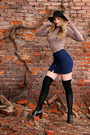
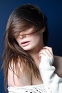
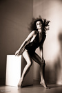
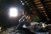
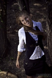
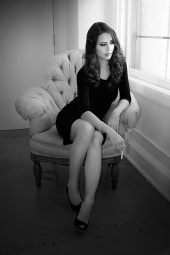
I agree with brother Philipp-T, If I had to pick one I'd say the red dress, pose seems awkward. Not comfortable. Jan 17 13 11:16 pm Link Mar 14 13 05:13 am Link Nadia Selen wrote: Oops, clicked the wrong button above. Mar 14 13 02:24 pm Link Bump... May 29 13 05:59 am Link *Commented on my favorite Worst:  Not a good angle, outfit, expression or pose. May 29 13 07:25 am Link I love your work! But this is my least favorite...  Something about her expression I dislike. Maybe its the squinty eyes? I dunno. I also really dislike how the bottom 4th of the image is darker than the rest. May 29 13 01:02 pm Link winking_wonder wrote: Thanks! May 29 13 05:17 pm Link -Ellie- wrote: Okay, thanks! May 29 13 08:10 pm Link Not a big fan of keeping holiday season pics. They always look out of place in July... Dec 17 13 03:17 pm Link I like your portfolio, but if I have to pick one, I would say this is my least favorite among all:  Dec 18 13 09:02 am Link  Dec 18 13 09:37 am Link Worst:  Dec 18 13 11:22 pm Link Cecilia Or wrote: Tough to pick just one but this is my favorite: Dec 19 13 03:34 pm Link Jorge Kreimer wrote: I tried to list this one but it was already on my list from a long time ago. Dec 19 13 03:38 pm Link Good to see you back in the forums. It's been a while. There are no weak photos in your portfolio (which is probably why you're getting so many different responses.) Your work is extremely consistent. If I had to remove one, it would be this one. I like the model, the colors and the textures. The photo didn't grab me at thumbnail size, but it looks much better at full size. 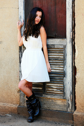 The reason I selected this one is the wardrobe. The white dress (which is borderline blown out in some areas) is billowing out, and this makes the model look wider/heavier. Plus, between the boots and the length of the dress, a very short length of the model's legs is showing, which makes her look shorter overall. I listed this one. In fact I created a new list for it.  Dec 20 13 07:26 am Link My least favorite is this one: https://www.modelmayhem.com/portfolio/pic/33516380 It's not a bad shot by any means--decent glamour head shot in fact--but the genre doesn't really fit with the rest of your port. You are a master of model-in-the-environment and this one is just out of character. I think if she had a different expression that better engaged the viewer, it would be much stronger. Dec 20 13 07:46 am Link Yurlet Photography wrote: Thanks! Dec 21 13 06:12 am Link Camerosity wrote: THANKS! Dec 21 13 06:19 pm Link This one drags your port down  The focus is awkward and so is her expression. The harsh lighting doesn't help either. Dec 21 13 06:27 pm Link Dec 21 13 06:27 pm Link SEI Photos wrote: Thanks for the feedback. Dec 22 13 07:03 am Link Marciano wrote: Thanks. I like this one: Dec 24 13 02:33 pm Link Personal Photograph wrote: Thanks! Love this one: Dec 28 13 03:41 am Link  You have a great portfolio so it was hard to choose, but I have to go with this one. Something about the lighting just really turns me off it Dec 28 13 04:45 am Link Forty-Six and 2 wrote: Thanks! Jan 01 14 06:32 am Link I like the interesting locations in your port. Some great poses too. For me this is the only bad one: It's not a good expression. Jan 01 14 07:34 am Link Dave McDermott wrote: Thanks! I get mixed feedback on that pic. Seems like the opinions are either love or hate... Jan 04 14 07:51 am Link You have a great portfolio, so this wasn't easy!! I'd say this one is my least favourite: https://www.modelmayhem.com/portfolio/pic/34152254 Nothing wrong with the shot itself, but the dress may be a bit too long and covering too much of the model's legs so she looks a bit short. I commented on my fave one Jan 04 14 10:03 am Link Hit me Jan 04 14 02:04 pm Link Sandra Valero wrote: Thanks for the input. Jan 05 14 07:11 am Link Like others have said, no really weak images. This one, I don't like the way the model is kind of hunched forward at the shoulders.  Jan 05 14 08:12 am Link you have amazing port! i like it a lot! especially 2013 this one is very artificial, don't like this facial expression Jan 05 14 01:28 pm Link Alex Oquendo wrote: Sorry, I'm getting an error message on your link. Jan 12 14 04:37 am Link I don't really see a a weakest, the 14 you have are quite comparable as a portfolio. Jan 12 14 04:45 am Link Solid port, although this one seems a little out of place. Looks more like a senior portrait...but a good one. Cheers Jan 12 14 08:51 am Link Jan 12 14 08:52 am Link All Yours Photography wrote: Thanks for the input. Jan 14 14 04:34 am Link May_Bee wrote: Appreciate the feedback. Jan 14 14 04:36 am Link Axioma wrote: Thanks. Jan 14 14 04:39 am Link Keith Aleksoff wrote: I like several. This one especially: Jan 15 14 03:55 pm Link |