
Photographer
255 West
Posts: 6468
New York, New York, US
You have WAY too many photos.
I often suggest, to models or photographers, to have no more than 20 to 30 photos.
Cut it down to about 40, THEN ask which should go.

Photographer
Orca Bay Images
Posts: 33877
Arcata, California, US
255 West wrote:
You have WAY too many photos.
I often suggest, to models or photographers, to have no more than 20 to 30 photos.
Cut it down to about 40, THEN ask which should go. Yep.

Photographer
EAS PHOTOGRAPHY
Posts: 118
Boston, Massachusetts, US
Okay, thanks, lets see how this goes

Photographer
Lee_Photography
Posts: 9863
Minneapolis, Minnesota, US
As you state in your profile time is money, save us all some time by deleting the photos you know are your weakest first
Photographer
EAS PHOTOGRAPHY
Posts: 118
Boston, Massachusetts, US
I've brought it down from 120 to 98.
I have 5 galleries, the one with the most has 30 images,
Maybe i should have asked which images in "specific" galleries should i
take down??
Photographer
255 West
Posts: 6468
New York, New York, US
EAS PHOTOGRAPHY wrote:
I've brought it down from 120 to 98.
I have 5 galleries, the one with the most has 30 images,
Maybe i should have asked which images in "specific" galleries should i
take down?? Think, if you had to run for your life from a burning building, which thirty photos would you save. (Forget about what to eliminate, it may be easier to concentrate on what to KEEP.)
Photographer
EAS PHOTOGRAPHY
Posts: 118
Boston, Massachusetts, US
255 West wrote:
Think, if you had to run for your life from a burning building, which thirty photos would you save. (Forget about what to eliminate, it may be easier to concentrate on what to KEEP.) LOL! I like that idea!! that had to be one of the best responses ive ever had! thank you!
Photographer
EAS PHOTOGRAPHY
Posts: 118
Boston, Massachusetts, US
down to 77, and this isn't easy 
Photographer
Lee_Photography
Posts: 9863
Minneapolis, Minnesota, US
255 West wrote:
Think, if you had to run for your life from a burning building, which thirty photos would you save. (Forget about what to eliminate, it may be easier to concentrate on what to KEEP.) Now that is a great thought, it does put it into perspective
Some suggested for removal
![https://photos.modelmayhem.com/photos/120930/19/50690588ce67a_m.jpg]()
![https://photos.modelmayhem.com/photos/120502/05/4fa122602a047_m.jpg]()
![https://photos.modelmayhem.com/photos/110718/18/4e24de4fb77aa_m.jpg]()
Photographer
Lee_Photography
Posts: 9863
Minneapolis, Minnesota, US
thanks Lee! the thing about these three photos, they've all been published, thats why i hadn't removed them, Had to chuckle when reading your reply, the ones I think are the weakest are the ones that you find are your strongest and published. Merry Christmas and Happy New Year
Photographer
EAS PHOTOGRAPHY
Posts: 118
Boston, Massachusetts, US
Lee_Photography wrote:
thanks Lee!
the thing about these three photos, they've all been published, thats why i hadn't removed them,
Had to chuckle when reading your reply, the ones I think are the weakest are the ones that you find are your strongest and published.
Merry Christmas and Happy New Year hahaha! thanks , but no definitely not my strongest, just ones I'm fond of
And a Merry Christmas to you and Happy New Year!
Photographer
DAN CRUIKSHANK
Posts: 1786
Vancouver, British Columbia, Canada
I would get rid if the albums all together. Going from left to right starting at the top I would get rid of #s 6, 8, 11, 12, 15, 18, ,26, 30, 31, 32, 35, 46, 48, 62, 67, and the last 5.
They won't be missed. Your port will look cleaner with 20 pics or so.
Photographer
EAS PHOTOGRAPHY
Posts: 118
Boston, Massachusetts, US
DAN CRUIKSHANK wrote:
I would get rid if the albums all together. Going from left to right starting at the top I would get rid of #s 6, 8, 11, 12, 15, 18, ,26, 30, 31, 32, 35, 46, 48, 62, 67, and the last 5.
They won't be missed. Your port will look cleaner with 20 pics or so. Thank you Dan!!
Photographer
DAN CRUIKSHANK
Posts: 1786
Vancouver, British Columbia, Canada
I would also recommend keeping landscape shots on their own rows, and portrait shots together... Results in less dead space and tightens up the on-screen display. I have always found this to be more pleasing to the eye, especially when there are a lot of images in the port.

Photographer
Jay Lee Studios
Posts: 1239
San Diego, California, US
EAS PHOTOGRAPHY wrote:
Morning MMer's
Just stopping by
asking for opinions on
what to keep in my port and what you think should go?
https://www.modelmayhem.com/portfolio/1619769 Kill these photos off
![https://photos.modelmayhem.com/photos/120827/21/503c4477ec70e.jpg]() black and white at the beach, with minimal contrast. It is boring and she is too far from the camera. black and white at the beach, with minimal contrast. It is boring and she is too far from the camera.
![https://photos.modelmayhem.com/photos/120722/16/500c86a7e1b9a.jpg]() T-shirt and bikini. Boring photo. Does not catch my eye. T-shirt and bikini. Boring photo. Does not catch my eye.
[img]http://photos.modelmayhem.com/photos/120717/08/5005822fded18.jpg[/img} Not really anything special about it. Unless a model wants a photo of her back what is the point of this except to advertise a vacation?
![https://photos.modelmayhem.com/photos/120717/08/5005822d41d94.jpg]() bad lighting for a beach shot way to hot the the face and her legs and forearms are under lit, lighting is way to hard for the face. bad lighting for a beach shot way to hot the the face and her legs and forearms are under lit, lighting is way to hard for the face.
![https://photos.modelmayhem.com/photos/120717/08/5005822b18ce3.jpg]() The waves in the background are slanted in comparison to the model makes me want to turn my head to keep them level and then the model is off center with that angle. It just does not flow together. The waves in the background are slanted in comparison to the model makes me want to turn my head to keep them level and then the model is off center with that angle. It just does not flow together.
![https://photos.modelmayhem.com/photos/120613/11/4fd8e11ab3eb6.jpg]() horizon is off...not in a good angle like a rule of 3rds but just you didn't have the camera set straight or you failed to crop and rotate. horizon is off...not in a good angle like a rule of 3rds but just you didn't have the camera set straight or you failed to crop and rotate.
![https://photos.modelmayhem.com/photos/120424/21/4f97784e0ff17.jpg]() artistic nude but not nude or black and white, whats the point? artistic nude but not nude or black and white, whats the point?
[img]http://photos.modelmayhem.com/photos/121119/17/50aae1c008971.jpg[/
img]looks cheap and corny, bad lighting and the blanket looks like it is on a hard floor which it is. If you want the bed look put a mattress under the blanket for a more natural look.
![https://photos.modelmayhem.com/photos/121104/20/50973d78ce396.jpg]() looks like the view from a tall pervert trying to look down her shirt looks like the view from a tall pervert trying to look down her shirt
![https://photos.modelmayhem.com/photos/120509/19/4fab2e39060e6.jpg]() again with the artsy non nude not black and white again with the artsy non nude not black and white
![https://photos.modelmayhem.com/photos/120418/20/4f8f8b1fc7c01.jpg]() bad crop job bad crop job
![https://photos.modelmayhem.com/photos/120317/17/4f652c53d34cc.jpg]() trying to creative is good just gotta get the lighting right..it is not here. the right wing merges into the back ground and you went to artsy with the rim lighting trying to creative is good just gotta get the lighting right..it is not here. the right wing merges into the back ground and you went to artsy with the rim lighting
![https://photos.modelmayhem.com/photos/120316/11/4f63825b04e76.jpg]() heavy shadows on her eyes and under her chin could use some fill. You could have also hit her with a kicker to make her pop. The background gets more attention than the model here. And her shoe is off her foot. heavy shadows on her eyes and under her chin could use some fill. You could have also hit her with a kicker to make her pop. The background gets more attention than the model here. And her shoe is off her foot.
![https://photos.modelmayhem.com/photos/120301/18/4f502bc22f6c4.jpg]() -that shadow kills the photo. -that shadow kills the photo.
![https://photos.modelmayhem.com/photos/120212/16/4f3854707cede.jpg]() -boring and her right leg blends into couch. -boring and her right leg blends into couch.
![https://photos.modelmayhem.com/photos/120201/19/4f2a02efa7575.jpg]() -for the third time with the artsy non nude bikini/lingerie look, it does not work. -for the third time with the artsy non nude bikini/lingerie look, it does not work.
![https://photos.modelmayhem.com/photos/120201/10/4f298abe893bd.jpg]() not flattering for the model, bad angle and framing is off. boring lighting in color does not make it better when turned to black and white. not flattering for the model, bad angle and framing is off. boring lighting in color does not make it better when turned to black and white.
![https://photos.modelmayhem.com/photos/120124/18/4f1f65ad6ce90.jpg]() lit from the wrong side heavy shadow on her face lit from the wrong side heavy shadow on her face
![https://photos.modelmayhem.com/photos/120113/21/4f110c6f57ab0.jpg]() -boring -boring
![https://photos.modelmayhem.com/photos/111230/17/4efe601c6d3a7.jpg]() model is stunning but the background is horrid, looks like a cheap motel shower curtain. and its wrinkled on one side. Model could have used a kicker light as well. model is stunning but the background is horrid, looks like a cheap motel shower curtain. and its wrinkled on one side. Model could have used a kicker light as well.
![https://photos.modelmayhem.com/photos/120119/17/4f18bd139fe17.jpg]() I can see so far up her nose I can see her brain. I can see so far up her nose I can see her brain.
![https://photos.modelmayhem.com/photos/120930/19/50690533c6e17.jpg]() -- too soft of focus on her and hair and outer edge of photo looks blurred..hurts my eyes -- too soft of focus on her and hair and outer edge of photo looks blurred..hurts my eyes
![https://photos.modelmayhem.com/photos/120930/19/50690531150ca.jpg]() --bad shadows --bad shadows
![https://photos.modelmayhem.com/photos/120717/08/500583abdc52c.jpg]() -is he totally oblivious to the woman all over him? What is the point of this photo? He looks upset that he is there. -is he totally oblivious to the woman all over him? What is the point of this photo? He looks upset that he is there.
![https://photos.modelmayhem.com/photos/120512/21/4faf3aebd4f76.jpg]() --too bright for black and white -------- --too bright for black and white --------
stopping here....
I have not made it through half your port and I can eliminate 9 of 10 of your photos for multiple reasons. Most of your work has the same problems over and over again. Please take this as advice but look at the ones that are not on my list to kill off and try to emulate those more. You need to work more on lighting and composition. Trying to save a bad image by turning it black and white just does not work it is now a bad black and white image.
Being completely honest, you should stay away from glamour. You are not good at it. You are much better at fashion and lifestyles. Stick with that, and build your port around that. Your port will be more consistent as well as much stronger. If you took this MM port to any agency they would not notice your good photos, just all the bad ones and you would not get the job. Good luck and clean out the photos that are hurting you. do not get emotionally attached to them. They are just photos.
Photographer
EAS PHOTOGRAPHY
Posts: 118
Boston, Massachusetts, US
Jay Lee Studios wrote:
Kill these photos off
![https://photos.modelmayhem.com/photos/120827/21/503c4477ec70e.jpg]() black and white at the beach, with minimal contrast. It is boring and she is too far from the camera. black and white at the beach, with minimal contrast. It is boring and she is too far from the camera.
![https://photos.modelmayhem.com/photos/120722/16/500c86a7e1b9a.jpg]() T-shirt and bikini. Boring photo. Does not catch my eye. T-shirt and bikini. Boring photo. Does not catch my eye.
[img]http://photos.modelmayhem.com/photos/120717/08/5005822fded18.jpg[/img} Not really anything special about it. Unless a model wants a photo of her back what is the point of this except to advertise a vacation?
![https://photos.modelmayhem.com/photos/120717/08/5005822d41d94.jpg]() bad lighting for a beach shot way to hot the the face and her legs and forearms are under lit, lighting is way to hard for the face. bad lighting for a beach shot way to hot the the face and her legs and forearms are under lit, lighting is way to hard for the face.
![https://photos.modelmayhem.com/photos/120717/08/5005822b18ce3.jpg]() The waves in the background are slanted in comparison to the model makes me want to turn my head to keep them level and then the model is off center with that angle. It just does not flow together. The waves in the background are slanted in comparison to the model makes me want to turn my head to keep them level and then the model is off center with that angle. It just does not flow together.
![https://photos.modelmayhem.com/photos/120613/11/4fd8e11ab3eb6.jpg]() horizon is off...not in a good angle like a rule of 3rds but just you didn't have the camera set straight or you failed to crop and rotate. horizon is off...not in a good angle like a rule of 3rds but just you didn't have the camera set straight or you failed to crop and rotate.
![https://photos.modelmayhem.com/photos/120424/21/4f97784e0ff17.jpg]() artistic nude but not nude or black and white, whats the point? artistic nude but not nude or black and white, whats the point?
[img]http://photos.modelmayhem.com/photos/121119/17/50aae1c008971.jpg[/
img]looks cheap and corny, bad lighting and the blanket looks like it is on a hard floor which it is. If you want the bed look put a mattress under the blanket for a more natural look.
![https://photos.modelmayhem.com/photos/121104/20/50973d78ce396.jpg]() looks like the view from a tall pervert trying to look down her shirt looks like the view from a tall pervert trying to look down her shirt
![https://photos.modelmayhem.com/photos/120509/19/4fab2e39060e6.jpg]() again with the artsy non nude not black and white again with the artsy non nude not black and white
![https://photos.modelmayhem.com/photos/120418/20/4f8f8b1fc7c01.jpg]() bad crop job bad crop job
![https://photos.modelmayhem.com/photos/120317/17/4f652c53d34cc.jpg]() trying to creative is good just gotta get the lighting right..it is not here. the right wing merges into the back ground and you went to artsy with the rim lighting trying to creative is good just gotta get the lighting right..it is not here. the right wing merges into the back ground and you went to artsy with the rim lighting
![https://photos.modelmayhem.com/photos/120316/11/4f63825b04e76.jpg]() heavy shadows on her eyes and under her chin could use some fill. You could have also hit her with a kicker to make her pop. The background gets more attention than the model here. And her shoe is off her foot. heavy shadows on her eyes and under her chin could use some fill. You could have also hit her with a kicker to make her pop. The background gets more attention than the model here. And her shoe is off her foot.
![https://photos.modelmayhem.com/photos/120301/18/4f502bc22f6c4.jpg]() -that shadow kills the photo. -that shadow kills the photo.
![https://photos.modelmayhem.com/photos/120212/16/4f3854707cede.jpg]() -boring and her right leg blends into couch. -boring and her right leg blends into couch.
![https://photos.modelmayhem.com/photos/120201/19/4f2a02efa7575.jpg]() -for the third time with the artsy non nude bikini/lingerie look, it does not work. -for the third time with the artsy non nude bikini/lingerie look, it does not work.
![https://photos.modelmayhem.com/photos/120201/10/4f298abe893bd.jpg]() not flattering for the model, bad angle and framing is off. boring lighting in color does not make it better when turned to black and white. not flattering for the model, bad angle and framing is off. boring lighting in color does not make it better when turned to black and white.
![https://photos.modelmayhem.com/photos/120124/18/4f1f65ad6ce90.jpg]() lit from the wrong side heavy shadow on her face lit from the wrong side heavy shadow on her face
![https://photos.modelmayhem.com/photos/120113/21/4f110c6f57ab0.jpg]() -boring -boring
![https://photos.modelmayhem.com/photos/111230/17/4efe601c6d3a7.jpg]() model is stunning but the background is horrid, looks like a cheap motel shower curtain. and its wrinkled on one side. Model could have used a kicker light as well. model is stunning but the background is horrid, looks like a cheap motel shower curtain. and its wrinkled on one side. Model could have used a kicker light as well.
![https://photos.modelmayhem.com/photos/120119/17/4f18bd139fe17.jpg]() I can see so far up her nose I can see her brain. I can see so far up her nose I can see her brain.
![https://photos.modelmayhem.com/photos/120930/19/50690533c6e17.jpg]() -- too soft of focus on her and hair and outer edge of photo looks blurred..hurts my eyes -- too soft of focus on her and hair and outer edge of photo looks blurred..hurts my eyes
![https://photos.modelmayhem.com/photos/120930/19/50690531150ca.jpg]() --bad shadows --bad shadows
![https://photos.modelmayhem.com/photos/120717/08/500583abdc52c.jpg]() -is he totally oblivious to the woman all over him? What is the point of this photo? He looks upset that he is there. -is he totally oblivious to the woman all over him? What is the point of this photo? He looks upset that he is there.
![https://photos.modelmayhem.com/photos/120512/21/4faf3aebd4f76.jpg]() --too bright for black and white -------- --too bright for black and white --------
stopping here....
I have not made it through half your port and I can eliminate 9 of 10 of your photos for multiple reasons. Most of your work has the same problems over and over again. Please take this as advice but look at the ones that are not on my list to kill off and try to emulate those more. You need to work more on lighting and composition. Trying to save a bad image by turning it black and white just does not work it is now a bad black and white image.
Being completely honest, you should stay away from glamour. You are not good at it. You are much better at fashion and lifestyles. Stick with that, and build your port around that. Your port will be more consistent as well as much stronger. If you took this MM port to any agency they would not notice your good photos, just all the bad ones and you would not get the job. Good luck and clean out the photos that are hurting you. do not get emotionally attached to them. They are just photos. Thanks Jay, I appreciate your input
check out my site when you get sometime, you might like it,...www.easphotography.info
BTW Is this your website? http://www.jayleestudios.com

Photographer
Philipe
Posts: 5302
Pomona, California, US
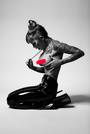
the one with the Santa hat has got to go
Photographer
EAS PHOTOGRAPHY
Posts: 118
Boston, Massachusetts, US
Philipe wrote:
the one with the Santa hat has got to go haha!! gone...
BTW Philipe
OUTSTANDING WORK!!!!!
|


 black and white at the beach, with minimal contrast. It is boring and she is too far from the camera.
  T-shirt and bikini. Boring photo. Does not catch my eye.
  bad lighting for a beach shot way to hot the the face and her legs and forearms are under lit, lighting is way to hard for the face.
  The waves in the background are slanted in comparison to the model makes me want to turn my head to keep them level and then the model is off center with that angle. It just does not flow together.
  horizon is off...not in a good angle like a rule of 3rds but just you didn't have the camera set straight or you failed to crop and rotate.
  artistic nude but not nude or black and white, whats the point?
  looks like the view from a tall pervert trying to look down her shirt
  again with the artsy non nude not black and white
  bad crop job
  trying to creative is good just gotta get the lighting right..it is not here. the right wing merges into the back ground and you went to artsy with the rim lighting
  heavy shadows on her eyes and under her chin could use some fill. You could have also hit her with a kicker to make her pop. The background gets more attention than the model here. And her shoe is off her foot.
  -that shadow kills the photo.
  -boring and her right leg blends into couch.
  -for the third time with the artsy non nude bikini/lingerie look, it does not work.
  not flattering for the model, bad angle and framing is off. boring lighting in color does not make it better when turned to black and white.
  lit from the wrong side heavy shadow on her face
  -boring
  model is stunning but the background is horrid, looks like a cheap motel shower curtain. and its wrinkled on one side. Model could have used a kicker light as well.
  I can see so far up her nose I can see her brain.
  -- too soft of focus on her and hair and outer edge of photo looks blurred..hurts my eyes
  --bad shadows
  -is he totally oblivious to the woman all over him? What is the point of this photo? He looks upset that he is there.
  --too bright for black and white --------