|
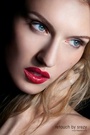
Looking for any input on this image and how to make it better. Thanks! 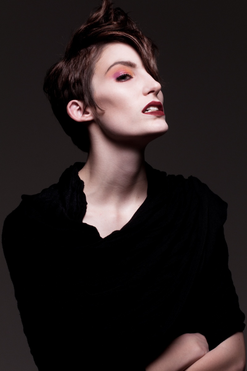 ~ciao! Feb 24 13 12:06 pm Link Great work and picture  . . There are some stray hairs at the top of the head. I think there is some yellow/green color cast in the teeth A little fix in liquify of the left side of the bottom lip, it looks like out of place in profile view. Feb 24 13 07:18 pm Link Some hair light for separation from the background. Feb 24 13 07:30 pm Link maybe it is my vision but here eye does not seem in focus - if I am correct some lightening and sharpening? her eye also looks quite small for her face and for the composition - perhaps select and free transform for size / enlarge? There seems to be a lot of missing facial structure in the region from below her eye to her upper lip - has it been over-smoothed or blurred? the line of the cheek does not look quite anatomically correct either not a fan of the cutt off arms / hands - and I am wondering if a re-crop that was a bit shorter and tighter might improve things a bit? Feb 24 13 07:37 pm Link You have so much beautiful images in your port! But I really don`t like the look of this one, to me it has no glamour. I understand the contrast of this image between the bright face and the dark, but I think the face is maybe still overexposed and is looking too flat in the colors, in the brightness and in the sharpness. I´m sure this image would be look absolutely great with the right retouch, because the shoot looks good! Feb 25 13 07:10 am Link Shirt is way too dark. Cant see any detail. Seems over-contrasted. Mar 06 13 02:01 am Link |