|
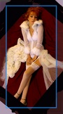
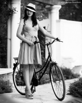
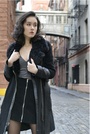
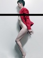
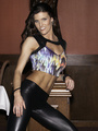
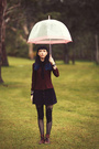
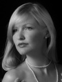
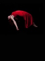
Apr 19 13 04:12 pm Link Charlie-CNP wrote: Ed Woodson Photography wrote: pass. the tones are nice, but it seems like too much background and not enough model in this one. I think that the expressiveness of your model is good in this image, but I don't get the concept fully from just seeing the model in the graveyard. what can you show me further in this image visually that will emote the story? please feel free to play again. Thanks for looking. The story is whatever you'd like it to be. Apr 19 13 04:13 pm Link Howsabout this one . . . 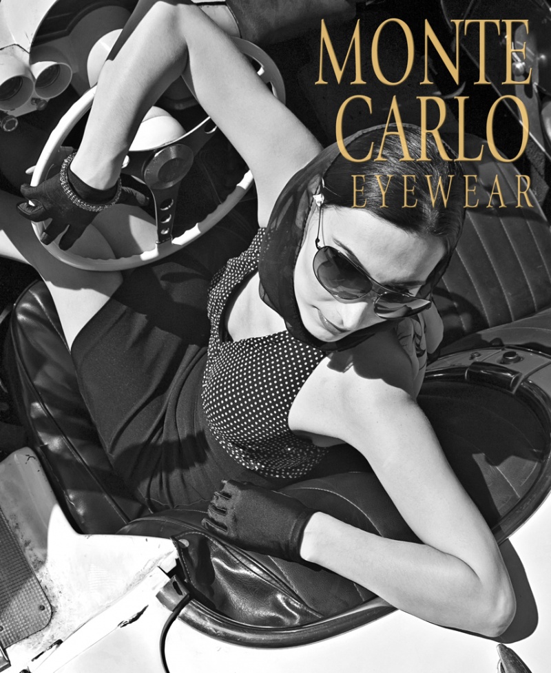 . . . or does the comp copy knock it outta da runnin' . . .  SOS Apr 19 13 04:20 pm Link Thank you for your comments. How 'bout this one:  Apr 19 13 04:54 pm Link Brian Scanlon wrote: pass. soft focus issues, bad lighting, composition needs work. try a longer exposure next round and some different framing. please feel free to play again. Apr 19 13 08:42 pm Link Brian Scanlon wrote: pass. The concept is ok for portraiture, but the light on her face could be improved upon. Compositionally, this one is stronger than your other one too, but maybe try cropping in from right and left just a bit further to tighten up the piece. please feel free to play again. Apr 19 13 08:44 pm Link Art of the nude wrote: yes, different post per image please. Apr 19 13 08:46 pm Link Charlie-CNP wrote: https://www.modelmayhem.com/portfolio/pic/2674926 Apr 19 13 08:46 pm Link Maxximages wrote: pass. the selective focus does not work well on this image. Generally in any composition your eyes should be able to move around in the space, and psychologically get drawn to the brightest part of the image. For me the arms feel really forced, and they trap the composition in this piece. please feel free to play again. Apr 19 13 08:47 pm Link Maxximages wrote: same image twice = same comment twice... ^^ Apr 19 13 08:48 pm Link Maxximages wrote: pass. not a fan of the lighting schema for this one. It gives you some area's that are blown out, where others are too dark. You also have some focus issues where for example her arm hairs are sharp, but you are using DOF somehow to make the rest of her soft. Is the focus supposed to be her arm hairs? Try shooting around F4 to F8 next time which will give you several more feet of focus to get the entire figure sharp, and maybe play with different light. please feel free to play again. Apr 19 13 08:50 pm Link Carioca wrote: Listed! This is a simple, soft, natural portrait. well done. Apr 19 13 08:51 pm Link BYNW wrote: pass. reminds me of an illustration of Ozzy Osbourn's Bark at the moon in a way, and not in a good way. It seems you might have some focus issues where the figure is not sharp to create the silhouette technically. The composition gets trapped also for me. Maybe try cropping the frame a little longer from top to bottom. please feel free to play again. Apr 19 13 08:53 pm Link BYNW wrote: pass. just say no to automatic Photoshop filters.... that is all. please feel free to play again. Apr 19 13 08:54 pm Link Prestigeshots wrote: this one is not black and white. it is monochromatic sepia toned. but if I were to judge it I would say pass because the lighting/exposure feels off. Maybe bounce some light back in on the left size of the frame and try a slightly longer exposure next time. please feel free to play again. Apr 19 13 08:55 pm Link JessBee wrote: pass. I actually like your pose and the lighting on this image, but it has focus issues and technical problems for whomever your photographer was which makes me cringe. Maybe try re-shooting though with someone that can wield a camera to put you tack sharp in the frame, and you're on to something there. please feel free to play again. Apr 19 13 08:57 pm Link Apr 19 13 09:01 pm Link AllyssaN wrote: pass. slightly over exposed to blow out your skin tones in this image, and maybe a hint too much skin smoothing in post. Your pose works well for the composition though. I do know Andrew personally also, and he is a great guy. Maybe try another shoot with him to see if he can work his magic. He is usually spot on with his shooting and editing, and I am surprised to see an image from him where the tones are blown out honestly. Maybe this one just needs a re-edit? please feel free to play again. Apr 19 13 09:01 pm Link sospix wrote: Listed! the symmetrical play with lines of the arms in this image are great. It also goes along with the concept where the model is driving what appears to be a roadster thinking along the terms of graphic design principles for edgy techniques. kudos Apr 19 13 09:03 pm Link Loria Harrison wrote: pass. the composition on this one seems too busy to me. there is a lot going on texture wise which I think detracts from the image even before I get into the issues of the photographers technical skills pulling the image into a blur (and not in a good way). The best part of the image is the smile. please feel free to play again. Apr 19 13 09:05 pm Link Count me in. Apr 19 13 09:07 pm Link Count me in. Apr 19 13 09:07 pm Link FotoMark wrote: please post one image per post for future ones. Apr 19 13 09:08 pm Link Elaine 45 wrote: pass. the image as a whole is too center weighted with the composition and pose I think. It has a few other technical issues for your photographer like the blown out tones in the hair/dress, but one thing I might suggest for you would be to play more with posing for future shoots. Something like practicing expressions in the mirror before shooting might be helpful also. Most often than not, the expression in particular sells an image. please feel free to play again. Apr 19 13 09:10 pm Link Mirror With A Memory wrote: where is the link to your image? please post if you wish to play. Apr 19 13 09:11 pm Link but again, keep going for those who want to play. I will check back later this evening, or sometime tomorrow. There are some great black and white images out there for sure.  Apr 19 13 09:12 pm Link Apr 19 13 09:38 pm Link Apr 19 13 10:04 pm Link Charlie-CNP wrote: Glad you enjoyed it . . . that ended up being the basis for an ad campaign, using the 50's European feel . . . Apr 19 13 10:21 pm Link How about this one? 18+ https://www.modelmayhem.com/portfolio/pic/28755875 Apr 19 13 10:31 pm Link Jeramie Campbell wrote: pass. you are almost there with this image. The tonality, composition, and lighting is great, but your model is not selling the image for you. Kind of feels like she is going to go to sleep in this image for some reason. please feel free to play again. Apr 20 13 12:11 pm Link Cole Morrison wrote: pass. the expression on the models face is probably the only thing that works in this image. The angle it was shot at, the over sexual connotations of the pose..etc. don't work. It is about taking the mood of the expression, and putting it all together compositionally so that the entire image stands on its own. please feel free to play again. Apr 20 13 12:13 pm Link Mark Callen Photography wrote: you posted this one before, please feel free to post up a new image. Apr 20 13 12:13 pm Link Keep them coming if anyone wants to play. I will keep giving feedback for the next couple days in this thread, and then I will call it. Apr 20 13 12:14 pm Link This?  Apr 20 13 04:44 pm Link Apr 20 13 04:47 pm Link  Apr 20 13 05:01 pm Link Apr 20 13 05:16 pm Link Apr 20 13 05:17 pm Link Apr 20 13 05:29 pm Link |


