|
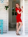
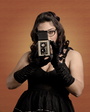
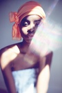
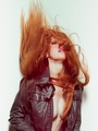
Would love to hear honest opinion about my new pictures . Thanks. May 20 13 05:53 pm Link Are we talking about the top row? You have to tell us which ones are new. May 20 13 07:21 pm Link If it's the top row I only like the first one/your avatar. May 20 13 07:26 pm Link I suspect any image with less than 50 'views' is new. I could be wrong! Irene, ya gotta put a little more into it. You seem to have one mouth position - lips together, sorta almost a smile. Loosen up! Don't look into the lens all the time (maybe that's just you picking images to post... I can't tell cause I don't see ALL the images.) My fav...  Just my opinion. May 20 13 07:50 pm Link none of them say "model" to me. In one you're in front of people seated at a restaurant, another holding some coffee drink and another holding a book. they just look like photos someone would take of their girlfriend while they're out and about doing things. Perhaps some more stylized shoots in better locations. Plus work on your posing and facial expressions. I think you can do much better.  May 20 13 08:12 pm Link Same pose same facial expression ... Boringggg May 20 13 08:20 pm Link of the top row I only like pic 3 - it looks like a nice commercial print photo consistent with what your look is. #1 is just bland and awkward to have that dress in that location, 2 just a snap shot and 4 is bad as no woman who isnt stick thin should ever pose with her one hand over her abdomen as it looks like your hiding something. May 21 13 08:37 am Link GingerMuse wrote: Well hopefully she is pursuing the logical market for her, commercial print, so not having pics that say "model" is a good thing. but I didnt look at her port beyond the top row. May 21 13 08:39 am Link I agree with the above. The images look like snapshots someone takes when going out. They don't even seem that exciting either. Try different expressions and looking in different directions. May 21 13 09:12 am Link May 21 13 10:49 am Link In regards to the top row, they're all very snapshotty. generic "I'm standing here" poses, on camera lighting, low contrast, which s not always a bad thing. You have the same half smile smirk in all of them and the thing I like the least is the composition, you're smack dead center in every single shot. In regards to the 2 in black at the bottom, I dislike the composition it does nothing for you and again you have the same half smile smirk. SMILE! The one on your belly, your legs actually become the focal point, even though they're slightly out of focus, they're the brightest part of the image, therefore it's the first thing you see. The head shot is generic and boring. However I will say at least there's off camera lighting on those two and they're not flat. Could have used a kicker or some kind of highlight but we can't have everything. May 22 13 03:25 am Link |