|
What do we think of the first 5? https://www.modelmayhem.com/portfolio/3224615/viewall May 25 16 02:43 pm Link Speaking of the whole batch: First thing that comes to mind is: white balance. These photos have a yellow cast - they are too warm. Check the whites of her eyes in the first photo – it's yellow. The second thing is how obvious it is that they are from the same shoot (because of the model's wardrobe) but how inconsistent they are in terms of exposure and focus. Third, looking at them as thumbnails in your portfolio, #2 and #4 look similar in composition. I think you only need one, not both. I'm also curious: What is the reason you don't retouch your photos? 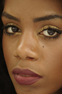 I'm one who likes to crop close to my subject, but this one feels a bit too close. Using shallow depth of field effectively is a powerful way to guide the viewers' attention. Used inappropriately it can leave the composition feeling awkward and unbalanced. In this case unfortunately, it's the latter. You decided to focus on the eye furthest from the camera rather than the near. This is the opposite of how the technique is usually applied. With such shallow depth and you camera being so close to her face, you've lost nearly half her face in focus blur so I'd like to know, what purpose did you have for doing it the way you did? Without knowing your reason, it looks like a mistake to me. 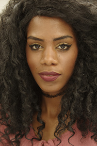 Not much to say about this one. It's not particularly interesting, but the exposure and focus seem to be ok. 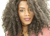 I like that her face is slightly over exposed: it works to smooth and conceal the imperfections in her skin and gives her a bit of a glow. Unfortunately the exposure doesn't work so well for her hair.  This one is very similar to the second image, but I think I prefer this crop because I feel her hair frames her face better.  Finally, a different view of this model! This I feel is the strongest of the five – here the shallow depth works well to separate her from the background, but her eyes and hair are in focus (yes!). I'm a little uncomfortable with how you cropped her arms at the wrist. That makes it feel a little awkward. Also, that one really long ribbon(?) from her blouse hanging down past the bottom of the frame is distracting, as is the string of lights that we only get a partial view of. A slightly different crop and remove some unnecessary distractions and I think you have a winner with this one! Oh, and don't forget to fix the white balance, too. hope this helps. May 27 16 01:40 am Link rich cirminello wrote: I readjusted to neutral, not sure I like it better rich cirminello wrote: Why is that a bad thing? It's my only shoot with her. rich cirminello wrote: Ouch rich cirminello wrote: OK rich cirminello wrote: Another ouch, I do. rich cirminello wrote: Yeah, needs to be removed. rich cirminello wrote: I sort of like the effect on her hair. rich cirminello wrote: Yeah, ok. rich cirminello wrote: Yes, the crop at her wrist is awkward. How would you crop differently, given that this is the full shot? I should have stepped back or used a shorter lens. That was the top she had. What would you do about the string? May 27 16 07:25 am Link |