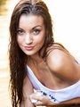
Jul 12 16 07:48 am Link You have a winning model for this shot. I wish you could have directed her to relax her expression a little bit…she appears tense. The wrinkles on her forehead are a bit distracting. You could minimize/eliminate the wrinkles in post. Overall, I like the concept with the silver flecks on her figure. I would have chosen different bikini bottoms with the silver flecks. Either a black bottom or silver bottom would have fit the silver metallic better. Lighting is a little harsh. I would have preferred to give the shadow side of her figure some light. If nothing else, a reflector on the shadow side would have decreased the shadows a bit. I like the placement of her left hand, but the crop of her right hand is a little awkward. I would have experimented with lighting for this shoot. It's a little harsh in my opinion. It might look interesting in black and white. Jul 13 16 10:01 pm Link Cute! Jul 15 16 12:28 pm Link Thanks for the critique chris. I agree with you on the light being some-what harsh. I'll try to be more aware of the distance from the model to the light and and try to use a reflector more. This was about my 5th time ever using flash as i have always used constant tungsten lights, so i am still learning. She picked the bottoms for this shot and didn't have another option, as i would have picked something different also. I did play with light placement on several other shots but this was the pose that stood out to me. We have a shoot planned soon with gold paint and i will try to take these tips into consideration! Thanks very much! Jul 15 16 12:29 pm Link Let me know if you need help applying paint on Brittany at your next shoot. ;-) Jul 15 16 04:14 pm Link I am not crazy about the glitter - there is too much of it. Too much on her breasts and too much elsewhere. Perhaps less would be more in this case. But more importantly, it seems a very strange choice to pair the glitter with the bikini bottom. I think the image would be much stronger if she was wearing the matching bikini top (and no glitter) or no bikini bottoms. As it is, it looks like you shot a nude concept with a model who was not comfortable modeling nude. The result seems forced and incoherent to me. The light on her hair (at least on her left side) is fantastic. Really shows off both the highlights and darker blonde tones. Otherwise I think the lighting is meh - especially the absolute black (or at least appears so on my screen) behind the model. As others have said, a little bit of light on the background and the rear of the model would be an improvement. The model's expression (combined pose and facial expression) has me puzzled. The pose is pretty typical for a glamour shot (although is a little "slouchy"), but the facial expression is not sexy, fun or inviting. It is....welll, I'm not sure what it is. uncertainty? confusion? indifference? outright boredom? I am guessing you were distracted by shiny objects (quite literally in this case) and forgot to pay attention to the other elements of the photo necessary to create a single coherent and compelling image. I hope that's helpful. Jul 23 16 07:35 am Link |