|
Actually got to shoot with two models in the past 2 weeks (Non-MM). First 3 rows. How'd I do? https://www.modelmayhem.com/portfolio/3224615/viewall Aug 01 16 07:36 pm Link Here are some random thoughts. I notice a few shots are overexposed, I'd consider removing these:   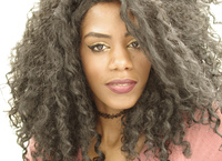  Keep an eye on cropping. A few of your photos have hands and limbs cut off, which can look a little odd sometimes. This series is fine, but I find the post work to be a little flat and uninteresting. This shot is best of the series.  I like your model here. This first shot is decent. I would have tried to simplify the background so that there is more of an emphasis on the model. This shot feels uneven to me, I really want to level it out. The second shot is a great portrait in my opinion. Excellent crop, rich colors, model is connecting well with the camera. Background isn't too bad, but it is a bit distracting with all the different shapes taking place behind her. Her wind swept hair is a great touch. Regarding styling, I actually wish she didn't have this choker on. The choker seems to be out of place with the cut off shorts and t-shirt. Lovely portrait overall. The third shot has attractive colors, but has a few minuses. Her toes and hand are cropped off. The shot needs to be leveled. I find the background to be busy…simplify the scene. Great lighting in this shot. 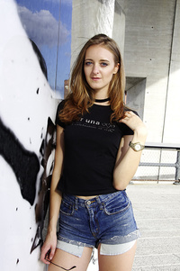 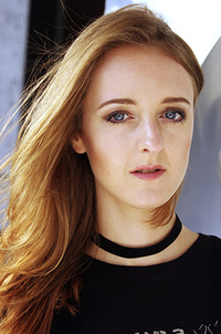  You've found a very exotic look with this model. Excellent make-up, gorgeous hair. I think the choker works better in this series. The first photo is a solid portrait. I like the crop, her hair frames her face nicely. The second shot is decent also. The peach top is a good color on her. I don't like the crop at her wrists. It's subtle, but I really want to Photoshop out the light strip on the support beam next to her. I would push the crop a bit more so you don't have the green strip on the right side of the shot. 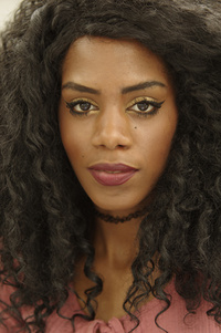  Decent portrait shots with Gingercat also. The first shot has good colors and lighting, but her hand positioning is below average. One arm is missing and her other hand is limp. The second portrait is nicely done. Crop out the excess background and you'll have a solid portrait.   Keep rockin'. Aug 06 16 04:12 pm Link Thanks for the review Kris. As for the overexposed pictures, I seem to like that effect on faces. It certainly cuts down on the post work on the skin but I seem to like it aesthetically. Your critique of the rest I would agree with and could give you reasons (excuses) why the eroorors in cropping were there but most of it is improper in-camera cropping. I do sometimes pick a somewhat complicated background because I get bored with plain ones. As for the last head shot, I feel tat the green adds to the portrait but I'll play with a bit more. Thanks again for the review. Aug 07 16 07:18 am Link Hmmm, keep in mind there is a difference between bright and overexposed. For example, in this shot, about 80-90% of her face has decent lighting. But it's the harsh lighting on the left side that is overexposed. Parts of her face are completely white, absolutely no color. Obviously, skin has pigment of some kind. From the reflection in her eye, it looks like you used a reflector on the camera-right side. If you had a scrim to block out the direct sun, you'd probably have a solid portrait. I hear ya regarding post and skin treatment, not the most exciting part of photography. But it is part of the job. Overexposure can be stylistic, but in these cases, it looks like an error. Aug 07 16 01:01 pm Link I think it would have been worth reminding the two models what your Gina Torres lookalike knew - It's All About The Jaw: https://www.youtube.com/watch?v=Qe3oJnFtA_k Or (2) here http://photography.tutsplus.com/tutoria … hoto-15608 Aug 11 16 07:47 am Link |