|
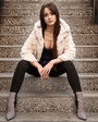
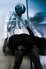
I'd truly appreciate constructive criticism regarding my offering/profile/pictures. Any guidance would be appreciated. Jan 13 18 11:44 am Link You have a nice body of work. All i would say is maybe re arrange the order of the pics to flow better. Jan 13 18 12:43 pm Link 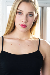 This is a great image, excellent eyes My suggested changes get rid of the window frame or what ever it is behind her head. Keep models head as it is but put body on angle to add dynamics. Raise the crop at the bottom, which would just be showing the two black straps and none of the black top. [Reason our eyes are drawn to high contrast areas, so the dark top against the light skin becomes a distraction] Make a print, cover up the black top and see if you see how her eyes become the dominate element in the photo.  Very powerful image Areas of adjustment, models hair seems a bit messy, right side of forehead and right cheek area seem a bit hot on exposure. [Nice dynamics head and body not facing same direction.]  Love the photo, great smile Areas of change level the horizon [right side of photo low], add dynamics keep head as it is rotate body a bit, would prefer this in a portrait camera orientation. 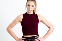 Pose wise lower fingers so elbows do not stick out so far, raise chin slightly, place body on angle to camera, and include all of her fingers next time.  Loose the red jacket, and hair band on models right wrist, place body on angle to camera [Love the eyes, great capture.] 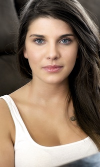 You are really good at capturing your models eyes Would like this photo cropped above the gray band in her top  This is fun, wish her eyes were facing straight ahead  Another fun photo, wish hat was tipped back a bit, and hair on models right side were behind her shoulder [So we could see her long lovely neck]  With that much leg, including feet would be nice  Details, hair band on models right wrist, something with the lighting or makeup on models face seems off You are a highly qualified photographer, it was a pleasure to view your work, I wish you well Jan 13 18 03:56 pm Link Thank you both so much! Jan 18 18 01:57 pm Link OP, --I'd watch some of your crops. I myself crop into the head from time to time, but, if it's a full length or close to it or where their feet is visible, I wouldn't do it. It looks off balanced.    --You seem to have the tendency to shoot too tight. This one, you're cutting her butt. And, looks off balanced because of the headroom and where there is no space at the bottom.  --The others, you're cutting fingers.    --Either crop just above the knee or show the entire feet.  --Looks too bland and out of place. I'd remove right away.  --I'm noticing some of your photos have this black outline. This for example, is on the right side (her left side). Not sure if it's just the light setup or what. But, makes it look like a bad masking/composite job.  Jan 24 18 12:15 am Link Eddie, thank you very much. I see exactly the direction your taking me. Very much appreciated. Jan 24 18 03:40 pm Link |