Forums > Critique > The dilema: "proper" framing vs what I like

Photographer

Philip Brown

Posts: 568

Long Beach, California, US

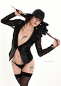
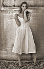
I have two quasi similar shots.

One is cropped in from 100mm
One was a hasty shot at 200mm, and the framing breaks some "rules" about cropping near elbow.
But i LIKE it.

opening up the floor for debate.

Please note: they dont work in low res.
So please click through,  full screen the browser, then lemme know your thoughts


(yes I did this before. but stop being logical. This is ART, not logic! big_smile )

EDIT: since I didnt make this clear earlier, I started this thread because I like the mood the colors evoke in the second one .
But for latecomers, there's a more general portfolio critique lower down.


https://lh3.googleusercontent.com/_579CrKf1WkPKCp_bAThVxevynxRqxXIWAASnfGeT5mBbWedUj3J7cwUcUEdUsD5v9YJhMcwXvYJEBIBOU6UR4RqcNKgLsD-aXjOOEFjF5haa8DJL25MfXIpIcpb8DXCb14iz4wJM1_k-aLgVTDLPq_Os2h_tKRea3bOrgkUEHATa7T-iNPNgUUWIzT87tTsoPNW9x-HMmwJMSTzTMuNX-m9iccqUw7ZYiWOfFVjF9Zwdxr2PYK7_a2qSQGsRy6Cb2VnwJGfI5S5waCA4WferF9b9oVgYX1FFvBzDDhaFnp3YYaR6iTowMvvONKxP0ncu6MUqxCCOKyDgctYPTya5W9rPNppAvEq4BtakFMdRIg4ZbTwG25_dOcEW3LJ-D7ImEcSGJr2xZMz6Z9SXp0cBztzH0r9nRlwKvJP7i28HFr7HyrxakFDRI0I0wB4gY2r9Iz1t_y8ngXc8A4qHed5HstDxpVdnlpWDt3EHxBVbeuZL9yT0CTKYKjtfuOwzB-5MqRYsdmj3PxPrvjO94_nc6HB3urLcK2unpQvMNuQ8-8nQ0Ft9YezjXd9LNMjhjlahoyu6oTmXfxxqJ0Ugd9R545uttJ6WA8aDr9vx4bkTbi_gjBHPlSd8YOL01Zj3QuiURWouTlJlfCVyTEib7xSYJSm5A=w1131-h1025-no


https://lh3.googleusercontent.com/9YtcoehbJ-mgDherrkMteWxGzfJeR7Aggov8FmnTb0MOs2w47NLobWeyaYtusK9-8cDShAQUgKH-JS8Hx_vVQcP8j_RRHGVS_mhyVWj06RnUZml6DrE8UMB2XX2V-DYz7-i0qFjbz7UkQi-vVG9W_hnQ2rylfbzpMWgeGKw8ODfSX5OTIkEzY1hqaMjQruJjOZTCxDgTN_aqSmCLHqcbzFLze_lcyXbMffuc_kLRYO8cZY4gra28-jdl7x0Hdh7rIWa44vrl6QOhSYgfsOp-bIOnQi06HvlF_VB0iOXbSfzzZPlS5wbIpCPDY8XSJJyLt9IKvYDy4tRAT0IcmdE4bmFZu6qgH8i7Hg9gFedIIl3kGq-TEzktWMVVZDCZLRThZL4QwH1hnbSymTWOyikjdz7sA1TviRfd3ZImicCPsKegaIWSU_1EUG3GsuYG0FKGLfXVRnS4rh4ypf_Y7SOje3o7oIzP1pn3Pm4SMM8GYrM1GBCRHL_RTaf0cjydtvKVlJ3ZFiRNUMRX02ob4fcQER2GbklNWpoz4Wk18FNMaEwAi16dGYN5MgH4lsWSUZq5dYlnleJllDzRdJwkJWR-UBIApJBM11N0oCvSVqzASafi-5IdHdJbbdmnkmKWGGYe0-auLvQfPRhbCro0P_w84eHxbg=w1519-h1015-no

Jul 23 18 12:45 pm Link

Photographer

Fleming Design

Posts: 1380

East Hartford, Connecticut, US

You seem to love everything you produce.  It might be time to raise the bar a bit, at least get it off the floor.  Those shots, delete and move on.

Jul 23 18 02:52 pm Link

Photographer

FIFTYONE PHOTOGRAPHY

Posts: 6597

Uniontown, Pennsylvania, US

Philip Brown wrote:
The dilema: "proper" framing vs what I like

If YOU like it what else matters?

Jul 23 18 03:17 pm Link

Photographer

Philip Brown

Posts: 568

Long Beach, California, US

FIFTYONE PHOTOGRAPHY wrote:
If YOU like it what else matters?

heh.  well if i like it, i keep it in my own storage regardless.
But other people's opinion matters for how much i show it around publicly

Jul 23 18 03:50 pm Link

Photographer

Mark Salo

Posts: 11726

Olney, Maryland, US

FIFTYONE PHOTOGRAPHY wrote:
If YOU like it what else matters?

Philip Brown wrote:
heh.  well if i like it, i keep it in my own storage regardless.
But other people's opinion matters for how much i show it around publicly

You never accept other people's advice. You always argue.

Jul 23 18 04:06 pm Link

Photographer

AgX

Posts: 2851

Philadelphia, Pennsylvania, US

Mark Salo wrote:
You never accept other people's advice. You always argue.

+1. There's often a lot of "yeah, but..."

Jul 23 18 05:10 pm Link

Photographer

Garry k

Posts: 30129

Vancouver, British Columbia, Canada

Curious to know what you like about either of these photos

Jul 23 18 05:15 pm Link

Photographer

Black Z Eddie

Posts: 1903

San Jacinto, California, US

Philip Brown wrote:
yes I did this before. but stop being logical. This is ART, not logic!

Neither of them fit in any of those categories.

Jul 23 18 05:34 pm Link

Photographer

Rays Fine Art

Posts: 7504

New York, New York, US

redacted, sorry

Jul 23 18 05:39 pm Link

Photographer

Philip Brown

Posts: 568

Long Beach, California, US

Garry k wrote:
Curious to know what you like about either of these photos

oh ouch. I thought the first "normal" one would at least pass, since it's more traditional smile But I dont really care about that one.

I'll just talk about the other one.

Time-saver Interruption: It isnt glamour photography. It's anti-glamour, in a way. It has zero sexy. It's not meant to be sexxy.
So obviously, all the glamor photogs will hate it, and they can just kindly skip this thread completely :p


I like the badly cropped one, because when it is full screen, the combination of:

- the particular shade of the ocean,and the way the color gradient of the water blends up to the sky
- the sand/ocean border lines up appealingly with a nice eye line to her chest. It's not sexy, but it is appealing, to me.
- the models' tilt of head, combined with the cascade of dark hair. There is a "waterfall" of hair, offset by the water of the ocean itself
- the subtle effect of the gently warm glow of sun on her side, matching the little bit on her face and knee.
- the way the ocean color picks up the color of her jeans.
- the sort of questioning look on the model's face, adds an element of story to me

It's a very quiet, contemplative picture. Quiet, kind of peaceful, and thoughtful.

The trouble is, though: as I said in the post, it REQUIRES FULL SCREEN to have this effect. Even I dont like it otherwise.

The typical white borders of the forum area (and potentially stuff on people's desktops) are too jarring.
Whereas the black boarder used by google photo, compliments it, IMO.

Jul 23 18 06:04 pm Link

Photographer

sweet gamine

Posts: 475

Vancouver, British Columbia, Canada

Gorgeous model.
Images are too dark and have no 'pop' to them.
The swimsuit is a shapeless sack of cloth and unflattering - even on someone this attractive.
If you can, shoot with this model again and get some lovely light on her.

Jul 23 18 06:05 pm Link

Photographer

Philip Brown

Posts: 568

Long Beach, California, US

sweet gamine wrote:
Gorgeous model.
Images are too dark and have no 'pop' to them.
The swimsuit is a shapeless sack of cloth and unflattering - even on someone this attractive.
If you can, shoot with this model again and get some lovely light on her.

yes, I agree.
which is why I have somewhat better shots of her such as here:
https://www.modelmayhem.com/portfolio/3 … l#/A506143

big_smile

Jul 23 18 06:17 pm Link

Photographer

Orca Bay Images

Posts: 33877

Arcata, California, US

Philip Brown wrote:

yes, I agree.
which is why I have somewhat better shots of her such as here:
https://www.modelmayhem.com/portfolio/3 … l#/A506143

big_smile

Those aren't any better.

Jul 23 18 06:30 pm Link

Photographer

Garry k

Posts: 30129

Vancouver, British Columbia, Canada

Philip Brown wrote:
oh ouch. I thought the first "normal" one would at least pass, since it's more traditional smile But I dont really care about that one.

I'll just talk about the other one.

Time-saver Interruption: It isnt glamour photography. It's anti-glamour, in a way. It has zero sexy. It's not meant to be sexxy.
So obviously, all the glamor photogs will hate it, and they can just kindly skip this thread completely :p


I like the badly cropped one, because when it is full screen, the combination of:

- the particular shade of the ocean,and the way the color gradient of the water blends up to the sky
- the sand/ocean border lines up appealingly with a nice eye line to her chest. It's not sexy, but it is appealing, to me.
- the models' tilt of head, combined with the cascade of dark hair. There is a "waterfall" of hair, offset by the water of the ocean itself
- the subtle effect of the gently warm glow of sun on her side, matching the little bit on her face and knee.
- the way the ocean color picks up the color of her jeans.
- the sort of questioning look on the model's face, adds an element of story to me

It's a very quiet, contemplative picture. Quiet, kind of peaceful, and thoughtful.

The trouble is, though: as I said in the post, it REQUIRES FULL SCREEN to have this effect. Even I dont like it otherwise.

The typical white borders of the forum area (and potentially stuff on people's desktops) are too jarring.
Whereas the black boarder used by google photo, compliments it, IMO.

redacted

Jul 23 18 06:32 pm Link

Photographer

Philip Brown

Posts: 568

Long Beach, California, US

Orca Bay Images wrote:

Those aren't any better.

that's not particularly helpful.
The point of the critique forum is that you're supposed to say how things can be improved.

Jul 23 18 06:56 pm Link

Photographer

SayCheeZ!

Posts: 20621

Las Vegas, Nevada, US

FIFTYONE PHOTOGRAPHY wrote:
If YOU like it what else matters?

If the client likes it.

Jul 23 18 07:09 pm Link

Photographer

Philip Brown

Posts: 568

Long Beach, California, US

sweet gamine wrote:
Gorgeous model.
Images are too dark and have no 'pop' to them..

Huh.
Changed computers. NOW they look too dark. I guess the monitor I was first using, is too bright :-/

How's the brightness on these now?

https://photos.modelmayhem.com/photos/180723/19/5b568dcaf2d2e_m.jpg

https://photos.modelmayhem.com/photos/180723/19/5b568db5d764e_m.jpg

Jul 23 18 07:29 pm Link

Photographer

Orca Bay Images

Posts: 33877

Arcata, California, US

Philip Brown wrote:

that's not particularly helpful.
The point of the critique forum is that you're supposed to say how things can be improved.

The "somewhat better" shots share the same problems as the first snapshots.

Way too dark (calibrate your monitors).
Bad framing (foot cut off).

Jul 23 18 08:09 pm Link

Photographer

Black Z Eddie

Posts: 1903

San Jacinto, California, US

Philip Brown wrote:
...It isnt glamour photography. It's anti-glamour, in a way. It has zero sexy. It's not meant to be sexxy.

Oh, that must explain why her pants are undone, flapped open, and slightly pulled down.

So obviously, all the glamor photogs will hate it

Yeah, right.  Never mind the fact:

--they're way underexposed (you finally saw the light).
--her arm looks like she got into a car accident, broke it, is now facing the other way.  That's just creepy looking.
--her arm looks like a turkey leg because she's putting pressure by holding herself up, and pressing it against her body. 
--she looks like she's pissed probably because you made her sit on a hot fire pit on a hot day.  It's just not a flattering look.
--the cropping, the composition, it's just bad.

Jul 23 18 11:07 pm Link

Photographer

Garry k

Posts: 30129

Vancouver, British Columbia, Canada

redacted

Jul 23 18 11:18 pm Link

Photographer

Chris Lauw

Posts: 14

Goleta, California, US

Philip Brown wrote:
So please click through, make them close to full screen, then lemme know your thoughts

Hey Philip, here's what I think:
https://i.imgur.com/5KxelFH.jpg
https://i.imgur.com/QSVQBUm.jpg
https://i.imgur.com/FYuCa78.jpg

Jul 23 18 11:23 pm Link

Photographer

Philip Brown

Posts: 568

Long Beach, California, US

Chris Lauw wrote:
Hey Philip, here's what I think:
https://i.imgur.com/5KxelFH.jpg
https://i.imgur.com/QSVQBUm.jpg
https://i.imgur.com/FYuCa78.jpg

oh wow. in depth critique. I appreciate it. Thanks a lot, Chris!

Jul 24 18 06:16 am Link

Photographer

Acraftman1313

Posts: 223

Greensboro, North Carolina, US

Chris Lauw wrote:

Hey Philip, here's what I think:
https://i.imgur.com/5KxelFH.jpg
https://i.imgur.com/QSVQBUm.jpg
https://i.imgur.com/FYuCa78.jpg

Chris, as a amateur I really appreciate the time and effort you shared in your critique.
( if your ever not bored enough feel free to give my port a look,lol!)

Jul 24 18 06:51 am Link

Photographer

Philip Brown

Posts: 568

Long Beach, California, US

I tweaked this one up some more, but think I may hav gone a little TOO bright.
no?

https://photos.modelmayhem.com/photos/180724/07/5b57316821ee5_m.jpg

Jul 24 18 07:13 am Link

Artist/Painter

Hunter GWPB

Posts: 8188

King of Prussia, Pennsylvania, US

It isn't glamour?  The clothing?  The mood?

Not a great expression on the model in the first one.  The dark face and the very bright shirt and the poor composition would make me think that this was meant as a sexy swim suit advertisement.  The swimsuit is the subject.  Even though it is not a swimsuit.

I don't like the arm cropped at the wrist. 

I can get past the even division of the background in sand and water.  The sky is insignificant.  The back ground is blue or brown.

The second one, you loose even the impact of the bathing suit.  Face is too dark for it to be about the portrait.

The full body image in your port is better.  With the foot cut off, it breaks the rules and I don't like it because the loss of the foot doesn't add some exciting impact on the image, but I have seen crops like that in SI.  Surprisingly. 

As pointed out, the arm position is awkward, even though it is a very common arm position, it is not appealing.  Cropping above the joint eliminates the issue ad you could probably salvage a decent portrait from it.

You say it looks better full screen.  It is portrait.  Do I need to rotate it and hold my laptop up on end to get the effect?  Shouldn't that be an indication that something isn't good enough, even to you, if the limits of the format have to be changed?  By the crop on the one prone position in your port, with no end space, it seems you are focusing on the girl rather than the overall composition, in both the ones you linked and the one in the port.

The rules of composition are there for reasons.  Breaking them is fine- for reasons.  It isn't always well received and it should be consistent with your goals.  Are you making art  for your pleasure or because you want to be an artist and derive an artistic income or artistic accolades?  (Yes, reluctantly I call it art because even the scribbles on the fridge are art, but art is never viewed without subjective decisions on quality and readability- sometimes a very good photo is just another pretty face).  It is hard to break the mold, get away from the ordinary, and still be aesthetically pleasing, which it seems you are going for, rather than being challenging, or provoking.

Jul 24 18 07:31 am Link

Photographer

David Kirk

Posts: 4852

Ottawa, Ontario, Canada

Philip Brown wrote:
...

Time-saver Interruption: It isnt glamour photography. It's anti-glamour, in a way. It has zero sexy. It's not meant to be sexxy.
So obviously, all the glamor photogs will hate it, and they can just kindly skip this thread completely :p

Uhm...I think it is definitely a glamour shot.  If not, why that choice of wardrobe...particularly with the pants undone?

Philip Brown wrote:
...
It's a very quiet, contemplative picture. Quiet, kind of peaceful, and thoughtful.

Her expression is anything but quiet and compemplative or thoughtful looking.


Philip Brown wrote:
The trouble is, though: as I said in the post, it REQUIRES FULL SCREEN to have this effect. Even I dont like it otherwise.

The typical white borders of the forum area (and potentially stuff on people's desktops) are too jarring.
Whereas the black boarder used by google photo, compliments it, IMO.

Maybe it really rocks in that environment - I don't know I didn't try it.  Lots of images look great without me having to follow instructions on how to view them.

If you like it that's great, but the point of starting a critique thread is too hear other opinions, not to defend yours.

Jul 24 18 08:48 am Link

Photographer

David Kirk

Posts: 4852

Ottawa, Ontario, Canada

to address your original question...

I prefer the original framing although I think it too has issues (like cropping at the wrist).

I sometimes prefer images which break the conventional rules and in those cases I do as I please.  However, I know that many others viewing the photo will disagree and prefer to see the image according to what they expect.  So, it really depends on who the photo is for.  If it is for you then do as you please and crop however you like it best.  If you are creating it for others to enjoy and appreciate then perhaps a different choice is more appropriate.

Jul 24 18 09:01 am Link

Photographer

AgX

Posts: 2851

Philadelphia, Pennsylvania, US

Philip Brown wrote:
It's a very quiet, contemplative picture. Quiet, kind of peaceful, and thoughtful.

That's an interesting take. I wouldn't have come to the same conclusion, but it's good that you did.

Jul 24 18 09:31 am Link

Photographer

Philip Brown

Posts: 568

Long Beach, California, US

grmblegrmblegrmble...
I took my favourite photo and enhanced it for other people's eyes.

https://photos.modelmayhem.com/photos/180724/11/5b5770d8cac6e_m.jpg

Jul 24 18 11:34 am Link

Photographer

Wandering Eyebubble

Posts: 323

Toronto, Ontario, Canada

I think you think you're better than you are, but you're also insecure and seeking validation while pre-emptively deflecting criticism.

I admire the fact that you put yourself out there, though, it's a tough thing to do. You're also tenacious, and that's a vital part of developing your craft.

I do believe you're improving, I like this last shot of Callie. It's vibrant and it looks cool.

Jul 24 18 09:21 pm Link

Photographer

Jerry Nemeth

Posts: 33355

Dearborn, Michigan, US

Philip Brown wrote:
grmblegrmblegrmble...
I took my favourite photo and enhanced it for other people's eyes.

https://photos.modelmayhem.com/photos/180724/11/5b5770d8cac6e_m.jpg

This is better but dark.

Jul 25 18 12:44 am Link

Photographer

Eros Fine Art Photo

Posts: 3097

Torrance, California, US

Philip Brown wrote:
One was a hasty shot at 200mm, and the framing breaks some "rules" about cropping near elbow.
But i LIKE it.

What exactly is it you LIKE about it??  Her elbow is bending in a way that doesn't look natural, her eyes are squinting and she has dark circles around the; the crop makes her torso look disproportional to her legs; and the scowl on her face makes it look like she's either uncomfortable or unhappy.  Yes, anyone can break the rules of framing a shot...but you still have to a GOOD photo to make it worth keeping.  If you want to get a good example of what "breaking the rules" looks like, then check out Jorge Kreimer's work ( https://www.modelmayhem.com/JGKW ).  His shots are more than just unconventional framing and compostion; they also have energy, mood, eroticism, and a distinct sense of style. The image you posted, combined with your post, just seems like someone trying to sell the emperor a new set of clothes. 

Philip Brown wrote:
Please note: they dont work in low res.
So please click through,  full screen the browser, then lemme know your thoughts

I don't need to see a bad image in hi-res to know it's bad.  The colors, the details (or lack thereof), and the god-awful pose look the same in any size.


Philip Brown wrote:
(yes I did this before. but stop being logical. This is ART, not logic! big_smile )

No, this is not "art".  Although I'm not a huge fan of Terry Richardson, I do find some of his shots to be very artistic.  There's a boldness and an 'in-your-face' attitude behind them, that captures the raw energy of art in the same way some punk rock can just grab you and make you want to hear more.  Your image is just another snapshot.  There's no sense of effort, planning, or even spontaneity behind it.  Basically, it comes across as something YOU find to be a "Happy accident", but I (and I'm sure a lot of other people here) don't see it.  That doesn't make me logical; that means I get no emotional response or visual interest in what you've shot. 

As someone else said, it might be time to raise the bar.  If you truly believe you've become an "artist" after only shooting for a very short time, then you might not really understand art.  Or, as Inigo Montoya put it..."You keep using that word.  I don't think it means what you think it means."

Jul 25 18 01:22 am Link

Artist/Painter

Hunter GWPB

Posts: 8188

King of Prussia, Pennsylvania, US

Jul 25 18 01:53 am Link

Photographer

Mark Salo

Posts: 11726

Olney, Maryland, US

Philip Brown wrote:
grmblegrmblegrmble...
I took my favourite photo and enhanced it for other people's eyes.

https://photos.modelmayhem.com/photos/180724/11/5b5770d8cac6e_m.jpg

You should enhance HER eyes.

Jul 25 18 06:26 am Link

Photographer

Mark Salo

Posts: 11726

Olney, Maryland, US

Philip Brown wrote:
...It's a very quiet, contemplative picture. Quiet, kind of peaceful, and thoughtful.
The trouble is, though: as I said in the post, it REQUIRES FULL SCREEN to have this effect. Even I dont like it otherwise...

To me it's sinister and threatening.
I guess that it depends upon the size of my screen.

Jul 25 18 06:31 am Link

Photographer

Philip Brown

Posts: 568

Long Beach, California, US

Mark Salo wrote:
You should enhance HER eyes.

a fair point. I did actually lighten around them a bit already though. they were in much more shadow previously.
you're saying if it were yours, you would completely enlighten around her eyes?

Jul 25 18 07:44 am Link

Photographer

Jorge Kreimer

Posts: 3716

San Cristóbal de las Casas, Chiapas, Mexico

No such thing as "proper" framing. There's good framing and there's bad framing.


Sorry to say, but your framing is not good, sir.

Jul 25 18 04:44 pm Link

Photographer

Mark Salo

Posts: 11726

Olney, Maryland, US

Mark Salo wrote:
You should enhance HER eyes.

Philip Brown wrote:
a fair point. I did actually lighten around them a bit already though. they were in much more shadow previously.
you're saying if it were yours, you would completely enlighten around her eyes?

I don't like the picture. If it were mine, I would delete it.

Jul 25 18 05:33 pm Link

Photographer

Orca Bay Images

Posts: 33877

Arcata, California, US

Philip Brown wrote:

a fair point. I did actually lighten around them a bit already though. they were in much more shadow previously.
you're saying if it were yours, you would completely enlighten around her eyes?

Chalk that shoot up to experience and learn how to use fill light, either from a flash or a reflector. Don't keep shooting bad snapshots and expect to fix the problems in post.

Get a bigger monitor and also get a monitor-calibrator. If we're seeing your images as terribly dark and flawed, so are the models you're working with as well as any clients you might have.

Jul 25 18 11:54 pm Link

Photographer

Jerry Nemeth

Posts: 33355

Dearborn, Michigan, US

Orca Bay Images wrote:

Chalk that shoot up to experience and learn how to use fill light, either from a flash or a reflector. Don't keep shooting bad snapshots and expect to fix the problems in post.

Get a bigger monitor and also get a monitor-calibrator. If we're seeing your images as terribly dark and flawed, so are the models you're working with as well as any clients you might have.

This is good advice!
I always use diffused flash fill light when shooting outdoor images.

Jul 26 18 07:33 am Link