|
Forums >
Digital Art and Retouching >
How to get this dark tones
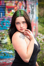
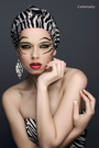
I've searched youtube with out luck .... not really sure what the right term is. Looking to get these dark tones using adobe elements 15 or LR 4. Not sure if its a preset or some IG filter? Thanks MR 1/ https://www.instagram.com/p/Bsm5-SInFlU … hare_sheet 2/ https://www.instagram.com/p/Bj24kr8A6_0 … hare_sheet 3/ https://www.instagram.com/p/BlBX7sKA2Wt … hare_sheet Feb 09 19 01:44 pm Link I would intentionally underexpose the photos in camera a bit, probably more than you'd initially feel comfortable doing. Also, I'd avoid using auto white balance settings if you want those warmer, richer tones. I don't know about Elements, but in Lightroom, you'd want to emphasize the blacks and shadows, and toy with contrast. It is my personal opinion that a lot of folks just overexpose everything in camera, and then textures and important darker points aren't as noticable. It's a lot easier to selectively lift areas that are underexpose and preserve textures, than to take down an overexposed shot. That being said, I have a few lenses that do pretty well with capturing darker, richer tones. They are vintage Pentax lenses from the 1970s and 80s. I do not feel that my contemporary Canon lenses are anywhere near as good at capturing the dark, warm colors. I have an old Pentax 28-80mm lens that I call my "tone beast." Nearly every shot I have where people remark about color or texture was shot with that lens. I found it a couple years ago in a pile of trash beside the road; someone had thrown out a few vintage lenses. Feb 09 19 03:46 pm Link You can underexpose, but I wouldn’t underexpose by more than a stop. I did that for a while but finally went to “normal” exposure, because underexposing sometimes gave me VERY deep reds in the shadows (and sometimes blue shadows), always on skin, that I couldn’t get rid of in post. The greatest concentrations of pixels are in the light tones, so by underexposing you’re essential throwing away information in the dark tones as well as in the light tones. Depending on how much darker you want an image, that may or may not be a problem for you. I’m not familiar with what features are in any version of Elements or with all versions of Adobe Camera Raw (which generally has almost exactly the same features as LR). I don’t use LR. Theoretically, at least, in LR or ACR you can recover up to five stops of underexposure (or take the exposure down by up to five stops) – but the closer you get to five stops under, the less you’ll like the results – just partly because of the fact that you’re giving away data in the RAW file by underexposing. This is the first image (in another of my portfolios) that I processed in ACR and PS back in 2011. (It took me seven weeks. I started over about once a week, because I was learning the software as I went). This was a normally exposed image with normal skin tones and a normal light blue sun dress (which is hidden in black). From way back in my film days, I was influenced greatly by Yousuf Karsh, and I decided to see if I could get a Karsh-like look. 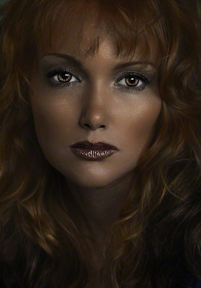 That would have been with PS CS 15 and whatever version of came ACR came with it. I would watch a tutorial on some aspect, work on that step, then go to another tutorial and another step. Later, I found that I had done things backwards. I checked a couple of MM photos to see what the “standard” size was, and that’s what I came up with. I cropped in first and sharpened next, both in ACR. There are MANY things I would do differently – the overlightened eyes, the lips and the general oversharpening, just to name a few. I keep telling myself that one of these days I’m going to go back and do it over. I don’t recall exactly what all of the steps were. ACR didn’t have a Blacks slider then. There was a black recovery slider that you could only move to the right. Now, I’d move the Blacks slider to the left. The first things I’d do in ACR (or LR if I used it) would be to get white balance and exposure as close to what I wanted. As you work with the other sliders, if you make any big changes, you’ll probably have to keep tweaking white balance and exposure and possibly make some color adjustments in HSL. When I got the luminosity down where I wanted it, I’d start tweaking the other sliders. You should have no problem darkening your photos that way. Rather than adjusting contrast, I’d use the whites and blacks sliders as much as I could instead. If you don’t have a Blacks slider, if you have a histogram, see if you can move the left side of the histogram farther to the left, or you could just use the contrast slider. You shouldn’t have any problem getting the overall luminosity as far down as you want it. After that, it’s just a matter of using the other sliders to adjust the contrast and using hue/saturation/luminance to adjust for any color shifts or color casts that crop up from darkening the image. You can also use HSL, curves and other adjustment layers in Elements if necessary. You shouldn’t need them except for local changes or further tweaking. That’s what I did with this 18+ image (and several others in this portfolio). There’s nothing difficult about this. It’s just that moving one slider a long way often requires additional adjustments with the other tools to compensate for the various other shifts that might occur. I doubt that you’re looking for anything much darker than this. https://www.modelmayhem.com/portfolio/pic/37119160 Depending on what you want to do, you may have to tinker with various tools to find out what works best in a particular situation and sometimes use the tools in slightly different ways than you’re accustomed to. Feb 09 19 09:48 pm Link Al_Vee Photography wrote: Thanks for the info Feb 09 19 11:36 pm Link Barely StL wrote: Thanks for the info Feb 09 19 11:36 pm Link One thing I noticed is that the photos in your portfolio are mostly low in contrast (lighting contrast, not color contrast). That’s fine for “normal” photography, especially if there’s color contrast. The darker you make a photo, the more contrast you’re likely to want. Without a fair amount of lighting contrast and/or color contrast, if an image is darkened much, it’s likely to look like an underexposed closeup of the top of a chocolate pie. Feb 09 19 11:53 pm Link I have Photoshop Elements 14 and 18 (have not used 18 much yet). Elements is very capable, I think it gets over-looked. Nice to buy once and use for 2-3 years or more. Most of the important RGB functions are there if you go to Expert mode and hunt down what you need. I would try stacking layers and using adjustment layers to work towards the darkness while leaving some of the lighter tones. The comments on contrast are spot on but you don't want contrast so much in the dark tones as they will turn into a black nothing. Layer modes like Multiply may be helpful as well for building the dark areas. Feb 10 19 01:34 am Link Shadow Dancer wrote: Two other things that you can use to get darken tones (if they're available in Elements) are gradient masks and LUTs. Feb 10 19 02:56 pm Link Camerosity wrote: LUTs Feb 10 19 11:21 pm Link You can have this effect with numerous techniques. One of these is a gradient map and a slight vignetting. The gradient map in multiply mode and relative opacity. Underexposure is achieved by adjusting the dark tones of the map.  Feb 11 19 01:13 am Link Since you are going for a specific look, I’d encourage you to look into gradient maps and LUTs. They are two of the main tools used in color grading. Both are easy to use. I’ve looked at tons of commercially available examples of each. As mostly a studio photographer, I have found that most of them don’t suit my needs, especially since I’m also usually going for a specific look from each shoot (or each set during a shoot). I’m looking for something different than what’s usually called cinematic color grading. I bought one package of 50 LUTs because it included three that I thought looked promising in terms of my photos and style. They weren’t. However, I recently (literally a few weeks ago) discovered a $30 product from Nino Batista that allows me to generate an unlimited number of gradient maps from specific reference photos that I like. If you start buying sets of gradient maps, you’ll spend a lot more money than that, and you’ll find that you’ll never use most of them. https://ninobatista.zenfolio.com/nbp-co … -photoshop You will find plenty of videos, both on Nino’s site and on youtube, on how he uses gradient maps, and you’ll get a very good idea of what you can do with them. I use them a little differently than he does. He is generally looking for more subtle changes than I am. You can use them either way by adjusting opacity. You can even create a gradient map from the reference photo that you posted in this thread. That doesn’t mean that using that gradient map will automatically give your photos the exact same look as your reference photo, because you’re starting with a photo that has different tonality, different lighting, different skin tones and hair colors, different wardrobe colors, different saturation and contrast, etc. Often you will get pretty close to the look you’re going for. Sometimes, you’ll have to tweak the gradient map and/or make adjustments in exposure, hue, saturation, luminosity and/or contrast. Most of the time, after you apply the map, you’ll want to dial back the initial look to some extent by adjusting the opacity of the map. So far, I’ve created about 50 gradient maps (it takes 1-2 minutes to create and save each one), and I’ve found that there are 5-6 that I use more than the others. One LUT will look great with one photo, while it will look awful with another photo. Once you get a photo out of ACR or LR and into Photoshop, it takes seconds to see how a LUT is going to work with a particular image. Many of the same things that I said about gradient maps can also be said of LUTs. Generally, the look from a gradient map is more subtle than the look you’ll get from a LUT. Most of the commercially available LUTs are demonstrated on landscapes or at least outdoor photos, which doesn’t give you an idea of how a LUT will look with skin and wardrobe, as opposed to beaches, grass, trees, bodies of water, buildings, skies, clouds, sunsets, etc. Many LUTs do weird things with skin tones (which you can mask out or reduce the opacity). (Purple skin, anyone?) The ones below protect the skin tones from such drastic changes. However, I have found one set (actually 10 sets with 10 LUTs in each set) that I like, although buying all 10 sets as a bundle will save you money. https://rggedu.com/collections/3d-lut-c … ollection# While I can use all the sets at various time, my favorite set is Vintage Brooklyn. You’ll see why in the second part of the video. These LUTS were created by retouchers Sef McCullough and Earth Oliver for use in their own work. If you want a quick (less than an hour) education in LUTs, McCullough has done a demo video (each is about 5-6 minutes) on each set of LUTs in which he shows all 10 LUTs in each set, used on two different photos, and explained why he selected the one he did for each photo. Actually, I’d start with the Introduction (Going Further with 3D LUTS), followed by the interview (Deep Dive): You’ll find these videos by clicking on the “How to Use Them” tab on each set’s page. Each set of LUTs is demoed in two different videos (one for ACR and one for LR). You only need to watch one of the two videos for each set. While these are not mostly studio photos, most of them involve models and wardrobe, which is what they were designed for. (Skin tones are protected from being changed to weird colors by the LUTs.) Actually, I’d watch the interview with McCullough and Oliver before watching the demos. That will put the demo videos in perspective and make the demo videos make more sense. That will take the total time up to 1.5-2 hours. There is yet another product that you might want to look at – Pratik Naik’s Infinite Color panel, which is the first one that I bought (except for the set of 50 useless LUTs). Here are two videos. I’d suggest that you begin with Unmesh Dinda’s tutorial. Unmesh is a friend of Pratik (both migrated to the US from India). Unmesh demos the panel on about 15 photos in a 36-minute video. Also, using his discount coupon will save you $35 instead of the normal $30 introductory discount, reducing the price to $94. (I bought ICP as a Christmas present to myself on Christmas Eve.) https://www.youtube.com/watch?v=2JOENeWevdw https://www.infinitecolorpanel.com/ Also, many photographers have linked about 250 of their images to Pratik’s IG page. This will give you a good idea of what you can do with ICP, which is basically creating LUTs or presets (that you can save and use again and again) as it changes the look of the image. It will also give you a wealth of photos that you can use to create your own gradient maps. https://www.instagram.com/solsticeretouch/ Pratik began with the premise that deciding what direction to take in color grading is the most difficult and time-consuming part of color grading. ICP will generate an endless number of grades, until you find just what you’re looking for. For what you’re trying to do, imo, the best place to start is with Nino’s NBP ColourmapX. You can view all of the videos mentioned above (which I think you’ll find informative) on the various websites without buying anything. A few caveats: None of these products eliminates the need to do the basic work in your RAW processor and Photoshop. While they’ll save you a lot of time and work, none of these products is guaranteed to instantly give you the exact look you’re going for. You’ll probably want to tweak the looks somewhat. But this will take a small fraction of the time it would take to create that look from scratch. Some products (especially LUTs) are only compatible with certain products. Some LUTs are created for specific motion picture color grading software only. Be sure that anything you buy is compatible with the software that you use. Nino's ColourmapX is compatible with Photoshop. The LUTs from RGGEDU are compatible with ACR, LR and Photoshop. Feb 12 19 11:09 am Link Tahnks everyone for the helpful replies  Feb 13 19 03:08 pm Link fireshoot wrote: Thanks. This is very close to what I'm looking for. Will give it a test. Feb 13 19 03:10 pm Link |