|
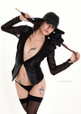
Please look at my portfolio and let me know where I am at. Thank you 😊 Jan 04 20 12:20 pm Link Hey girl! Welcome to MM! I'm also a model with minimal experience so take what I say with a grain of salt. I think you're beautiful! But you need to simplify your portfolio. https://www.modelmayhem.com/portfolio/pic/46035519 This image doesn't highlight you at all, and could be anyone. It's just overly edited and is not a reflection of who you are. https://www.modelmayhem.com/portfolio/pic/46035421 I really like the pose here and your expression...but the contrast and photo composition could be way better. https://www.modelmayhem.com/portfolio/pic/46020314 This one is my favorite, but still pretty poor quality. Your pose and facial expression here are great. Work with better photographers, simplify your wardrobe/makeup. Think natural, tank-tops, simple lighting, and relax a bit on the over-editing. When you're first starting out, you've gotta show off YOU. Best of luck!  Jan 05 20 10:19 pm Link Amanda gave pretty solid advice. I'll be broader and more blunt. You've got a few good images, some others that will suffice until you get to work with better photographers, and some images that need to be killed with fire asap.  IMO, your best image and a keeper... except that obnoxious stamp across you is like a finger in the eye. If any photographer ever does that to you again, whack him with a rolled-up newspaper. But the image is otherwise good. Clear, well-lighted, good color. Shows you off well. But that stamp...  Underexposed, but a good closeup. Very natural, personable expression.  One of your better shots at this point. I'm not crazy about the color temperature. We'll call it an artistic bent and leave it at that. Good closeup.  See prior image. Shows you off pretty well.  Ditto. Overexposed to the point of looking overprocessed, but it'll do. Shows you off fairly well.  Nice changeup. I like the pose. Image lacks sharpness, but is okay for now.  I like the expression. Now we're getting to the "kill it with fire" group.  Welcome to Cataract City. This image is overprocessed and does you no good.  Can't tell who that model is. That said, it's useless to your portfolio.  Shot in a steam bath? I can see a hat, but can almost make out the model.  The image isn't well done (lackluster pose, bad angle, and white dress in front of white drapery) and you're absolutely lost in that bulky gown and veil. If you're going to do bridal, choose a gown that fits your form and shows you off, not hide you.  I don't know what to say because I don't know what this is.  This would've been very useful for your portfolio, but why are you hiding half of you?  Off-kilter framing will not distract from the fact that this is a Facebook snapshot.  W... T... F...? No!  The odd thing is, if that image weren't so massively overprocessed and flatly lighted, that cat makeup might have been a cute oddball addition to your port. Might. But the combo of massive overprocessing and that makeup takes this way out of portfolio consideration. ---------------------------- In summary, avoid overprocessed (or even merely heavily processed) images. They do you no favors. They backfire and make the viewer wonder what you're hiding. Also avoid the artsy-fartsy filters and ultra-contrasty shots. The port needs to show you, not the special effects. At this point, simpler is better. Jan 06 20 01:25 am Link Kelly3903 wrote: Florida? Jan 06 20 01:54 am Link Orca Bay Images wrote: Thank you 😊 , I thinned out my portfolio. Jan 06 20 05:45 am Link Kelly3903 wrote: Much better! But why the redundancy of the first two images? Jan 06 20 12:22 pm Link I like that you have a wide breadth of styles. It shows you are trying to figure out where you are most comfortable. I'm not sure if maybe your photos are just too low res or if you've resized them yourself before uploading them but that would be the first step I would take in upping your portfolio. Are these all taken by the same photographer? I would love to see some diversity on that side, I think it would help improve your port from where it is. There is a common theme, for me, in your images of incorrect exposure... some are too bright, others are too dark. Thanks for putting yourself out there, though! I really look forward to you growing and improving your portfolio. Keep up the good work! Jan 07 20 11:22 am Link |