|
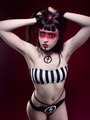
After a long hiatus I'm back on MM. I went to school for graphic design. I originally thought I would be a retoucher. However, I won my first award for photography when I was in second grade. I was gifted a cameras in my childhood, but never had anything decent until I was about 15. I got a hand me down canon rebel xt. I enjoyed taking shots but didn't think anything of it until a few years ago. I shot my first model the summer of 2015. Then I started to get serious 2 summers ago. Then sure enough, I decided I wanted to go pro after shooting a runway show at NY fashion week. The photos came out way better than they should have in my opinion. So I went back to school and used my refund check to jump start my dreams. Now here we are. About 3 months into owning my first low level professional camera. The Sony A7III. What do you think? I process all the photos myself through lightroom cc 2020. I don't use photoshop almost at all, accept for paid work. (I know I should still be putting in the extra effort.) Pretty much everything I shot on my profile are test shoots. Even the paid shoot was a bit early into my career (1.5 months). Please take no prisoners and tell me what you really think. I'm here to learn and grow. I will not be offended or hurt by your opinion. Expert or not. Thank You. I hope everyone is okay during this trying time! Mar 25 20 06:39 pm Link OK, not sure if you are overlookning a lighting opportunity, increasing contrast or underexposing but your blacks have no texture to them. They just look flat. Quite a few of your images have a black background, the person has black hair and it almost lookls like you cut the shape of their face out of a piece of black paper and had them pose through it. That really stands out to me as the biggest improvement you could make. Some rim lighting would help, where that is not possible, try opening the aperture, using a slower shutter speed or increasing the ISO (or a bit of all of the above). Pop your models off the backgrounds and make them look 3 dimensional!!! Hope this helps. Mar 27 20 07:59 pm Link Shadow Dancer wrote: I definitely need to learn more about lighting. I need to learn more about retouching and editing. Thank you for the feedback. I appreciate it! Mar 27 20 11:35 pm Link In looking at your portfolio I noticed that every one of the posted photos have almost identical compositions. Back in my film days we had to be a bit more conscious about the images because each one had a cost to it, with digital you can slam out a 1000 shots and there's not much of a thought about it. With film we learned that varying the composition added interest to the set. Take a little time and think about what it would be like if every shot you took costs you $1, how would you shoot a session with that thought? There are some fantastic expressions captured in the set, try changing the composition and see if it can enhance the presentation. I taught classes many, many moons ago and when we came to the "rule of the thirds" I would always change it to the "suggestion of the thirds"! Use the idea as a base but vary the execution and there will be fascinating outcomes. Just as a thought, if you took the photo of the guy in front of the tires and recomposed it. Move him in front of the tires on the left a bit more, step back opening the frame, place him balanced just outside of the left 1/3 and see how it looks. A lot would depend on what else is in the background but just something to think about. Apr 02 20 07:52 am Link Zeelon wrote: That's a great idea. I seemed to have been more focused on taking a decent shot. I haven't considered the creativity. That's something I need to start focusing on. How to breath more life into my work. Thank you for the suggestion. I'll look into editing that photo. It's technically a still from a music video I shot. I can share that with you here: https://www.youtube.com/watch?v=KV9qvYN9aUY Apr 14 20 07:50 am Link I hope you don't mind, I grabbed one of the images from your profile and did a couple of suggested edits. This is the only way I could figure out how to do it, I am not a coder! The links will expire at some time. I like the image a lot so making a couple of suggestions. Just download the files, don't worry about signing up. With this you cut the background completely out and only have the core of the image: www.filedropper.com/test_669 And then to an extreme: www.filedropper.com/test2_7 These are just other ways to show the images and these would all be done in post or you can take them with several final products in mind. Well, with the ability to bang out a 1000 shots, mix it up a bit! Apr 14 20 07:25 pm Link Try not to repeat shots. Unless its a series that connects. I would suggest finding a local photographer and try to assist or go to some of the NY work shops. https://www.eventbrite.com/d/ny--new-yo … -workshop/ Some have been moved to later dates dues to Covid -19. Join this: https://www.ppa.com/ Your images (most) suffer from poor composition and subject placement. Apr 17 20 12:39 pm Link Before I went inside of your portfolio, I read your profile to sort of set my eyes for what I would see. The two do not match at all. But that does not mean that they will never match nor does it indicate how long before you get there. What I see is a total disconnect with controlling light, and as others have pointed out, placing subject. Start reading and attendin3 mag some workshops. Someone noticed how your blacks had no texture. I noticed how your whites had none as well. Go back to the basics and start concentrating on textures. Ensuring that your skins have texture, your wovens have texture. I have never shot a NY Fashion Week. Looking at the lack of texture in your work, I am asking myself how did you get hired to do it, and how come you don't at least add that work to your portfolio instead of a dozen photos from the same shoot with no variety. Try not to use more than 2 ( 3 max) photos from the same concept unless is a series and they connect. Here is a basic tip for you. Place light between your subject and the background and it will seperate the two and not make it look like someone is sticking there head through the backdrop. Now with that being said, ensure that you control that light so that it does not blow out the whites or the subject. Keep posting in critique until you are convinced that your portfolio matches your profile. You have ambition, so go get it. Good luck my friend. Bluestill May 05 20 04:16 am Link  The flowers in her hair and the shirt are blown out. You can probably fix this by shooting manual, shooting raw and bringing down the highlights in post. This is one of the better composed shots in your portfolio On the subject of composition… Almost all of your photos have the subject centered in the frame. Take the time to learn the basic rules of composition. Sometimes you can break them but many times they will serve you well. An example of centered composition: 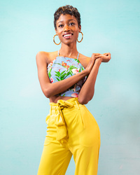 Cheers, Noah Nov 19 20 09:46 pm Link |