|
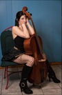
Take a look and please give me ANY suggestions you may have. Dec 17 22 10:16 am Link You have some nice work posted. You have a couple of more or less snapshots as well, consider deleting those. Your avatar image, the bright yellow top is distracting from YOU. There are a couple with a bright red dress that also distracts. You could take those bright colors down considerably in Photoshop or you could delete the images, your choice. Overall, you are doing good work! Dec 17 22 12:33 pm Link Thank you so much! That was very helpful!  Dec 18 22 11:39 am Link WVGirl0105 wrote: You're very welcome, I'm glad my opinion was useful to you! Dec 18 22 03:18 pm Link 18+ https://photos.modelmayhem.com/photos/2 … 973968.jpg WAY over exposed. It's so bright that I can't tell if it is actually 18+ or not. Dec 20 22 05:06 pm Link On too many of them you are just staring into the camera instead of working on face position or tilt. Concentration should also be done on eye placement .The limbs are also not positioned in any any sort of feminine way on many. Done well - the limbs will compliment the face - as will the eyes. I might suggest a book called "Dynamic Posing Guide by Craig Stidham and Jeanne Harris. And no, I'm not selling something and when I use the word "book" people love to massacre me with severe criticism about how, books , "in their opinion" do nothing as far as they are concerned --- but , to me , it is my photographers bible (well, one of them anyway) --- so I am suggesting it anyway. Not going to worry about the nay sayers and those who just love to criticize ! On "a few more" of your images I would consider opening the mouth "just a little more" but only enough to show" just a "little bit"of the teeth. There are too many of them where the completely closed mouth gives a bored appearance to the image. Feb 24 23 06:32 am Link Consider updating your profile stats to reflect your actual appearance, because it's confusing to a person browsing the site. For example, your hair is listed as red, when it's clearly dark brown in your posted pictures. Also, the headless picture of you leaning against the spray painted wall is out of place. Mar 14 23 06:36 am Link Your avatar is so somber. You can do better. Not all of your recent uploads should be flagged "M". Mar 14 23 04:52 pm Link posted to images .. this is my fave https://www.modelmayhem.com/portfolio/pic/47722235 great stuff ;-) yes I agree work on expressions and try to create more feminine poses Mar 20 23 12:34 pm Link I've always thought it was a bit unfair to critique models images because they can only show what they're given by photographers. Still here goes... Whenever possible use a MUA. Many here work for for trade but its often well worth it to go to a mall and let them do it. It's a small investment but often pays off well. Expressions can make or break an image. Practice in a mirror. Now here's the really hard part. As a model its important to know the difference between an average or poor shot and a well done one. Equally important is to consider things that distract the viewer. Things like hair ties on wrists or things that shouldn't be in the background or foreground. However your job as a model is to look good and move as directed. Good photos are on those you choose to work with. Here choose wisely especially if you aren't being paid. Mar 23 23 02:01 am Link
Post hidden on May 03, 2023 04:00 pm
Reason: other Comments: Please don't use forum posts to post your personal links when they're not relevant to the conversation. Apr 27 23 08:33 am Link Overall you are doing pretty well, but you seem to look into camera when there's no reason to do so, making your images too much alike. I think your expressions are the area you need to work on the most. They tend to be somewhat expressionless. Rick Sep 07 23 03:56 pm Link |


