|
Forums >
Digital Art and Retouching >
How to achieve this look
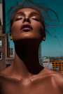
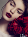
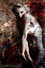
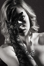
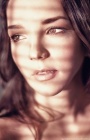
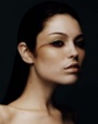
I have tried over and over but I cannot get the color/tone of this photo. http://lookbook.nu/look/2738217-112311 please help thank you Dec 01 11 08:39 pm Link Soft lighting and a whole lot of Photoshop blur. -PKD Dec 01 11 08:43 pm Link looks like just some desaturation applied to the image in post. Dec 01 11 08:46 pm Link hi...welcome to Model Mayhem...enjoy your first post. Dec 01 11 08:50 pm Link PK Digital Imaging wrote: He needed help in regards to the color tone... not how to terrorize a poor photo. Dec 01 11 08:50 pm Link Mika wrote: Thank you very much Dec 01 11 10:26 pm Link Looks like cross-processing to me. Original is on the left, target on the far right.  Settings:  Dec 02 11 06:39 am Link Peano wrote: +1 Dec 02 11 09:42 am Link joana adam mcgee wrote: Have you tried a layer copy, diffuse glow with a soft color cast, and then adjust transparency and levels of copy and color saturation and shadow levels of original layer? Dec 02 11 10:05 am Link The main image on the link wouldnt load but the others did. One thing I noticed was well exposed models with a lot of backlight that was blown out. This is a look I get a lot when shooting heavy backlight if I dont use fill and balance. Try easing up your exposure in LR or Camera RAW as a starting place. Let the clipping begin, just stop it before the shin highlights get blown out. You might even try bumping your ev compensation a stop when shooting but I really think it's more of an exposure and light thing than strictly post production. Dec 02 11 10:14 am Link [edit] Oooops, much to late. Sorry. ( had a example but Peanos was so much easier and better ) Dec 02 11 10:46 am Link Alluring Exposures wrote: Really?? I don't think that by using blending modes you are going to achieve this final look!! Is definitely a matter of cross processing and curves for that is your best friend.. Dec 02 11 12:10 pm Link One way to get the skin looking smooth would be to simply copy the R (from the RGB channels) and set the layer mode to Luminosity. Mask out the areas you don't like the look in and feel free to clip a Curves layer to it for some more control over the tones. Drop on your straw colored solid fill layer and play with blending modes until you get a look you like. But that's just another option. Peano's example, while not being a perfect match, is pretty close. Dec 02 11 03:30 pm Link split toning is the way to go. Either via individual RGB channels on the Curves adj layer or by tweaking Selective Color Adj Layer Good luck R Dec 02 11 10:55 pm Link The Invisible Touch wrote: That's exactly how I did this in the sample I posted to illustrate. Dec 03 11 01:42 am Link Alluring Exposures wrote: Carlos, that's exactly what I mean, in my opinion your sample doesn't have any resemblance to the OP question! What the OP is asking is achieve by cross processing :-) Dec 03 11 04:08 am Link The Invisible Touch wrote: It's an image that was shot differently, lit differently. But what I did brought it close to the feeling in the original image form the OP. Dec 03 11 01:41 pm Link Alluring Exposures wrote: Sorry but I'm with Invisible Touch... it looks nothing like the look/feel the OP is after. Dec 03 11 02:50 pm Link Peano wrote: Brilliant! Dec 03 11 02:54 pm Link One thing I notice about a lot of posts like this is that the image someone is trying to make 'look like' the desired result often contains significantly different subject matter in terms of tonality and contrast. I'm not singling out the OP here, who did not specify what photos he's trying to get that particular look and failing on, but just bringing it up in general. What I notice about the example image is that the colors are all within a very limited palette, very pastel, and not a lot of vivid color, or contrasting colors, between model's skin, hair, clothing, and background. Whatever filtering is being done, the relationship between those colors and tones is the biggest part of why the final result looks the way it does. If you apply that same technique to an image with vivid colors, or even contrasting pastel colors, or with more dramatic highlighting and shadowing, you could do exactly the same thing and never get that same 'feel' in the result. Same thing goes with black and white conversion settings, along with many other color processing styles. Most photographers who have a 'signature' look to the color tones of their images also have a particular way they shoot - and they've developed (no pun intended) their post processing techniques to suit their shooting styles. So it's image + post work coming together to create a cohesive result. Use a different style of image with the same post work/filtering, and the results will most likely be completely different. That could be awesome, or it could be not-so-awesome, but either way, it won't replicate the look/feel of the original example. Just something to keep in mind with the 'how did they do that' kinds of questions - even if there is significant post-processing involved, part of the answer usually still lies in how the photo was shot to begin with. Dec 03 11 03:02 pm Link wynnesome wrote: Good point. When I raised it here, all it got was a stupid reply. So don't expect much. Dec 03 11 04:24 pm Link |


 i found this very helpful.