|
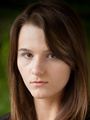
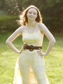
I took these on Tuesday. Now you guys get to pick mine apart.     Sep 15 05 10:14 pm Link If I had to pick I'd say number 1 and 2. Her braces are extremely distracting to me. I'm going to nitpick here and say if you do a shoot with her again you may want to suggest for her to layoff the eyeliner slightly. It makes her eyes seem more shallow. In the second shot she reminds me of Nicky Hilton for some reason, bone structure perhaps. This is just my pointless view, but otherwise great shots. Your work overall is very nice. Sep 15 05 10:56 pm Link Dark background, dark dress, dark hair the only light reflecting back is off her skin. Not always a bad thing but in this case there is not enough contrast in the bulk of the image and too much in her face. The result is a lifeless image with too strong a shadow around her cheeks and eyes. Change the background to allow for greater contrast and play with the lighting to on her face to reduce those shadows. Light brings life to every living thing on earth and if you want your images to live and breath you have to have light. Everything dies in the darkness including our photos. #2 is the best because there is more skin to reflect the light and her eyes ae not looking racoonish. Your portfolio is much better. Sep 15 05 11:02 pm Link I think there too, High school portrait. Her braces just scream, 15-year-old! Sep 15 05 11:10 pm Link BRACES freaking rock...wow how cool is that Sep 15 05 11:11 pm Link ProShotPhoto wrote: That's an interesting comment because I think there's too much contrast. Here's a brown on brown shot that I really like (from MikeyBoy): Sep 16 05 12:02 am Link angelavasquez wrote: That's because she is 15. Sep 16 05 12:04 am Link Envy wrote: I'll pass on the tip on the eyeliner. Different color maybe? Sep 16 05 12:05 am Link Y'know, I've read your critiques of other peoples' images, and given the things I've read, I can't believe you'd even put these up for critique. Hate to be an asshole. But, hey... that's what I am. Sep 16 05 12:10 am Link Well I did. So what don't you like about them? Paul Sep 16 05 12:15 am Link Different color may help, I think her eyes are so deepset that black liner makes them appear even smaller and as I said shallow. That or perhaps not bringing the liner all the way across the bottom lid, just to the middle may help as well. The eyes and braces are the first two things that popped out at me and thought it was worth a mention. I had braces, I know how impossible it is to hide them behind a smile. As you said she's fifteen , it goes with the territory. She's a cute girl nonetheless.  Sep 16 05 12:16 am Link They are probably fine for the client but I would say they are not portfolio quality. There just isn't much life or mood to them. I look at them and think "run of the mill senior portraits". They just don't "snap" like some of your other work does. Know what I mean? That dark ondark image you posted by another photographer works because there is life and attitude in that image. The color is gorgeous and the composition is spot on. The image you posted of this girl are just sort of flat, and, lifeless. Cheers, Zack Sep 16 05 12:39 am Link Any suggestions for turning flat and lifeless shots into the next step? I agree that I don't see attitude. Paul Sep 16 05 12:43 am Link You're a night owl too huh? Until Adobe makes a "life" filter I figure it is our job as a photographer to drag life out of the subject. I would bet she wasn't totally comfortable in front of the camera. As you well know, that happens a lot and our challenge as shooters is to find that life that the camera is blocking. I regularly stop shooting and start "chatting" and engage the less confident subjects in conversation to take their mind off of the camera. It can be the hardest part of the job. As you already know I'm sure. Cheers, Zack Sep 16 05 01:03 am Link If anything, I think there is a little too much contrast. Perhaps her eyes are a little dark, and maybe a change in eyeliner is in order, but I think the high contrast is what makes the eyeliner more noticable. If the contrast bothers you I might use a little more light on the left to fill in her eyes, soften her cheeks, and eliminate some of the shadows her hair cast on her face, but it doesn't really bother me. A fill on the left might add some detail to the dress too. I don't know, I can also make the arguement that it is all a style choice. I wouldn't worry about it. I can't fault the braces, and I think I like the brakes look in picture 3 more than the lip pucker in picture 2. I know the pucker is from the braces - seen quite a bit of it - and I know there is nothing you or she can do about it, so why worry? Like Zack, I suspect she was a little ill-at-ease. Some people you can loosen up in 5 minutes, some it takes 2 hours. If you don't have 2 hours, you take what you can get. Don't sweat it. Sep 16 05 01:25 am Link Hey Paul I agree with the flat, lifelessness also. It looks like you were having an off day. I have tried to pin point the problem but it seems to be a handful of small stuff that's adding up. For me it's mostly her hair. It is dry and straw like. It's plastered to the top of her head and looks constrained, not free and natural. It's also getting into her face some. It just doesn't look natural, almost wig like. And the other thing is the spark that is not present. It's definitely all the models fault. lol Paul Ferrara wrote: #3 you might try lightening up her eye sockets and that hair strand shadow on her face. But you know what they say Paul, "crap in crap out". Not your work is crap of course, just that you can't get something from nothing. Sep 16 05 01:26 am Link I like the first one the best. I really like the brown on brown. Very cool. What I don't like about the 2nd and 3rd are cosmetic. Her hair is messy, her face is lighter than her body and her smile looks goofy. But these are not your dept. They do look a bit flat compared to your other work. I don't know how to fix that. lol What I do know how to fix is this: She should do less liner on the bottom and soften it. Rub some a little silicone-based product through her hair to catch the fly away strands. Or not straighten her hair. Or pull it back. And a tiny bit of bronzer on her face to soften the contrast between face and body. And get her eyebrows professionally shaped. It would really open up her eyes. Sep 16 05 08:26 am Link I love the braces! You know, everyone is like ... ARGH! Braces! ... but you are capturing a moment in a person's life. Anyone who has braces *should* have a portrait taken while wearing them! I do agree about the contrast. Could you even them out a bit by punching up the shadows a bit? I think the comments about eyeliner have more to do with the fact that the liner is a bit heavy on the lower lid. Sep 16 05 10:06 am Link she should not be smiling. where was the makeup artist? or stylist? lighting is really flat and dosent help her eyes at all. Sep 16 05 10:16 am Link Was there an MuA or did she do her own hair and make-up? I think some post production work would clear up her dark eyes and split ends. Saturate the background and see if the light brown is a better fit against her hair and dress. Adding a smart blur wouldn't hurt either. Over all they are great portraits. Nice work. Sep 16 05 10:23 am Link Nicholson Photography wrote: The lighting is flat??? I only used one light, at camera right. Look at the shadows on her rear arm/hand. Sep 16 05 11:03 am Link Sometimes a few very simple suggestions may suffice, and I hope that is the case here: --What I want on a face if I can get it: an overall matte finish (no shine); cover beneath the eyes and spot use where needed (and blend, blend, and blend again); accents only for eyebrows, eyelashes, underlashes (?), and lips unless I have an MUA who has a more brave and practiced approach to painting. --Lighting: you (and I) probably can't get even enough lighting across a woman's face while also maintaining some interest via shadow in the scene or background. You know the tools. If a styling adjustment, say moving the hair off the cheek, makes better use of the beauty dish, softbox, umbrella, octabox, or northern light, then good. --Photoshop: I lost my "straight photography" cherry this month with CS2 and have no shame. Well, maybe that's a bit much--I don't want to do my spotlighting by going to the filter that does that; however, I am learning that the air brush and healing tools are my friends. You do what you can to conform to standards and kick it up some. Energy with amateurs? I haven't had enough experience but have had some: on the safe side, if you have something for them to do physically (from the "say cheese" school of photography, telling a model to hum will get a kind of smile as will suggesting other actions that effectively mimic expression). Other techniques apply to other types. Sep 16 05 11:04 am Link C R Photography wrote: Thanks. She did her own hair and very light makeup. Her hair is naturally curly so she straighened it. I could have done a better job on the fly-aways. Sep 16 05 11:06 am Link Tracey Masterson wrote: Thanks for the tips, Tracey. Sep 16 05 11:08 am Link No offense, Paul, but everything about these shots indicate that she is INCREDIBLELY uncomfortable in front of the camera. Sep 16 05 12:33 pm Link Paul Ferrara wrote: Yeah, right...... Sep 16 05 12:36 pm Link Here's a question - have you edited these yet, Paul? Sep 16 05 01:10 pm Link Don't like the fake smile in #1. Good job on your part though. Sep 16 05 01:14 pm Link Yep, although I didn't screw around with the loose hair. And Mark, I don't think that smile's fake. Paul Sep 16 05 01:45 pm Link Paul, As you so often comment on critiques for models to get better photographers, I will suggest to you to get better models. While the technical aspect is on par, these images are far removed from the expectations placed on those in the modeling industry. Upon review by those having the ability to pull the trigger on whether a model moves to the next level, the first statement to this young lady would be, "come back when your braces are removed." As well, if these images were used in your portfolio in presentation to gain additional work at the agency level it would probably give an impression of nothing more than yearbook photography. Technically solid, albiet an impression of not being astute enough to recognize even a basic fundamental in model presentation and with that the effort in creating these images can be cast aside as wasting time if the motive was creating model imaging. They are just plain wrong. It comes down to the choice between understanding the need and having the sensibility to present it, or one that makes an attempt without being fully aware of all the requirements. Thus, you would probably be passed over at the hiring level for one that has stronger model recognition even without having pristine lighting. The sensibility shown here is good crisp presentation, yet a woeful misunderstanding of what model imaging is all about. These would receive high marks on Portrait-Yearbook Mayhem, but they are anything but Model material as they clearly show the time well spent for creating pretty pictures of this young lady cast immediate disqualification. Therefore, just as you solidly recommend to others, make better choices with whom you work with. That in itself is becomes a very telling statement regarding your understanding that it takes a lot more than touching up loose hairs and capturing perfectly balanced light. This isn't a critique about photography as you so often feel compelled to place front and center in importance. It's more about what to do with the photography and putting it in its rightful place. Sep 16 05 07:03 pm Link Geez, she's 15 and I don't have any of her pics in my port. She's just a cute girl with braces and I felt like uplaoding them for critique. Paul Sep 16 05 07:35 pm Link Paul Ferrara wrote: Paul Sep 16 05 08:12 pm Link BlacklistVisual wrote: I think we should stick any old images up here for crtique. Why should they be what we think is the best we ever did, - why not just any old one from yesterday. The point of this forum is to share what we know and to learn from each other amd if every image is perfect we will learn squat, as everyone ways WOW and kisses A: Sep 16 05 08:16 pm Link Paul, this is the worst studio lighting I've seen out of you. You know better than that. Your shadows are far too deep for her face, and they accentuate her flaws. Look at the double chins you've given her. Her eyes are in shadow, and her nostrils are so dark, they draw a lot of attention. But the single thing (well, things, since it happens twice) that bothers me most is the oval highlight of her left cheek when she smiles. It's just floating there, completely surrounded by shadow, and it looks completely unnatural. I don't mind single-light portraits (I do my fair share) but you really have to be careful about the shape of the face in relation to the shape of the light. And having seen you do that so carefully in the past, I'm really confused as to why you have forgotten it here. On the positive side, you never let her arms look fat, which is not always easy to do, even with skinny girls. Sep 16 05 08:27 pm Link The smile is just too much, not a natural look. She looks like she's stuggling to smile.. Sep 17 05 10:55 am Link She's ugly. Sep 17 05 11:04 am Link Brian Diaz wrote: Really? I didn't think so. Sep 17 05 11:41 am Link Nerlande wrote: And you're black. So what? Sep 17 05 11:41 am Link Nerlande wrote: ***Ouch. Sep 17 05 11:45 am Link Nerlande wrote: The photographer asked for a critique of his work; the model didn't ask if you thought she's cute. Sep 17 05 11:47 am Link |