Model
Christina Josephine
Posts: 121
Warsaw, Indiana, US
ikonas wrote:
Welcome to MM Josephine. You've got already a great start on your port. Keep in mind that a port is always stonger if it does not include variants - see rule [1] provided in the guidelines of my original post on page 1 of this forum. Thus, I recommend removing images 2 and 3 as the related fan image is stronger.
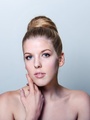
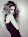
You have several very strong images, this one is one of them for your intense expression and beauty.
![https://photos.modelmayhem.com/photos/121018/15/50807f2d0330e_m.jpg]()
Good luck! Thank you so much for the advice. I'll start cleaning house!

Photographer
ikonas Boston
Posts: 736
Boston, Massachusetts, US

Maria Panina wrote:
I'd like to hear your opinion Hello Maria, please note that I have already reviewed your port on page 4
Model
Winnie L
Posts: 5868
Singapore, Singapore, Singapore
Photographer
ikonas Boston
Posts: 736
Boston, Massachusetts, US
Apples Photography wrote:
Ok Lets Hear it ? Greetings Mr Apples, since you seem to be just starting out, I will try to be gentle. I prose deleting the three bare breasted ladies images. These seem just nudies, with no unique concept behind. The ladies are beautiful, but the photography is mediocre. Keep shooting, keep reading and I know you will grow and get better. I was there before.
I find this image superb on several levels including her beauty, makeup, and great light. Keep shooting like that.
![https://photos.modelmayhem.com/photos/121029/07/508e9815921ff_m.jpg]()
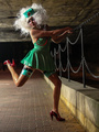
This image is creative and fun
![https://photos.modelmayhem.com/photos/121027/04/508bbfda7b4cc_m.jpg]()
Photographer
ikonas Boston
Posts: 736
Boston, Massachusetts, US
Megan Camille wrote:
me! Welcom to MM Megan,
You seem to be on the right track. Your stats are great, the photography is technically good, your poses and expressions are quite strong. Perhaps delete this one as the sister image is very similar
![https://photos.modelmayhem.com/photos/121029/08/508ea5ab59c89_m.jpg]()
I love this portrait as it is captivating and your beauty is natural, down to earth.
![https://photos.modelmayhem.com/photos/121029/09/508ea8ad9ddf7_m.jpg]()
Have fun
Photographer
ikonas Boston
Posts: 736
Boston, Massachusetts, US
HERE IS A TIP FOLKS: Hide all your images except keeping your top 20. Take note how much your port has improved. (You can recall hidden images anytime)

Makeup Artist
ImageBeautique
Posts: 169
Sheffield, England, United Kingdom
Once your back at it id love to know your thoughts
Thankyou!!
Photographer
ikonas Boston
Posts: 736
Boston, Massachusetts, US
ImageBeautique wrote:
Once your back at it id love to know your thoughts
Thankyou!! Thanks for stopping by. I love compact ports and yours is one of them. You show a range of your beautiful work quite effectively. Truthfully I would not remove any image. Besides your AVI which of course is superb, I would also like to highlight this portrait for the makeup, light and beauty
![https://photos.modelmayhem.com/photos/121018/14/508075990ed74_m.jpg]()

Model
Rochelle Remy
Posts: 54
Birmingham, England, United Kingdom
Photographer
Matt 333
Posts: 54
Fairfax, Virginia, US
Great idea. Looking forward to your comments.

Model
Kimmi Fox
Posts: 81
London, England, United Kingdom
Not sure if I've posted in this or not, the thread is so long!!! So apologies if I have.
As I've recently started out, any critism would be good, would love to know what to keep, what should go, how to present myself better with what I have available.
I know I have a few variables, so opinions on which is the best out of them would be great

Photographer
Summer Polonsky
Posts: 2
Bellevue, Washington, US
I'd love to have your feedback!
Photographer
ikonas Boston
Posts: 736
Boston, Massachusetts, US
Matt Hildebrandt wrote:
Great idea. Looking forward to your comments. Hello Matt, it is unusual and refreshing to see a port primarily fpcusing on wedding photogrphy here. Your images are captivating and I do not see much violations fo the basic guidelines spelled out on page 1. So I will depart from my usual critique and focus on the wedding part.
While most of your images are of good quality, the models, their dresses and location are great, I have the immpression that the brides are models as they all are credited a MM members. It would be a good idea to display, at least several, if not all, your actual customers, This would give more credibility to your work. In the same vein, I propose showing bride/groom images and bridesmaids/best men.
Back to the original topic of this forume - what to delete? I propose one to remove would be this one. It is a beautiful image, but you posted already the same bride in the same dress with the piano. If you read my previous commentary and the guidelines on page 1, you will see that I disapprove of variants as they dilute the power of one's port.
![https://photos.modelmayhem.com/photos/120118/20/4f1797c8a6d0e_m.jpg]()
I would also propose deleting this one as her expression and pose are awekward.
![https://photos.modelmayhem.com/photos/121016/18/507e09b9e770b_m.jpg]()
This one is one of my favorites for the super composition
![https://photos.modelmayhem.com/photos/120119/11/4f186ebc85bdb_m.jpg]()
An I love the blissful epression here
![https://photos.modelmayhem.com/photos/120325/19/4f6fcf9e41af6_m.jpg]()
Photographer
ikonas Boston
Posts: 736
Boston, Massachusetts, US
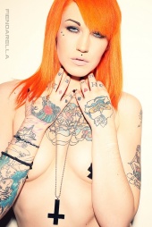
Kimmi Fox wrote:
Not sure if I've posted in this or not, the thread is so long!!! So apologies if I have.
As I've recently started out, any critism would be good, would love to know what to keep, what should go, how to present myself better with what I have available.
I know I have a few variables, so opinions on which is the best out of them would be great Hello Kimmi and welcome to MM. I see you are on a good start in your portfolio building. Like majority of your peers who start out, you posted multiple variations of the same theme which davalues a port, as it confuses the viewer. the 6 images with your orage hair are great, but they are too similar. I propose deleting 4 of the 6.
I also recommend deleting this one as there is no discernable concept and it does not show you in the best way. Another hint that this image is week is the few comments it received, actually only one in 600 views.
https://www.modelmayhem.com/portfolio/pic/30167851
Also remove this variant
![https://photos.modelmayhem.com/photos/120927/07/506460440cc1d_m.jpg]()
THis one is one of my favorites for your captivating expression, dungeon location which is appropriate for the concept, and great light
https://www.modelmayhem.com/portfolio/pic/30423653
This one is my favorites from the orange series.
https://www.modelmayhem.com/portfolio/pic/30082325
I also like this implied as it is a great display of your many tattoos
![https://photos.modelmayhem.com/photos/120927/07/50645c424a229_m.jpg]()
I would like to give you my opinion about your open crotch image. I think these sort of imges devalue one's port as imagination is always better than seeing the actual thing. These do of course get comments, but not from real photographers, but rather from the lechers lurking on this site.
Photographer
ikonas Boston
Posts: 736
Boston, Massachusetts, US
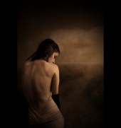
Summer Polonsky wrote:
I'd love to have your feedback! Welcome to MM Summer. Like the previous port I just commented on was unique in its wedding theme, yours is unique in that it focuses on instrument playing. You light your subjects well, and your overall photography skills are good. Not great, but that will come in time, I am sure based on what I see.
Your port is compact, you have no variants, so I would not delete any images at this time. Only start deleting as you create better images in the future.
I have one suggestion. Bring your new fashion shoots indoors, and your instrument playing outdoors. Just for the sake of your port diversification.
As far as my favorites, I love her thoughtful expression and the shadow
![https://photos.modelmayhem.com/photos/120908/16/504bd75f810d3_m.jpg]()
Here the afternoon sun provides just the perfect backlighting through her translucent dress. Keep shooting like that.
![https://photos.modelmayhem.com/photos/120908/16/504bd66e3966d_m.jpg]()
Model
Maggie Xia
Posts: 452
Atlanta, Georgia, US
Hey there! I just updated my port and would love to hear your opinion 
Model
Emily L 92
Posts: 15
Melbourne, Victoria, Australia
I would really appreciate you looking through mine! plus any tips or criticisms! I'm new to all this and really appreciate the feedback!
Photographer
Matt 333
Posts: 54
Fairfax, Virginia, US
Ikonas, Thanks for the feedback. All are valid points that I'm going to heed. This is a kind thing for you to do. Cyberspace would smell better if there were more people who lend their peers constructive criticism like you're doing in this thread! Perhaps you should consider giving classes under or like Scott Kelby, et al. ikonas wrote:
While most of your images are of good quality, the models, their dresses and location are great, I have the immpression that the brides are models as they all are credited a MM members. It would be a good idea to display, at least several, if not all, your actual customers, This would give more credibility to your work. In the same vein, I propose showing bride/groom images and bridesmaids/best men.
Photographer
ikonas Boston
Posts: 736
Boston, Massachusetts, US
Matt Hildebrandt wrote:
Ikonas,
Thanks for the feedback. All are valid points that I'm going to heed.
This is a kind thing for you to do. Cyberspace would smell better if there were more people who lend their peers constructive criticism like you're doing in this thread! Perhaps you should consider giving classes under or like Scott Kelby, et al.
Matt, your kind comment is much appreciated. I find what I do here quite enjoyable, however getting feedback like yours makes things doubly rewarding and this is what keeps me going
All the best,
Photographer
ikonas Boston
Posts: 736
Boston, Massachusetts, US
Randall Photography wrote:
I'm down Hello Randall, thanks for stopping by. Your models are gorgeous and you know how to capture their beauty in creative ways, and in lovely locations. You show great control and understanding of light, depth of field, composition, etc. So I find it a bit of a challenge to critique a body of work of as high caliber as yours and thus I need to judge you by a higher standard.
In light of what I just said, I propose deleting three images.
Here, while your model is beyond gorgeous, I dont find a unique concept besides the fact that she is wearing boots in her naked state. However, you already used this concept in another image, and thus I consider this a variant - rule [1] of my guidelines on page 1. What actually really bothers me is the apparent irregularity in her boobs appearance. Or perhaps it's an illusion? Regardless, one breast seems a bit droopier than the other. A simple edit might correct this situation.
https://www.modelmayhem.com/portfolio/pic/30431176
In the next image, while the model is lovely and so is her corset, her expression seems a bit stiff, and so does her pose. Having received only one comment in 100 views also hints at the image weakness - for more on this topic, see rule [4] in my guidelines dealing with comment to view ratios.
![https://photos.modelmayhem.com/photos/120719/18/5008bacd66763_m.jpg]()
Another image that does not meet the high standard of your port is this one. The model has the body of a goddess, however I find the lighting mediocre. Even though we know we have to use a reflector or a flash as fill-in in such shots, it should not be obvious one used a flash. In this image it is too evident. Furthermore, I see squarish shadows on top of her breasts, almost an artifact of photoshop work? With all the comments and lists, I doubt you will delete it, but you wanted my opinion, right?
![https://photos.modelmayhem.com/photos/110321/22/4d88312539263_m.jpg]()
In contrast to the above image, the light in the next one is absolutely superb and hence I chose it as one of my favorites
![https://photos.modelmayhem.com/photos/110221/10/4d62af6ae85a2_m.jpg]()
Another one that deserves honorable mention is this one, for its divine natural light
![https://photos.modelmayhem.com/photos/100604/11/4c0945fe786df_m.jpg]()
Great work overall, and thanks for being a gatekeeper!

Photographer
Randall Photography
Posts: 514
Los Angeles, California, US
ikonas wrote:
Hello Randall, thanks for stopping by. Your models are gorgeous and you know how to capture their beauty in creative ways, and in lovely locations. You show great control and understanding of light, depth of field, composition, etc. So I find it a bit of a challenge to critique a body of work of as high caliber as yours and thus I need to judge you by a higher standard.
In light of what I just said, I propose deleting three images.
Here, while your model is beyond gorgeous, I dont find a unique concept besides the fact that she is wearing boots in her naked state. However, you already used this concept in another image, and thus I consider this a variant - rule [1] of my guidelines on page 1. What actually really bothers me is the apparent irregularity in her boobs appearance. Or perhaps it's an illusion? Regardless, one breast seems a bit droopier than the other. A simple edit might correct this situation.
https://www.modelmayhem.com/portfolio/pic/30431176
In the next image, while the model is lovely and so is her corset, her expression seems a bit stiff, and so does her pose. Having received only one comment in 100 views also hints at the image weakness - for more on this topic, see rule [4] in my guidelines dealing with comment to view ratios.
![https://photos.modelmayhem.com/photos/120719/18/5008bacd66763_m.jpg]()
Another image that does not meet the high standard of your port is this one. The model has the body of a goddess, however I find the lighting mediocre. Even though we know we have to use a reflector or a flash as fill-in in such shots, it should not be obvious one used a flash. In this image it is too evident. Furthermore, I see squarish shadows on top of her breasts, almost an artifact of photoshop work? With all the comments and lists, I doubt you will delete it, but you wanted my opinion, right?
![https://photos.modelmayhem.com/photos/110321/22/4d88312539263_m.jpg]()
In contrast to the above image, the light in the next one is absolutely superb and hence I chose it as one of my favorites
![https://photos.modelmayhem.com/photos/110221/10/4d62af6ae85a2_m.jpg]()
Another one that deserves honorable mention is this one, for its divine natural light
![https://photos.modelmayhem.com/photos/100604/11/4c0945fe786df_m.jpg]()
Great work overall, and thanks for being a gatekeeper! Thanks! Yea I've been meaning to try a different image from the corset series, trying to really pare back on any that aren't getting much attention.
The first girl I think literally JUST got her boobs done like a week before, now that they've settled a bit I plan on shooting her again, that was her second shoot ever and her first time posing nude
And surprisingly the blue bikini is from a silver reflector that is very close to her. I think I was shooting when the sun was too high. I have some newer ones of this girl, just waiting for the green light from her to post them. I think the squareness is from shadow created by her top and the reflection angle. Also critiquing is why I'm here  i like to only showcase my best. i like to only showcase my best.
I do a lot like your favorite, just simple gridded octobox standing against the white wall in my dining room haha. And I've tried recreating the second one but it has to be a specific time of year and the light has to be perfect from that angle also I think it was dusty that day to have the light filter like that
Model
Kay K
Posts: 7
BOISE, Idaho, US
Photographer
ikonas Boston
Posts: 736
Boston, Massachusetts, US
Randall Photography wrote:
Thanks! Yea I've been meaning to try a different image from the corset series, trying to really pare back on any that aren't getting much attention.
The first girl I think literally JUST got her boobs done like a week before, now that they've settled a bit I plan on shooting her again, that was her second shoot ever and her first time posing nude
And surprisingly the blue bikini is from a silver reflector that is very close to her. I think I was shooting when the sun was too high. I have some newer ones of this girl, just waiting for the green light from her to post them. I think the squareness is from shadow created by her top and the reflection angle. Also critiquing is why I'm here i like to only showcase my best.
I do a lot like your favorite, just simple gridded octobox standing against the white wall in my dining room haha. And I've tried recreating the second one but it has to be a specific time of year and the light has to be perfect from that angle also I think it was dusty that day to have the light filter like that Randall, I appreciate your feedback. I think it is very instructive for the readers of this forum to learn the photographer's thought process, methods used, and challenges encountered in creating a particular image.
Photographer
ikonas Boston
Posts: 736
Boston, Massachusetts, US
Kayleen Klauser wrote:
I would love to know (: Hello Kayleen, and welcome to MM. Since you only have four images, there is nothing to remove at this point. Your images are professionally done, they are all diverse in dress and location and your poses are good. It is evident that your beauty and form are on your side.
One apparent weakness to point out is your expressions. You need to show more emotion, more excitement, sensuality, allure, etc. This is something for you to work on. In modeling and glamour photography it is often the expression that makes or breaks an image, and ranks higher in importance over light, composition or other technical detail. Good news is that this will normally come in time with enough practice, and experience where you are relaxed and totally comfortable with your photographer.
This B&W is my favorite for good photography, great wardrobe, and your beautiful features.
![https://photos.modelmayhem.com/photos/121026/00/508a42c6d66f7_m.jpg]()
Good luck to you, I know you will do well. You are welcome to come back here after you have posted more work.
Photographer
ikonas Boston
Posts: 736
Boston, Massachusetts, US
Megan Camille wrote:
me please Hello Megan, I've just posted your critique last week on this very same page. Have you read it? If so, did you find it constructive? I welcome your feedback before I embark on a second review.
Model
Elena Antonia Pappas
Posts: 946
Cape Town, Western Cape, South Africa
Such a busy year at university that I have not done much modelling work...need to do a shoot or two....advice on my port???
Thank you
ELENA
Photographer
Krukis
Posts: 36
London, England, United Kingdom
Photographer
ikonas Boston
Posts: 736
Boston, Massachusetts, US
Elena Antonia Pappas wrote:
Such a busy year at university that I have not done much modelling work...need to do a shoot or two....advice on my port???
Thank you
ELENA Hello again Elena. You may recall I did your port review (page 17) and I see you have deleted the images which I recommended. So your port is in pretty good shape right now as you have no variants, your poses are good, etc. So now lets take the next step.
While your images project your beautiful figure and face quite well, I think your port includes too many lingerie and bikinis shots. This is sort of a variant in theme. It would be constructive for you to diversify and include such things as interesting wardrobe, night shots, artistic images, or you can go in any number of other directions. Once you start adding these new images, you can also delete some of your bikinis to the point of leaving only half as many as you have now - the viewer or potential client will still get the point that you are in great shape without getting them bored.
I've already pointed my favorite the last time. This one is another:
https://www.modelmayhem.com/portfolio/pic/26612705
Model
Lakin S
Posts: 308
Ashland, Kentucky, US
Hola!
I need some help choosing the worst of the top 3 rows, plz & ty.
Photographer
ikonas Boston
Posts: 736
Boston, Massachusetts, US
Krukis wrote:
oki, go for it Hello Krukis, let me tell you the good news first. Your port subject is unique on MM, that is it provides images of naked girls on the streets of London taken under natural light conditions - that is street lamps. Your little tramps look sexy in their nocturnal urban environment. The uniqueness of your port makes it captivating.
Now for the bad news. Many of your images are too small. Too late now, but in the future move to a larger format. Next issue is a common one on MM and deals with variant images - you've got too many. For example, delete this one as its related image is much stronger (better pose)
The uniqueness of it makes it captivating.
Here is another one that should go for the same reason
![https://photos.modelmayhem.com/photos/100517/08/4bf160ccb5e99_m.jpg]()
This one is one of my favorites for the pose, the model's beauty and the red background
https://www.modelmayhem.com/portfolio/pic/26264749
Love this one too, for the model's nice form and pose and for the weirdness of this concept.
https://www.modelmayhem.com/portfolio/pic/29064399
Have fun shooting, but try not to get arrested
|