Forums > Digital Art and Retouching > Let's Talk About Carving
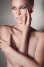
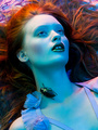
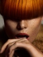
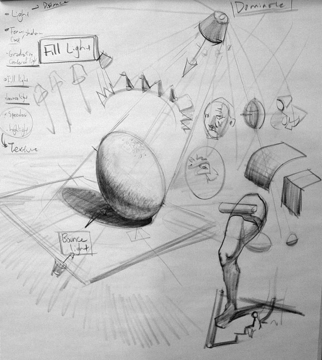
Retoucher

SterlingHein

Posts: 165

Vancouver, British Columbia, Canada

Ronald Nyein Zaw Tan wrote:
One of my challenges is "extrapolating" or recreating definition. The photographer in me realized that the image left's shoulder should have that "depth," because the model's shoulder is coming out towards the viewer. I drew in (as best I could) the highlight and surrounding circles of darker shade to illustrate the shoulder bulge.

This thread is good for me as well! Thanks for the images to be shared.

Thank you Ronald! That's super helpful.

Thanks also to digital Artform for all of the comprehensive responses

Dec 29 11 12:14 pm Link

Photographer

790763

Posts: 2747

San Francisco, California, US

Here is one more...the handsome Grazian. Thanks, buddy for allowing me to carve your portrait.

https://temp.ronaldnztan.com/Grazian_Retouched.gif

Carving Layer:

https://temp.ronaldnztan.com/Grazian_Carving.jpg

Alternative Crop: [I introduced additional yellows to the highlights].

https://temp.ronaldnztan.com/Grazian_640.jpg

Dec 30 11 02:33 pm Link

Retoucher

DexterManejaRetouch

Posts: 8

Cebu, Central Visayas, Philippines

learned a lot from the this thread, specially M P Retouch posts on page 1... ^_^

Jan 03 12 03:54 am Link

Photographer

Neil Snape

Posts: 9474

Paris, Île-de-France, France

Carving. I suppose I'm an experienced retoucher, but must be living in my grotte for too long. I never heard the term carving other than the mess I make when hacking a poultry , and everyone asks me , "you call that carving?"

It's all just DB, years before MM existed I was doing this with curves layers in mixed L modes. Not sure exactly when the bone heads at Adobe came out with opacity and flow but I think around V7. Using the pen was easier before , you didn't need to be constantly adjusting the keypad shortcuts to get to where you were going.

It has become a reflex, but isn't at all the way it should be. While many of you try to precisely paint the layer, I just hack with varying opacity and flow most often at 50/50 , 30/30, or 70/70. Then I mask the layer and paint on it to redo or revert the splendor of all the wow and pow, that made the picture too 'Shopped to be real.

I think there is a saturation problem if you go too far in DB , carving if you like, that you should pay attention to. For Greenberg pictures it's passable, for others it becomes vulgar quickly.  So that said, I can see reason why 100% / 2 % flow without masking would ensure a decent touch.

My way is a sure way to look back in time and say "what the heck was I thinking"?

Jan 03 12 04:12 am Link

Photographer

790763

Posts: 2747

San Francisco, California, US

Bonjour Monsieur Snape,

Hiya Neal. I agree with you, "carving" is under the umbrella category of "dodging and burning," but more specifically, you are contouring and remapping and enhancing light.

I just think "carving" sounds more refined and sophisticated. I was introduced to the term from the RetouchPro forum. An alternative for carving could be "painting with light or PWL" for short.

Thanks for contributing your tips, Neil. Happy 2012!


Neil Snape wrote:
Carving. I suppose I'm an experienced retoucher, but must be living in my grotte for too long. I never heard the term carving other than the mess I make when hacking a poultry , mand everyone asks me , "you call that carving?"

It's all just DB, years before MM existed I was doing this with curves layers in mixed L modes. Not sure exactly when the bone heads at Adobe came out with opacity and flow but I think around V7. Using the pen was easier before , you didn't need to be constantly adjusting the keypad shortcuts to get to where you were going.

It has become a reflex, but isn't at all the way it should be. While many of you try to precisely paint the layer, I just hack with varying opacity and flow most often at 50/50 , 30/30, or 70/70. Then I mask the layer and paint on it to redo or revert the splendor of all the wow and pow, that made the picture to 'Shopped to be real.

I think there is a saturation problem if you go too far in DB , carving if you like, that you should pay attention to. For Greenberg pictures it's passable, for others it becomes vulgar quickly.  So that said I can see reason why 100% / 2 % flow without masking would ensure a decent touch.

My way is a sure way to look back in time and say what the heck was I thinking?

Jan 03 12 10:48 am Link

Photographer

NothingIsRealButTheGirl

Posts: 35726

Los Angeles, California, US

Just wanted to put in a word or two from the painters...

Sometimes the color you need is not simply a lighter or darker version of the color you have, but a somewhat different hue or saturation. For this reasons digital painters are routinely discouraged from using dodge and burn as a means of painting.

Don't dodge and burn your highlights and shadows.

inexperienced and unskilled at just about everything ... all I know is dodge/burn.

Something to throw into the mix...

Jan 03 12 11:27 am Link

Photographer

NothingIsRealButTheGirl

Posts: 35726

Los Angeles, California, US

Something else to look at--

While Steven Stahlberg doesn't use a gray layer to modify existing color, he DOES sometimes use a color layer to modify existing grayscale. And to good effect:

http://www.androidblues.com/JealousySte … ystep.html

So you CAN use blend modes to 'dodge and burn' paintings or photos (obviously) but it takes extra thought as to the colors being produced.

Here I'm refining the colorization further - note the different hues on the sheet and skin, the blue shadows, the reddish shadow-edges etc... it's exaggerated at this stage so that (hopefully) some of it will survive into the final image.

When you've taken this as far as it can go, start using brushes in 'Normal' mode. (Again I use round hard edged brushes, with pressure sensitive opacity mostly, occasionally Airbrush or texture brushes.) You'll know when it's reached that stage, you can feel it - the point of sharply diminishing return. It gets harder and harder to see what you're doing with these modes, since they're very transparent and subtle.

For the next level of subtlety it's best to use straight Normal mode.  But if the preceding stage of colorization has gotten you close enough, you won't need to cover all of the image with 100% opacity, you can focus on some areas, which makes it easier.

Now is also the time when I enlarge the image to it's final resolution, to get all the detailing done with the opaque paint.


http://www.3dtotal.com/index_tutorial_d … 819&page=2

And I guess you can't really just brush in new color without sacrificing skin pore detail.

Jan 03 12 11:34 am Link

Photographer

Julian Marsalis

Posts: 1191

Austin, Texas, US

Awesome thread thanks all....

Jan 03 12 11:59 am Link

Retoucher

Lanenga

Posts: 843

Amsterdam, Noord-Holland, Netherlands

Ronald Nyein Zaw Tan wrote:
I agree with you, "carving" is under the umbrella category of "dodging and burning," but more specifically, you are contouring and remapping and enhancing light.

I just think "carving" sounds more refined and sophisticated. I was introduced to the term from the RetouchPro forum. An alternative for carving could be "painting with light or PWL" for short.

I just call it D&B and as Neil says, it has been done for many many years. Even make-up artists use this when applying shadows and highlights. This is part of the reason why all those actors in Hollywood look so ripped. Apply some shadowy make up in the right places and you look twice as buff big_smile

None the less, this turned out to be a nice and interesting thread. I wasn't sure what you were getting at when you started it, but MP got it rolling wink

Jan 03 12 01:03 pm Link

Photographer

790763

Posts: 2747

San Francisco, California, US

Mike is awesome.


MP = Michael Pearson.


REMEMBER his name. :-)


Lanenga wrote:

I just call it D&B and as Neil says, it has been done for many many years. Even make-up artists use this when applying shadows and highlights. This is part of the reason why all those actors in Hollywood look so ripped. Apply some shadowy make up in the right places and you look twice as buff big_smile

None the less, this turned out to be a nice and interesting thread. I wasn't sure what you were getting at when you started it, but MP got it rolling wink

Jan 03 12 01:20 pm Link

Photographer

dvwrght

Posts: 1300

Phoenix, Arizona, US

MP Retouch wrote:
https://2.bp.blogspot.com/-sabxwGMTWpg/Tvlcc_wirnI/AAAAAAAAA74/uXQzgq__dP4/s1600/sadf.jpg
(the curve masks composited onto a 50% grey layer)

i wouldn't claim to be an advanced retoucher, but my guess is that the more talented a retoucher is at painting human anatomy, the easier this kind of retouching is going to be for him... because you're essentially painting a face in grayscale.

Jan 03 12 01:25 pm Link

Photographer

dvwrght

Posts: 1300

Phoenix, Arizona, US

Ronald's Carving Layer:

https://temp.ronaldnztan.com/Grazian_Carving.jpg

Jan 03 12 01:26 pm Link

Retoucher

Lanenga

Posts: 843

Amsterdam, Noord-Holland, Netherlands

dave phoenix wrote:
i wouldn't claim to be an advanced retoucher, but my guess is that the more talented a retoucher is at painting human anatomy, the easier this kind of retouching is going to be for him... because you're essentially painting a face in grayscale.

It's true that if you know your anatomy and you are a good painter this retouching might get a bit easier, but it's nothing like painting a face in grayscale. The face is already there. You'd just be enhancing some features.

It's more like coloring within the lines than painting from scratch.

Jan 03 12 04:12 pm Link

Digital Artist

Koray

Posts: 6720

Ankara, Ankara, Turkey

I also believe that one can d&b quite well to some degree without even brushing at all

Jan 03 12 07:49 pm Link

Photographer

Grazian

Posts: 104

Wolfsburg, Lower Saxony, Germany

Great input so far, really helpful,

im currently practicing carving on an image,

i think i have spotted the problem areas,
but have some problem getting the right shoulder natural flow fixed ,
apart from that i have an hotspot on top of the shoulder and the back look kind of flat , i would like to improve in the muscular areas a little bit, i have tried some edits but still am not satisfied  , i mainly burnt ,

i would like to combine the shoulder  with the back more fluidly, currently it looks dont know the exact word but "fleshy " comes to my mind

if anyone could give me direction i would be very happy

image


graz

Jan 04 12 04:42 am Link

Retoucher

Natalia_Taffarel

Posts: 7665

Buenos Aires, Buenos Aires, Argentina

Lanenga wrote:
but it's nothing like painting a face in grayscale. The face is already there. You'd just be enhancing some features.

It's more like coloring within the lines than painting from scratch.

Depending on your intent.

I´m never content with the existing shapes so I change them, create my own, my favourite one is the space between the mouth and the nose.

When D&B you are purifying and defining a gradient. Just like when painting.

Ronald Nyein Zaw Tan wrote:
MP = Michael Pearson.
REMEMBER his name. :-)

smile

Koray wrote:
I also believe that one can d&b quite well to some degree without even brushing at all

To enhance, not to create.

Jan 04 12 04:46 am Link

Retoucher

Lanenga

Posts: 843

Amsterdam, Noord-Holland, Netherlands

Lanenga wrote:
but it's nothing like painting a face in grayscale. The face is already there. You'd just be enhancing some features.

It's more like coloring within the lines than painting from scratch.

Natalia_Taffarel wrote:
Depending on your intent.

No, not really. Unless you are actually PAINTING new parts in, it's nothing like painting from scratch.

Natalia_Taffarel wrote:
I´m never content with the existing shapes so I change them, create my own, my favourite one is the space between the mouth and the nose.

When D&B you are purifying and defining a gradient. Just like when painting.

I knew someone would say this. But even if you do change shapes, that would be more like adjusting the outlines and all you do with carving is color inside them REALLY REALLY precise big_smile

I do know people who actually do paint parts in(I've even done it), but that's not what is being discussed here. It was about the comparison between carving/D&B and painting in greyscale.

Lets get back on topic...
This kind of work does however require the retoucher/artist to have the same level of knowledge of "playing with light" as a painter has.

Jan 04 12 08:29 am Link

Photographer

790763

Posts: 2747

San Francisco, California, US

@Grazian: I'll let the advance artists answer your query, since I am a "padawan" at carving. Michael has been insightful and offering me tips and tricks to improve my weakness.

Jan 04 12 12:19 pm Link

Photographer

Grazian

Posts: 104

Wolfsburg, Lower Saxony, Germany

Thank you from another padavan :-), i really would like to learn more, so far i learnt great things here! best wishes

Jan 04 12 12:59 pm Link

Photographer

790763

Posts: 2747

San Francisco, California, US

Here is my attempt at augmenting a slight, structural correction. A lot of guess work and I am still having difficulty "seeing" it.

https://temp.ronaldnztan.com/pg3dey5y_carving_layer.jpg

https://temp.ronaldnztan.com/pg3dey5y_carving_practice.gif

Link to the layered TIFF: http://temp.ronaldnztan.com/pg3dey5y_ca … actice.tif

Jan 04 12 01:19 pm Link

Photographer

790763

Posts: 2747

San Francisco, California, US

If anyone is lurking at the thread, please join us. We are amongst friends and are here to assist one another.

I am learning tips and tricks myself. It is fun!

Jan 04 12 01:39 pm Link

Photographer

NothingIsRealButTheGirl

Posts: 35726

Los Angeles, California, US

Lanenga wrote:
but it's nothing like painting a face in grayscale. The face is already there. You'd just be enhancing some features.

It's more like coloring within the lines than painting from scratch.

https://www.cs.cmu.edu/~christos/courses/826.S07/HW3_sol/q1_1_swav1_t.jpg

It's not the sine wave, it's the +/- pushes and pulls to the sine wave.

https://www.cs.cmu.edu/~christos/courses/826.S07/HW3_sol/q1_1_swav2_t.jpg

Jan 04 12 02:08 pm Link

Photographer

Grazian

Posts: 104

Wolfsburg, Lower Saxony, Germany

Ronald Nyein Zaw Tan wrote:
If anyone is lurking at the thread, please join us. We are amongst friends and are here to assist one another.

I am learning tips and tricks myself. It is fun!

Great approach ronan, i must train my eyes more,  on the forms and flows of light and dark body spots, but the "lighten" part on the arm was in my mind , i love to exercise , this thread is great

Jan 04 12 02:17 pm Link

Photographer

NothingIsRealButTheGirl

Posts: 35726

Los Angeles, California, US

Ronald Nyein Zaw Tan wrote:
Here is my attempt at augmenting a slight, structural correction. A lot of guess work and I am still having difficulty "seeing" it.

https://jfrancis.smugmug.com/photos/i-jgWNKgq/0/O/i-jgWNKgq.jpg

There is a triangular bone there, the scapula (shoulder blade) and it has two edges (indicated in white) that are present in the model.

Also there is some muscle indicated in green.

https://www.vancouveryoga.com/assets/photos/levator.jpg

There is actually a lot more muscle around the shoulder blade, but the bony ridges, I think, are the most important landmarks.

Jan 04 12 02:23 pm Link

Photographer

790763

Posts: 2747

San Francisco, California, US

I see that the "bone" region indicated should be lightened and not darkened as I have in my carving layer.

Jan 04 12 02:38 pm Link

Photographer

790763

Posts: 2747

San Francisco, California, US

Here are the updated images. First my carving layer and later the GIF. Does my edit look more correct?

https://temp.ronaldnztan.com/pg3dey5y_carving_layer_updated.jpg

https://temp.ronaldnztan.com/pg3dey5y_carving_practice_updated.gif

Jan 04 12 02:53 pm Link

Digital Artist

Koray

Posts: 6720

Ankara, Ankara, Turkey

this thread is starting to get scary tongue

Jan 04 12 02:54 pm Link

Photographer

790763

Posts: 2747

San Francisco, California, US

I am scared and intimidated from Francis' replies. His posts are helping me "see" and more importantly, justify why things should be burnt or lighten—taking into account both anatomical and creative jurisdiction.


Koray wrote:
this thread is starting to get scary tongue

Jan 04 12 02:59 pm Link

Digital Artist

Koray

Posts: 6720

Ankara, Ankara, Turkey

its all fine as long as this thread will make the world see better images...and I'm not scared of Francis the Bone Collector evilgrin

edit: oh...I wasnt aware that an evilgrin smilie was added!!!

Jan 04 12 03:05 pm Link

Photographer

790763

Posts: 2747

San Francisco, California, US

Scary

Koray wrote:
its all fine as long as this thread will make the world see better images...and I'm not scared of Francis the Bone Collector evilgrin

edit: oh...I wasnt aware that an evilgrin smilie was added!!!

Jan 04 12 03:26 pm Link

Photographer

790763

Posts: 2747

San Francisco, California, US

OFF TOPIC: Isn't there a time on MM, that is people use the word, "scary," the coding would automatically replace with some graphic?

Ronald Nyein Zaw Tan wrote:
Scary


Jan 04 12 03:27 pm Link

Digital Artist

Michael C Pearson

Posts: 1349

Agoura Hills, California, US

NothingIsRealButTheGirl wrote:
Sometimes the color you need is not simply a lighter or darker version of the color you have, but a somewhat different hue or saturation. For this reasons digital painters are routinely discouraged from using dodge and burn as a means of painting.

Good point. I think photographers have a bit more leeway because of the nature of the media we're working with. With a painting the viewer is supposed to believe it's real and thus d&b doesn't give very lifelike, vibrant results. Retouching a photo on the other hand is already clearly real so we can get away with less visually exciting highlights and shadows. Sometimes I do like to go and paint in some of the background color to the shadows and the light color to the highlights for visual interest though.

NothingIsRealButTheGirl wrote:
Something else to look at--

Awesome, bookmarked. I love how it clearly shows the the way the artist shaded the simplified forms.

Natalia_Taffarel wrote:
I´m never content with the existing shapes so I change them, create my own, my favourite one is the space between the mouth and the nose.

When D&B you are purifying and defining a gradient. Just like when painting.

I'm glad someone brought this up. The curve of the surface is expressed through the gradient, so by altering gradients you can change how angular or smooth a surface is. I also find myself just simplifying gradients I see in the image as it creates a more sleek, visually appealing result.  Same goes for simplifying the shapes of the highlights and shadows. For people who aren't Francis the Bone Collector, this involves lots of trial and error as I don't really know if an highlight or shadow adjustment will "work" until I try it out.

https://3.bp.blogspot.com/-XghuMj5lmMg/TwOtQbmQbXI/AAAAAAAAAaU/h4UQN-0QDNk/s1600/144.jpg

Neil Snape wrote:
I think there is a saturation problem if you go too far in DB , carving if you like, that you should pay attention to. For Greenberg pictures it's passable, for others it becomes vulgar quickly.  So that said I can see reason why 100% / 2 % flow without masking would ensure a decent touch.

My way is a sure way to look back in time and say what the heck was I thinking?

Theres a method I use that's saved me lots of time in the color correction part of d&b. Before I did this I found myself color correcting the d&b more often than not. Now I find myself leaving it alone more often than not. The method is I pull the highlight point of the curve down a little bit on the burn curve, and raise the black point of the curve a bit in the dodge curve. The amount that the saturation is affected by the curve can be adjusted by playing with the corresponding end point to your dodge layer (shadow point) or burn layer (highlight point). This trick only works if you d&b in tiny little blobs and strokes, not if you enhance a large section of the face as contrast will be lost. If you darken down a very bright area, you'll most likely need to paint color. Likewise with an extreme brightening.

Lanenga wrote:
It's true that if you know your anatomy and you are a good painter this retouching might get a bit easier, but it's nothing like painting a face in grayscale. The face is already there. You'd just be enhancing some features.

It's more like coloring within the lines than painting from scratch.

I do think it's much easier than painting a face from scratch, but the amount you intend to change the form of the face determines how much it feels like painting a face from scratch. For example in the edit I posted in this post, I really did end up painting the form of the nose in a way that was totally different from the original. Even that isn't quite the same as painting from scratch, but it's close.

Ronald Nyein Zaw Tan wrote:
OFF TOPIC: Isn't there a time on MM, that is people use the word, "scary," the coding would automatically replace with some graphic?

Looks like the evil reign of the fear cat has finally come to an end. Rejoice!

Koray wrote:
its all fine as long as this thread will make the world see better images...and I'm not scared of Francis the Bone Collector evilgrin

edit: oh...I wasnt aware that an evilgrin smilie was added!!!

I love "Francis the Bone Collector's" extensive knowledge of anatomy. I guess I'm his padawan when it comes to understanding the body.

Jan 04 12 03:57 pm Link

Photographer

790763

Posts: 2747

San Francisco, California, US

No one is ever going to wonder with MP stands for any longer. :-) Time to make some noise around your name, Mr. Pearson.

;-)

Jan 04 12 04:14 pm Link

Photographer

Stecyk

Posts: 365

Calgary, Alberta, Canada

Michael C Pearson wrote:
Theres a method I use that's saved me lots of time in the color correction part of d&b. Before I did this I found myself color correcting the d&b more often than not. Now I find myself leaving it alone more often than not. The method is I pull the highlight point of the curve down a little bit on the burn curve, and raise the black point of the curve a bit in the dodge curve. The amount that the saturation is affected by the curve can be adjusted by playing with the corresponding end point to your dodge layer (shadow point) or burn layer (highlight point). This trick only works if you d&b in tiny little blobs and strokes, not if you enhance a large section of the face as contrast will be lost. If you darken down a very bright area, you'll most likely need to paint color. Likewise with an extreme brightening.

Before I begin, I want to comment that I really like your work and your contribution to this thread. As someone who is not a retoucher but enjoys learning about retouching, I am thankful for your contribution.

Your comment above with regard to color correcting with d&b reminded me of something I read in Gry Garness's ebook.

Page 15, digital RETOUCHING for FASHION, BEAUTY & PORTRAIT PHOTOGRAPHY
photoshop CS5
Part 2 Skin Retouching
By Gry Garness
http://www.grygarness.com/photoshop/e-b … -books.htm

USING A SCREEN LAYER FOR DODGING

I generally find myself dodging much more often than burning, and this is definitely one of my favorite ways to dodge. By simply making a blank layer and blending it to Screen mode, you can sample the color of the skin nearby and use this color to dodge with. Just find the right brush capacity. It's really intuitive. If you have a pink blemish (or area) and your want to drive it more towards yellow as you lighten it, you simply sample a more yellow area of skin and brush over the pink. For this it's best to work with very low opacities.

I am not positive that this information directly relates to your comments Michael about color correction.

However, I hadn't seen the color sampling before when dodging and burning. Perhaps some others hadn't either. So I thought I would mention it in case others find color sampling helpful.

Jan 04 12 04:45 pm Link

Retoucher

Lanenga

Posts: 843

Amsterdam, Noord-Holland, Netherlands

Michael C Pearson wrote:
I'm glad someone brought this up. The curve of the surface is expressed through the gradient, so by altering gradients you can change how angular or smooth a surface is. I also find myself just simplifying gradients I see in the image as it creates a more sleek, visually appealing result.  Same goes for simplifying the shapes of the highlights and shadows. For people who aren't Francis the Bone Collector, this involves lots of trial and error as I don't really know if an highlight or shadow adjustment will "work" until I try it out.

To me this sounds all really obvious and is what I always tell people first.

When looking at 2D images, our brain tricks us in seeing 3D shapes/objects because that's what we have experienced throughout or life when growing up, but with enough practice you can make your brain see what's really there (insert matrix quote). A flat image with gradients on them.

So when people ask me how to become better at retouching, I tell them to train there eyes to see what's really there. This however is always a lot harder than just copying some techniques you've seen on some DVD.

When it comes to anatomy I'd like to suggest to get yourself a copy of Sobotta  or Gray's Anatomy. I find them a lot more useful now, then back when I was in med school.

Lanenga wrote:
It's true that if you know your anatomy and you are a good painter this retouching might get a bit easier, but it's nothing like painting a face in grayscale. The face is already there. You'd just be enhancing some features.

It's more like coloring within the lines than painting from scratch.

Michael C Pearson wrote:
I do think it's much easier than painting a face from scratch, but the amount you intend to change the form of the face determines how much it feels like painting a face from scratch. For example in the edit I posted in this post, I really did end up painting the form of the nose in a way that was totally different from the original. Even that isn't quite the same as painting from scratch, but it's close.

I did see that image and I am still not convinced unless you would call this painting too

Click link for video

Ronald Nyein Zaw Tan wrote:
OFF TOPIC: Isn't there a time on MM, that is people use the word, "scary," the coding would automatically replace with some graphic?

Haha yes there was. Seems like MM is maturing. Too bad...

Jan 04 12 04:51 pm Link

Photographer

790763

Posts: 2747

San Francisco, California, US

@Carlos: the link to the video is awesome. I wish I could do "digital makeup" in Photoshop, but my it is way beyond my skills.

In a sense, "carving" is doing what makeup artists do. Improving and reshaping the face resulting in attractive illusions.

Keep up the great tips and even fun and off topic things. :-)

Jan 04 12 05:00 pm Link

Digital Artist

Koray

Posts: 6720

Ankara, Ankara, Turkey

Ronald Nyein Zaw Tan wrote:
In a sense, "carving" is doing what makeup artists do. Improving and reshaping the face resulting in attractive illusions.

Well she is pressing her fingers right into the bone and muscle structure to smudge which we cant big_smile

Jan 04 12 05:03 pm Link

Photographer

790763

Posts: 2747

San Francisco, California, US

HEY!

There is a "Smudge" tool in Photoshop! Haha. I know what you mean though.

Koray wrote:

Well she is pressing her fingers right into the bone and muscle structure to smudge which we cant big_smile

Jan 04 12 05:06 pm Link

Retoucher

Lanenga

Posts: 843

Amsterdam, Noord-Holland, Netherlands

Koray wrote:

Well she is pressing her fingers right into the bone and muscle structure to smudge which we cant big_smile

Note to Adobe:
Add a Poly Juice tool in next version of Photoshop

Jan 04 12 05:17 pm Link

Retoucher

Natalia_Taffarel

Posts: 7665

Buenos Aires, Buenos Aires, Argentina

Michael C Pearson wrote:

NothingIsRealButTheGirl wrote:
Sometimes the color you need is not simply a lighter or darker version of the color you have, but a somewhat different hue or saturation. For this reasons digital painters are routinely discouraged from using dodge and burn as a means of painting.

Good point. I think photographers have a bit more leeway because of the nature of the media we're working with. With a painting the viewer is supposed to believe it's real and thus d&b doesn't give very lifelike, vibrant results. Retouching a photo on the other hand is already clearly real so we can get away with less visually exciting highlights and shadows. Sometimes I do like to go and paint in some of the background color to the shadows and the light color to the highlights for visual interest though.

NothingIsRealButTheGirl wrote:
Something else to look at--

Awesome, bookmarked. I love how it clearly shows the the way the artist shaded the simplified forms.

Natalia_Taffarel wrote:
I´m never content with the existing shapes so I change them, create my own, my favourite one is the space between the mouth and the nose.

When D&B you are purifying and defining a gradient. Just like when painting.

I'm glad someone brought this up. The curve of the surface is expressed through the gradient, so by altering gradients you can change how angular or smooth a surface is. I also find myself just simplifying gradients I see in the image as it creates a more sleek, visually appealing result.  Same goes for simplifying the shapes of the highlights and shadows. For people who aren't Francis the Bone Collector, this involves lots of trial and error as I don't really know if an highlight or shadow adjustment will "work" until I try it out.

https://3.bp.blogspot.com/-XghuMj5lmMg/TwOtQbmQbXI/AAAAAAAAAaU/h4UQN-0QDNk/s1600/144.jpg

Neil Snape wrote:
I think there is a saturation problem if you go too far in DB , carving if you like, that you should pay attention to. For Greenberg pictures it's passable, for others it becomes vulgar quickly.  So that said I can see reason why 100% / 2 % flow without masking would ensure a decent touch.

My way is a sure way to look back in time and say what the heck was I thinking?

Theres a method I use that's saved me lots of time in the color correction part of d&b. Before I did this I found myself color correcting the d&b more often than not. Now I find myself leaving it alone more often than not. The method is I pull the highlight point of the curve down a little bit on the burn curve, and raise the black point of the curve a bit in the dodge curve. The amount that the saturation is affected by the curve can be adjusted by playing with the corresponding end point to your dodge layer (shadow point) or burn layer (highlight point). This trick only works if you d&b in tiny little blobs and strokes, not if you enhance a large section of the face as contrast will be lost. If you darken down a very bright area, you'll most likely need to paint color. Likewise with an extreme brightening.

Lanenga wrote:
It's true that if you know your anatomy and you are a good painter this retouching might get a bit easier, but it's nothing like painting a face in grayscale. The face is already there. You'd just be enhancing some features.

It's more like coloring within the lines than painting from scratch.

I do think it's much easier than painting a face from scratch, but the amount you intend to change the form of the face determines how much it feels like painting a face from scratch. For example in the edit I posted in this post, I really did end up painting the form of the nose in a way that was totally different from the original. Even that isn't quite the same as painting from scratch, but it's close.

Ronald Nyein Zaw Tan wrote:
OFF TOPIC: Isn't there a time on MM, that is people use the word, "scary," the coding would automatically replace with some graphic?

Looks like the evil reign of the fear cat has finally come to an end. Rejoice!


I love "Francis the Bone Collector's" extensive knowledge of anatomy. I guess I'm his padawan when it comes to understanding the body.

I think i love you.

But you already know that smile

x

Jan 04 12 05:37 pm Link